Logofolio case

© 2022
logo
folio
Besides MVP design and development, we also create corporate identity elements, for example — logos. Here's a collection of our latest logos.


Vims

Client's wishes
A logo should have conveyed the joy of life and energy associations. Well, life is an abstract concept, so the logo turned out abstract too.
About the project
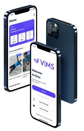
A fitness app that offers workout plans and training progress tracker.




What we offered
We combined the first letter of the name V with a sea wave. We have gone deeply into abstraction: a sea wave is a symbol of energy and life because we can’t survive without water.

Letter “V”

Wave

Logotype


Naqera

Client's wishes
They wanted us to use primary colors: blue, red, and yellow, and make a text logo and an icon logo. And all of this should be in Arabic.
About the project
A real estate agency.


What we offered
Since this is a real estate agency, we combined the first letter of the name N with house roofs.

Letter “N”

House roofs

Logotype


Shaoke

Client's wishes
The client approached us for a corporate identity. They already had a logo, and we needed to redesign it. They also wanted to make a solid-looking text logo.
About the project
A logistics company that is focusing on last mile delivery.


What we offered
We’ve made both the logo and the icon looking minimalistic, concise and, most importantly, recognizable.
Pattern
In addition to the logo, we designed a pattern with decorative vehicles.


Shape of the freight transport


Pattern


Boxz

Client's wishes
To make a logo that would reflect the project idea, which is to give a new life to old things. The second-hand marketplace asks not to throw used things in the trash but to resell them.
About the project
Stuff resale project.




What we offered
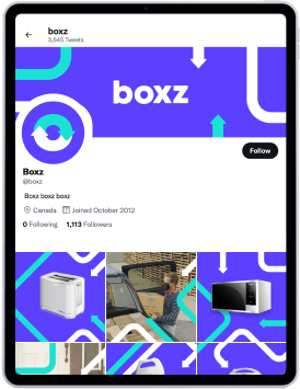
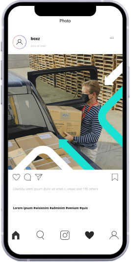
We expressed this concern for the environment in the logo. We combined the letter O with a symbol of renewal and recycle sign. Besides, we’ve made a pattern for social media and banners.

Letter “O”


A symbol of renewal

Recycling symbol

Logotype


Spark

Client's wishes
The logo was supposed to reflect the friendly approach of the company to each client, as they rely on the company taking care of them.
About the project
Indian insurance company.


What we offered
They needed a font with round and soft shapes. We’ve chosen orange color because it’s associated with energy and life.


FPS

Client's wishes
Russian streamers wanted to create a non-classical, recognizable, and dynamic text logo. Our task was to create a logo suitable for video games and at the same time make it look good in both light and dark themes.
About the project
Russian streaming platform.




What we offered
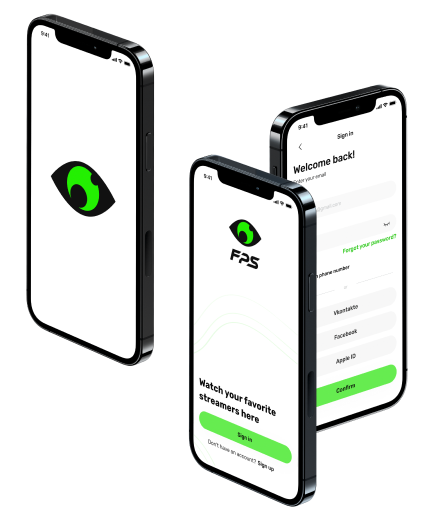
We chose an eye as the centerpiece of the logo — it reflects viewers who watch streams and also looks like a web camera lense that the streamers use to shoot streams. The accent color is neon green.

Eye

Web camera

Logotype


Thanks for your inquiry. We usually take up to 24 hours to get back with reply.
Wanna schedule an online meeting?
Sorry, something went wrong with your request.
Please, try again later.