Need help with your project?

Oops! Something went wrong while submitting the form.

Shaoke is a delivery service that provides liner shipping. The primary audience of Shaoke are companies that need delivery services and customs clearance.

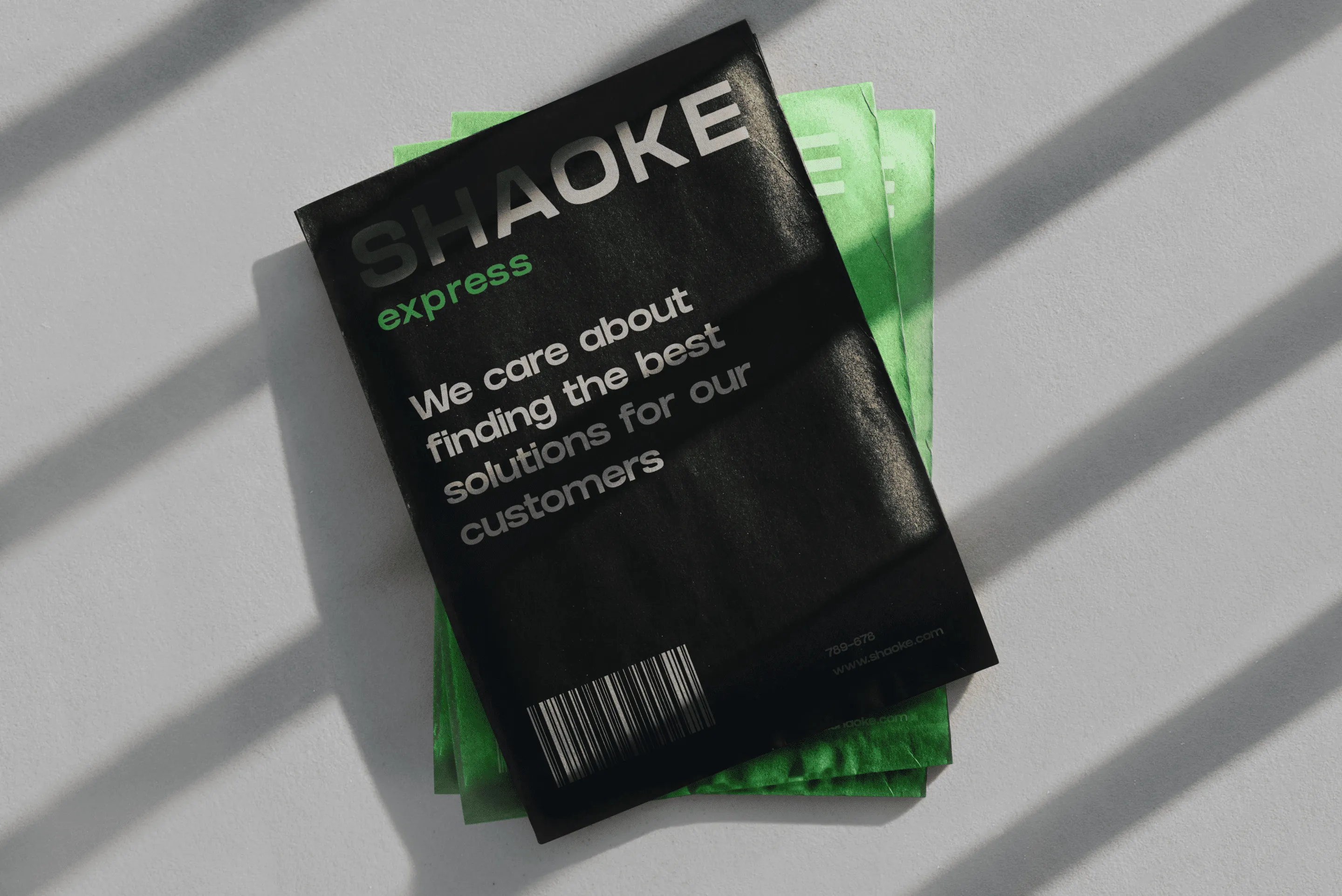
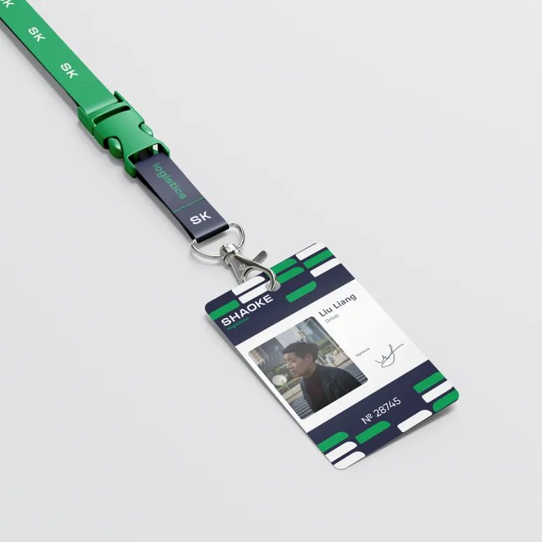
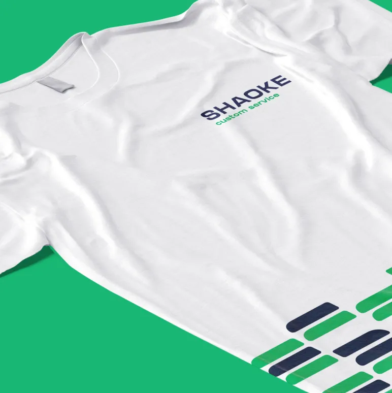
Shaoke already had a logo. It has some departments connected with delivery services: logistics, express, fulfillment, custom service. We needed to redesign the logo and make it dynamic.
The client let us know that he wanted a minimalistic corporate identity. No symbols or abstractions. Everything should be simple and clean like the identity of big companies and the most important — it should be recognizable.
Initially, we made a black-and-white logo to agree on the shape, and then we offered several color schemes. The client liked the logo shape.


There is a superstition in China that a triangle is fragile. Therefore, Chinese people don’t like sharp edges. The client liked the first logo variant but asked to make the edges round.


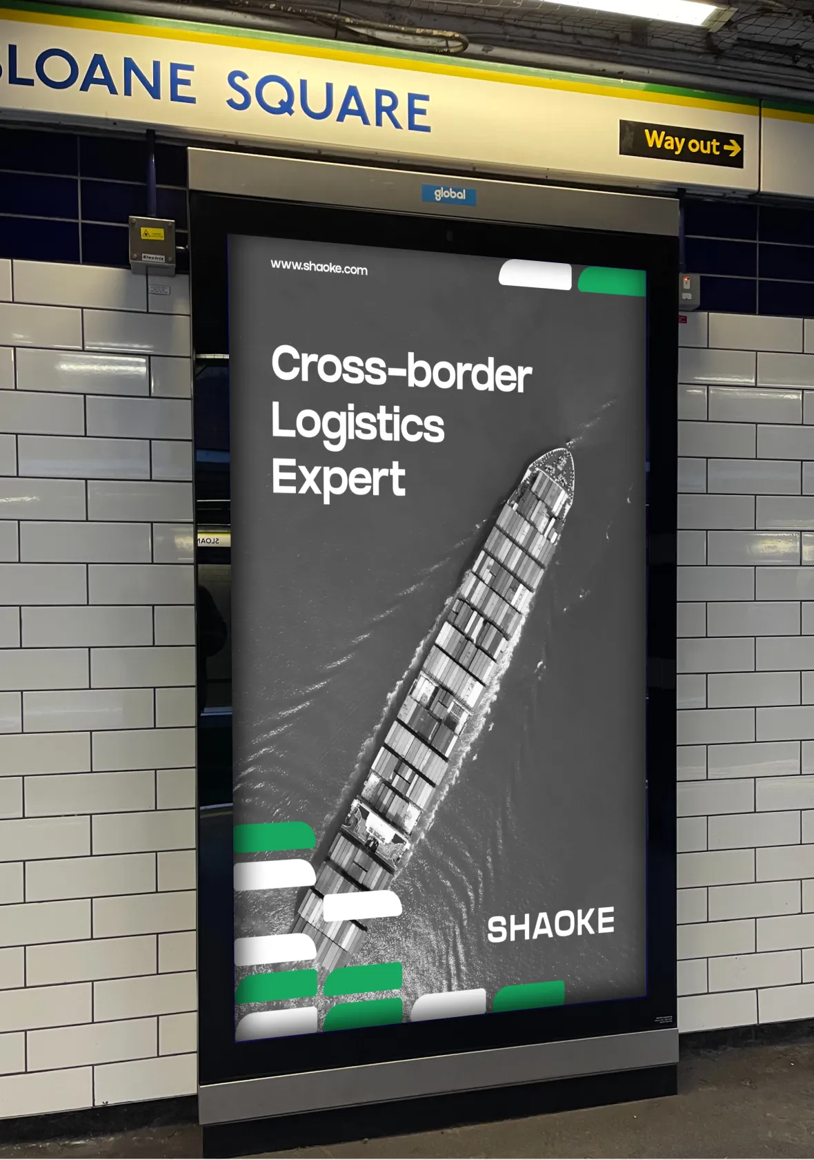
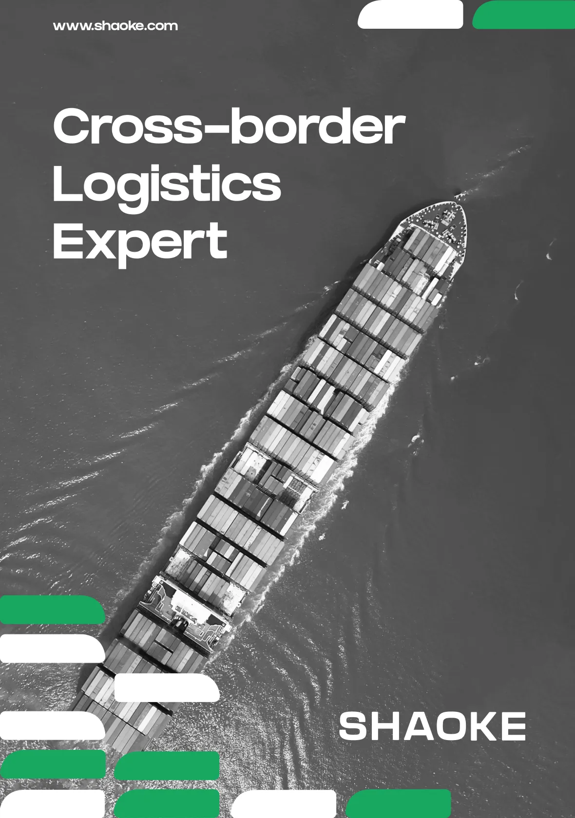
Before choosing a color scheme, it’s vital to analyze competitors because Shaoke’s corporate identity should stand out. As a result, we chose green, pink, blue, and orange. The competitors haven’t used these colors yet.

We offered the client different variants of color combinations. He chose the second variant with the green and blue color palette out of the warm and cool color schemes.
But the client asked to make these colors brighter to add more contrast.
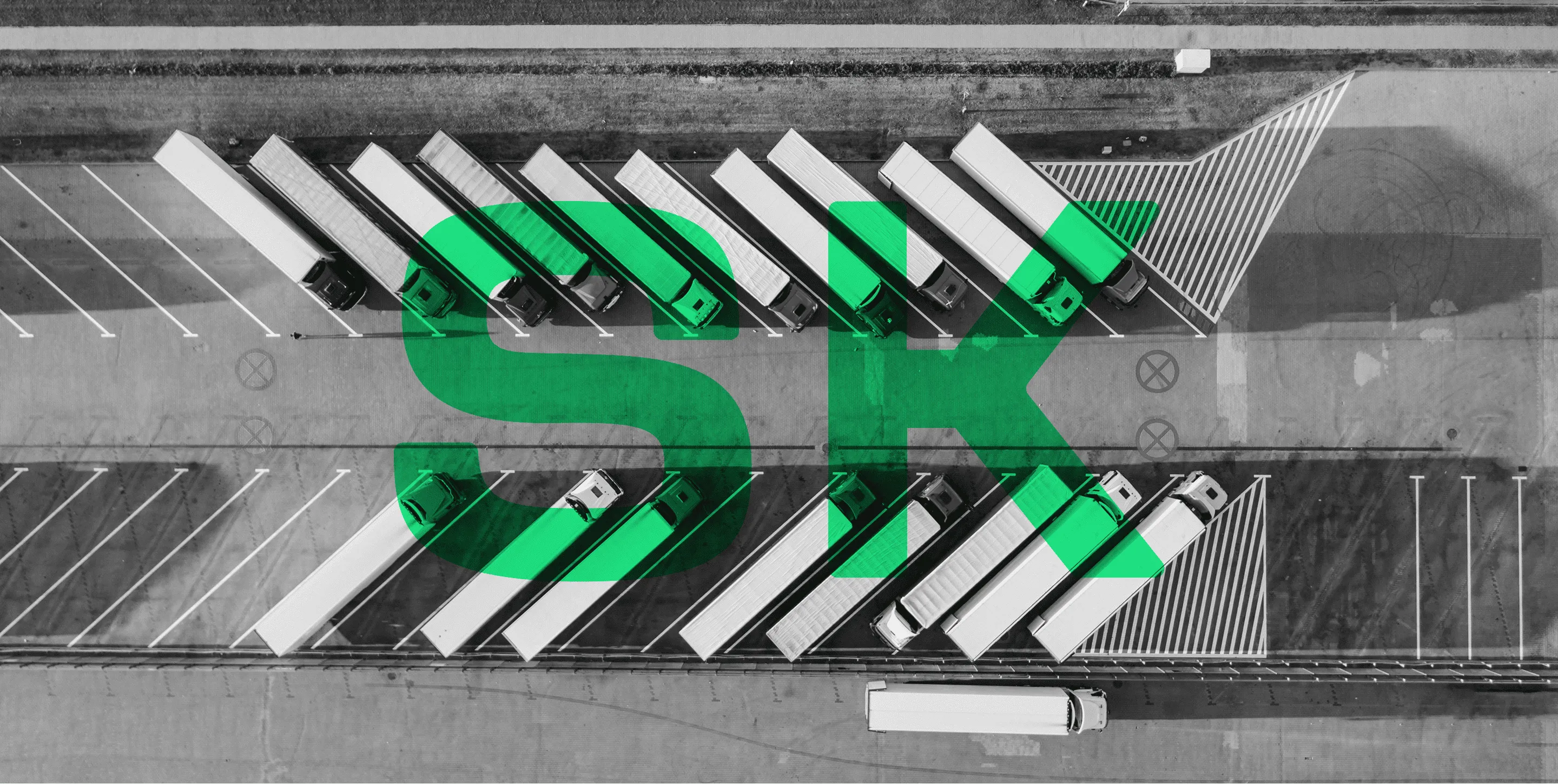
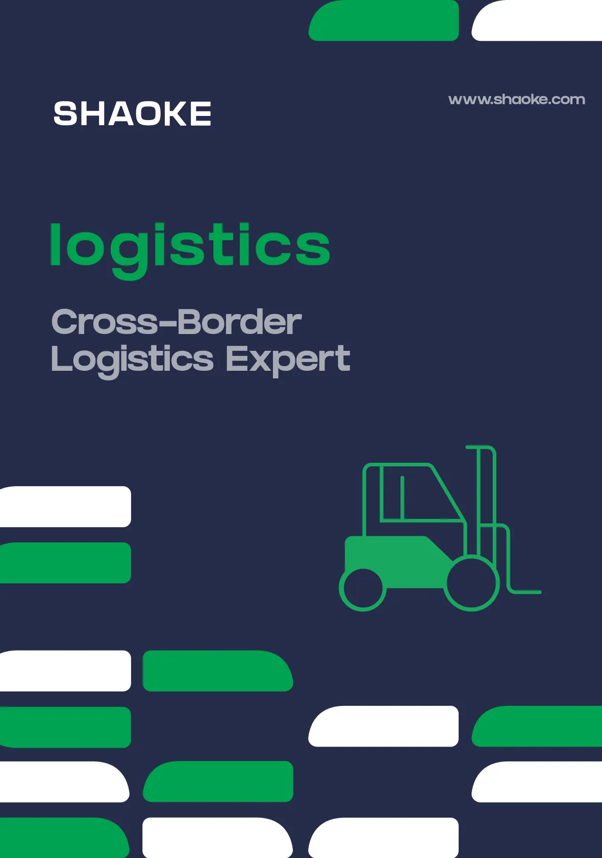
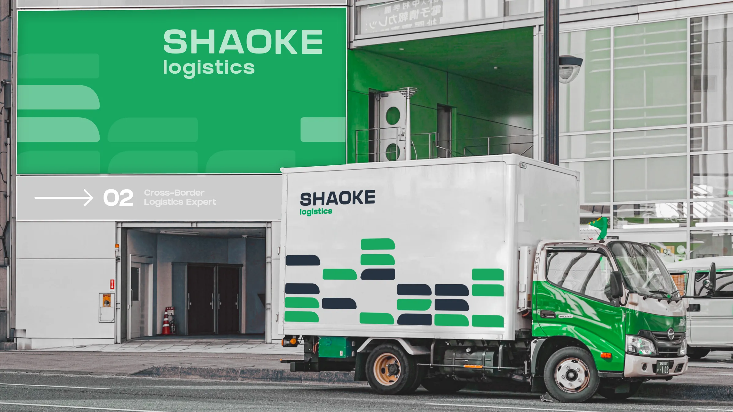
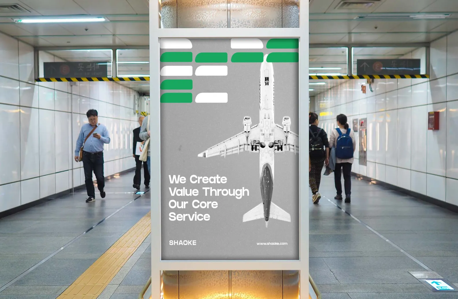
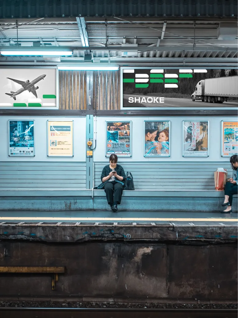
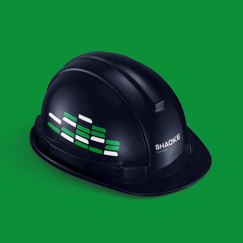
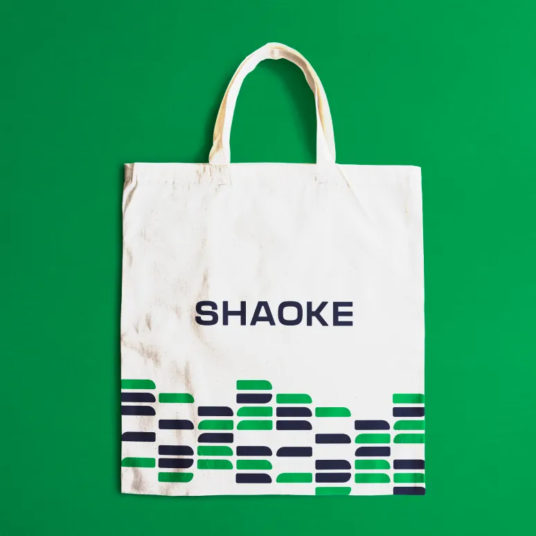
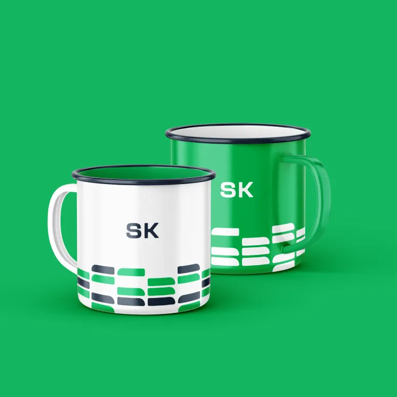
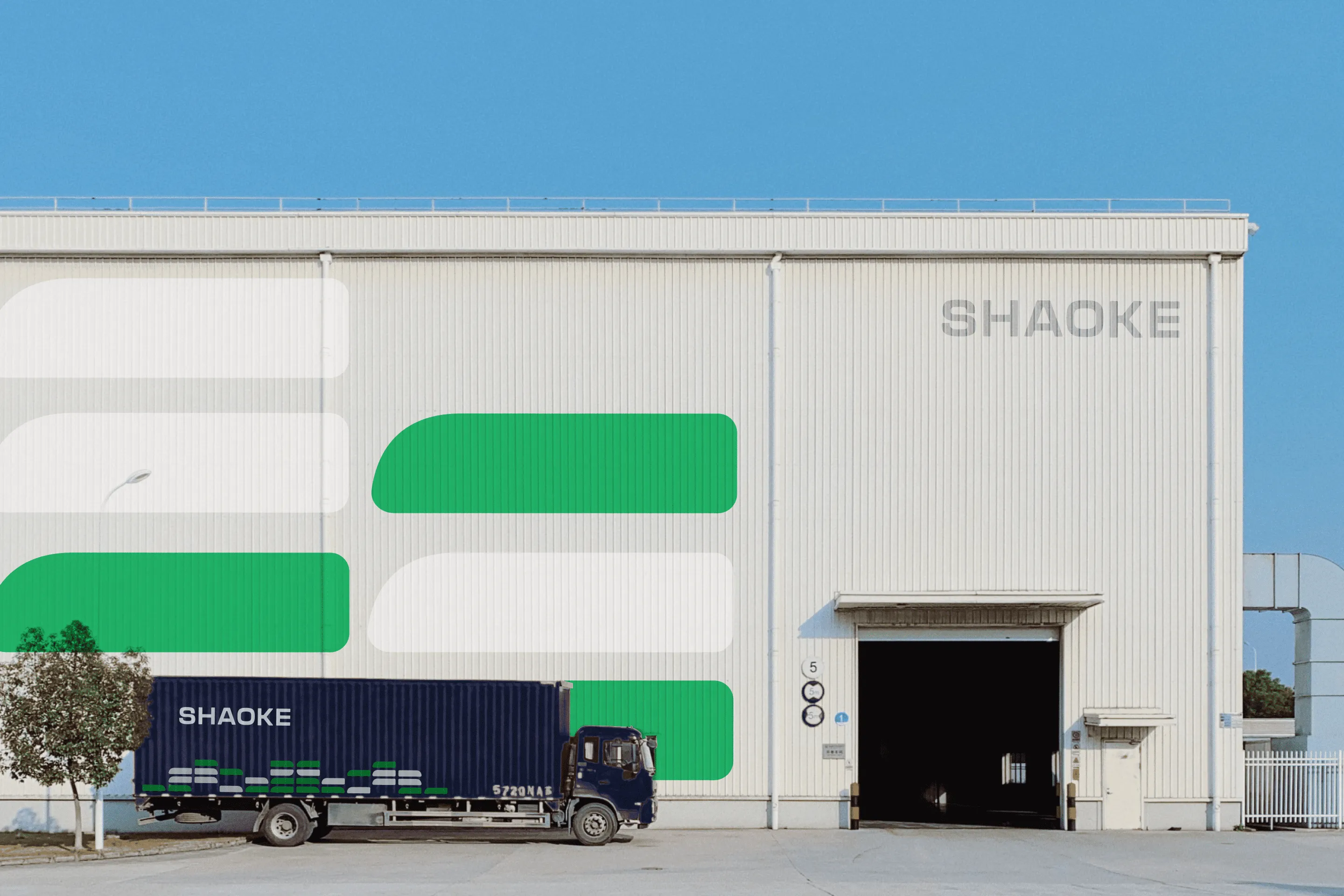
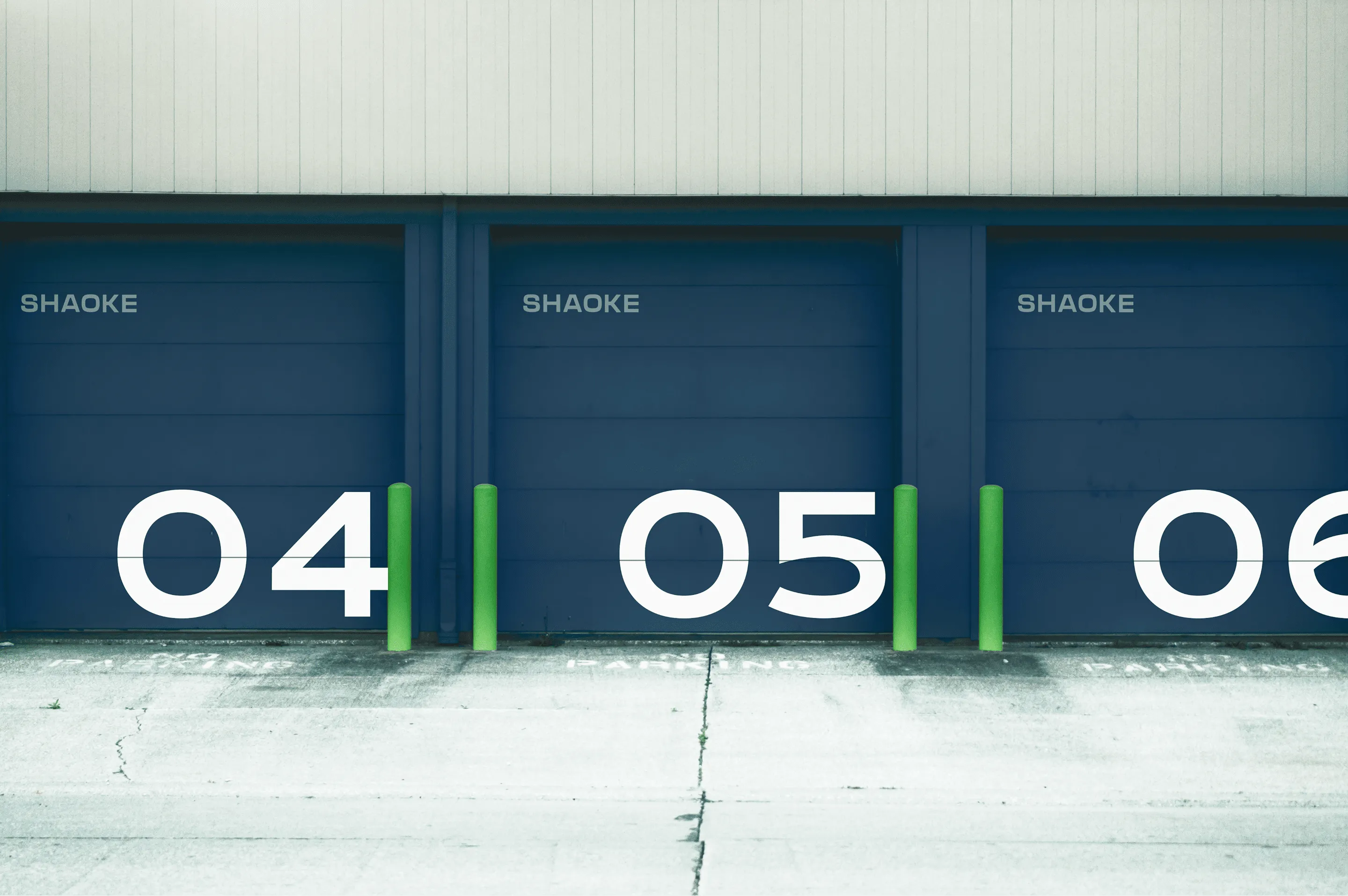
When we decided on the logo and colors, we began to work on a pattern. We found a form that unites all cargo vehicles. The pattern represents the connection, movement, and transport.

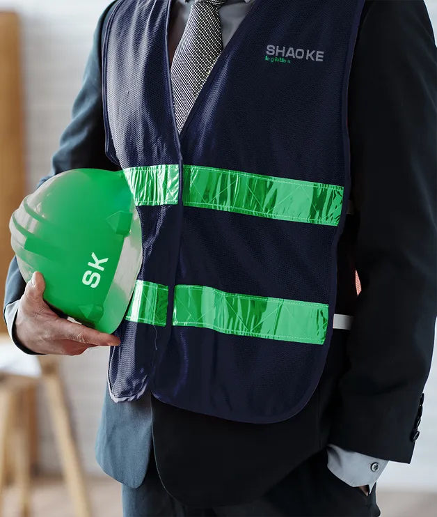
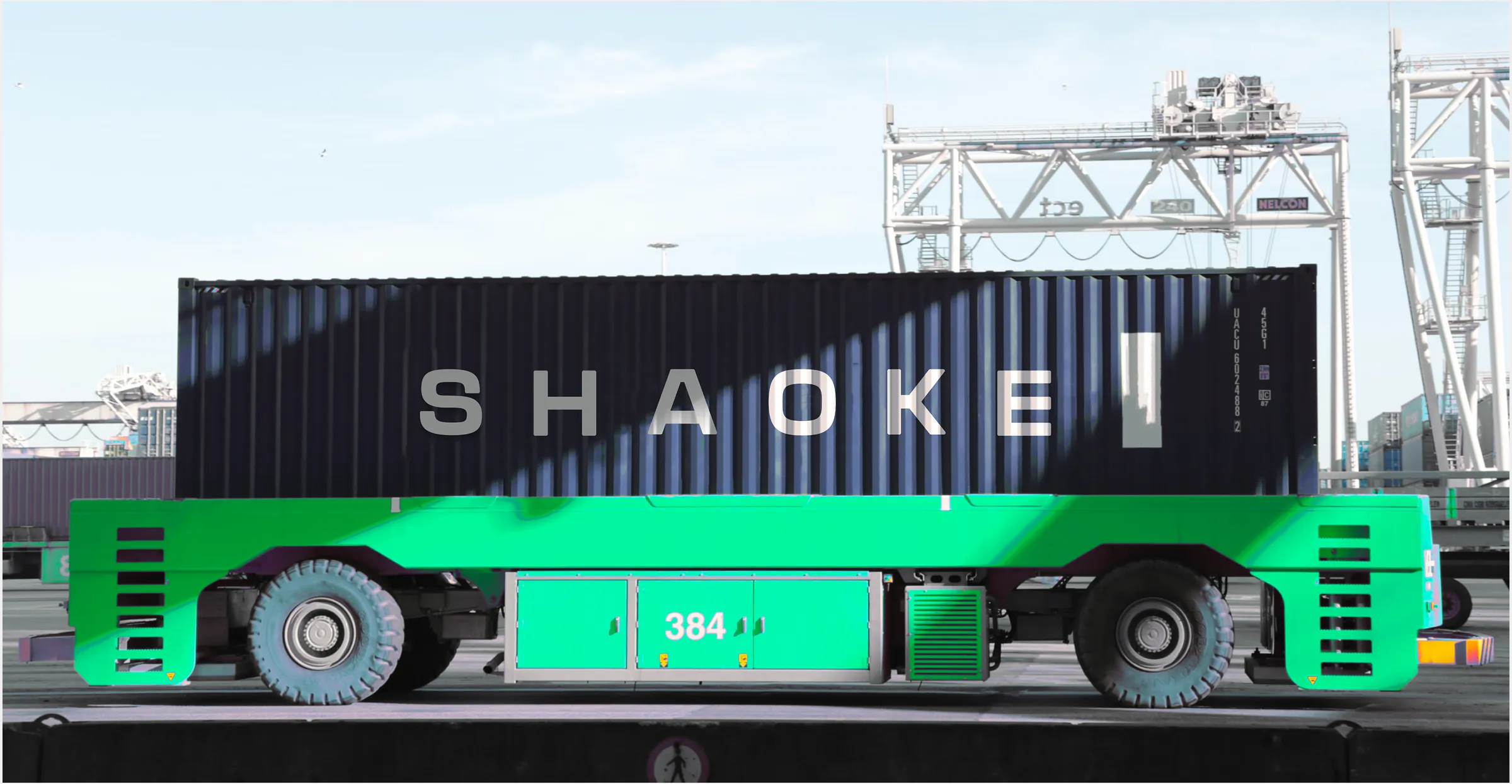
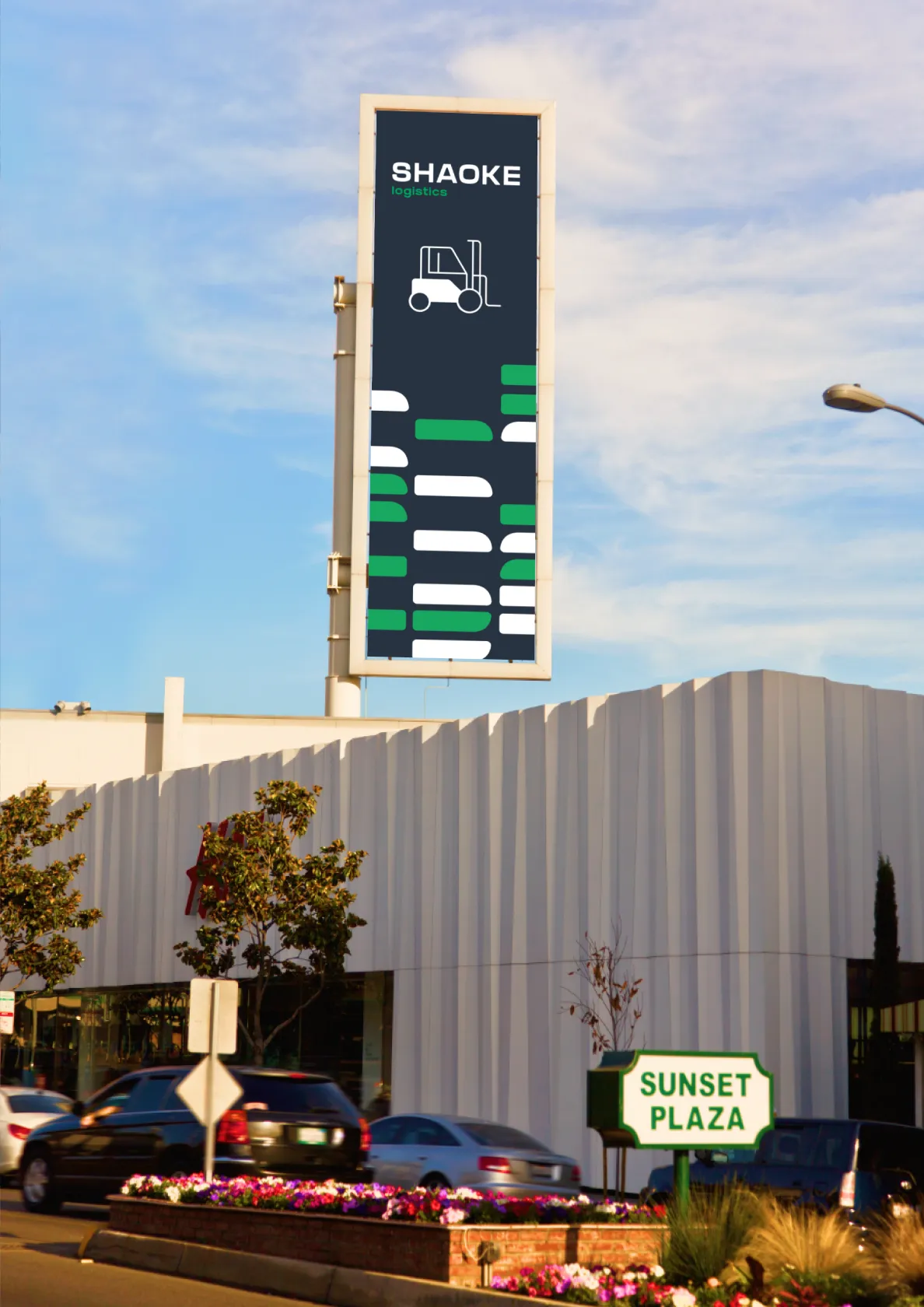
We added extra graphic elements that reflect the variety of liner shipping. The icons help to understand what is the company's activity. The client liked the design on the first variant. We also showed this composition on billboards.

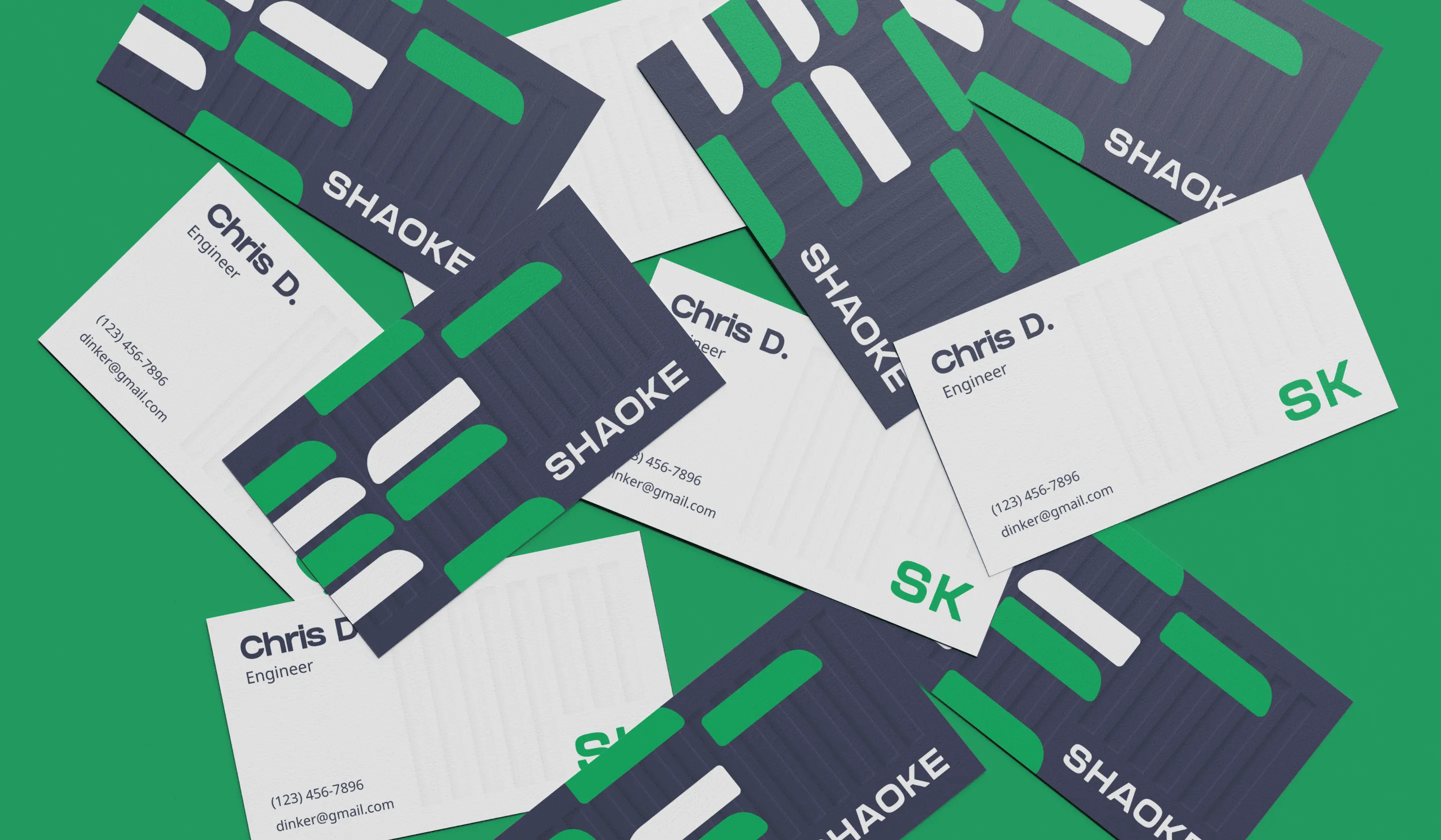
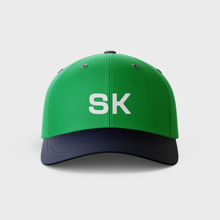
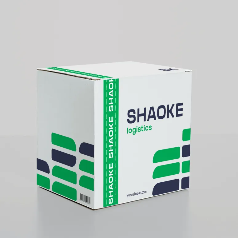
The key factor was that the logo would be printed on business cards and contracts. Design in digital format is one thing, but design in printed form is different.
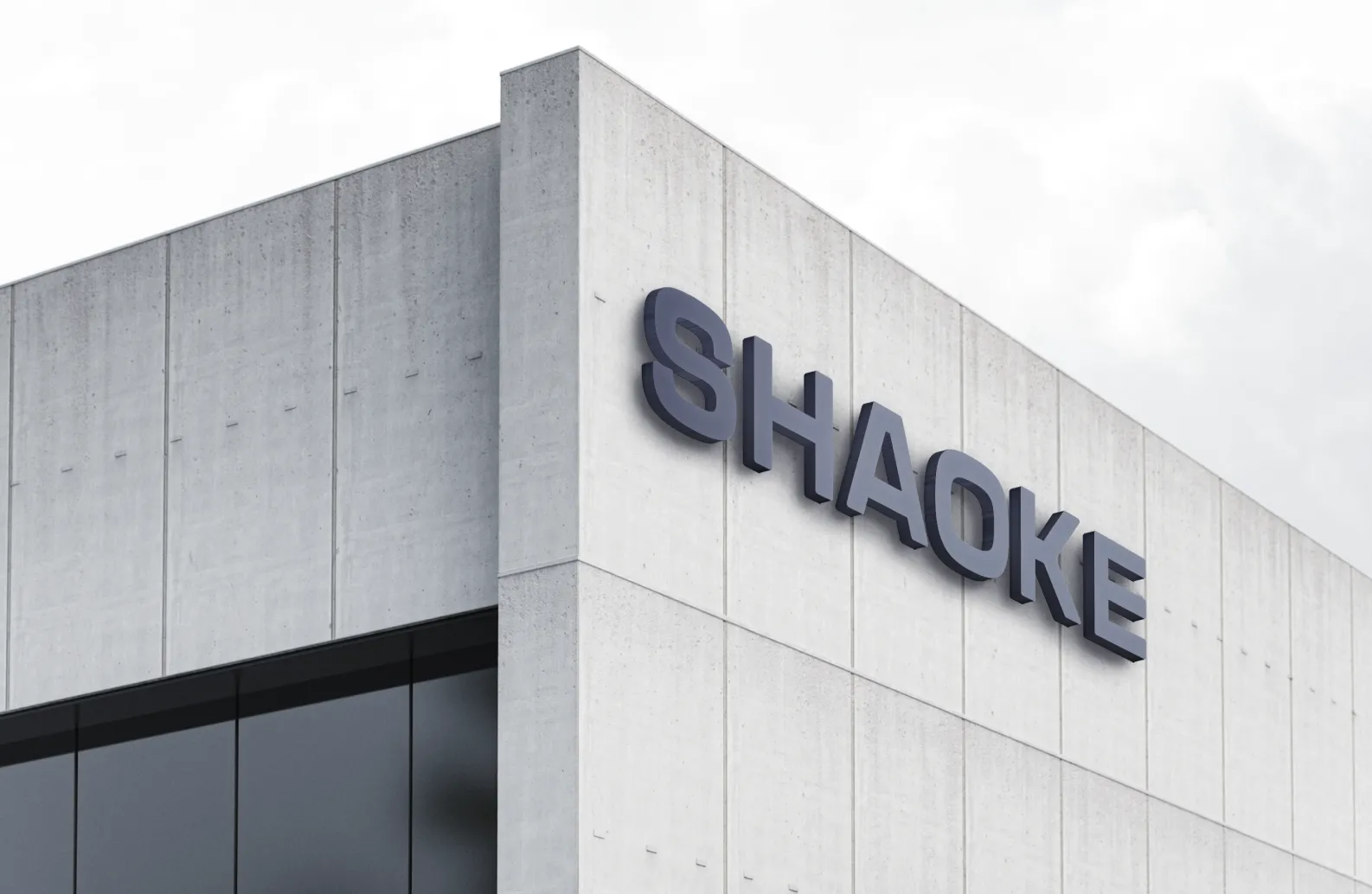
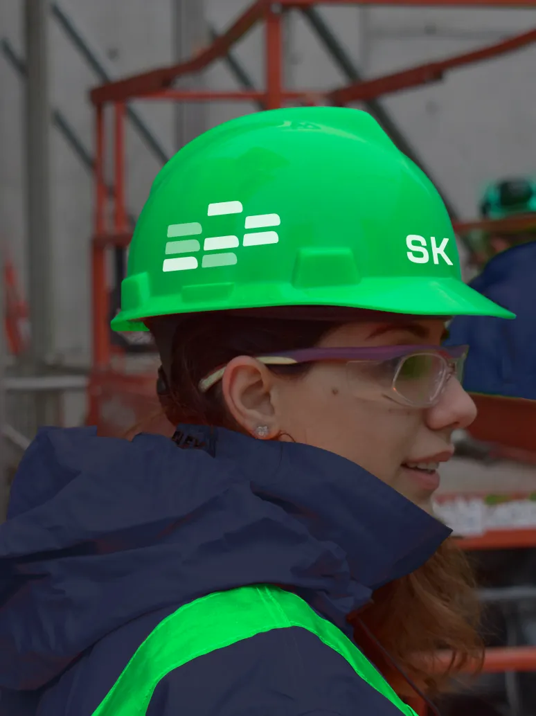
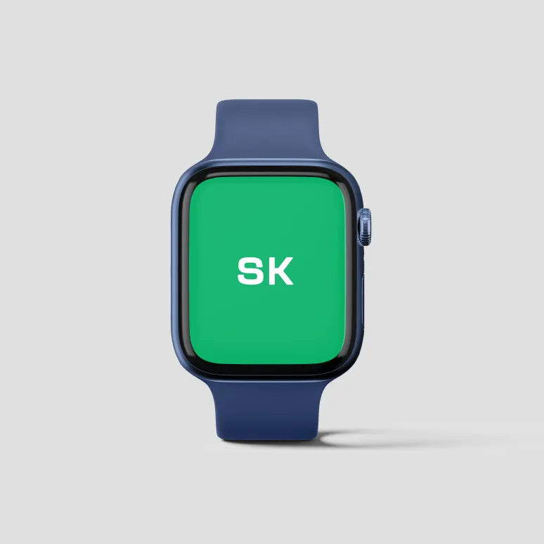
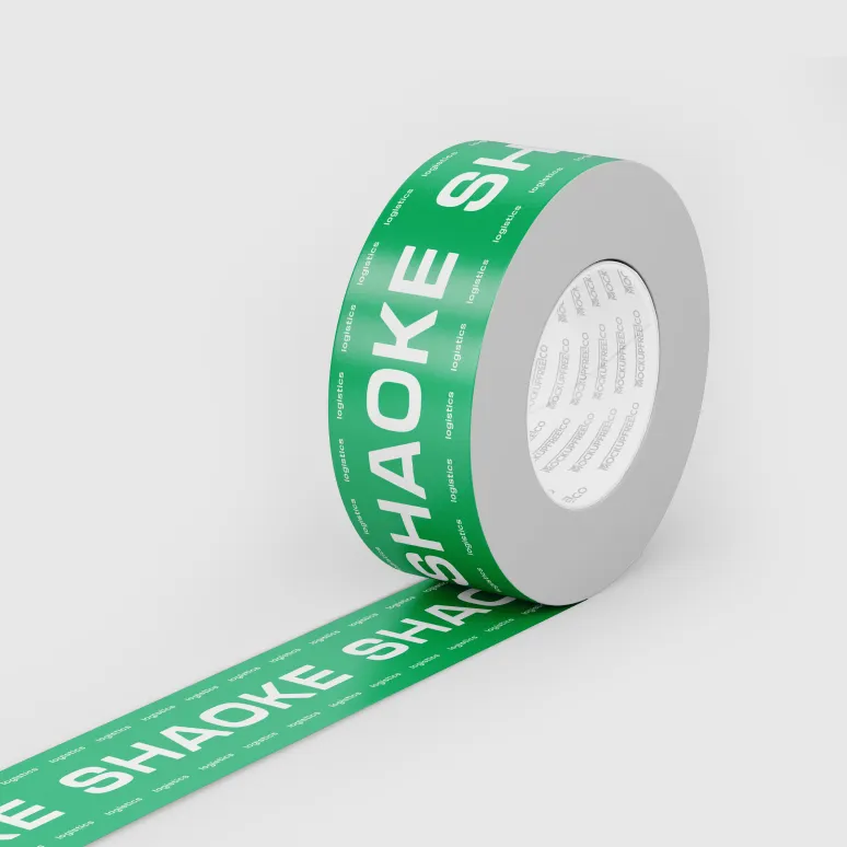
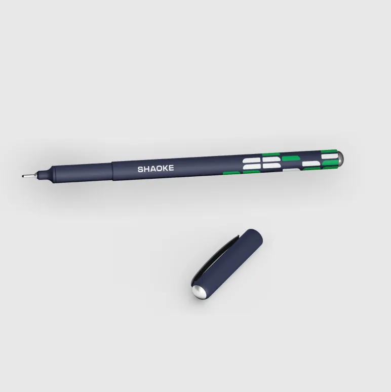
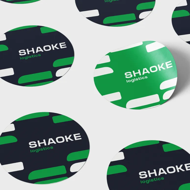
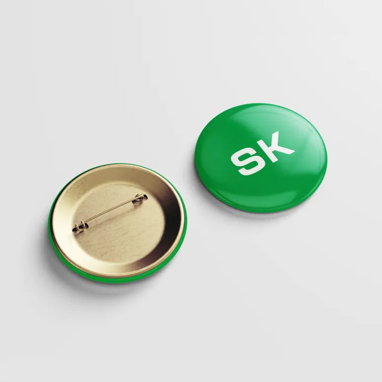
It’s important to make everything proper, and all colors and shapes should print well. We tried the new identity on different carriers: an office logo, banners, mugs. We also created mock-ups with boxes, phones, and watches.
We also tried the logo on the app icon and presented it in the shortened form. Green as the accent color distinguishes the icon from other apps.

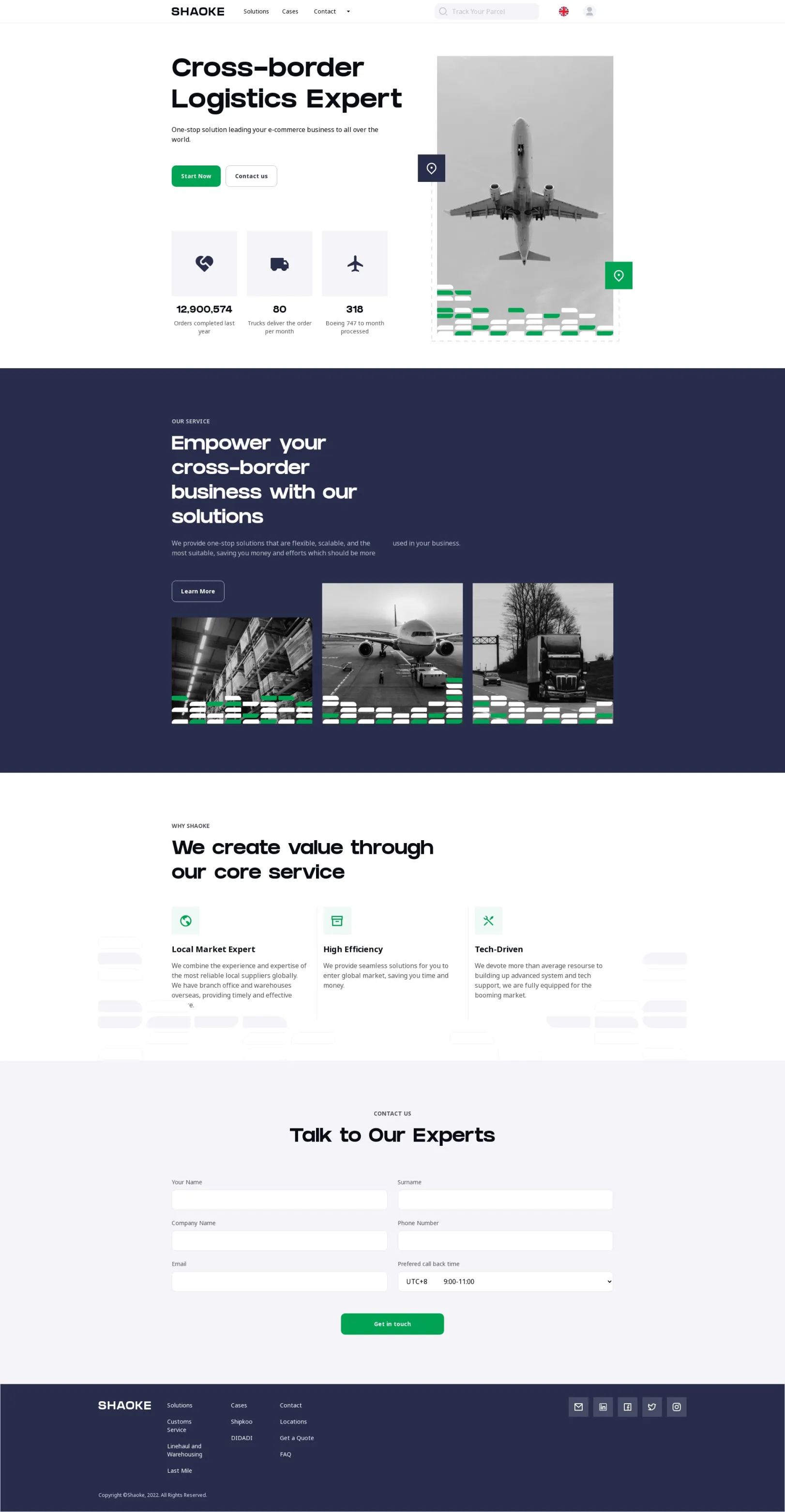
One can see the corporate identity on Shaoke’s website. It creates a coherent visual image of the company and enhances its brand awareness.
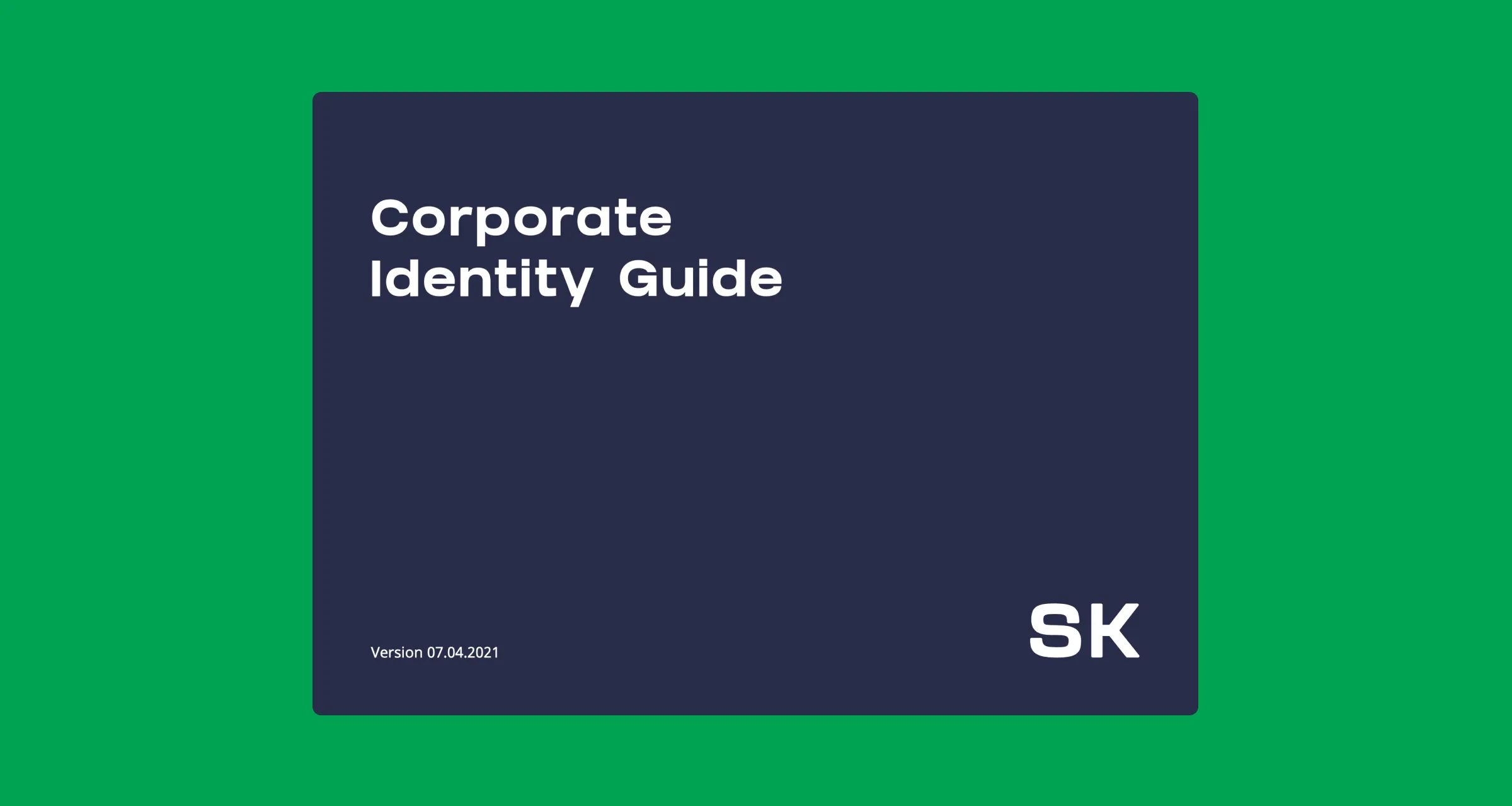
Then we made up a guidebook, described everything, and prepared files in all formats to make sure they would open on all devices. It took us a lot of effort but we certainly knew that everything would go according to the plan. There shouldn’t be any mistakes because we were dealing with the production in another country and it was important that our design wasn’t messed up and remained the way it was created.
Purrweb designed a good logo and we also asked them to design our website. We liked the logo and the main color very much and updated our office based on them. Purrweb’s team has done a great job, they are real professionals.