Need help with your project?

Oops! Something went wrong while submitting the form.


We’ve already talked about how UI kits help keep your designs nice and tidy. Back then, we shared a couple of helpful tricks for those who use Figma, Sketch, and Adobe XD. Purrweb designers, however, primarily work in Figma, so we have enough experience to write a whole book about it — or at least an article. Scroll down for some useful tips.

But let’s clarify some things first. We build UI kits using components and the auto layout (AL) function. Virtually every designer knows their way around components, but AL gets much less attention. And that’s a shame! This function saves us a ton of time when we receive edits from the customer and have to tweak the design a bit.
This is why we want to begin with a brief introduction to auto layout before covering components.
Auto layout is a tool that helps manage spacing, link elements to their container’s sides as well as distance those elements from each other. Let’s see how it works in action:
We’re typing in more text, but the spacing remains the same
It’s easy to see that the element maintains its proper look despite any changes. If it wasn’t for AL, these changes would affect the text, causing it to stretch and behave in unwanted ways.
AL also comes in handy when you need to create complex components like cards, headers, and modals. The function allows tweaking their parameters while maintaining the original position of all the elements.
To create an input, we use AL with a fixed height. If the input has a header, we also apply AL to the text container and then place both elements inside one big AL. As the last step, we choose the Fill container setting
If you now change the size of the big AL, both the input and header will stretch and shrink as a single element
Now, do the same thing for the subtext but don’t lock the AL’s total height. It should stretch in case the error text takes up multiple lines.
Use separate AL for inputs with differing heights — this helps developers understand how many lines each input should have.
It’s also important to toggle on the Hug content setting. With it active, the container will wrap around its contents, and the developers won’t add too many spacings to the screen.
Once again, use AL with a fixed height. If there’s a header, the procedure is the same as for inputs. Don’t forget about Hug content.
To set up a dropdown and a menu, use the Space between features. It will keep the text on the left side of the container while pushing the arrow to the right side.
Adding Space between
An opened dropdown is a whole other story. Create an AL with a text field and a dividing line below — this will comprise a single item. Use these containers to build an AL with a 0 px spacing between the elements. Don’t forget to apply the Fill container feature to all the elements so that they change in size together with their parent container.
This is how you do it
Create more items than necessary just to be on the safe side, and then hide most of them. Now, if you need to create an extended dropdown for a particular screen, you can simply toggle on their visibility
Hiding the items
Stick to the same guidelines when creating menus, both ordinary and modal. These elements work in a very similar way.
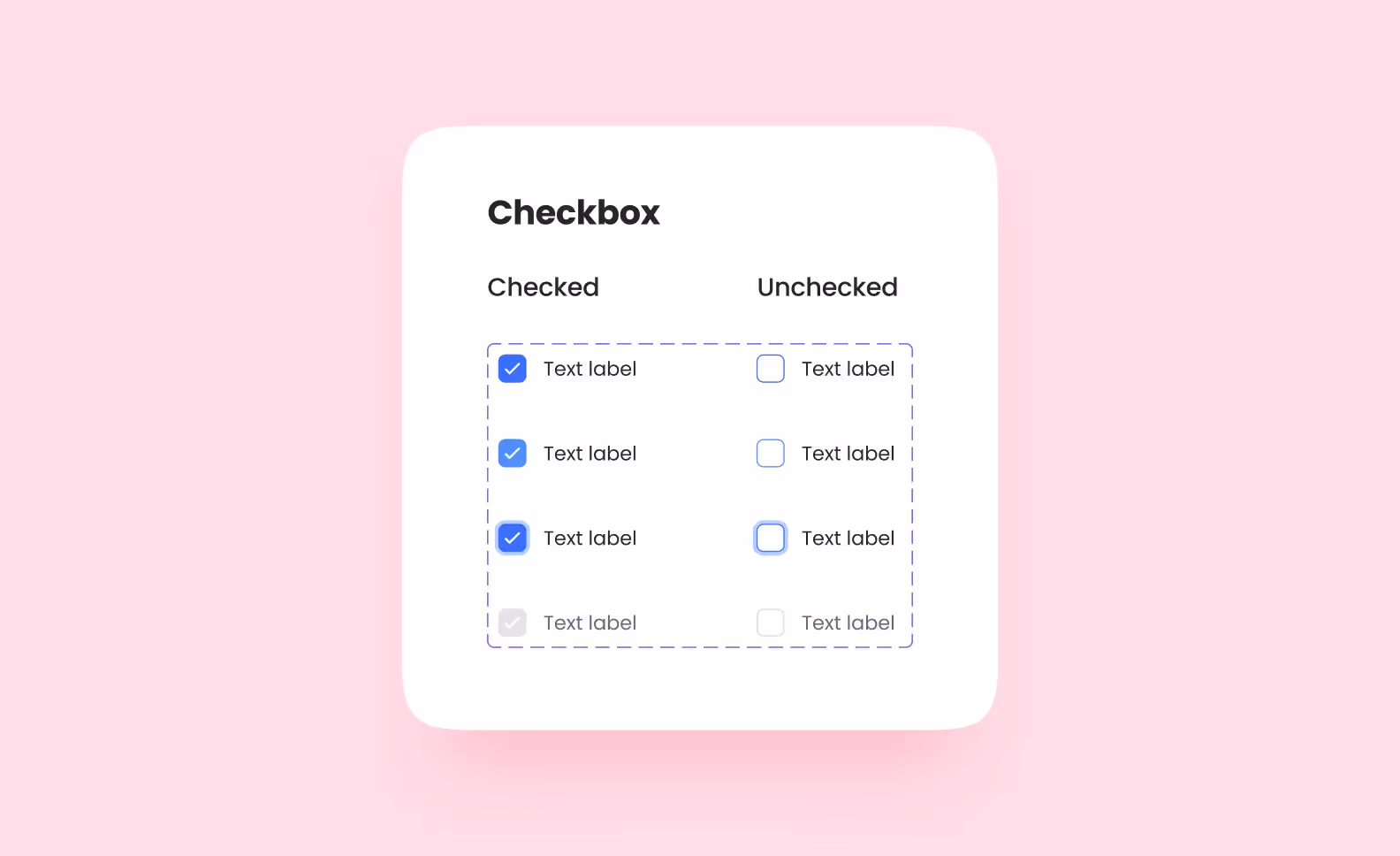
For buttons, use AL with a fixed height. Buttons with the same height comprise a single variable component — you can change their color, states, and size, but in essence, they remain the same button. Just slightly altered. If you need a button with a different height, you’ll have to create a separate component.
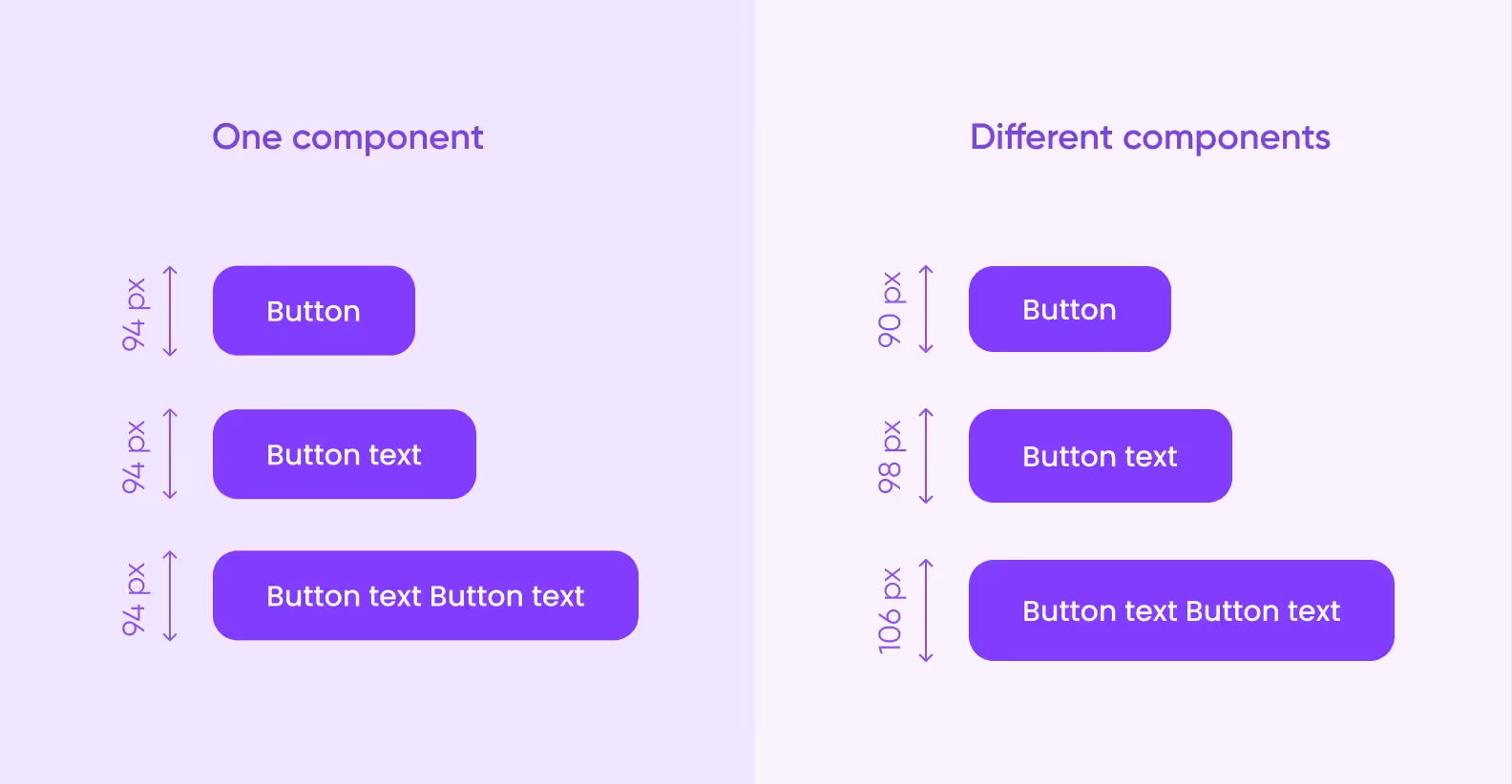
Set the same size of the container for all the different states, otherwise, the layout might turn out messy: the button will change its position or size and behave unexpectedly. Toggle Hug content for the text field.
Hug content off (left)
In the previous article, we said that you should turn every repeated element into a component. It’s true, but there’s also no point in overdoing it: it would be enough to create 3–4 modals and change their contents for every separate instance.
If you approach it this way, all the elements will be similar to each other, and the overall design will turn out pretty consistent. The user will be able to easily understand the purpose of the modal that they’re seeing.
You should also restrict modal messages in lines. Nobody likes to read them, so they should be as concise as possible. But we’re entering the domain of copywriting here, and that’s a bit out of scope for now.
Progress bars with 3, 5, and 10 steps are three separate components. Approach each one individually. Alternatively, you can stick to the rules of atomic design, create a single step as a master component, and use it to build other elements.
Adding a 4th step to a progress bar
Approach breadcrumbs in the same way.
It’s best to set up pagination in AL and then stretch it to make it fit the screen. It should be a single component with its own padding — this will prevent the pages from deformation.
Build them using variable components to easily switch their state on-screen. On the desktop, all these elements feature 8 states: Initial (primary state), Hover (when hovering over the element with the cursor), Focus (when choosing the element with Tab), and Disabled. The same goes for inactive elements, totaling in 8 states.
For mobile versions, the on/off states are enough. If you set up the On & Off (True & False, accordingly) values in the variable component settings, Figma will allow you to change the state using a toggle in the side menu.
This is how changing looks like
Build tabs according to the principles of atomic design. All the atoms comprise a single variable component with one tab in different states (on/off, hover, etc.).
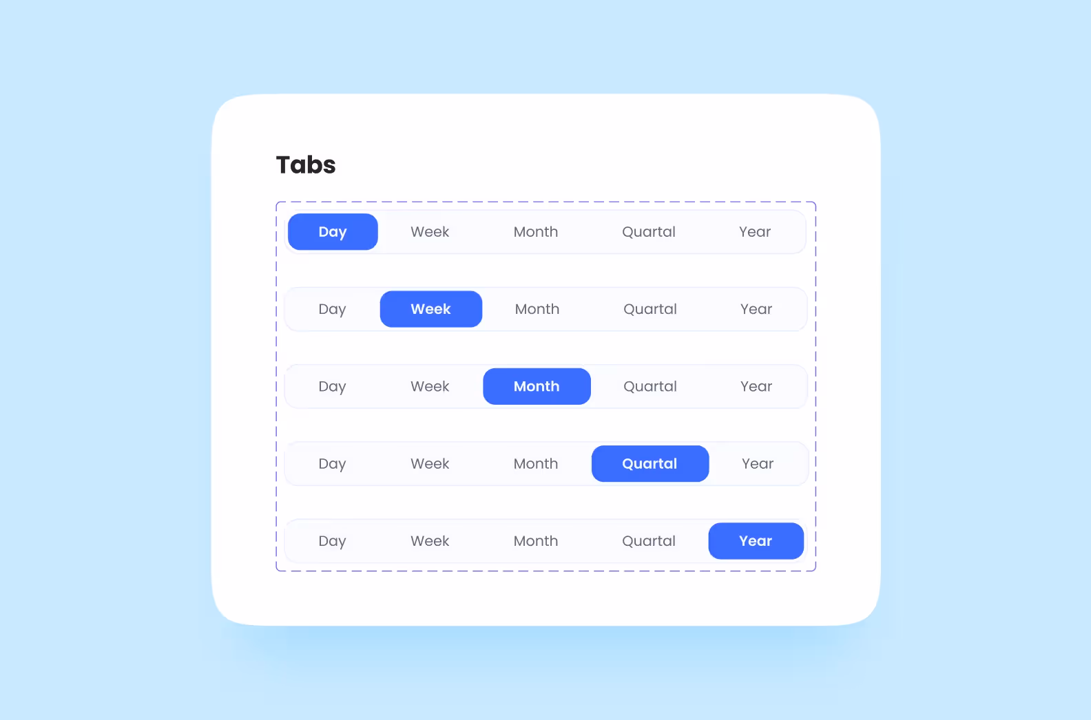
You can also build separate components with any number of tabs. To do this, wrap the tabs in AL with a fixed height and apply the Fill container to each atom. Now, when you add new tabs to the container, they will align in size
The tabs have aligned themselves
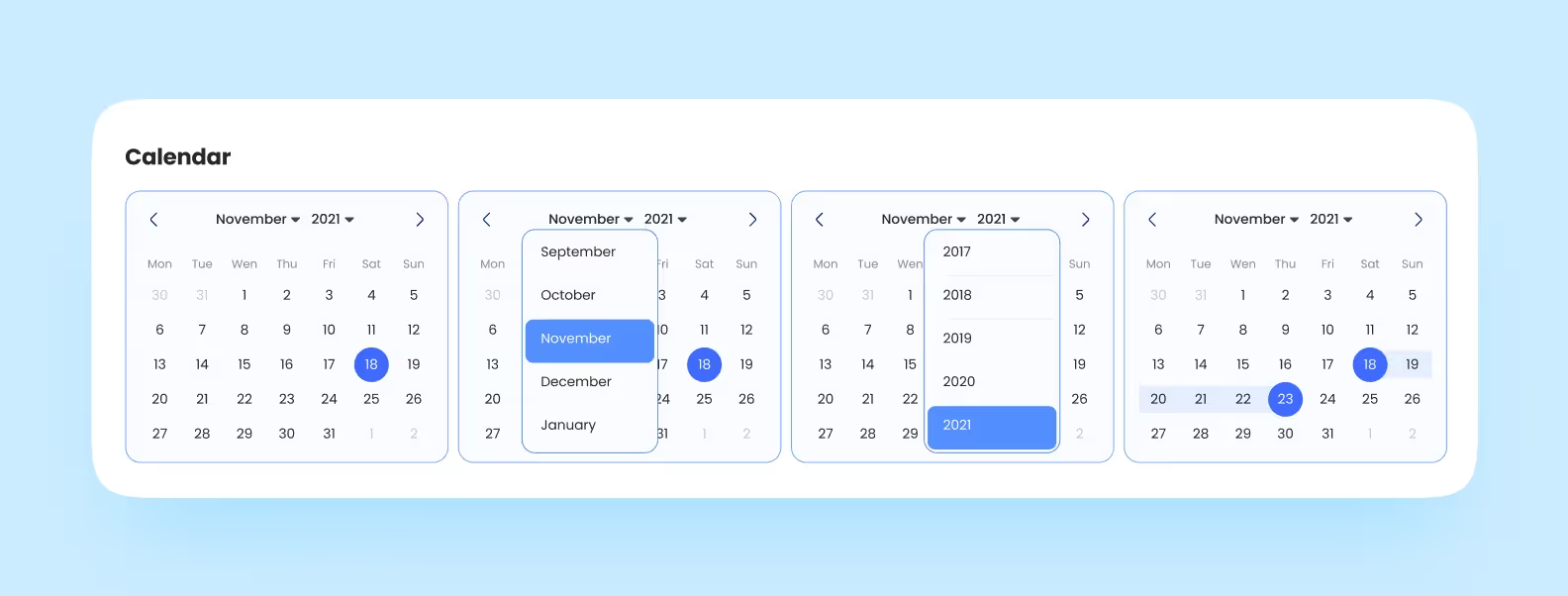
You can build a good calendar once and then reuse it in every project, changing only the color and other insignificant details.
Once again, we turn to the logic of atomic design. In this case, one atom = a field with a date and various states. Create an AL with a fixed size (say, 40×40 px) and stretch the text container until it fully covers this square. Use the atoms to build a single AL with 0 px spacing between elements.
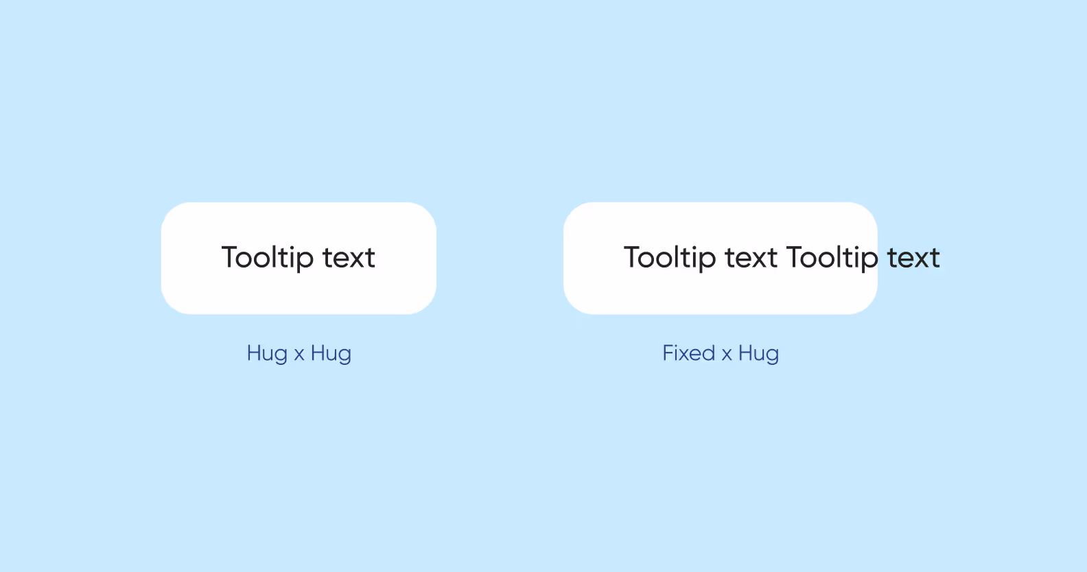
Yep, you guessed it: we’re going to use AL with element attachment. This way, the Close button will always stay in the top right corner, and the text container will change in size according to the amount of text.
Place the tooltip arrow in a separate AL and set a distance of 0 px between it and the main container. Make the AL wider than the arrow itself — now, you can place this element wherever you need to.
Building a tooltip
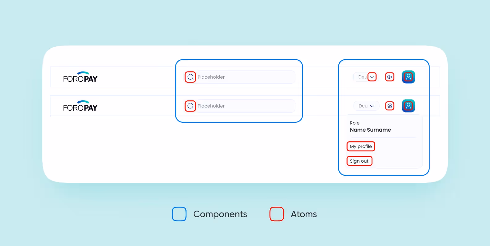
Remember how we approached modals? The same goes for complex elements like headers: there’s no need to create more than 2–3 components. The trick is to make them as versatile as possible. Whenever the content changes, they should change accordingly.
Alternatively, you can build everything using atoms. For instance, a mobile app header breaks down into the following atoms and molecules:
For a card, it’s enough to create a complex component that will change its size depending on the amount of content. Let’s look at the process of creating a desktop card that adjusts to the size of the screen.
First, we create a rectangular vertical AL with rounded corners and place the gear button in the top right button. Then, we apply the Fill container to the image so that it changes its size together with the container. Finally, we do the same thing with the header and button, which is already in AL, meaning that it will stretch correctly. 😊
Tip: Limit the number of symbols in the header when building complex elements. This way, the text will always fit the container. In addition to this, we recommend that you add all icons to the UI kit.
Figma features two plugins that will pack your text and color styles into a UI kit.
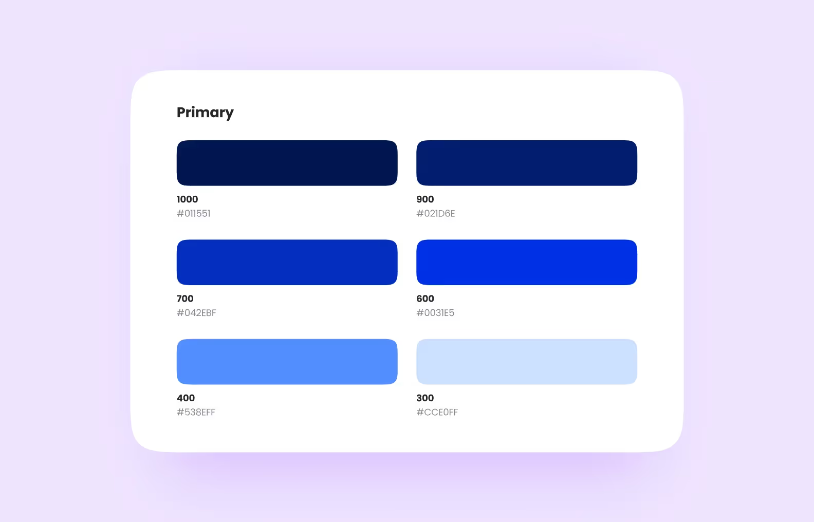
Color Style Guide will automatically render your color styles as blocks.
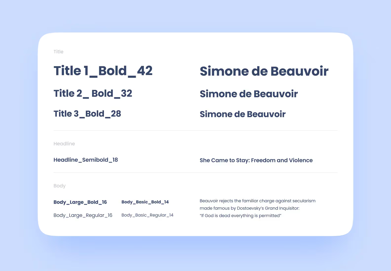
Typography Style Guide will do the same thing with text styles.
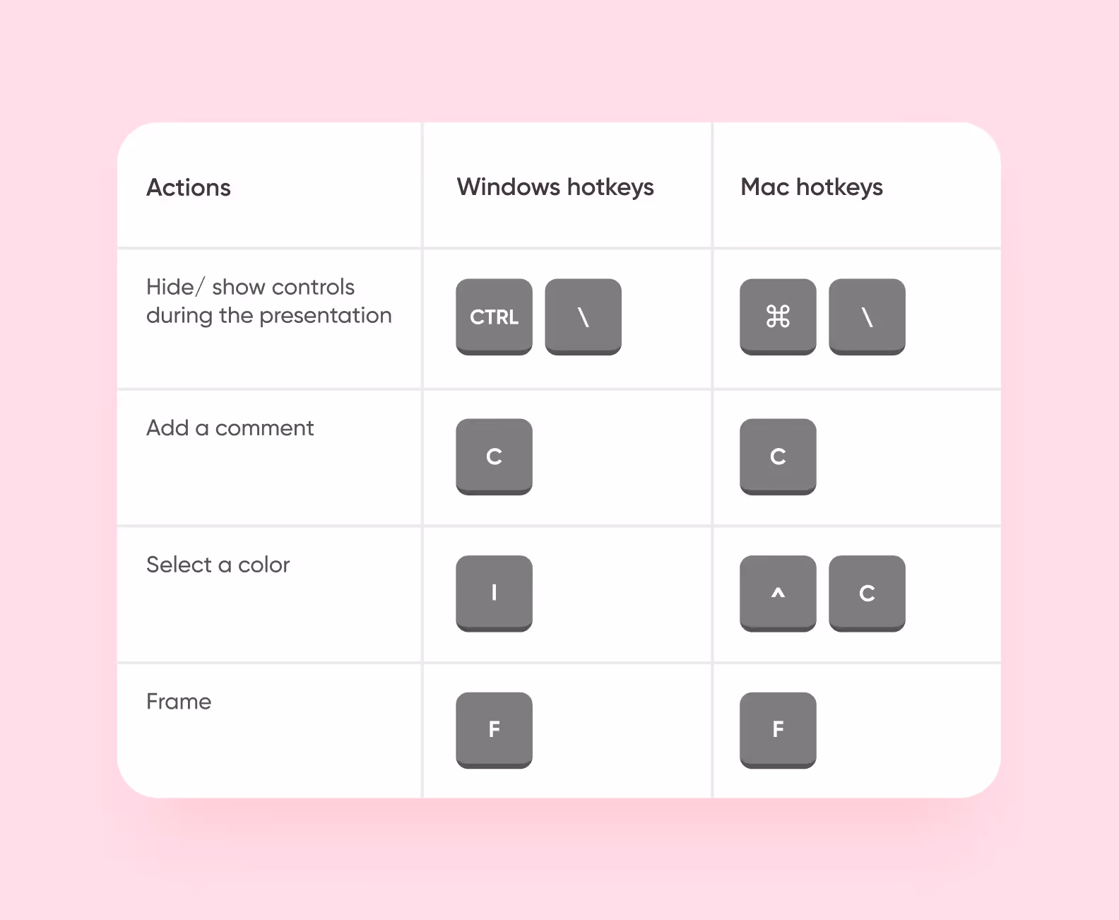
Building a UI kit correctly is good. Building it quickly is even better. Hotkeys are a must for this. You can find the full list of hotkeys for both MacOS and Windows here.
If you’ve made it here — here’s a link to a sample UI kit built by Purrweb. To see the settings of every element, copy the file and save it to drafts.

.svg)