Need help with your project?

Oops! Something went wrong while submitting the form.


Healthcare platforms, such as EHR and EMR, cater to several types of audiences at once: doctors, nurses, administrators, insurance agents, and patients. All of them have various needs and levels of tech proficiency. If the interface is too cluttered or hard to navigate, it slows everyone down. And in healthcare, even small delays matter: users will move to a competitor who offers faster and more intuitive software.
A well-designed, intuitive EHR interface will improve daily workflows, help reduce errors, and provide faster access to information. In this article, we’ll explore the best principles of UI/UX design for EMR/EHR.
.avif)
EHR, or electronic health records, contains all information about the patient collected over time from different healthcare systems and providers. This includes demographic data, billing details, medical history, doctors’ notes, and appointment information.
EMR, or electronic medical records, is essentially a digital version of a paper chart that consists of information about the intake form, symptoms, vitals, preliminary diagnosis, and prescribed medication. It’s a snapshot of a patient’s visit to a particular clinic at a particular time.
EHRs are designed to be shared across different hospitals and healthcare providers, while EMRs are primarily used within a single practice. Though they have slightly different applications, both types of platform follow the same principles when it comes to UI/UX design.

The interface is the user-facing side of any EHR/EMR platform, meaning it’s the part of the app that healthcare providers and patients directly interact with to gain access to the information and complete their requests. The interface includes all elements of UI/UX design: logic, accessibility, navigation, and visual elements like fonts, buttons, or illustrations.
EMR/EHR interfaces use various types of patient data and exchange it with other healthcare providers. This impacts the UI/UX logic as well: when planning the platform, you need to fit third-party integration into user workflows and come up with a way to present complex information in a user-friendly way.
<div class="post_divider"></div>
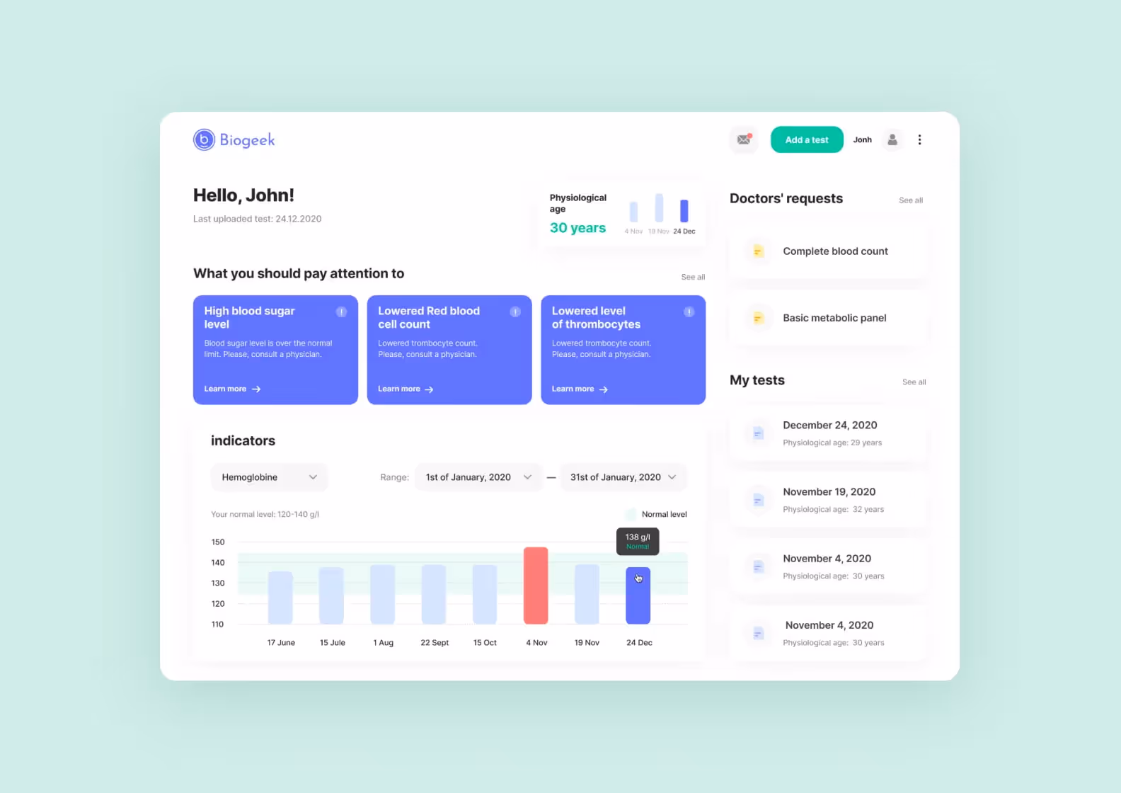
⭐️ Our experience. Biogeek
Purrweb’s team developed many healthcare apps, including Biogeek. This web app helps users upload and track lab test results in one place. The project started as one platform but later split into two: Biogeek.Health for lab tests and Biogeek.Expert in personalized nutrition services.
When designing Biogeek’s interface, we made sure to keep the navigation very simple and intuitive. Our team built custom dashboards with accent colors that highlight all important elements, such as the analysis cards.
<div class="post_divider"></div>
Usability challenges are problems that users experience when interacting with the EMR/EHR system. It’s essentially what confuses users, slows them down and turns them away. Below are the 4 most common EHR design issues we see in platforms — make sure you avoid those when planning a platform.
One of the most common mistakes is cramming every possible detail into a single page. When the EHR interface is overloaded, it’s hard to scan or focus. If the doctors and nurses waste time searching for the information they actually need, they risk missing something important or slowing down the diagnosis process.
By that, we mean situations when EHR interfaces have inconsistent menus or label things in unclear ways. Imagine yourself as a patient who wants to find a medication you used to take. You click on “Medication,” but it shows only the current prescription. You try “Patient history,” but it just displays previous visits to a hospital.
Turns out, the “Past Medication” button is hidden somewhere two screens deep. When basic patient data is hard to find, users get annoyed, make mistakes, or give up altogether.
Raw patient data needs to be transformed into clear graphs, trends, or color-coded flags so a healthcare provider can read it and interpret what’s going on. For example, through EHR design, you can highlight abnormal vitals or prompt clinicians to quickly compare lab results over time.
Not everyone needs to see the same information in the EMR/EHR interface. Nurses, doctors, patients, and admins all use these platforms differently. If the interface doesn’t adapt to their roles, users end up with irrelevant fields and extra steps that slow them down.
To better understand what a good EHR/EMR interface is, let’s talk in more detail about bad examples first. Overcrowded interfaces with a lack of structural logic or intentional design elements are simply useless: users who cannot find the information they’re looking for within the first 20-60 seconds will just close the page and move on to another, more convenient solution.
Here are 3 examples of how a bad EMR/EHR interface can harm the business and turn customers away.
Poor interface design can frustrate users and ultimately lead to mistakes. When it comes to a niche like healthcare, the price of an oversight is much higher. If a doctor uses the wrong chart or mixes up patients’ lab reports, this can result in misdiagnosis, improper treatment, and malpractice cases for a healthcare provider.
If you have too many elements on the screen or opt out of real-time data exchange, it takes longer for clinicians to find what they need. This time can be crucial to make a diagnosis and administer medication, especially in emergencies. Fast access to patient data from multiple providers helps to have a full picture and resolve health issues quickly.
The training on the EMR/EHR interface is a mandatory part of the onboarding of new hires and even temp workers. When the design is not clear or straightforward, how do you expect the employees to find out where to click? Also, it’s a bad first impression for a company to hinder user understanding from the start.
Enough about poorly designed EMR/EHR interfaces. We’ve already established that the design has a direct impact on patient care. So now let’s explore the advantages that clear, responsive, and easy-to-use software offers for medical businesses and customers.
With a clean, intuitive layout, doctors can access lab results, vitals, and medical history in seconds. There’s no need to click through five screens or open multiple tabs. Quicker access to relevant data equals faster decision-making, especially in time-sensitive situations.
When the EHR interface is cluttered or inconsistent, users are more likely to click the wrong tab, enter data in the wrong field, or miss a critical update. That leads to mistakes or delays in care. A clear interface with consistent flows helps minimize user error, which means less time between diagnosis and treatment.
Simple design supports better conversations. Tools like shared notes or built-in chats provide an opportunity for patients to circle back to what the doctor said during the appointment and ask follow-up questions about certain recommendations and prescriptions.
In hospitals and large practices, patient care often involves multiple people: labs, nurses, specialized departments, and the front desk. A well-structured EMR/EHR system helps everyone to stay on the same page, share information in real-time, and avoid miscommunication.
<div class="post_divider"></div>
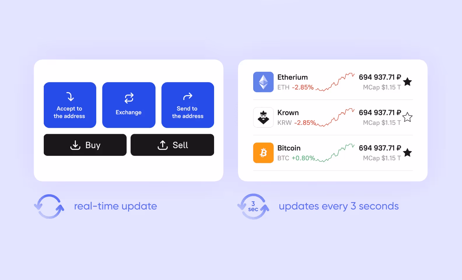
⭐️ Our experience. Broex Wallet
For many industries, real-time data exchange is a crucial feature, and fintech is not an exception. When we were developing Broex Wallet, we needed to set up an enormous amount of real-time data: exchange rates, current transactions, etc. At some point, the app started to slow down, and our test phone was heating up — the system couldn’t handle these tasks.
We found a compromise and split up the data into 2 categories: one updates non-stop, and the other every 3 seconds. It lowered the load on the resources while still showing the most up-to-date information.
<div class="post_divider"></div>
We convened with our design team and put together a list of universal principles for user-centered EHR design.
Before starting the design process, talk to potential users. Ask what they struggle with in competitors and what features they need most. The feedback you collect will give you a clear roadmap for future development. If you want more in-depth research, consider project discovery services.
<div class="post_divider"></div>
⭐️ Our experience. Journey Verse
Project discovery helped our client, founders of Journey Verse, save almost $40,000 and validate their idea for a trip-planning app. The services included user interviews and surveys that found that many travelers struggle with planning and want tools to simplify the process.
This research confirmed that the app idea had potential, especially with a monetization model based on partnerships. Based on our findings, the client decided to move forward with building an MVP focused on one city to start small and scale later.
<div class="post_divider"></div>
Don’t try to show everything on one screen. Focus on core information and show only the data relevant at each step. We also recommend using familiar UI patterns — common, recognizable practices among other EMR/EHR platforms.
If buttons or fonts look different across the app, it confuses and distracts users. Stick to one style for menus, colors, typography, and layouts. That way, users can learn your branding once and recognize those patterns everywhere. To keep the style consistent, we recommend assembling a UI kit with all key interface components.
Negative space, also called white space, is empty areas that help separate content, highlight key data, and avoid visual overload. Don’t think of it as wasted space: in EHR design, it improves readability and reduces user fatigue.
Not every user needs the same layout, and not everyone needs the same access level to patient data. Adjust what doctors, nurses, and admins see on their side of the user interface.
Healthcare staff use EMR systems dozens of times per day. If a user has to click through 5 screens to access lab results once, it’s already too much. Prioritize high-frequency actions, keep them within two to three taps, and add an opportunity to access most-visited pages faster.
Show lab results and patient history using charts, color codes, and visual indicators. Data visualization helps clinicians notice trends and make decisions faster. For more complex cases, integrating virtual reality in healthcare can provide an immersive 3D view of patient anatomy, making surgical planning much more precise.
You can’t improve what you don’t test. Choose a few users from different roles and ask them to complete core tasks, like finding patient vitals or updating medication. Record what part of the interface slows them down, and then fix it.
Usability is never “one and done.” It requires constant analysis and updates. After release, monitor how users interact with the EHR interface; run follow-up tests and release improvements based on the usage data. Consider continuous project discovery services: this method of user research includes conducting customer feedback and introducing updates based on the findings.
Adding a built-in assistant helps both patients and doctors complete tasks faster. For example, it can suggest diagnostic codes, fill in frequent phrases, or survey patients about symptoms, offering a preliminary diagnosis.
EHR design is meant for everyone. Use readable font sizes, color contrasts, and keyboard navigation. Make sure users with low vision or limited mobility can still navigate the app easily. Every country might have its own digital accessibility standards and regulations. For instance, for the U.S.-based apps, WCAG and Section 508 of the Rehabilitation Act and the Americans with Disabilities Act (ADA) are important.
<div class="post_divider"></div>
⭐️ Our experience. Medico
Once we partnered with an oncologist-led startup to design and develop Medico, a remote monitoring platform for cancer patients. Our team created mobile and web apps that support custom health surveys, patient-doctor messaging, and data visualization dashboards.
Digital accessibility was a big part of the UI/UX process. The clients helped us adapt design elements for users of various needs. For example, we added bigger and simpler text to make it more readable for people with poor eyesight.

<div class="post_divider"></div>
Your app shouldn’t require a user manual. Use clear section labels, suggestions, and intuitive navigation bars to make it easy for users to switch between tabs and screens.
Add a way for users to report bugs or suggest improvements right from the EHR interface. This helps you find issues early and shows users that their opinion matters.
Some clinicians work from desktops, others use tablets or mobile phones during rounds. Make sure the UI adapts to each screen. That includes adjusting button sizes, repositioning menus, and scaling charts.
If you already have an existing healthcare solution, but it feels like something isn’t working, the answer might be in the design. Here are the tips on how to access your user interface and find out what needs improvement.
First, talk to the people who use the EHR interface every day. Doctors, nurses, and admin staff will show you exactly where they get stuck, whether it's looking for old lab results or updating medication. These insights will help shape the direction of the redesign process and avoid guesswork.
Check how users complete common tasks like checking test results or adding notes to a patient’s chart. Record where they hesitate or click around without finding what they need. Usability testing will give you proof of what flows work and what needs fixing.
If the screen is full of menus, dropdowns, and icons, users lose focus. Clean, minimalistic layouts help staff process information faster and reduce the chance of clicking the wrong button.
Analyze what features healthcare providers use the most and focus on them. If 80% of your users open the lab results tab every day, don’t hide it under layers of navigation. This will help speed up the entire workflow and increase user engagement.
<div class="post_divider"></div>
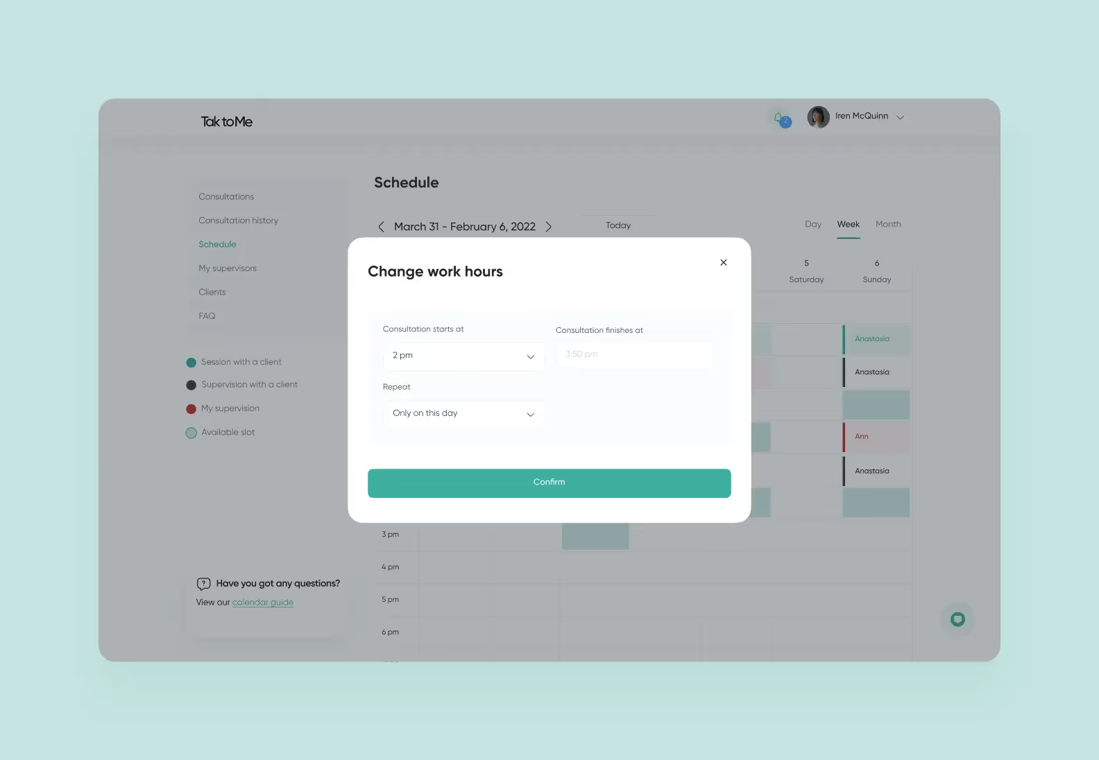
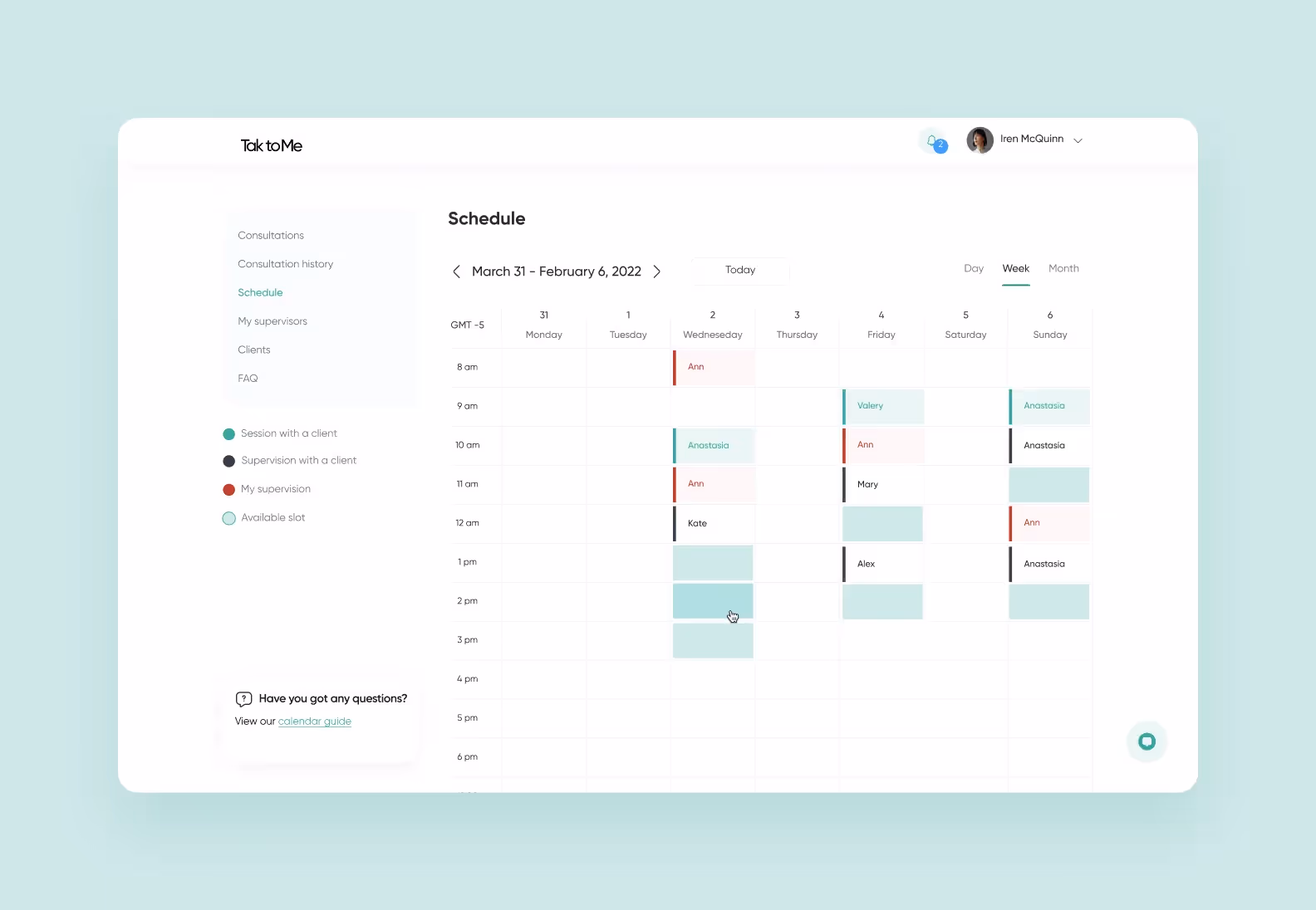
⭐️ Our experience. Talk To Me
Purrweb developed a full-scale platform for online therapy sessions, Talk to Me. Our priority was the users and how we could help them schedule sessions as easily as possible. We focused on designing a clean and accessible UI and a custom therapist calendar with a color-coded navigation.
<div class="post_divider"></div>
Behind every good EMR/EHR user interface lies hard work and extensive research: studying user flows, understanding common design patterns, and planning intuitive navigation. We’re happy to help you with these tasks.
Purrweb’s team has over 550+ successfully completed projects across various niches: from healthcare and EHR, to fintech, education, logistics, and IoT. Many of our clients stay with us for years and grow their ideas into profitable and strong companies.
➡️ <a class="blog-modal_opener">Fill in the form</a> to get a free project estimation on your idea in 48 hours.

.svg)

%20(1)%20(1).png)