Need help with your project?

Oops! Something went wrong while submitting the form.


No one understands the niche better than the business owners themselves. Except for the designers who had to delve into it to understand what “we want something modern” really means. In such cases, experience and initiative come in handy. That’s something we proved once again while working on the Zeroney project.Let's see how we developed a conversion-increasing design for the educational platform and landing page ahead of schedule, exceeding the client's expectations.

The client asked us to redesign the existing Zeroney platform and a landing page for its promotion. The platform’s idea is to make training for complex and in-demand professions, such as Data Science, VR/AR technologies, and AI, accessible to many users.
After the disaster in Myanmar, the education level of its population significantly declined. Locals worked hard to recover financially, including young people who had to give up on their goals to enter a university. Zeroney app aims to address this issue.
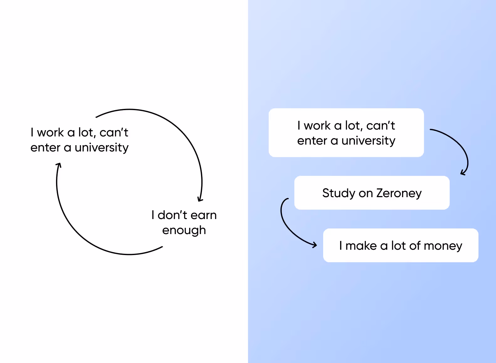
With online courses on Zeroney, users from Japan and Myanmar can become experts in AR/VR, engage in Data Science, or delve into artificial intelligence. It’s unnecessary to enroll in an expensive university or quit their jobs. The educational platform provides access to prestigious professions for all its users.
Initially, the Zeroney platform was successful, but over time, the conversion from cold leads to users dwindled. The client analyzed their product, compared it with competitors, and identified the problem.
The design of Zeroney had become outdated, contradicting the product – providing education for the most modern professions. User trust was decreasing, and Zeroney started losing popularity.
So, we had two tasks to complete:
1️⃣ Develop a new design for the platform that appeals to the target audience and remains user-friendly in terms of online learning.
2️⃣ Develop a captivating landing page design in a futuristic style with a 3D animation to attract new clients to the Zeroney platform.
It wasn’t easy, but we succeeded — partly thanks to the proper interaction with the client.
Asami Moriya, the CEO of Zeroney Inc., reached out to us after seeing examples of our work on Dribbble. It was exactly what her company needed. Our bold approach to design and modern solutions matched their goal to make Zeroney an attractive platform for 21st-century professional education.
We’ve already worked with clients from different countries, many of whom weren’t native English speakers. So, we were ready for communication challenges. Surprisingly, our communication went smoothly from our first meeting and throughout the entire project.
We had a great understanding with Asami Moriya, the AI expert from the company and the team lead of their internal development team. The clients provided a lot of documents and references for the design, and we actively developed their ideas, suggesting improvements for the platform.
Our client had a budget and a strong desire to attract more users. The client understood that the platform needed to look more modern but had a vague idea of what exactly needed to be done.
We took the initiative, requested visual references from the client, and offered our own. Such a meaningful discussion helped us understand each other better.
In addition, we worked on the design of a landing page for the Zeroney platform. The client gave us a lot of freedom and asked us to merge futurism and 3D animation on the first screen. And it paid off. Even with such an abstract request, we managed to develop a landing page that pleased the client and (what’s more important) resonated with the target audience of the platform.
Everything was going really smoothly. We completed the tasks on time, and the client quickly reviewed and approved the results. So, we managed to complete all the planned tasks even earlier than promised.
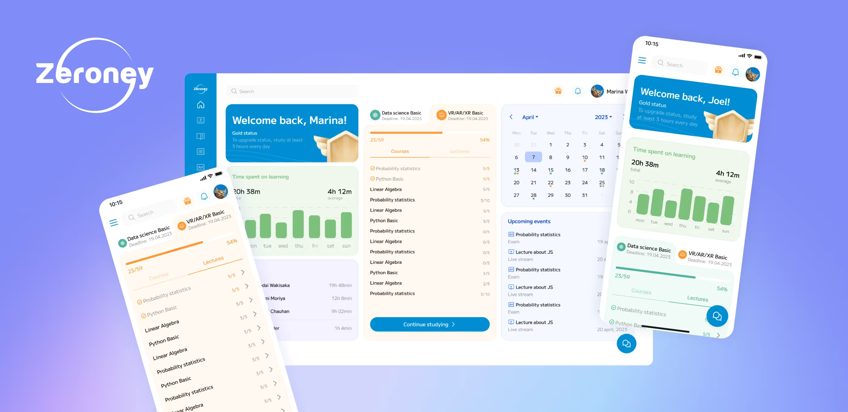
The goal was to make the Zeroney platform look modern while ensuring it remained user-friendly for training. Let’s see how our design addressed this challenge:
1️⃣ The colors are bright but not loud: we decided to use green and blue with orange accents. Such a color scheme sets a joyful mood without distracting users from the course content.
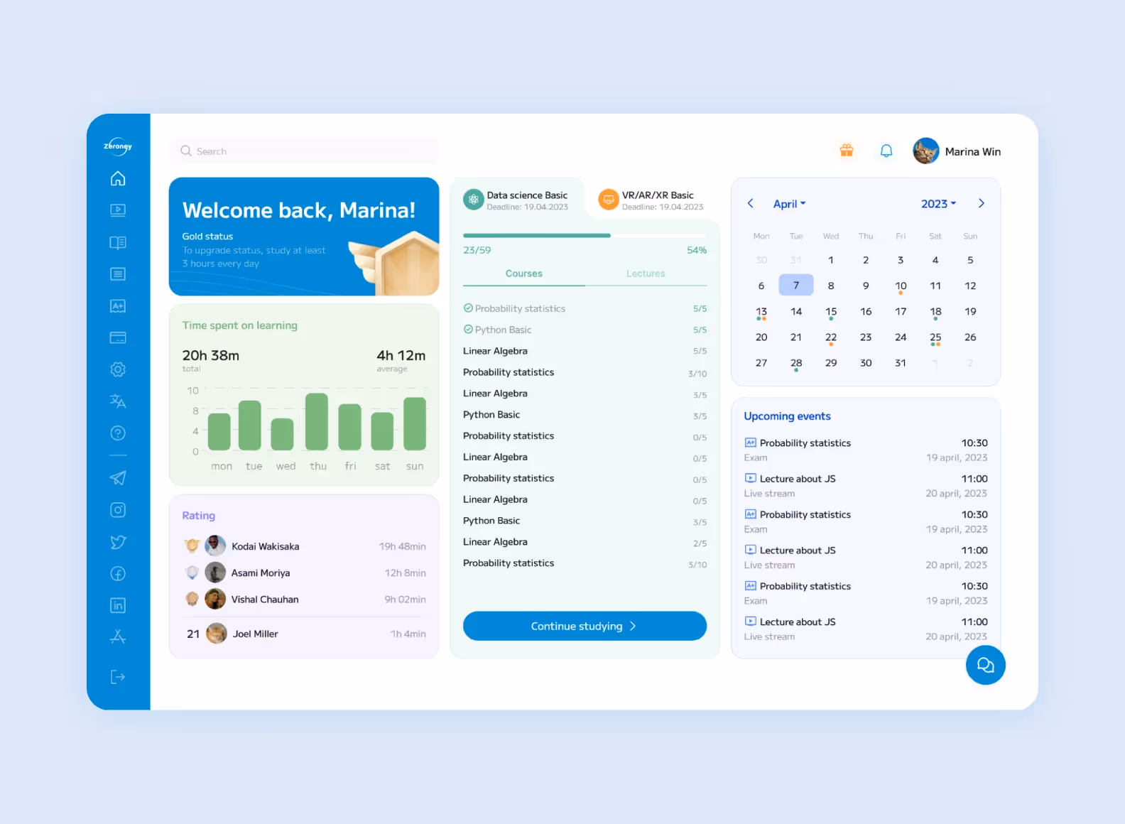
2️⃣ We chose the Roboto font, designed according to Google’s guidelines. The font is easy to read and looks quite simple. Roboto doesn’t draw too much attention, which works best for online learning.
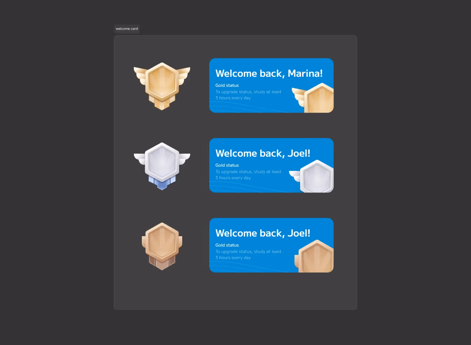
3️⃣ We added detailed reward icons, a progress bar, and a rating to motivate students to continue their learning.
4️⃣ The dashboard is designed to be well-structured. Users can easily navigate their schedules, review the covered materials, and track their achievements.
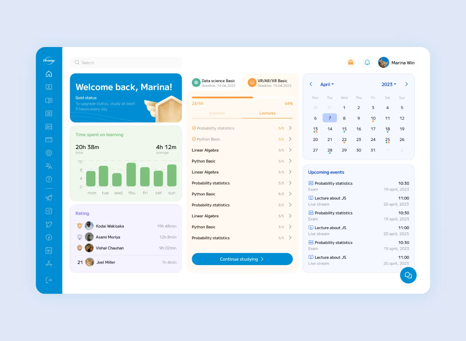
5️⃣ We added some subtle animations for clicks and the built-in messenger. Initially, this wasn’t part of the plan, but we quickly handled the main task and gave our client more than she expected.
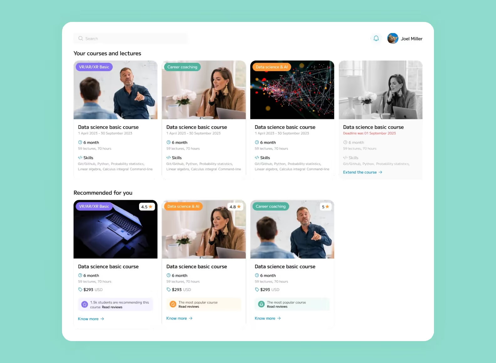
6️⃣ There is a brief yet informative and visually structured preview for each course on the catalog. Additionally, courses are divided into purchased and recommended ones. This way, users see how they can expand their knowledge while the platform benefits from the increased course sales.
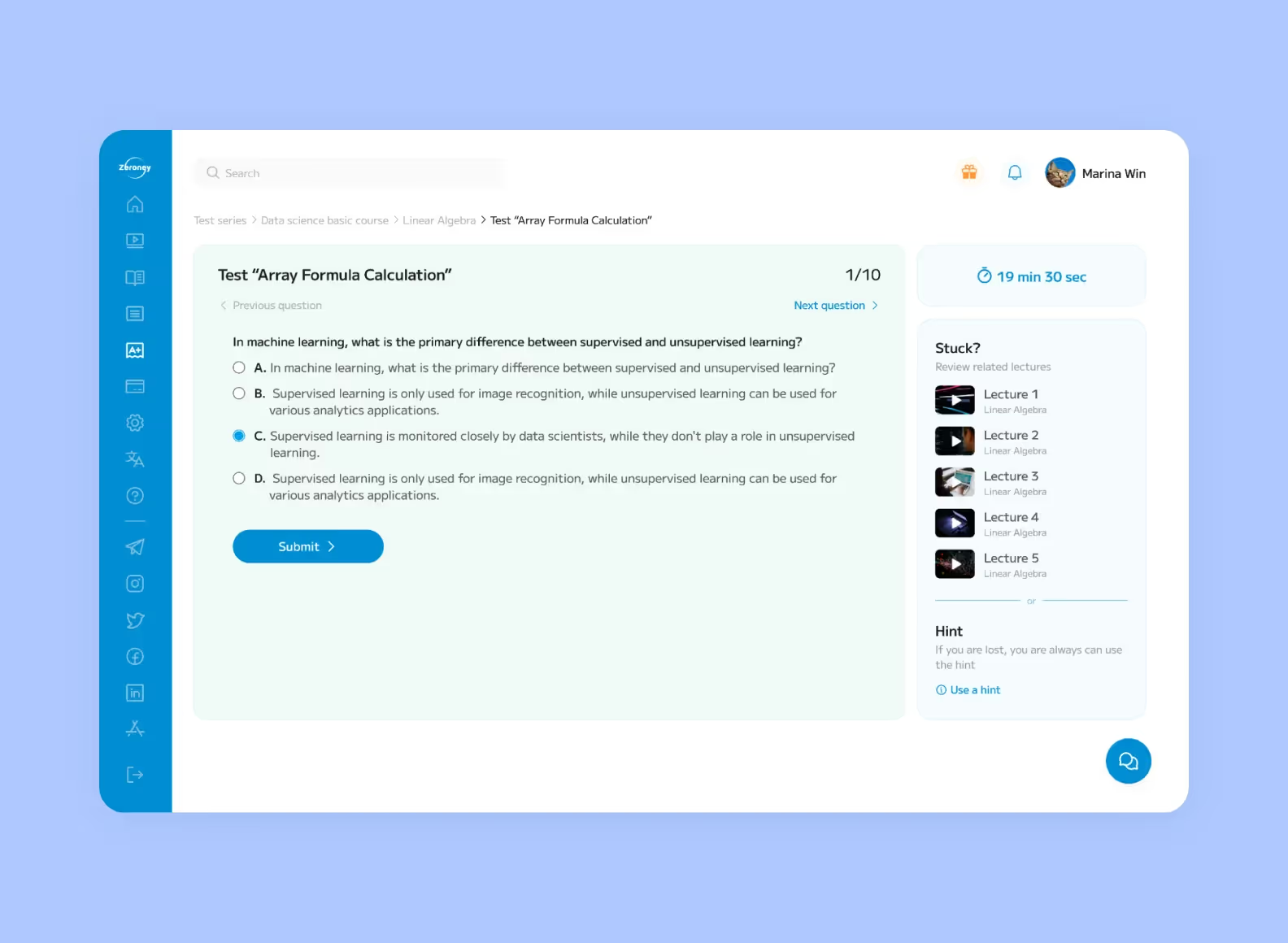
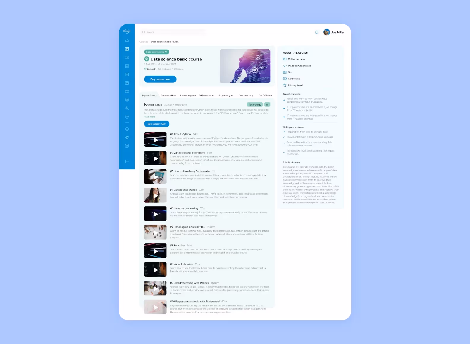
7️⃣ The course page contains all the information the user needs to know. There’s a lot of information, but it’s conveniently divided into blocks and easy to grasp.
We also worked on the design of the landing page. We made it vibrant and eye-catching, as we aimed to engage potential users and keep them interested. What is important is that our design easily adapts to Japan. For instance, the layout of the landing page won’t “break” if the English text is replaced with Japanese.
1️⃣ The main colors of the landing page are black and white. The bright accents of yellow, purple, orange, and green look great with such a background.
2️⃣ The modern color scheme matches the product offered: online training for the future-oriented professions that are gaining popularity.

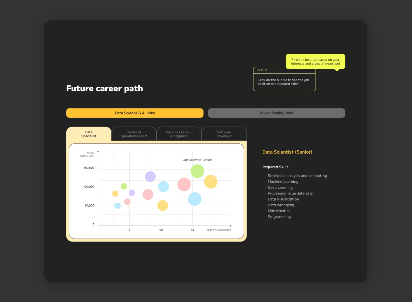
3️⃣ On the first screen of the landing page, there’s a futuristic 3D animation that captures the users’ attention.
4️⃣ We added some subtle motion design elements to engage “cold” customers. For example, the latest global technology trends emerge right before users’ eyes
5️⃣ The bright accents guide the user’s attention and focus it on the advantages of the Zeroney platform.
In two months, we developed the design for the platform and landing page and handed it over to the client’s internal development team. The client received a feasible design matching the preferences of the target audience and the specifics of online learning.
Asami Moriya, the CEO of Zeroney Inc., left a positive review after working with us:

Now, we’re planning further collaboration with Zeroney Inc. and discussing new design tasks.

.svg)