Need help with your project?

Oops! Something went wrong while submitting the form.


We at Purrweb enjoy tricky tasks. Nothing can scare us including deadlines burning right from the start and the necessity to develop business logics on our own. In this article, we will tell you how we created a service for our client from scratch and made big companies’ lives easier.
.avif)
In November 2022, our regular client came to us again. They create innovative IT businesses, and together we have developed four projects so far. For example, we have made an eco app that helps track a company’s carbon emissions and compensate for the damage.
So they presented a new project idea. They wanted to make an app for big businesses to help them make non-financial reports. These reports prove that companies hire a proper number of women, respect their employees, and don’t harm nature. In Europe and many other countries, such reports are a must for companies that wish to get reputation points and attract investors. These reports may be based on different benchmarks. For a start, our client selected one of the most popular standards — GRI (Global Reporting Initiative). We agreed to implement other standards after the release.
The trouble with the reports is a 100-page PDF file a company has to fill in to answer all the questions. It’s a tiresome, time-consuming, and complicated routine. Besides, employees have to review the entire document to find every misprint or mistake, and this task is truly exhausting.
Our client came up with a solution which is to create a service that would allow companies to make reports easier, faster, and in web format. This idea rocks because:
We had only 4 months — March 2023 was our deadline. We estimated the scope of work and realized that it needed 6 months for the project to be ready in May.
That was no good: companies always start making reports in March, so the service would be useless at the end of the spring.
To speed things up, we suggested expanding the team and budget, to which the client agreed. Still, it was just the beginning.
As a rule, we at Purrweb follow the flexible SCRUM methodology. This means, we split the workflow into short two-week sprints. At every stage, we complete a certain part of a project, show it to a client, and then proceed.
We have selected SCRUM, as this approach is beneficial for both our team and our clients:
In 90% of cases, this approach is perfect for projects. Still, sometimes we can’t fully apply SCRUM technologies. This time, we had to modify our routine.
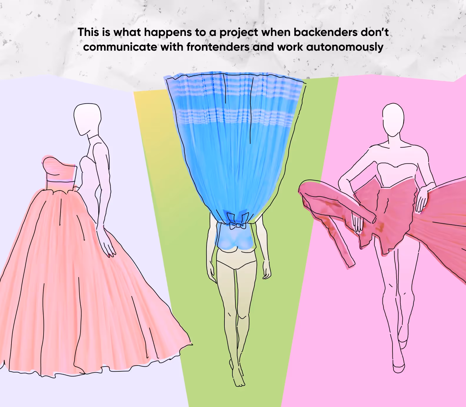
With the tight deadlines and abstract tasks, we couldn’t build the project piece by piece. To finish the service on time, we had to develop the design, frontend and backend simultaneously. That’s why after the two-week sprint, we had nothing to show as the development and testing processes went on.
This approach allowed us to fulfill various tasks at the same time without waiting till a client sees a partial result. The client trusted us and approved this approach — this was vital for us.
To meet the deadline and stay as flexible as possible, we implemented the contract list principle. With this approach, backenders contact frontenders beforehand to describe the data structure that will be transmitted between frontend and backend. So, developers don’t have to wait for each other to deal with their part of a project.
Our client presented their prototype on the first call meeting — they used a web site kit to build it and show how the service should function. This was useful: the client was an unsurpassed expert in non-financial reports, so they knew better what UI elements were vital. Our task was to make the UI friendly and engaging, as well as offer technical solutions based on our experience.
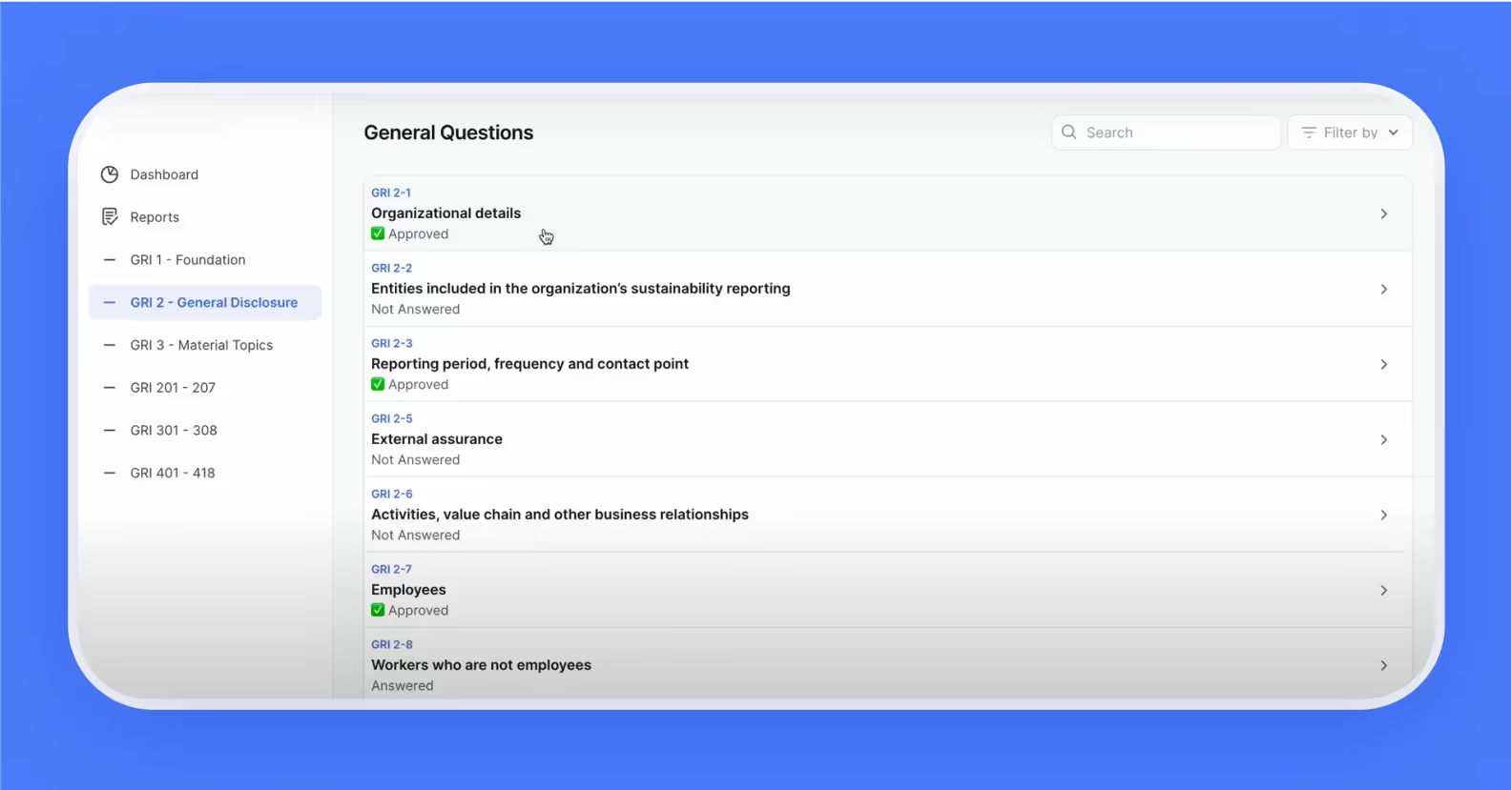
In the client’s prototype, we saw the main flow: a report consisted of a few question blocks that could be processed individually. All the blocks had their statuses, like Answered, Not answered, or Approved. This system makes the entire flow convenient, so an employee won’t miss a single question. It is a true advantage, as a missed question makes the entire report invalid.
We proceeded developing the design on our own and hardly asked our client any questions. We became their autonomous team that enjoyed significant discretion and required minimum calls and coordination. At our presentations, we never got any negative critical feedback. Instead, the client inspired us with motivating and friendly CTAs like “It rocks! Keep going!”
Although, to avoid any kind of revisions, to save time, and to meet client’s expectations, we asked them to provide more negative and positive references. So, the client referred to the websites like Metrio and Vanta with their pure, simple, and minimalist UIs. We took these services into consideration.
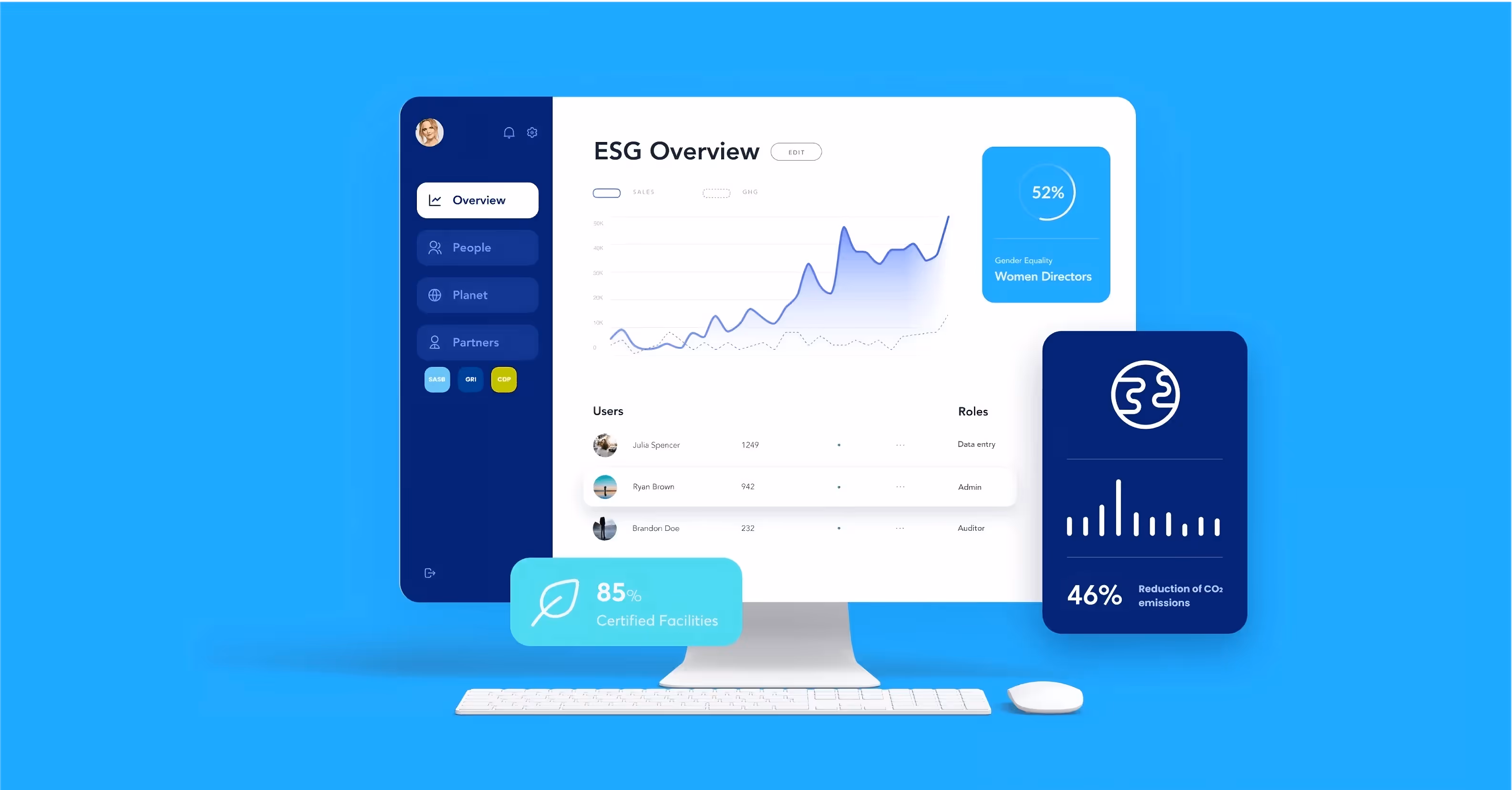
We added accents for better navigation through the service. Gray shades are the basis of the entire design. They take over 60% of the project’s color scheme. We used these shades to highlight various page areas. At the same time, we added contrasting accents that support each other visually: 30% of the UI is blue, whereas yellow, green, and red take 10% of the color scheme each.
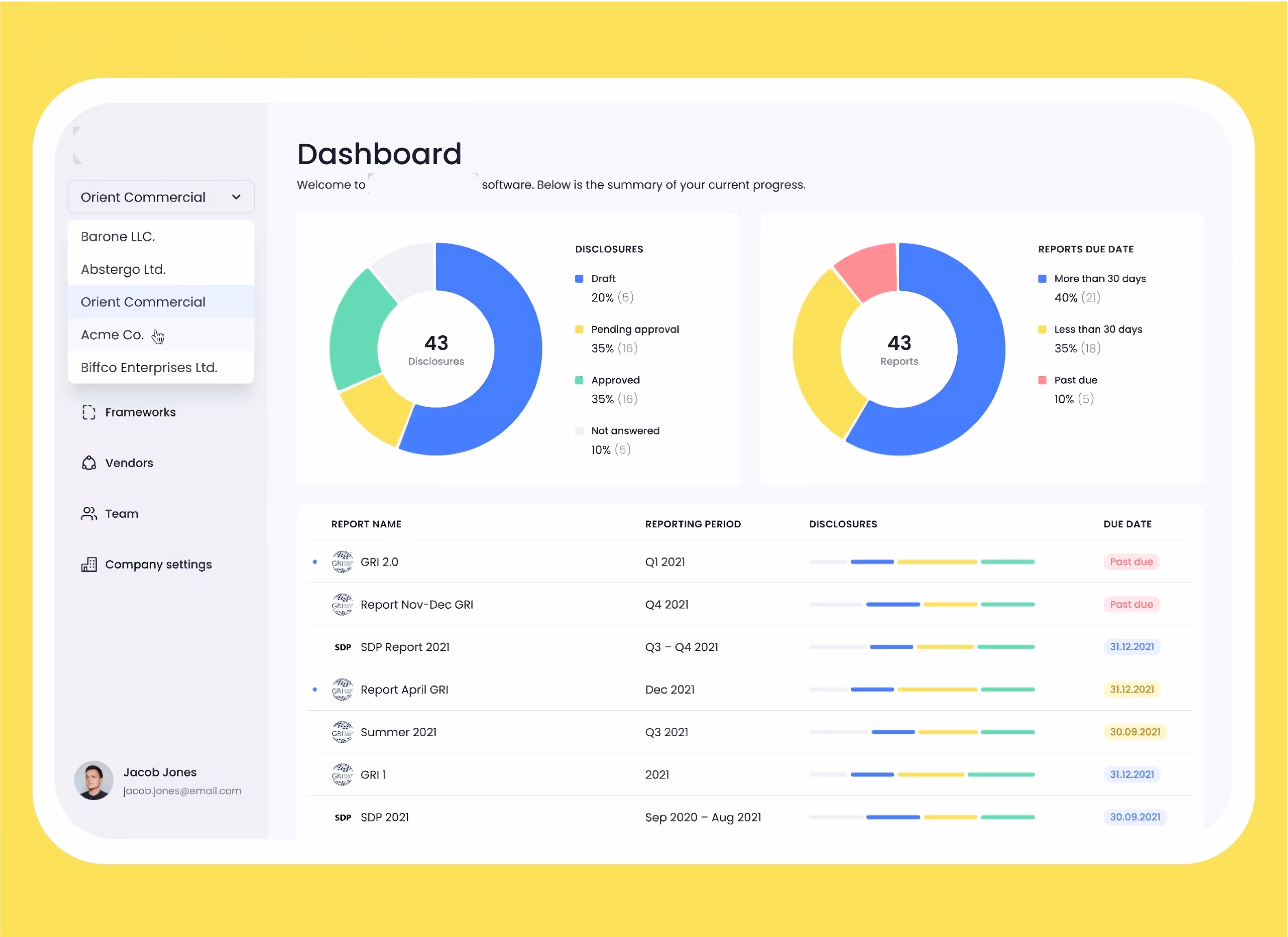
As a result, we have a neat UI with the shades that not only decorate it but also enhance navigation and help visualize the analytical data. An authorized user sees the dashboard that displays the report status.
We know it’s not a fantastic design and don’t expect to surprise anyone with gray shades. But note that it was not our goal. Making a design that is highly functional and straightforward was far more crucial for us. All sorts of pop-ups, animations, and rainbows would torture the users who only wanted to fill in a report.
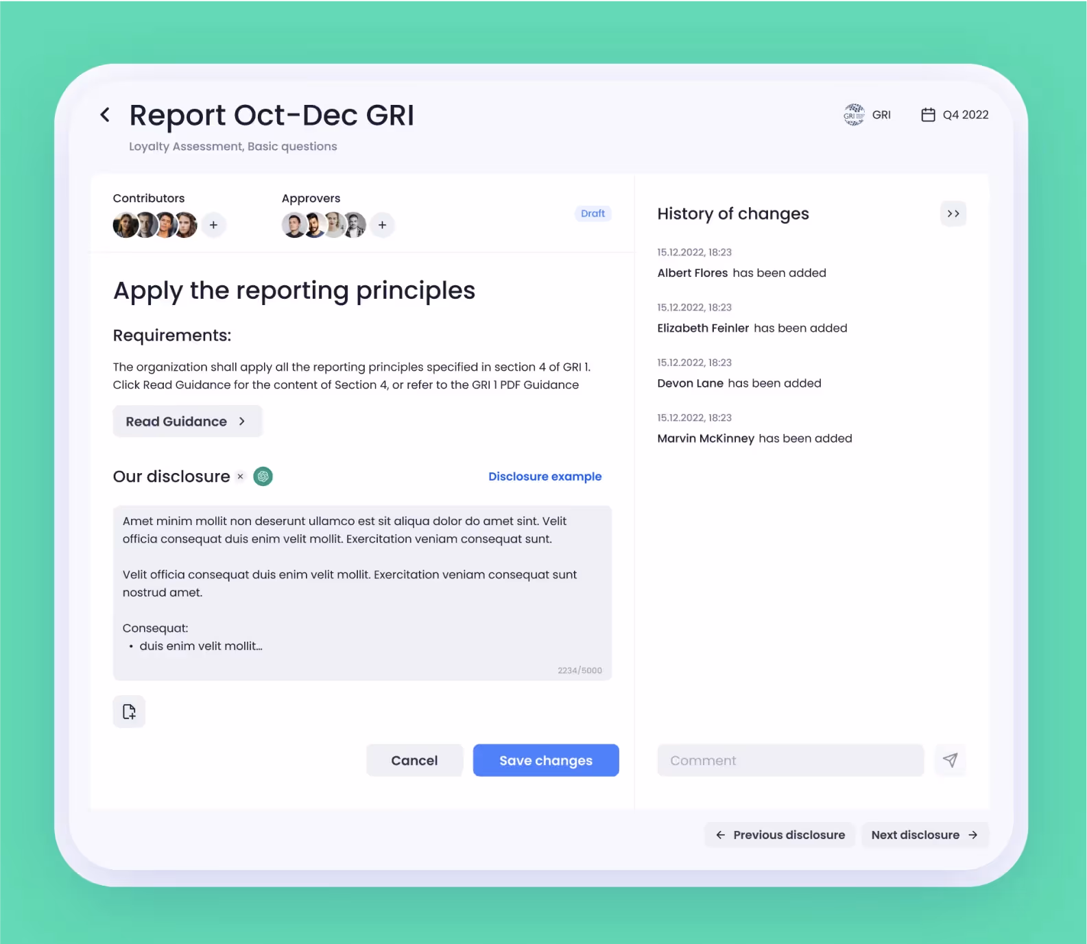
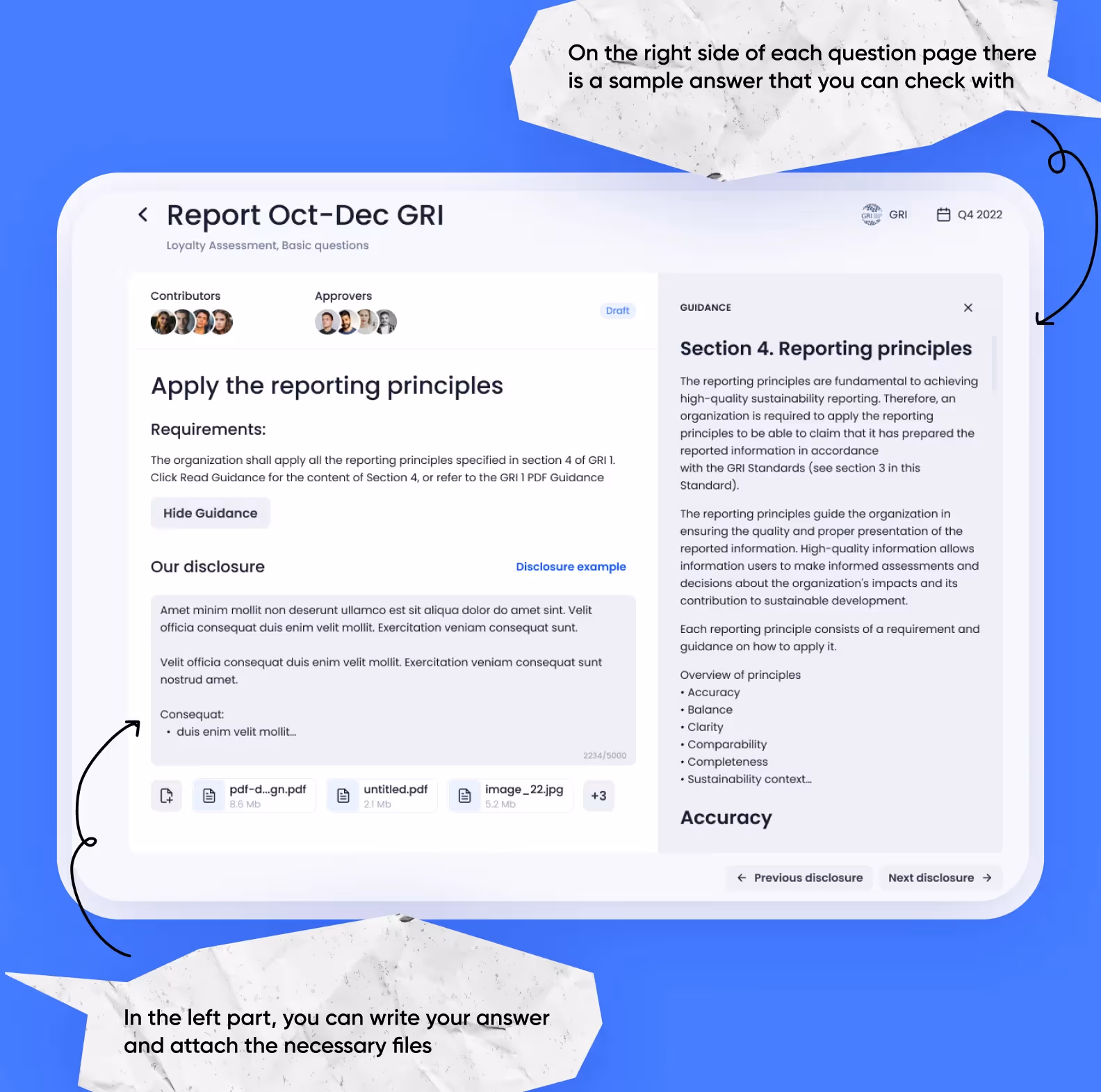
We split the UI into two parts. As we were developing the service, we faced a problem: when users were answering a single question, they had to deal with multiple functions concentrated in one window. We did our best to make this element simpler and split it into two parts. The left part contained the question itself, the requirements, and the related tips. The right part included the history of changes that allowed users to navigate between work statuses better.
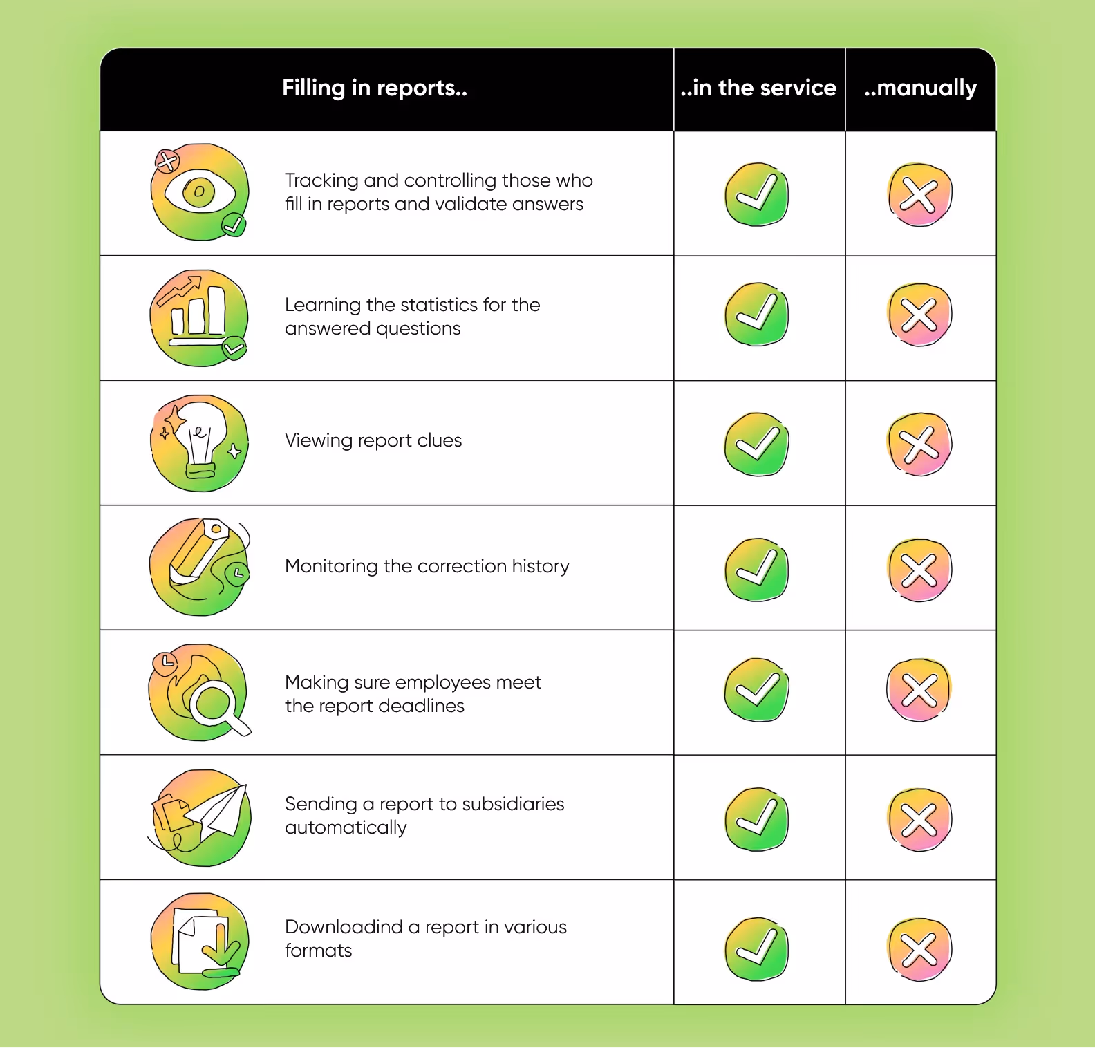
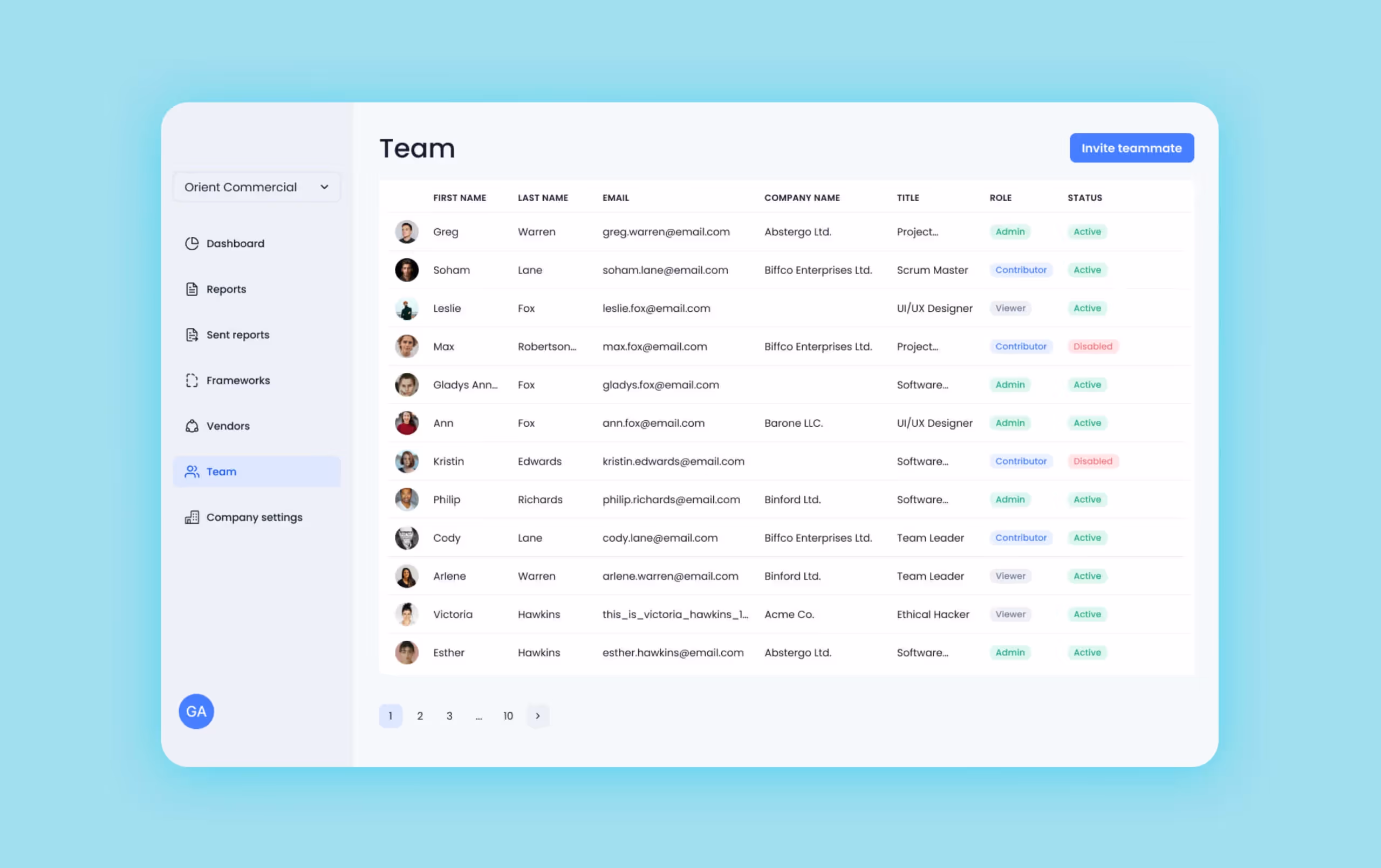
This service was supposed to make the entire report flow easier than filling in a PDF file manually. Otherwise, this project would be useless. That’s why the client asked us to create several roles in the UI. Unlike the old-fashioned report routine, this solution allowed users to have total control over the progress on the report flow.
We developed the idea and created these roles:

First, the client wanted us to make the role of an approver. This user was supposed to decide if they should approve an answer or send it back for changes. We discussed this issue with our system analyst and talked the client out of this idea. As a matter of fact, an approver would be there only to moderate the process. Instead, they could use the administrative access to be able to comment and edit reports.
In such a way, we managed to save the budget of our client on making the fourth role.
Multiple roles enhance the workflow where users can see the status of every task, correct mistakes, and don’t need to call the employee responsible for this or that question. As a result, the process becomes absolutely transparent, and the CEO can monitor every detail.
The tasks from our client grew even more abstract as we started development.
The client could just say: “I want a tab with tips on report making” — and we decided how to implement this idea. Some time ago, we told you about micromanaging clients. It was quite the opposite in this case. Our clients provided absolute discretion and only estimated the result. They kept as far away from the process as it was possible.
We decided on the order of the functions to be developed, rating from the most to the least urgent and important. To speed up the process, we made all the decisions on our own. When the plan was ready, we got approval from the client and started developing the product.
Our developers diligently devised the logic behind the report flow. As a matter of fact, the entire UI is a big form with fields to be filled. But different reports are supposed to compile with different requirements, and this issue proved to be a true challenge. For example, the quarterly and yearly GRI reports include different sets of questions. To make the service more convenient, we created a dynamic form that analyzed the entered data and gave relevant tips in every case.
Besides, we talked the client out of one questionable decision. They wanted the service to share a download link to all the official recommendations on making the PDF reports. We discussed this idea with our system analyst and found a more convenient and native solution.
Our idea was to replace that download link with a sample answer right in the UI. This was tricky: we had to find examples for every case in the 800 page GRI documentation. Our system analyst collected all these data in a .csf file, and then we made a script that automatically sent all the sample answers to the databases of the relevant questions.
We were especially enthusiastic about our client’s decision to implement chatGPT into the project. To meet the deadline, we added this function after the first release. Yet, now it’s a part of the service.
The chatGPT integration made it possible for AI to answer the questions in the report. The report window contains a chat where a user can enter any request. For example: “Write the info for this block using this data.” The neuronet analyzes the request and enters the information — the users only need to analyze the result and add it to the answer field.
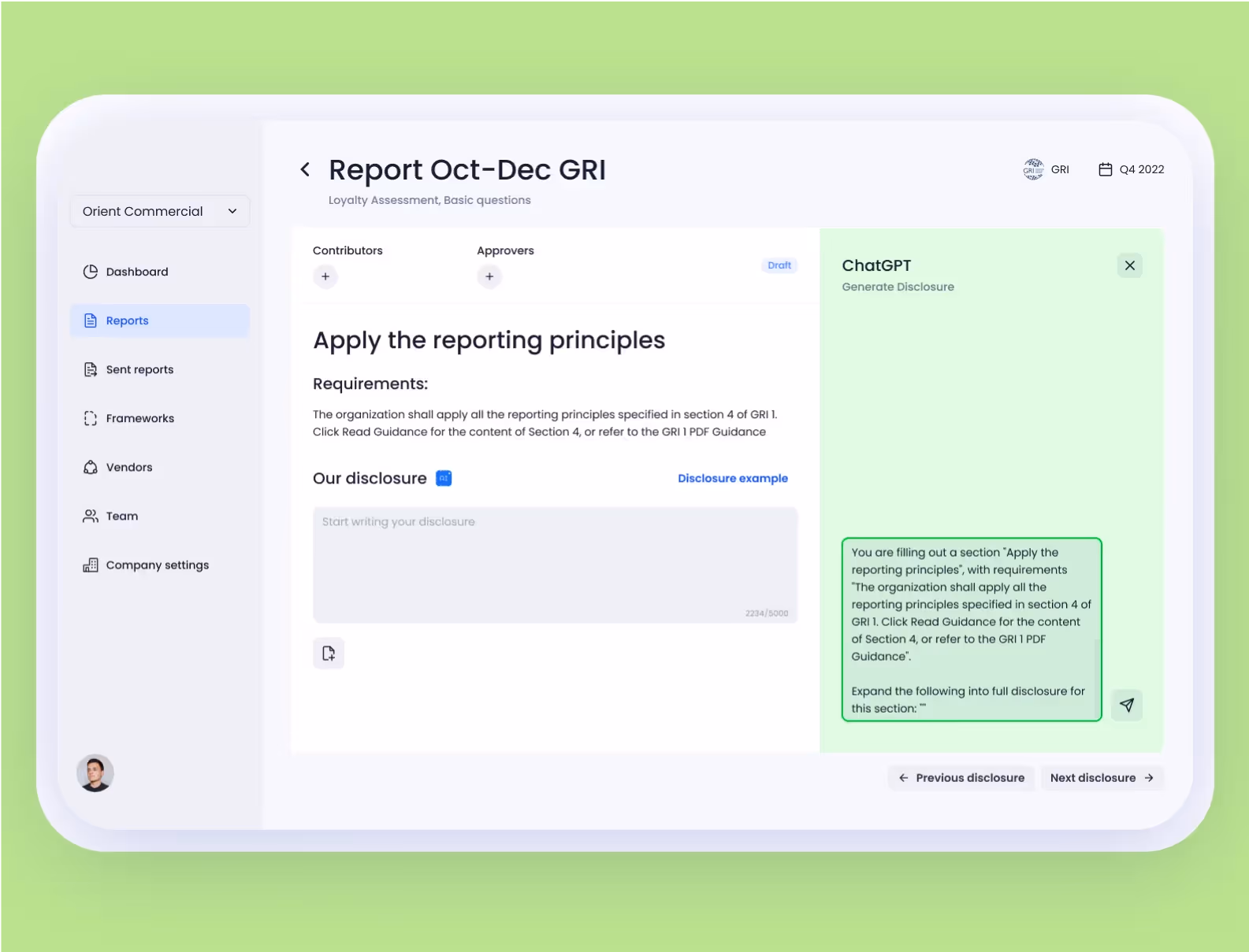
We integrated the GPT-4 model as it works faster and generates answers better than, say, Davinchi we had used before. We did even more and added our own feature — along with a user’s request, chatGPT gets other related information. This way, the neuronet can give more exact answers even if the service’s client hasn’t provided enough details.
This scheme will help us explain the idea better:


We met the deadline and the project proceeded to the production stage at the beginning of March 2023. As promised, it took us 4 months to design and develop the service. Now, the client shows the project to their clients, so they can buy it. At the same time, we implement additional functions.
We managed to create a simple app that deals with complicated issues. We analyzed the flow of non-financial reports, created a simple design, and made a clear UI. The work routine was quite unusual, as we are more used to doing sprints and completing a few minor tasks every fortnight instead of dealing with a single global task for four months. Still, we adapted to our client’s requirements and fulfilled all the agreements.