Need help with your project?

Oops! Something went wrong while submitting the form.


An experienced customer is a strict but fair teacher. Their requirements force you to try your best, and well-deserved praise inspires great things. At least, that was the case when Purrweb was working on the restaurateur app Grecha.pro. A demanding client encouraged our designers to outdo themselves. And that’s how it was.

At the helm of the Grecha.pro app is a serial entrepreneur, Mikhail Ryvkin. He has built and sold a successful startup LuxBase, invested in Varlamov.Eats service, fitness club chain Gym-Gym, sex education project Tizzi, Bright Kitchen — a chain of cooking shops with no restaurant halls, and other projects. Thanks to his work on Varlamov.Eats, he realized the pain points of restaurateurs and came up with an idea to break into the market of restaurants and suppliers.
One of the main restaurateurs’ pain points concerns dealing with suppliers. The interaction takes place on different channels. One is texting on Telegram, another uses WhatsApp, while the third sticks to emailing. You constantly update and save your product mix somewhere in Google Sheets and have to bookmark all the important details. Moreover, personal chats blend into work communication. Supposing that a restaurateur has 10 suppliers, this quickly becomes a problem.
Stock control usually happens on paper, and it’s impossible to supervise goods received in real-time. So, managers on both sides find out about any issues only after the fact. Then, they waste their time clarifying the details: received or not; if not received, then what and why.
From this, the idea of Grecha.pro originated. It allows restaurant owners to:
At the MVP stage, Grecha.pro only solves restaurateurs’ main pain point: removing the multichannel communication with suppliers. Restaurants communicate with all their suppliers in one place, select goods using the app, and place orders, while suppliers continue to use their usual communication channels: Telegram and email.
During pre-sale, we listed features for the MVP and highlighted the core ones. The only similar application on the market was Choco. It’s a startup from Germany that connects restaurateurs and suppliers. The customer wanted to see how they implemented the idea and made it even simpler.
It wasn’t easy to check out this Choco app. We tried to log in and got the following message:

Then, we used a German SIM card. We tried again and saw this:
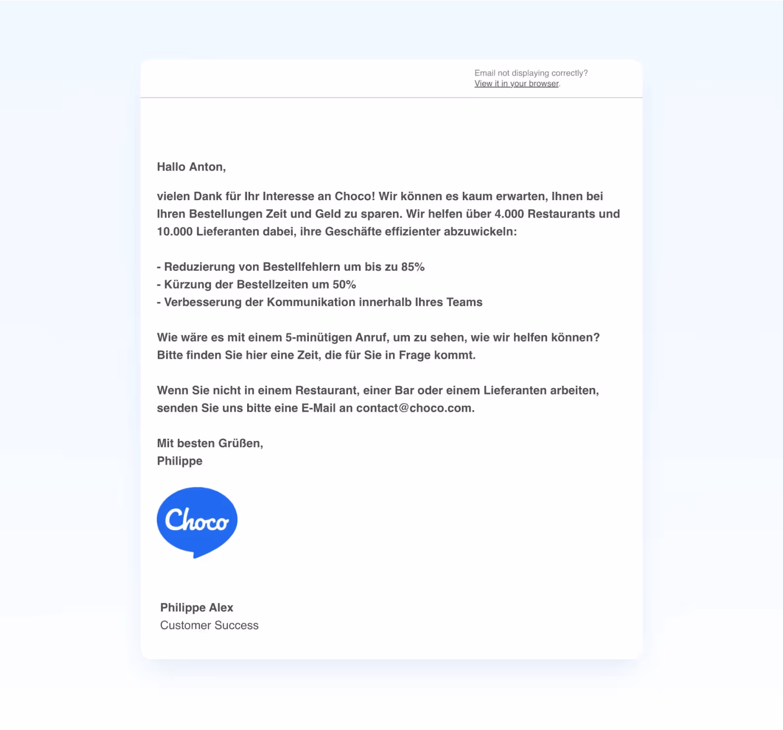
At the time, the Choco team was still studying their users to refine the application. So before gaining access, each new user had to talk to a Choco account manager.
We came up with a cover: our business analyst said he wanted to open a restaurant in Berlin. While working on a business model, he spotted Choco and thought it might be easier to order products through them. We probably could have done without it, but at least we got a 2-day trial period.
We studied the flow and looked at everything through the eyes of an end-user. We realized the application was convenient, and our client wanted something similar. Only without the suppliers’ part thus far as it would almost double the budget.
As a result, we settled on the most important features:
To make the life of restaurant owners a little easier, we needed to:
The project team included a project manager, a UI/UX designer, 3 developers, and a QA engineer.

We approved the application logic and the user flow with the customer within a couple of days. Everything was simple. Users log in and see chats with all their suppliers (which they added before). They enter the chat and can place an order by going to the supplier’s catalog. They select products, leave a comment, choose time and place — the order is all set.
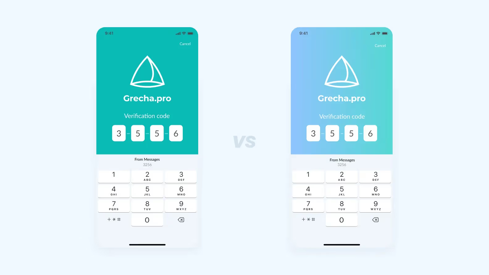
Normally, before moving on to the design, we ask the client for anti-references. We want to understand exactly what they don’t like and what not to do. This way, we are more likely to meet the expectations and requirements of the customer. Mikhail did not have the time nor desire to collect anti-references. There were only two major requirements: the functionality and usability of Telegram and the color “Tiffany Blue.”
We tried to pry out a few more details and put together a mood board. The answer was the same: “Telegram and Tiffany Blue”. Okay, no sooner said than done. We made it Tiffany Blue… and added a gradient.

We learned from our mistakes. So now, if our vision is different, we prepare 2 color schemes: as required by the customer and our version. But ultimately, the clients remained unconvinced — it had to be Tiffany Blue.
In working with startups, more often than not, one single person makes the final decision about design and development — the startup owner. It was the same with Grecha.pro. To validate the design of the future app, we needed Mikhail’s approval. Given his vast experience, we considered it a first test of the team’s mettle.
There were two tasks before us: to make a logically impeccable design and to impress the client with visuals. We never had a problem with either logic or visuals. However, we wanted to outdo ourselves and strengthen our case with a new form of concept presentation.
We used to show several application screens as a way to present a concept. If the client liked the colors and the style, we designed the entire app accordingly. But there is a disadvantage to this approach: it’s hard to perceive the screens out of context. At first, the client might say that everything is okay. But once the entire design is ready, it turns out to be not what they wanted. It’s the lack of immersion into the app flow during the concept design stage.
That is why we chose a different path for Grecha.pro. We fully developed the flow of placing an order from the chat and wrapped the screens into a landing-like presentation on Readymag. It looked like a finished product — good enough for an investor pitch. These were not 3 or 4 abstract screens but a visual representation of a working app — all within just 2 days.
Fortunately, the bet paid off — Mikhail sealed his approval with a certain, “Okay, looks nice.” Of course, we expected a standing ovation and tears of happiness but got so high on making such a great presentation that a rather dry “nice” was good enough. Defending our solution on the first try was an excellent start to the project. Readymag presentations became our new standard for design concepts, and now we do this for all projects.
For connoisseurs of beauty, we have made a Grecha.pro design case featuring all visual solutions.
We had a lot of fun designing Grecha.pro. Not to say that we suffer on other projects. It’s just that we applied new effective processes to Grecha and enjoyed it, which inspired us even more.
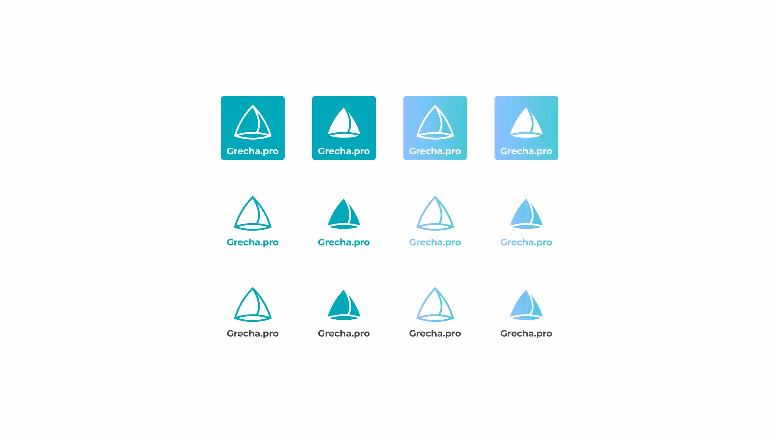
Grecha.pro has given us an opportunity for one more experiment — designing a logo. There were 18 designers with us already, but at that time, the team had barely begun to take shape. We were exploring new areas — toying with logos and brand identities. Our startup clients often came to us without a brand book. They don’t have 30 grand to spare for branding but still need some visual style to base the design on. Mikhail did not have a brand book and therefore, a logo. We decided to fix it on our initiative:
Everything went smoothly with the SMS service, push notifications, and frontend, but Telegram and Mailgun gave us a hard time. The application focused on restaurateurs for the time being. Suppliers were to use their regular communication channels — Telegram and email.
The logic is as follows:
Let’s discuss the magic further.
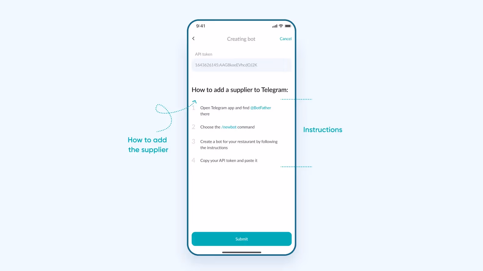
Since this is an MVP, each restaurant has to create its own chatbot. The supplier has a Telegram chat with a particular restaurant, with no restaurant IDs in the messages, and with the ability to communicate directly in that chat.
Here is the flow:
1. The restaurant picks a communication channel — Telegram.
2. If they never worked with suppliers via Telegram before, they see the following screen.
3. The supplier receives an invite link to a Telegram chat.
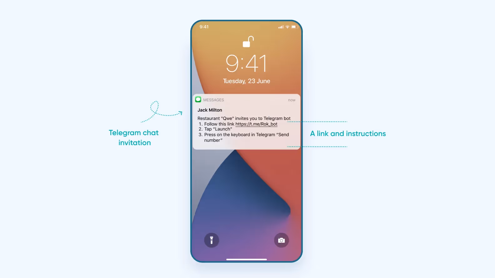
4. The supplier sends his phone number to the chat so that the app links them to the right restaurant.
5. And we got a connection. 🎉
There were no particular problems with integration. We had a ready-made Telegraph library with well-written API documentation. We just had to study the API and register our endpoints — and that was it.
The task was to make sure that messages and orders from the chat arrived at the supplier’s email address. The supplier writes a response, and the restaurant receives that response in the application.
We could set up our own mail server but decided to save our client some money and use a ready-made solution — Mailgun. All we had to do was set up routes for message forwarding and get rid of the unnecessary text.
The problem was that email clients add some extra details to the body:
There were no particular problems with integration. We had a ready-made Telegraph library with well-written API documentation. We just had to study the API, register our endpoints — and that was it.
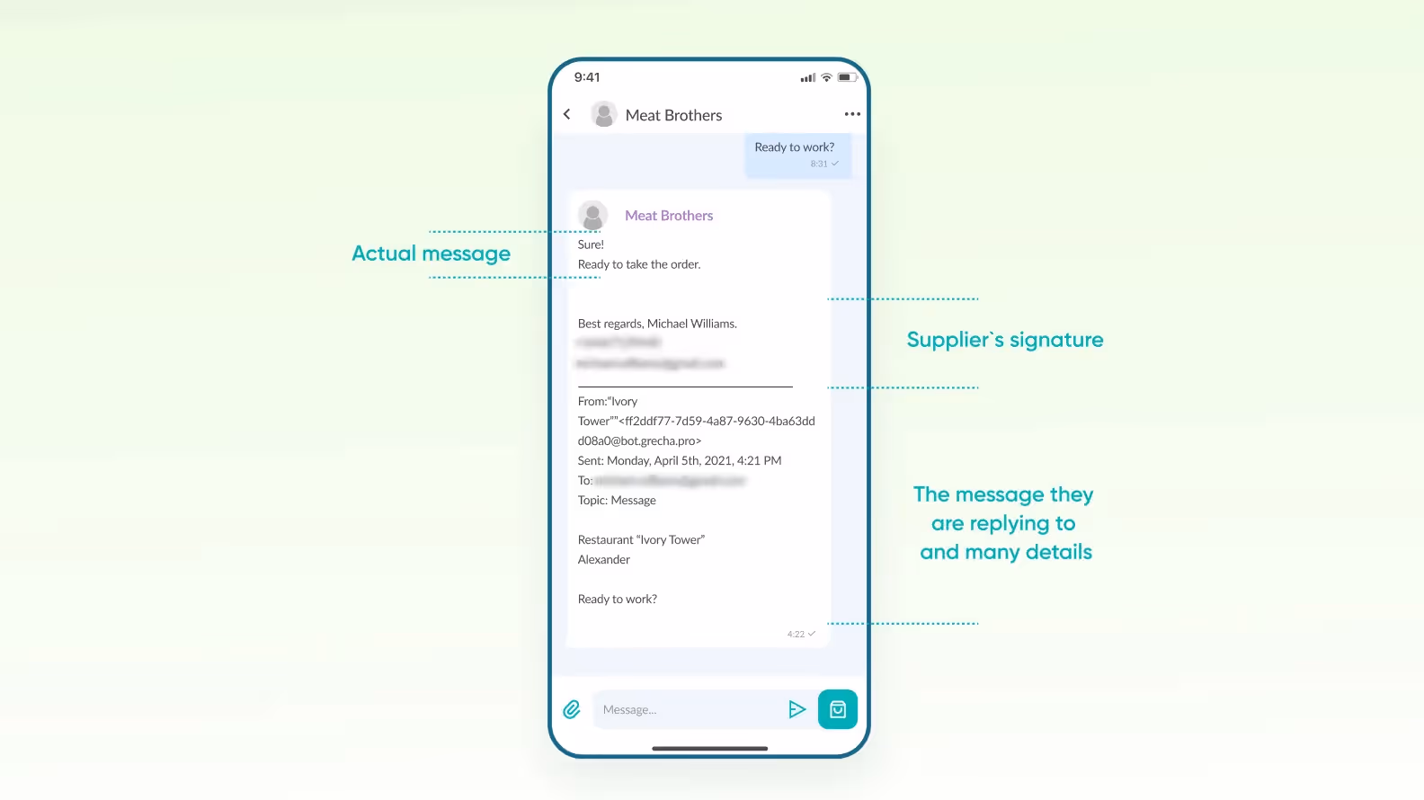
You don’t need all that information in the chat, so we have written special scripts to isolate useful text and remove unnecessary text. As a result, the restaurant sees the supplier’s message only, and their correspondence looks like a regular chat.
Mikhail approached the launch of MVP wisely. After the release, he did not get the marketing efforts firing on all cylinders but went to the customers and restaurateurs to collect feedback. After all, the main reason for an MVP is to test a hypothesis.
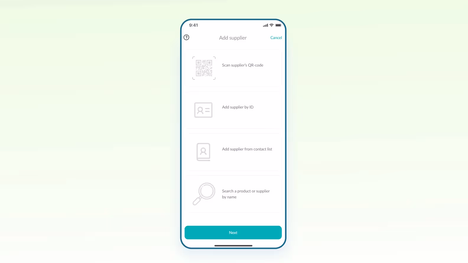
The hypothesis turned out true — the restaurateurs found the service useful. But it also happened to have a drawback. Since Grecha did not work directly with suppliers, the restaurateurs themselves had to upload price lists to the app. As a result, onboarding was difficult and confusing. So, we decided to add QR codes.
Here is how they work:
All in all, in 2.5 months, we made a logo, a landing page, and Android and iOS applications. Both are already in stores and available for download.