Is ‘Dark UIs are trendy in 2020’ factor enough to prefer a dark appearance over the light one? If so, you’ll have to prepare a bunch of excuses for the users. And, be sure, if you ruin the whole experience with the wrong colors, they’ll just leave without even asking you for change.
Let’s try to understand what stands behind the idea of adding a dark theme to the mobile or web app — all the insights come from Purrweb, a UI/UX design agency for startups. We came up with very vivid use cases and indicators where a dark user interface fits best. Hope you won’t fall to the dark side after reading that 🙂
Session length matters
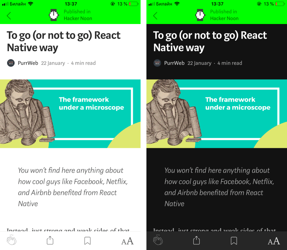
Time spent in apps mainly affects the way we perceive content. This includes our ability to see clearly things on the screen — be it headlines, menus or icons. To explain how session length influences content perception, let us share how painful it can be to work in Google docs for long hours.
A complete white background is totally fine to easily write texts — nighttime or daytime — no difference, right? Not so fast. If you’re writing for like an hour — that’s ok. Even a couple of hours won’t be that troublesome. Although, if you’re doing this for 5 hours at a stretch it turns into ‘Wait [eyes trying to figure out where to look] what?’ It does feel like someone tried to poke your eyes out —unsuccessfully but still hurts.

Google will introduce the dark-mode one day. And third-party walkarounds won’t be needed anymore
If your users do something for prolonged periods of time in your app — whether they write code or read content — just let them the option to turn on the dark mode. It doesn’t mean that a dark-colored background is a must for all apps with lots of texts — the main focus here is ONLY on how long the app is in front of users.
As the Google devs would make all writers’ working sessions more productive if added a real dark mode:)
Engaged time matters as well
When it comes to ‘dark on light vs light on dark’ debates, we don’t just refer to how long users interact with the app but also when. There’s no sense in overcomplicating things here, let’s just simplify it to day or night.
There is a clear correlation between light conditions and the best color scheme based on the severity of eye strain the interface can potentially bring. So, you understand why evenings, nights and mornings are the dark UI best friends, right?
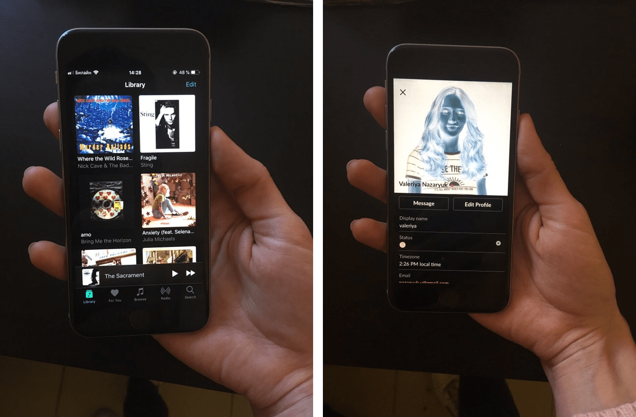
 We use Medium app throughout the day, although the black theme is our fave for the bedtime routine
As a good example of thinking about their audience, let’s take Apple. MacOS Mojave’s new theme darkens everything in a very smooth way. In 2019, Apple brought dark mode to iOS — the alternative color scheme became a major update for iPhones and iPads. Before iOS 13, only ‘Smart Invert’ was available — and actually this feature was the closest thing to dark mode.
The main disadvantage was that unlike true dark mode the ‘Smart Invert’ feature worked properly in certain stock apps.
 Apple Music is totally fine, see? Watching profile pics in Slack is a total disaster though
The logic is stupidly simple. When the sun goes down or rises we do not want our screens to be the only source of light — it unbelievably hurts. When we lie in bed mindlessly scrolling the feed — we hardly wanna see the harsh bright light spoiling that sweet joy of doing nothing. So, to make sure users return over and over again, make the app easier on the eye.
Dark UI is useful for visually-driven interfaces
To make the color scheme choice more reasoned, think about what you actually want to present. Videos, dropdowns or data tables — you name it. Plus what areas you wanna highlight.
In iOS, the Clock app helps us primarily focus on time. To understand what a black interface brings here, imagine you’re watching a concert with a single performance artist on stage. All the lights are focused on a single area to magnify the image and completely fix our attention.
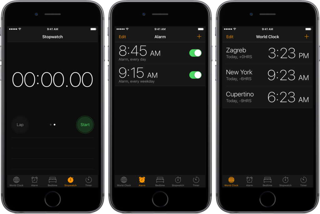 Nothing here would distract you from the numbers
For visually-driven interfaces, the dark mode will definitely do the trick. By ‘visually-driven interface’ we mean graphics, charts, and images — not texts. Don’t do this to bring a prestigious look but to make meaningful UI elements stand out.
‘Teens love dark UIs!’ is NOT on the list
At the beginning of this article, we wanted to laugh over this ‘Trendy dark mode’ thing. But you know what? It is a hot trend indeed. Dark mode is already available on Instagram, Twitter and Google Maps — this list isn’t even complete. Learning from giants is definitely a good idea. But getting started with users’ needs and the product itself is way better, right?
We won’t tell you that all teenagers find dark UI design stylish or sophisticated. Neither would we advocate for choosing a light-colored background for grown-ups if this article was about cases when such perform well. Stereotypes are fine to rely on, fact. Although no matter how old your user group is, get feedback and track competitors’ designs to better understand what they really like and make it all work.
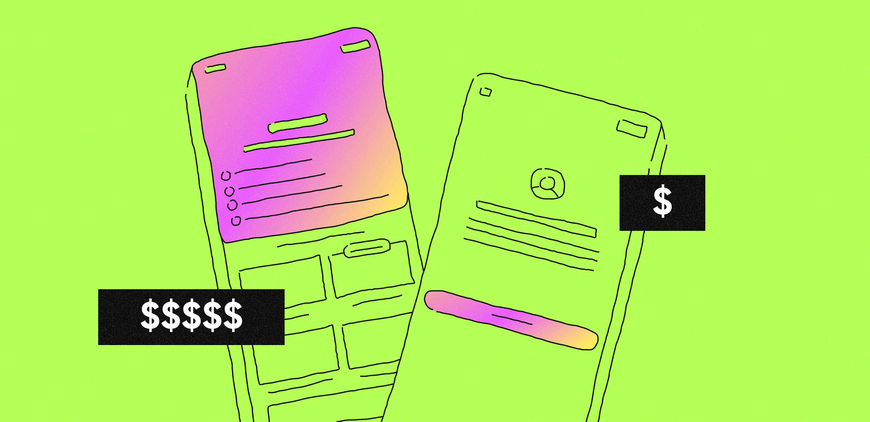
P.S. About guys who want their products to support both color themes from day one. For god’s sake, not for MVPs. At this stage, the goal should be ‘Stay lean and test things out‘, not ‘Come up with something that changes color tones’.