Explore

Need help with your project?

Oops! Something went wrong while submitting the form.
Over the recent years, we at Purrweb have completed 5 projects with Arabic UI. Sure, 5 is a less impressive number than, say, 50. Nevertheless, our team has accumulated a substantial knowledge base. We just can’t keep it to ourselves, so we share some hacks with you.
Challenge: at first, an Arabic design seems easy to make: text translation + right alignment = profit. Actually, a designer must be ready for a great deal of hidden traps.
Solution: follow the tips from this article to make an easy-to-use and sound Arabic UI.
Let’s start with a brief introduction to Arabic design.
The Middle East users expect to see an RTL (Right-To-Left) layout. In this article, we focus on Arabic apps, but you can apply these tips to Hebrew UIs as well.
RTL differs from LTR (Left-To-Right) in how an app displays its content.
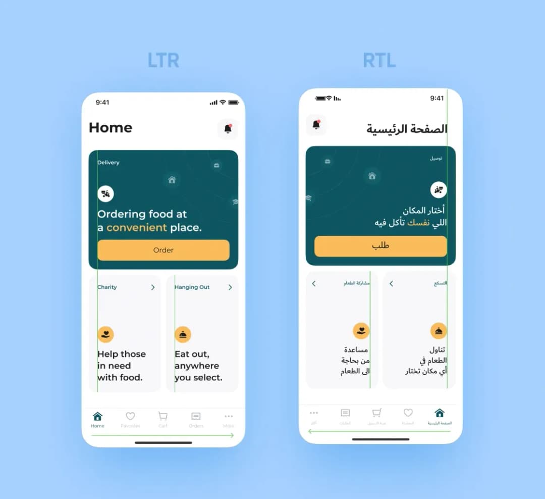
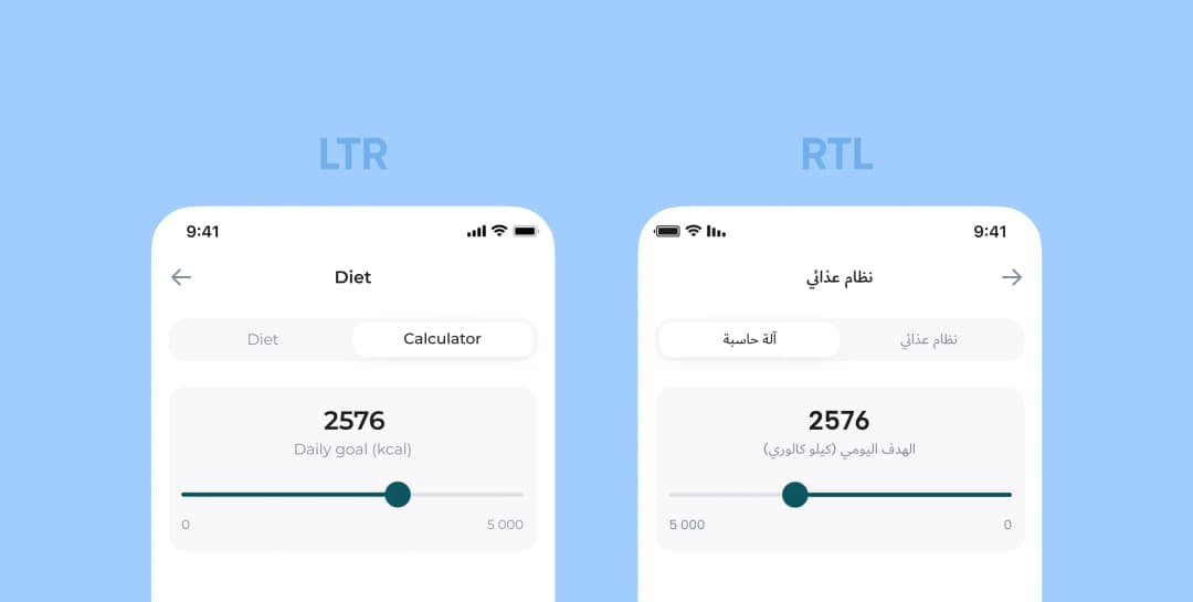
Have a closer look at this image. You will notice that the UI elements now have aligned to the right and changed their position. Besides, in the RTL UI, some buttons and icons are backwards, whereas the others look the same.
We have made all the changes for a reason — RTL UI users view a screen in a specific way. Let’s begin with a text.
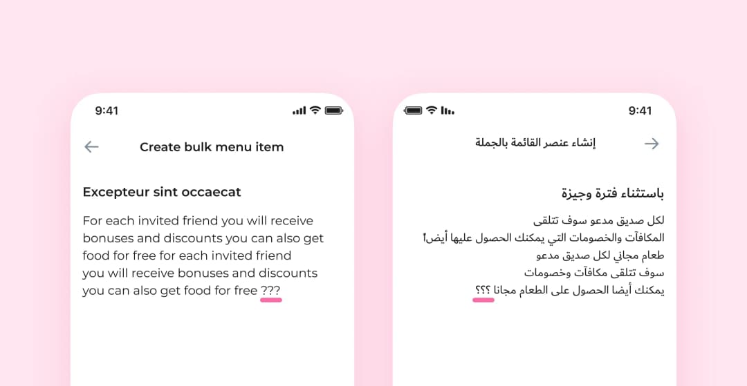
Right-align the text. Translate the text into Arabic and make a mirror version of it. We can’t write or read in Arabic to understand if the text looks the way it should. That’s why we add a few question marks. If they are reversed, we’ve done everything right. Such details make life easier 🙂
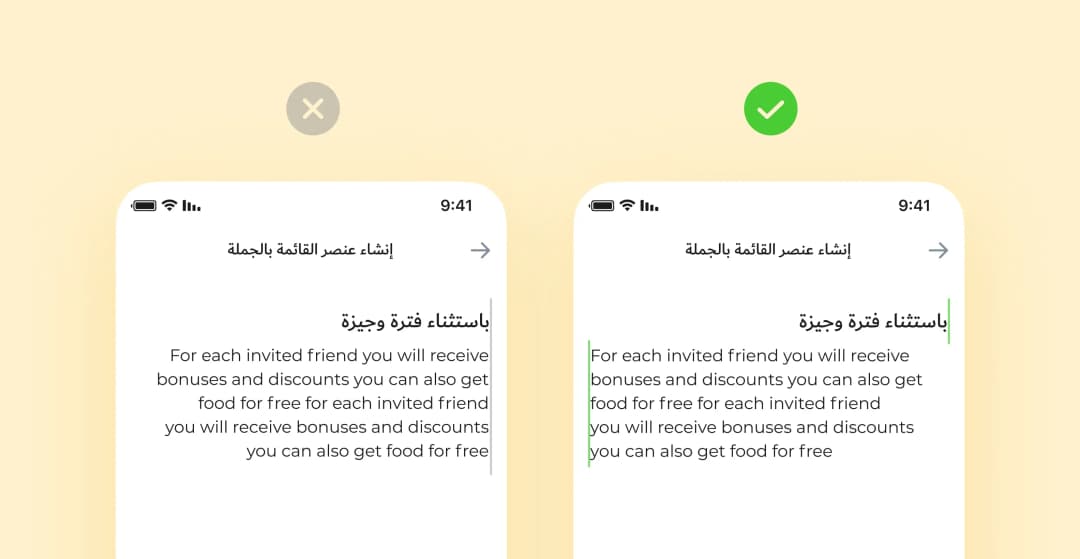
We right-align non-Arabic words and sentences, but don’t reverse them. Always stick to the direction of the text’s language.
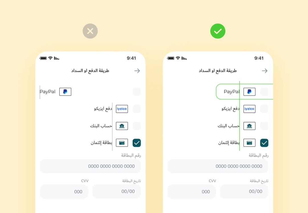
It would be best if you don’t translate proper names and any text that makes sense in its source language only.
❗️Note: sometimes, a client asks to add a whole paragraph in a non-Arabic language. We left-align such substantial pieces, even if other elements are right-aligned.
Make sure a typeface supports Arabic. If the main version typefaces don’t support Arabic, adopt the app style to the new version and find the proper typefaces. For example, in April, Apple introduced SF Arabic to its typeface family and Google offers the Noto family.
In our latest case, the client asked us to apply the Dubai typeface.
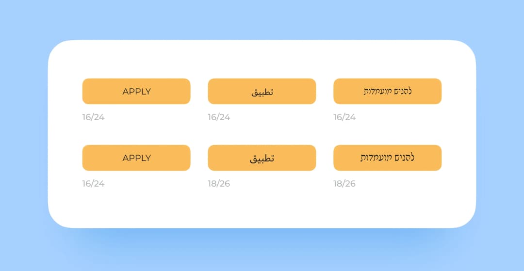
Increase the font size of buttons and headings. We use Caps Lock to uppercase texts for buttons and headings in English. This doesn’t work in Arabic or Hebrew as they have no capitals, so just increase the font size by 10%.
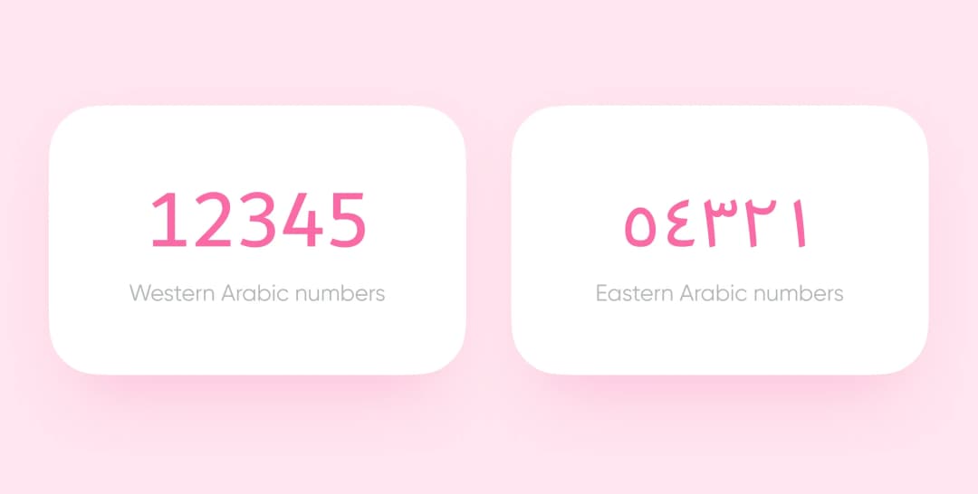
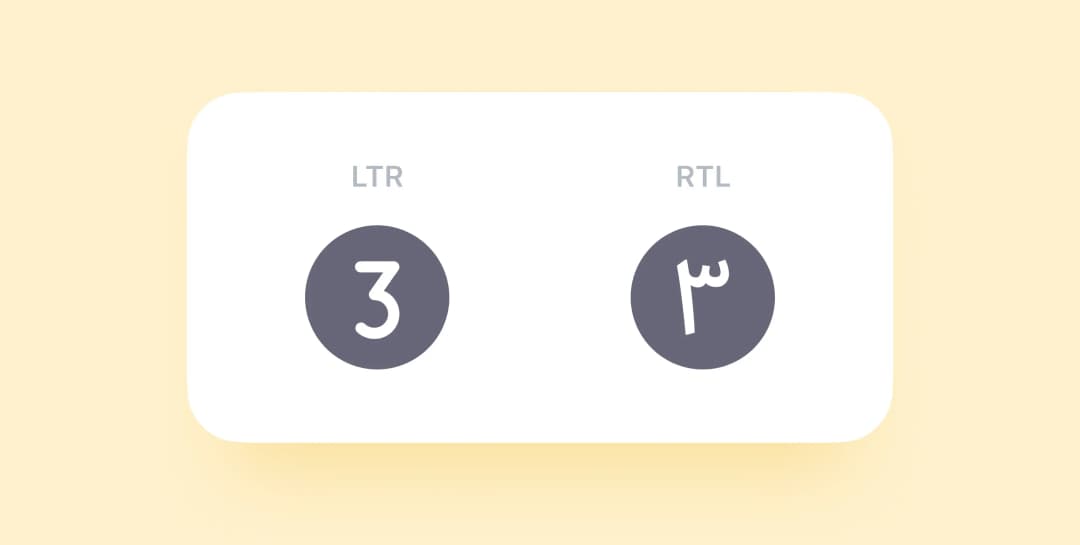
Use correct numbers. People can use either Western or Eastern Arabic numbers, depending on a country or a country region. For example, in Egypt and Sudan, people use both types, whereas in Iran or Afghanistan, they prefer Eastern Arabic numbers. Consult your client to avoid mistakes.
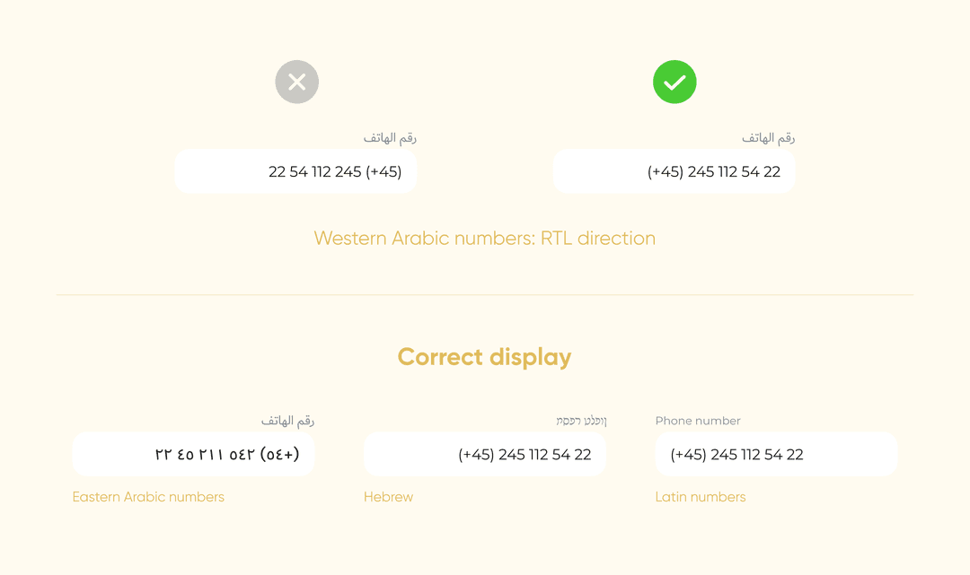
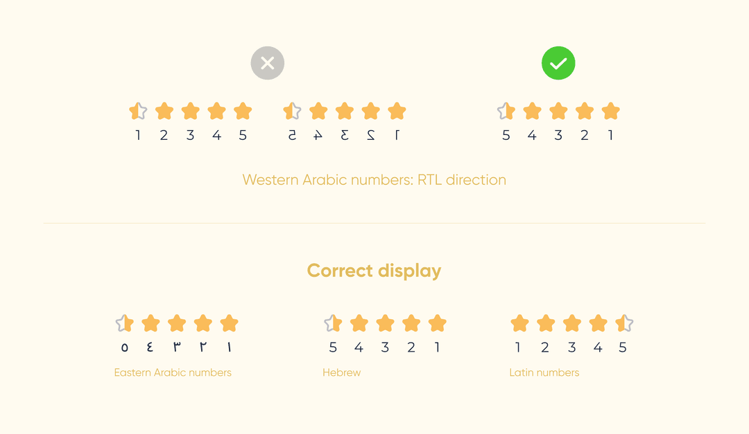
No matter what language you use, stick to the correct order of numbers. You don’t even need to reverse the Western numbers — simply right-align them. Don’t forget about the RTL direction for the Eastern Arabic numbers.
❗️Note: use RTL direction for the elements that show progress (like rating scales), but don’t reverse the numbers.
We devoted the previous part to text solely. Now, let’s deal with the UI visual details, like icons, indicators, and tab bars. You reverse some of them and leave the others as they are. Let’s puzzle out each case.
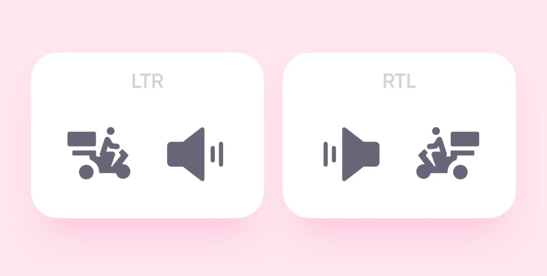
Motion icons. If users read from right to left, they see RTL objects as moving forward. So, when you turn an LTR UI into an RTL one, reverse the motion icons: the carrier should ride left.
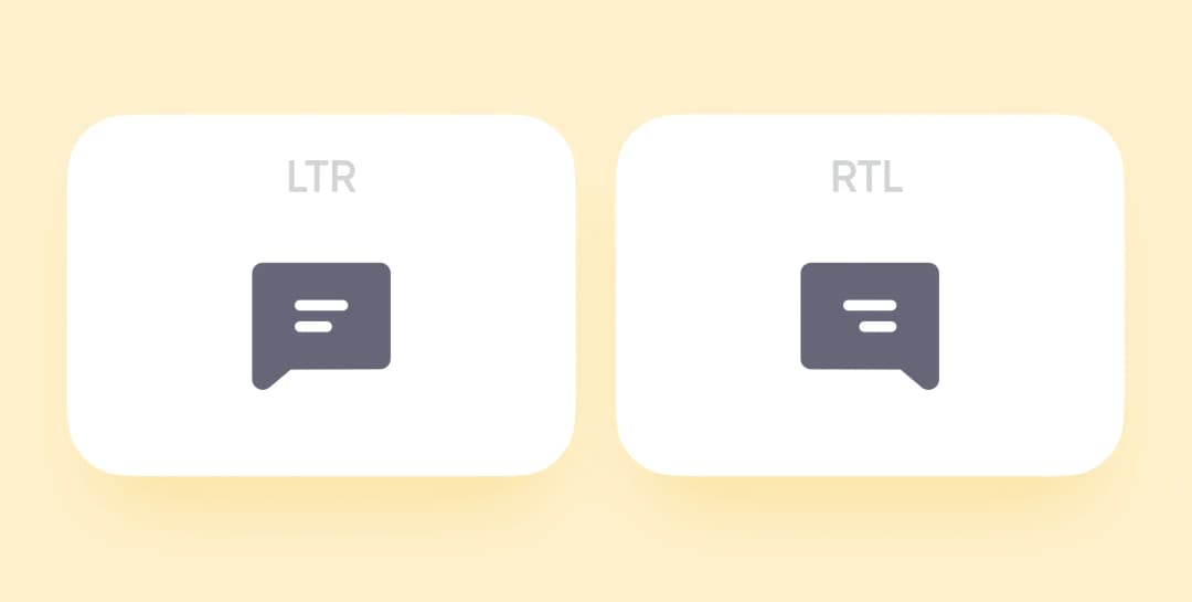
Text icons. To create the right impression, reverse message icons and other images that imitate text lines.
Redirecting. Forward and Backward icons change their positions. In LTR design, Backward buttons point left, in RTL design, they point right.
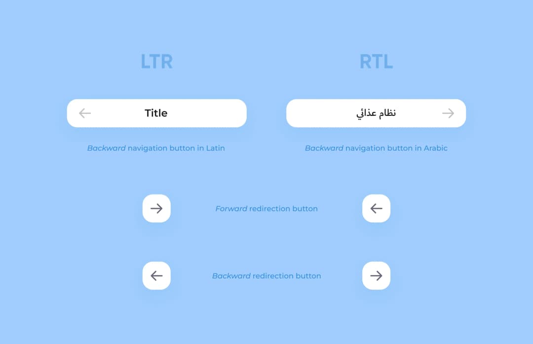
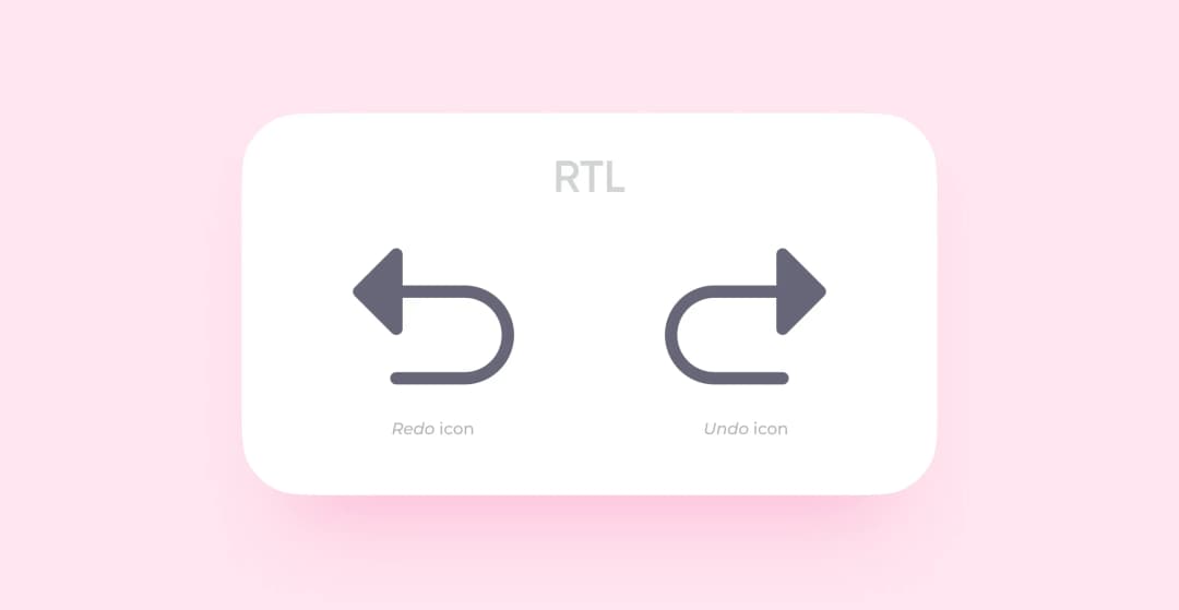
Undo & Redo. An Undo button cancels the latest action, a Redo button restores it. It’s like moving backwards and forwards in time. These icons change positions the way the previous ones do.
UI control elements. Reverse sliders, switchers, and other elements that require start and endpoints.
Images. Don’t reverse them for two reasons:
Sometimes, you have to reverse an image for it to comply with a page design. Using a different image for an RTL app may be the best option in this case.
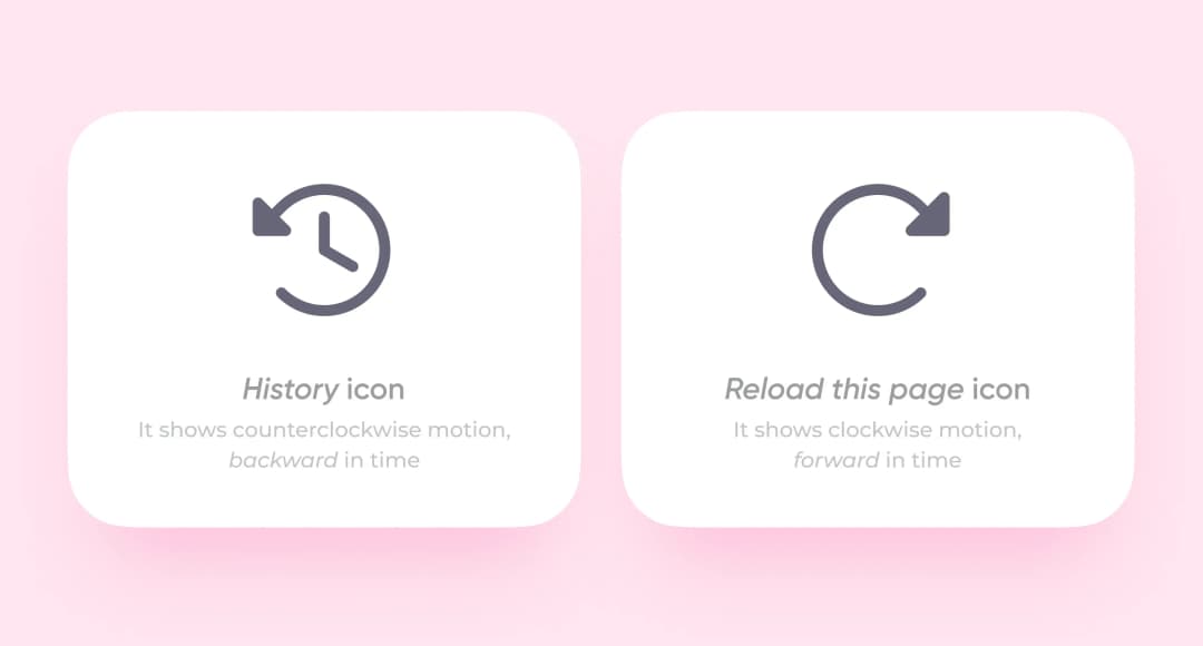
Clockwise and counterclockwise arrows. Undo and Redo buttons show time direction, whereas the images of the History and Reload buttons are based on an actual clock face. They demonstrate clockwise and counterclockwise motion in any design version.
Real objects. Don’t reverse anything that symbolizes an existing object if the direction is not an issue. A moving car is a direction icon, so reverse it, but don’t change an open book or earphones as they are just images.
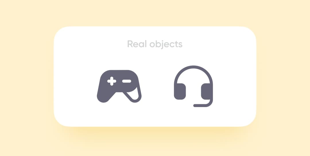
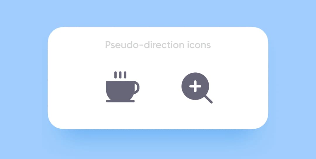
Pseudo-direction icons. Some existing objects may seem to symbolize direction, but they are just meant for right-handed people.
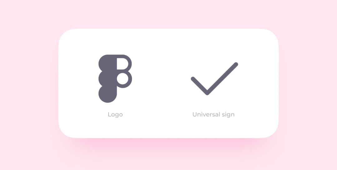
Logos and universal signs. Never reverse such visual elements. Otherwise, you will confuse a user or violate copyright.
Icons with letters and figures. You can reverse them if you need to, but mostly you don’t. In any case, you must translate numbers.
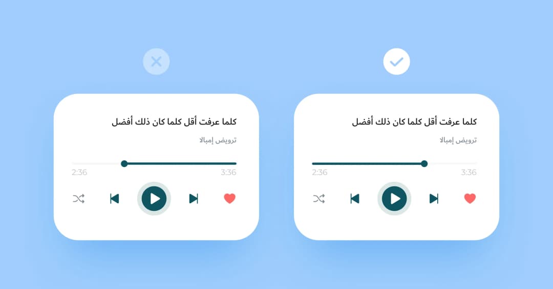
Video and audio players. They look like UI control elements, never reverse them. They are the same in any design.
That’s it. If you have any questions left, ask them in the comments.
Meet the algorithm we use to turn a LTR design into an RTL one:
1. Configure your workspace. Decide on the number of files you need to render app versions. Create a style library and connect it to the new files if you need several ones.
Life hack — configure your Figma based on the project size:
2. Make an RTL version of the UI kit. Reverse the existing components: first, the master components, then the icons, and other UI components.
3. Replace the current elements with RTL ones. Open both versions and replace all the required elements.
4. Prepare text fields. Apply a new typeface if the current one doesn’t support Arabic. Right-align the whole text before translation.
5. Translate into Arabic. Use Google Translate or hire a specialist. When the Arabic text is ready, add it to the mockup.
Your Arabic UI is ready!
RTL (right-to-left) design means mirroring the entire interface layout so it reads naturally for Arabic speakers. Navigation, icons, and text all flow from right to left. Elements like progress indicators, breadcrumbs, and swipe gestures are reversed, while logos, real-object images, and clockwise icons stay unchanged. Purrweb applied this across five Arabic UI projects.
SF Arabic, Noto Naskh Arabic, and Dubai are the three fonts that perform reliably across iOS and Android Arabic interfaces. Arabic glyphs are taller and wider than Latin equivalents, so increase heading and button font sizes by at least 10% compared to your English layout to maintain visual balance and readability.
Arabic localization costs $3,000-$15,000 depending on app complexity. A basic RTL layout conversion for an existing app runs $3,000-$6,000. Full cultural adaptation -- RTL architecture, Arabic typography, halal compliance review, and QA -- adds $5,000-$10,000 on top of translation costs. MENA-specific features like prayer time integration add $2,000-$5,000.
Halal fintech apps must avoid interest-based (riba) transaction flows -- replace APR displays with profit-rate terminology and remove conventional loan calculators. Dating apps serving MENA markets typically require identity-verified profiles, family-supervised matching modes, and no alcohol or explicit imagery. These compliance decisions affect UI copy, icon choices, and onboarding flows.
It depends on the target country. Egypt, Saudi Arabia, and most Gulf states commonly use Western Arabic numerals (0-9) in digital interfaces. Morocco, Algeria, and parts of Iraq prefer Eastern Arabic numerals. Confirm with a native speaker from your target region rather than applying one standard across all MENA markets.
Prayer time integration uses GPS coordinates and a calculation method library (such as Adhan.js or IslamicFinder API) to compute the five daily prayer times based on the user location. The app typically displays a daily schedule widget and sends push notifications before each prayer. Implementation takes 2-4 weeks and requires handling time zone changes during travel.
Do not mirror logos, brand icons, photographs, real-object illustrations, video player controls, clockwise-rotation arrows, or map orientations. Mirroring these creates visual confusion and looks incorrect to native Arabic users. Only directional and flow-indicating elements -- navigation arrows, progress bars, and swipe cues -- should be reversed in RTL interfaces.


.svg)