
Need help with your project?

Oops! Something went wrong while submitting the form.


User experience/user interface design is a powerful tool to convert meanings. In fact, good interface design is much more than pretty graphics. It is about the little details that support the business logic and make the product more user-friendly.When developing MVP, remember that your future product has the power to convert random visitors into loyal customers if you take advantage of the UI/UX techniques to increase conversion. In this article, specialists with years of experience in UI/UX services will share with you some tips that help turn visitors into customers.
.avif)
UX/UI designers build user interfaces based on the needs of potential users. Any digital product needs proper design, it helps to make a good impression on users and make them come back.
Let’s see what differs UX from UI and what is it all about.
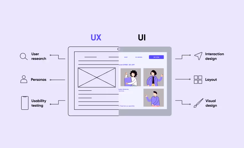
UX stands for user experience design: UX designers research potential users, their problems, and build the initial logic of the products. These specialists know the UX design principles and can make the app’s interface as simple and easy to use as possible.
UI stands for user interface design: UI designers create all the visual elements of the product — fonts, colors, buttons, forms, etc.
UX cannot exist without UI, and vice versa. That’s why usually designers learn both skills, and development agencies that create app interfaces, offer both design services.
If you want to engage users from the first seconds on your product, pay attention to the details and make them work to your advantage.
The first screen is the most important one. When users open your web or mobile app, make sure you interest the visitor from the first second by making it attractive and catchy.
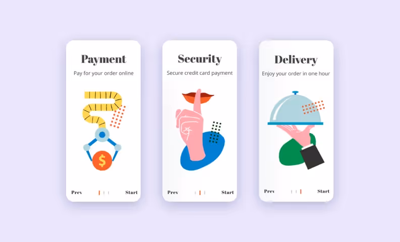
In order to improve the onboarding, you can conduct surveys, A/B testing, or work with focus groups:
In search of originality and self-expression, some designers use weird layouts and create ‘original’ elements — and it’s a bad practice. Users don’t want to sort out anything new, they like to see patterns.
What are user experience user interface design patterns? Patterns are design elements that your customers get used to. Remember that the purpose of design is to make products usable and convenient — there is no reason to reinvent the wheel, even if it seems that your vision is much more interesting and original. So, chasing originality, do not forget about the convenience of the users.
Let’s talk about the central part of the layout. Both web and mobile app conversion rates depend largely on understandable navigation. If users don’t understand where to get the information they need, they will probably go to your competitors.
Want your users to make a purchase or drop a message? Tell them about it! A call-to-action button is a direct tool for user conversion, so pay attention to its color, size, and the message on it. Here are some tricks that will help you to design better CTA buttons:
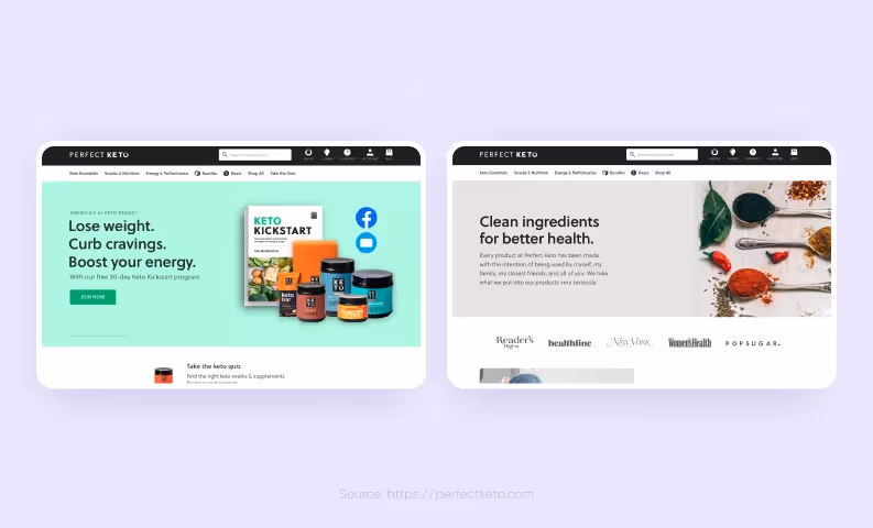
Businesses often see the first screen as an opportunity to display as much information about their services as possible — they believe this will help them to ‘hook’ a customer.
Well, check out Google’s home screen: it looks simple and accessible right from the start, and no info is given.
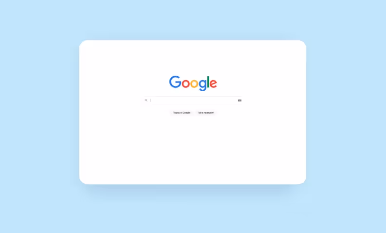
When there is too much content on the page, it becomes overwhelming. Users simply don’t know what to explore first. To ease the cognitive load, use more white space. White space (also referred to as negative space) makes it easier to build a visual hierarchy of elements and allows the user to focus on the key elements.
The text describing your product is the primary source of communication between you and your potential clients. Make sure you display high-quality content that shows the advantages of your product. The main content of talking to people is text. That’s why it must be understandable.
Have a look at the example:
Effective copy should be written by a professional who knows the rules of writing a certain copy (for example, a landing page is different from a blog post in many aspects), is familiar with the psychology of sales, and can maintain the tone of voice that is right for your company.
A spreadsheet of text with no accents scares people. People who visit your app don’t want to put much effort into getting information. What can you do to help them? Use different fonts, font sizes, and Kegels to place accents + introduce headers and subheaders that break the content into blocks and aid the user to navigate in the text.
Help your users understand your idea. Emphasize important pieces of information in different fonts. Yet there is a tricky point: try not to use more than two or more different fonts, otherwise your product becomes a mess and looks overwhelming.
Okay, let’s say you wrote a good copy and worked on the typography of your product — it is still not enough. You know everybody loves images. Photos, schemes, and animations added to the content make it more readable and appealing. Using graphic elements is a must to help you attract more people.
Don’t forget that the images should also look good on a smartphone screen — the number of mobile subscriptions is rising every year, and more and more people use their smartphones. If you have a website, you should make it responsive. If you have a web app, develop a mobile version too.
Videos are even more effective than graphic elements. Think of your last time staying on a site because of a cool video you met. Displaying videos is a great tool as long as it doesn’t affect the load speed. If the website is loading for more than two seconds, the bounce rate increases.
Here, we’re talking about websites. The loading speed should be fast, or the users will leave your product. Some services that allow you to check your own speed, such as, Google PageView Insights.
If it takes more than five seconds for your website to load, you need to think of techniques that help you optimize loading speed. For example, you can move your website to a better host. Rent a dedicated cloud from Google, AWS, or Microsoft Azure, or purchase a server that will be just your own.
Improving the load will decrease the bounce rate and can potentially increase conversion.
The color you use must be appealing, too. It is important not to make your product too gaudy. Don’t think you need to use many colors to make your solution interesting. Two to four different colors are usually enough.
Use brand colors if you have a brand book. If you don’t, don’t worry — the designer will provide you with a cool color scheme that reflects your corporate values. Plus, there are plenty of online color generator schemes — you can play with them yourself and discover the color combinations you like most of all.
If you don’t want to confuse users, you need to keep the same layout logic, color scheme, and fonts on all screens or pages. Keeping your product coherent means creating consistency.
Why do you need it? Because it is easier for users to find what they’re looking for — they expect to see units they saw before. Users like products that are simple to use, so sticking to this principle can also help you increase conversion.
Do not make a person who is interested in your product search for your email address to contact you. Make the procedure simpler — include a chatbot on your page. It can answer the most frequent questions and redirect the person to a human professional if needed.
If you do not want to spend money and time on chatbot development, at least include contact forms in the key places of your webpage. It allows the user to send you a question without extra steps. Simplify the communication process, and you will seem much more open and reliable to a potential customer.
User experience user interface design is an effective tool to increase conversion. By following our tips, you make your product more accessible to potential clients. They easily find the information they need and keep coming back for more. Putting the user’s comfort in the first place, you can achieve amazing results.
Now, the bonus tip. Choose a UI/UX design agency in Dubai. Why? To rest on the beach while we at Purrweb make sure the design increases conversion, of course! <a class="blog-modal_opener">Drop us</a> a line and we’ll discuss your idea 😉

.svg)


.avif)