Today we’d like to share the most irritating things about apps. Check them out to ensure you’re not doing the same.
Irrelevant notifications
Abusing push messages that bring zero value irritate and throw users off. Wishing to measure the number of daily active users or user retention, you turn into this ‘LOOK AT ME’ company that spams a lot. Being a spammer is NOT GOOD, you’re likely to know it 🙂
How to avoid being a spammer? Offering users to turn off notifications is NOT a really good option. Notifications remind users of your app’s presence and keep them informed about time-limited deals and latest announcements.
Take a look at what Amazon does to avoid being spammy.
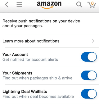 Users can control notifications they want to receive
Not every user needs the same type of messaging. Let’s say you have a travel app. Some users won’t even care about your discount hotel rooms or cheap flights and that’s ok. Reach out to people who will take advantage of all these perks.
Let users choose what they want to know about
Mandatory tutorials
Say you’ve created a step-by-step guide to show users how to actually use your thing. But what if they are fast learners or they just re-installed your app or they already used it on another device? They know exactly what to do and want to JUST JUMP INTO STRAIGHT AWAY. Without reading instructions or watching tutorials.
Vevo tried to check whether or not removing tutorials anyhow influences user experience. They tested two variants within 28 days and with over 160,000 participants — one with tutorials and the other without them. Without tutorials they got 10% more users logged in and 6% more sign-ups.
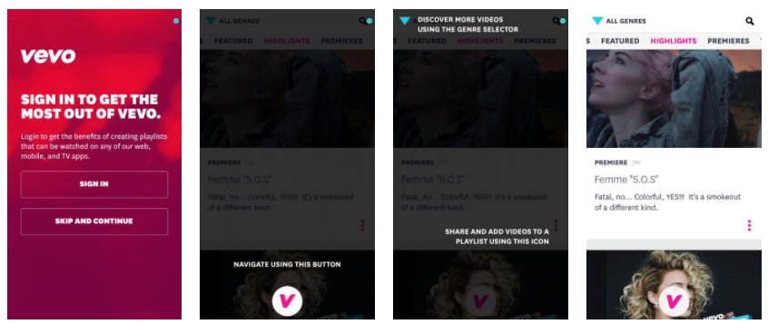 Vevo has enough of a brand, so users don’t need to be convinced to watch music videos
Tutorials are very helpful for explaining advanced features to advanced users. By saying ‘advanced users’ we mean users who already experienced the core product value, took different actions within the app over time. By giving them a tutorial, you just wanna make sure they check out all the cool features and hacks to use your app to its full potential. In any other case, give users the ability to skip a tutorial.
Make tutorials skippable
Long registration forms
Registrations are barriers. Users are required to type in their names, email addresses, job titles, locations and zip codes to see what’s behind the form. Whether or not to use your thing – they haven’t decided yet. So, why the hell should they put in the extra effort to get what they want?
A form like the one below presents a barrier:
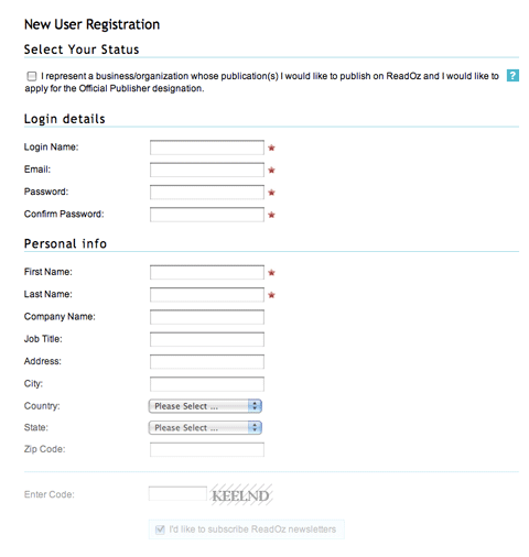 If six fields are optional, what the heck are they doing here?
As for taking care of users, Basecamp does it quite well:
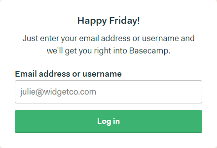 Users fill in just one field and go
If you want to include first name, ask yourself, ‘Why the hell do I need this?’ If your answer is ‘For the sake of being respectful’ – drop it. Most likely you’ll get not a real name, but LoverBoy69 or xffsgldgdf. Being respectful is not the same as sending ‘personal’ emails with names filled by software robots. It’s more about creating content that provides real value.
To minimize drop-outs (and not freak out), ask for what’s really important
Annoying surveys
Say, a user is ready to get into your app. But it won’t happen because of your frequent requests to fill out these ‘Tell us about yourself’ surveys. This is as irritating as when a sales guy bombards prospects with tons of questions once they go into a store – the feel attacked and leave. Without buying anything.
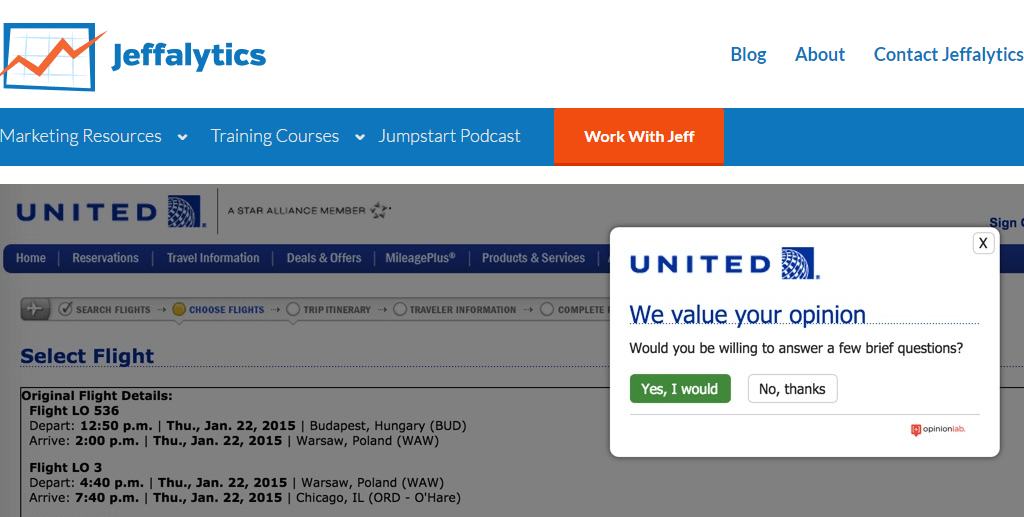 Wanna book a flight? Nah, man. We want your feedback. Here and now!
Firstly, no one really cares about your surveys. You promise that it takes only 10 minutes…Seriously? If we had 10 minutes to spare, we’d rather spend this time on Instagram. Or just do nothing. Doing nothing is always better than answering ‘stupid’ survey questions.
A few basic rules to get the most out of surveys:
- Move out the survey code from any transactional pages of your website.
- Avoid showing the survey to users on their first page.
- Leverage users’ insights into positive changes. If you cannot put the data to work within 30 days, it’s not worth gathering.
Gather the data that you can act on within 30 days
P. S. We didn’t tell a word about complicated navigation, hard-to-read fonts, and bugs. Have you ever met anyone who loves this stuff? We haven’t 🙂


