


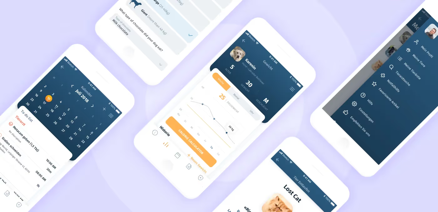
Sergey Nikonenko, a COO at Purrweb, explores some nuances of app development for the foreign market and explains why clients need SCRUM
Brilliant plans for IT-products come not only to developers. People with no IT background also go with ideas for amazing projects: these might be pastry-makers, florists, or veterinarians, for example. They face a great challenge: lack of experience results in a bad understanding of the development process. That’s why unfair contractors leave them high and dry with a sloppy product.
At Purrweb, we are dead set against the intransparent approach. If a client is interested in details, we are ready to share them all and explain each step of work on the project in real-time. The SCRUM project management methodology helps us with this — the work is being done in short iterations, the client receives regular product reports and demo versions at the end of each sprint. This allows us to avoid many problems at the final approval stage.
A veterinarian who has her own small clinic in Germany hired us to develop a mobile app. Although we communicated through a technical manager, we knew she wanted to keep the development under control. That’s why SCRUM was perfect.
The idea was to create a mobile app Petbuddy that would allow users to:
All of these features go like a bomb in European countries where chipping pets and regular appointments to a veterinarian are common.
With such an app, the client could achieve the following goals:
Agencies tend to charge an hourly rate so does our team. Our client has never encountered this payment model and was concerned over the final cost.
To cut her worries and not go about a wasteful project, we set a deadline for the project implementation — 3 months. In our experience in mobile app development, this is the time required to develop a successful product. After that, we calculated the cost of work of all project team stakeholders (designer, TeamLead, two developers, and project manager) for 3 months, which resulted in $ 30,000.
We realized that taking on every ‘want’ of the client would greatly increase the amount of work. What she wanted would in theory cost $50,000 but we had a limited budget and deadline.
That’s why we:
Jesse, the technical manager on the client’s side, came to us with a logo, color palette, and wireframes. For those who don’t know: a wireframe is a page or screen layout that contains blocks the client expects to see in the final design version.
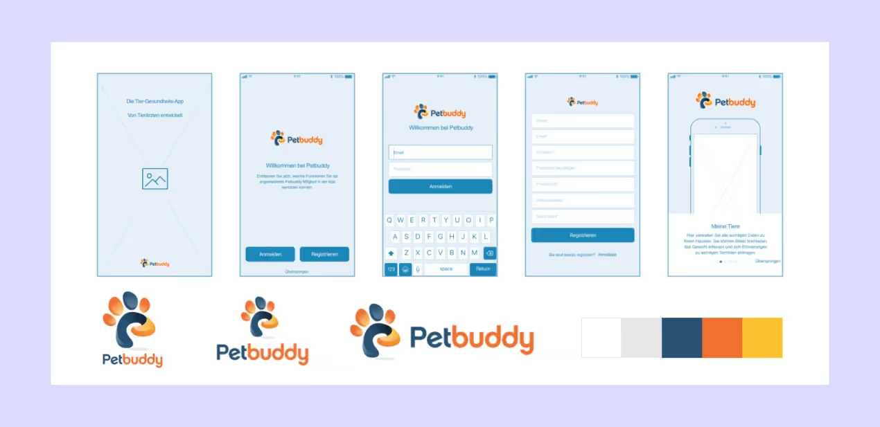
We studied the wireframes and decided to make a test screen. To get started, we picked one of the main screens — Pet Profile.
Note: we worked on the project in 2019
That’s what I got:
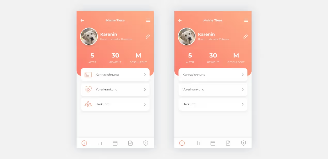
Here comes a turning point. We got feedback on the color palette, and I had to change it to the original one. So, having done grunt work, I changed the colors from orange to blue:
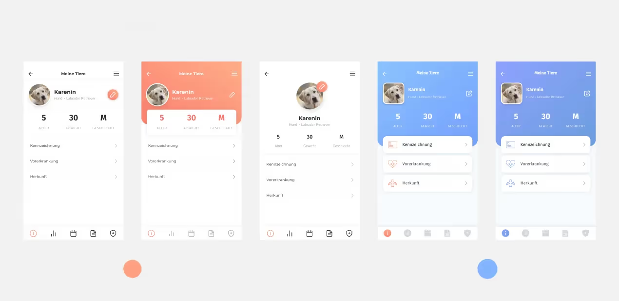
We ended up with night-blue as a primary color and yellow as a color for UI elements:
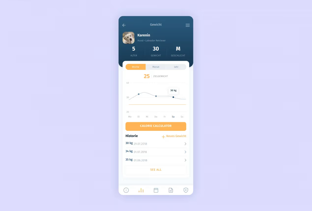
‘I didn’t talk to the client by myself, so we escaped the main approval process. In general, she liked everything except for the logic of placing the blocks and some other trivial moments like the color palette,’ says Anastasia.
Sometimes clients don’t know what screens and features they need to put in the app. They have vague ideas — and it’s up to us to specify them, discuss, approve, and then add to the backlog. It was the case.
Look at the features we came up with for Petbuddy:
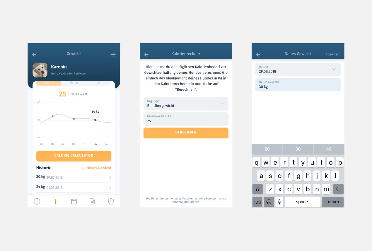

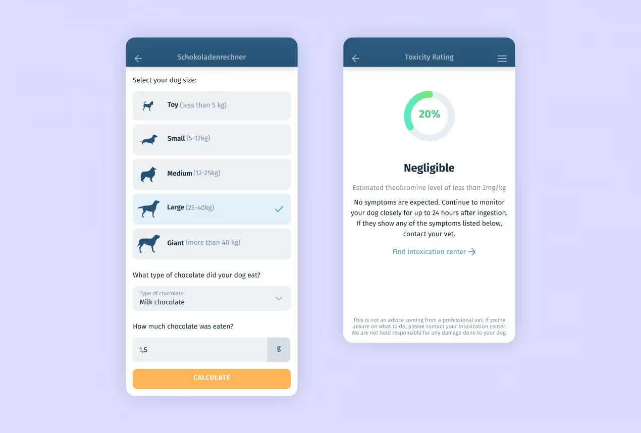
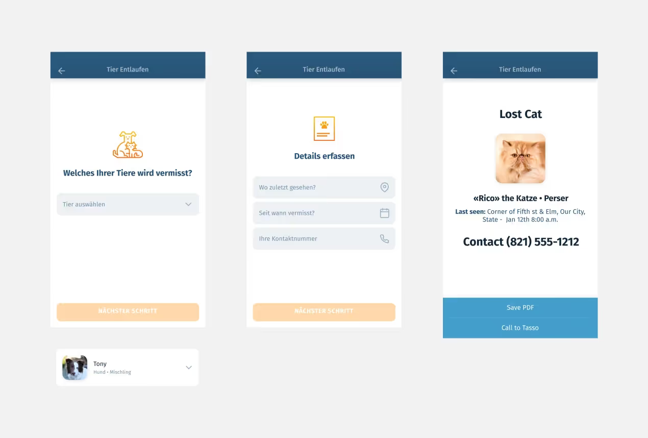

Each flow (user scenario) was approved by Jesse — who was, for sure, a true German, very thorough man. Therefore, we had nothing to tweak at the development handoff stage. This is rather an exception — in most cases, you cannot create a UI/UX design that won’t cause any adjustments during the development phase. We know how to do the trick: after sharing the done UI/UX design with the devs, designers still visit project team daily meetings and keep their fingers on the pulse of the idea implementation. Or make quick improvements, if there are technical issues.
At this stage, we build the front- and back-end architecture of the project, draw database diagrams, and go ahead with the coding itself.
We won’t dig into technical details: instead, we will touch upon some aspects we went through while working on this project.
The point is that we forgot to take the latter into account when estimating the project cost. We had to make push-notifications (we mean customize them) at our own expense.
There were some struggles with a chocolate & calories calculator. To create it, we needed special formulas that the client didn’t have. Therefore, we studied competitors’ calculators and reverse-engineered the logic (still, had to line up some of the constants by ourselves to make everything work correctly).
And it is not the end. Another hassle was the pet weight graph. The client had a million requests. The problem was to adapt the graphs (scale) of all breeds and sizes. Compare a Chihuahua and a Mastiff — these dogs are in completely different weight categories. A Chihuahua is within 6 lb, while a Mastiff can grow up to 250 pounds. It was necessary to scale the graph so that it could show both.
There is a popular methodology to describe a project in the form of User Stories. The concept is to separate an app into large functional blocks (so-called ‘epics’). The epics in their turn are split into small user stories.
It’s cool to work with epics because you can complete one isolated app part and then proceed to the next. But you should be careful: if too many epics run in parallel, you may end up with rough results that are hard to test. The fallout: you cannot be sure the app will be bug-free. During working on this case, we turned to epics only when the app was almost done — it’s not the first time we practiced SCRUM but still are mastering it.
So the final push — a lot of negligible bugs (what we’re trying to avoid when using epics). We didn’t set a specific day for fixing bugs in the sprint plan, so faced a pile of minor yet important tasks. It took us a little more time to finish the last sprint (other ones were completed without delay though).
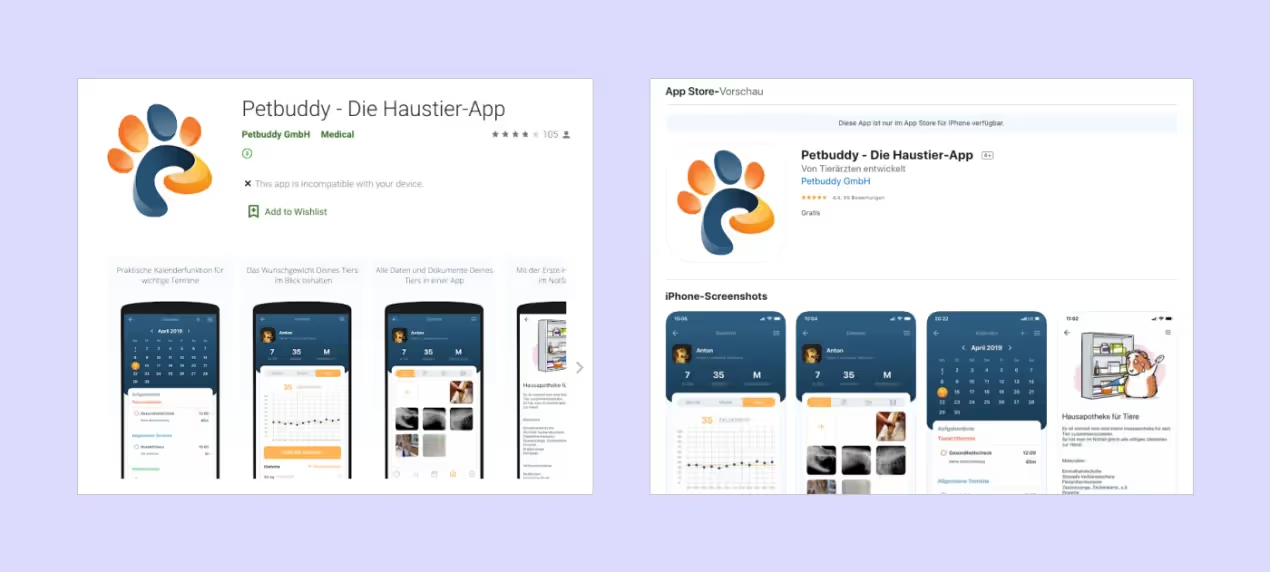
The MVP created as a niche project showed a good result — it’s rated 4.5 out of 5 in the App Store and 4 of 5 in Google Play. By now we see that the app has been downloaded more than 5.000 times.
The client managed to meet her goal. Although there is no financial metric, she’s now looking for investments to level up the project and monetize it. The social function, as we see it, is completed with a bang.