
Need help with your project?

Oops! Something went wrong while submitting the form.


When someone feels unwell, they rarely reach for a phone book anymore — they search online. A healthcare website is where worried parents check symptoms at 2 AM and anxious patients decide if they can trust you with their health.
A thoughtful website design acknowledges these vulnerable moments and responds with clarity, accessibility, and reassurance. Let’s explore how to create a healthcare website that serves both patients and providers.
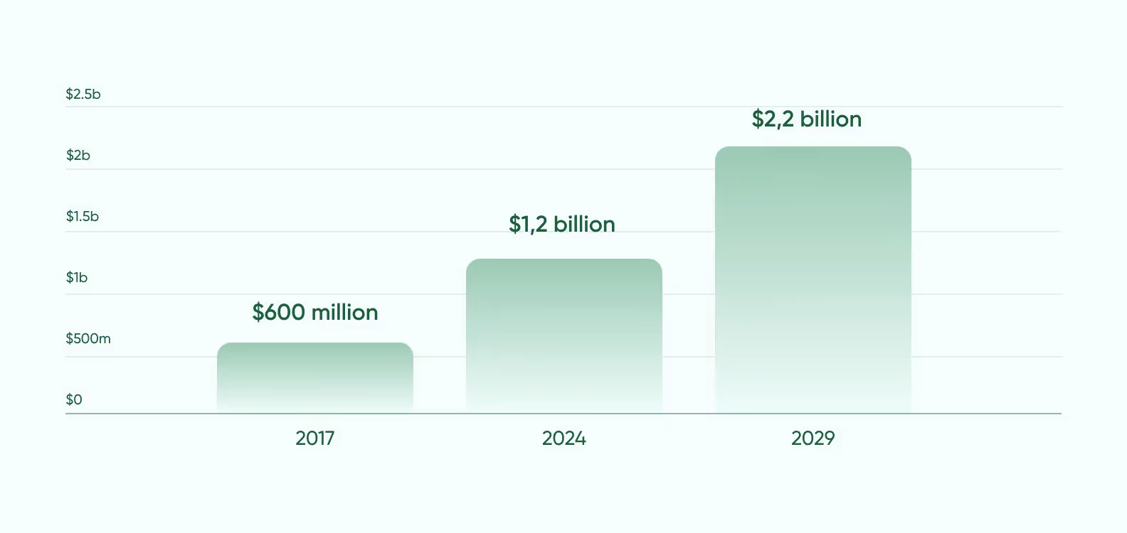
A healthcare organization’s website serves as the first point of contact with potential patients. Worldwide digital health users increased from approximately 600 million in 2017 to over 1.3 billion in 2024, with projections indicating continued growth to more than 2.2 billion by 2029, according to Statista.
When patients visit your website, they form an opinion about your practice within seconds. A professional, clean, and user-friendly design signals competence and attention to detail.
These are the qualities patients naturally want in their healthcare providers. Conversely, an outdated or confusing website can raise red flags about the quality of care they might receive.
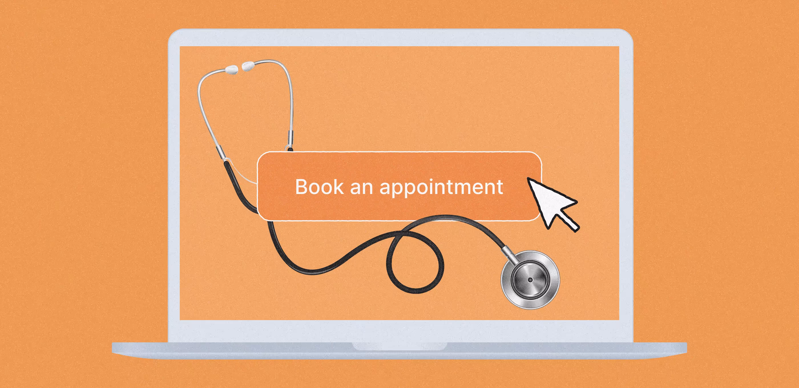
A well-designed healthcare website converts visitors into patients. Clear calls-to-action, easy appointment scheduling, and accessible information about services all contribute to higher conversion rates.
For existing patients, a helpful website with patient resources encourages loyalty and reduces the likelihood they’ll look elsewhere.
Online appointment scheduling, digital intake forms, and patient portals reduce administrative burden and paperwork. This efficiency cuts costs and frees up staff time to focus on in-person patient care rather than administrative tasks.
A website helps communicate what makes your practice unique. Whether it’s your specialized expertise, patient-centered approach, or innovative treatments, thoughtful design helps showcase your value proposition.
A healthcare website needs to do more than just look good. It needs to work well for both patients and your staff. These five features make a website a tool that improves patient experience while making your practice more efficient.
Patients should be able to easily view test results, medication lists, and visit summaries without frustration. The best portals also allow secure messaging with providers, prescription refill requests, and access to educational materials.
Remember that many users will access this portal when they’re not feeling well, so simplicity is crucial.
Few things frustrate patients more than playing phone tag with a receptionist. An online scheduling system lets patients book, reschedule, or cancel appointments at their convenience, even outside office hours.
Look for systems that sync with your practice management software, send automatic reminders, and allow patients to fill out necessary paperwork before their visit.
<div class="post_divider"></div>
⭐ Our experience
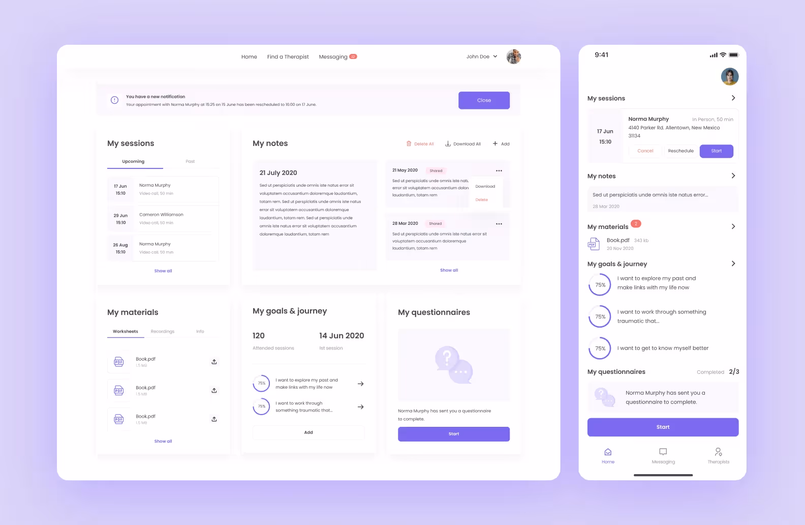
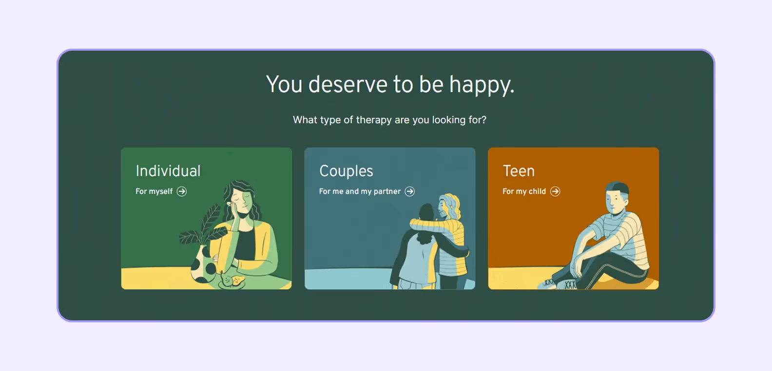
We designed and developed an online therapy platform connecting patients with mental health specialists. The project focused on creating a calming, accessible interface with a soothing color palette dominated by blue and white tones.
Our main goal was to create a booking system allowing patients to filter therapists by specialization, price, and availability. That’s why the design team prioritized simplicity and emotional comfort through a clean calendar interface for appointments.
<div class="post_divider"></div>
Patients want to find the right doctor quickly. A searchable provider directory should include photos, credentials, specialties, languages spoken, and insurance accepted.
Filtering options help patients narrow their search based on specific needs. Personal touches like short provider bios or videos can help patients feel more comfortable with their choice before the first appointment.
The demand for virtual visits continues to grow. Your website should connect patients to telehealth services with clear instructions on how to prepare for and join virtual appointments.
Features like pre-visit technical checks, virtual waiting rooms, and integration with your electronic health records make telehealth more effective for everyone involved.
A secure online payment system lets patients view their bills, understand their charges, make payments, and set up payment plans if needed. Clear explanations of insurance coverage and estimated costs for common procedures demonstrate transparency and build trust.
These seven best practices can guide your design decisions to create a website that builds trust, improves engagement, and leads to better patient experiences.
Healthcare websites must work for everyone, including people with disabilities. This means designing with screen readers, keyboard navigation, and assistive technologies in mind from the start — not as an afterthought.
Use sufficient color contrast, provide text alternatives for images, ensure forms are navigable with keyboards, and test with actual users who have disabilities.
Remember that accessibility benefits everyone. The same features that help someone with a permanent disability also help someone with a temporary limitation — like using a website one-handed while holding a sick child.
Colors evoke emotions and associations that can either support or undermine trust. Blues and greens traditionally signal trust, stability, and healing in healthcare settings, which is why they’re so common in medical logos and websites.
However, don’t rely on color alone to communicate important information, as some patients may have color vision deficiencies. Use color purposefully to guide attention, establish hierarchy, and create a calming atmosphere. Always pair it with clear shapes, text, and patterns for those who cannot distinguish certain colors.
<div class="post_divider"></div>
⭐ Our experience
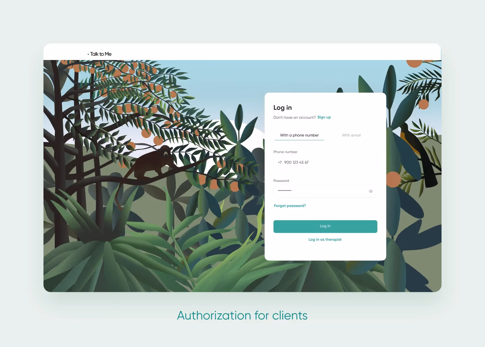
We developed Talk to Me, an online platform for psychological consultations that stands out with its unique nature-inspired design. Unlike typical healthcare platforms that use minimalist 2D designs with one or two accent colors, Talk to Me features a distinctive visual identity with 3D illustrations inspired by tropical jungles and a soothing green color palette.
The designers prioritized simplicity for users who might be experiencing anxiety or depression, following the principle of “one screen = one big green button” to reduce cognitive load and decision fatigue.
The app features a custom calendar system with color-coded slots, automated scheduling, and pattern recognition to make appointment management effortless for therapists.
<div class="post_divider"></div>
Healthcare information is often complex, but a website navigation shouldn’t be. Organize content from the patient’s perspective rather than mirroring your internal organizational structure.
Limit main navigation options to 5–7 items, group related information logically, and create clear pathways for common tasks like finding a doctor or scheduling an appointment. Use plain language for navigation labels: “Find a Doctor” works better than “Provider Directory.”
Small visual details can significantly impact perceived trustworthiness. Include recognizable credentials, affiliations with respected institutions, security badges, and patient testimonials.
High-quality, authentic photography of your actual facilities and staff creates a more honest connection than generic stock photos. Show real people — diverse in age, ethnicity, and ability — receiving compassionate care. These authentic elements help patients envision themselves in your care before they ever walk through your doors.
Medical situations often involve stress, worry, and information overload. Your website should reduce this cognitive burden. Break complex information into manageable chunks, use bulleted lists for scannable content, and provide simple summaries of technical information.
Eliminate unnecessary elements, animations, and pop-ups that distract from critical information. Remember that patients may be visiting your site while experiencing symptoms or anxiety about a diagnosis, so clarity and simplicity are acts of compassion.
<div class="post_divider"></div>
⭐ Our experience
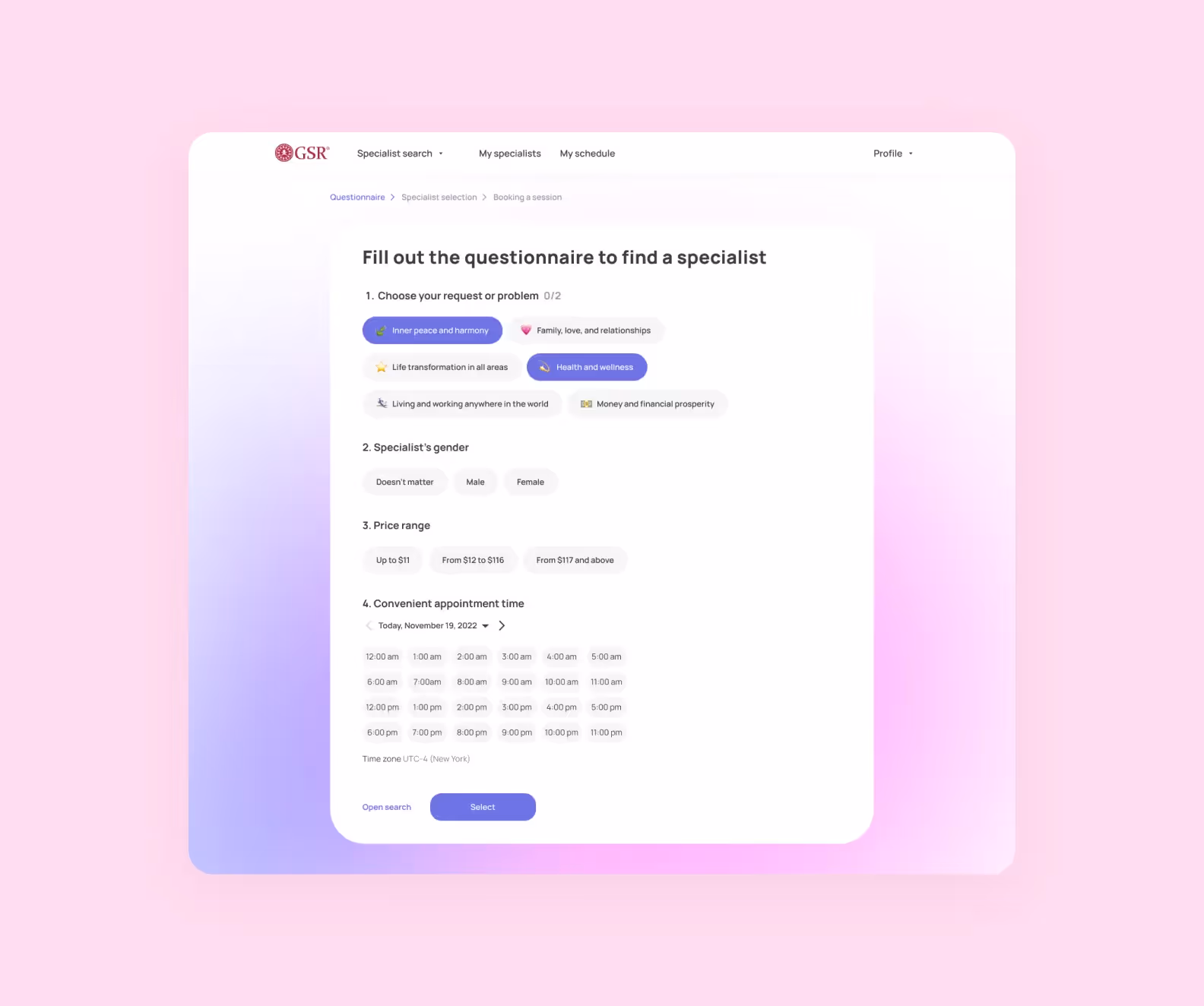
We designed an MVP platform for GSR psychological consultations with a focus on simplicity and user comfort. The design featured a clean, minimalist interface using purple as the main color. It’s a self-sufficient choice that works well across different devices without becoming dull or expressionless. For elements requiring attention, we implemented purple gradients on call-to-action banners.
The user journey was streamlined with a simplified questionnaire using prepared answers to avoid overwhelming users who might be in vulnerable mental states.
The “one screen, one action” approach reduced cognitive load, while responsive design ensured the experience remained consistent across devices.
<div class="post_divider"></div>
Your website must function seamlessly across devices, from desktop computers to smartphones. More than half of healthcare searches happen on mobile devices, often in urgent situations.
Ensure that appointment booking, form completion, and information finding work equally well on small screens. Test your site on multiple devices and browsers, paying special attention to critical pathways like appointment scheduling and finding contact information.
A healthcare app can complement your website by providing dedicated mobile experiences optimized for on-the-go access.
In healthcare, slow websites can have serious consequences. Optimize images, minimize HTTP requests, leverage browser caching, and consider using a content delivery network to improve loading speeds.
Prioritize the loading of critical elements like contact information and emergency instructions. A fast-loading site in healthcare emergencies could literally save lives.
These standards aren’t just legal checkboxes. They’re essential safeguards that build trust and protect users.
The Health Insurance Portability and Accountability Act sets rules for protecting patient health information. A website must secure any collected patient data, implement access controls, maintain audit trails, and use proper encryption.
Forms collecting medical information, patient portals, and appointment systems need special attention to stay HIPAA-compliant.
The Americans with Disabilities Act and Web Content Accessibility Guidelines ensure your site works for everyone, including people with disabilities. This means providing text alternatives for images, ensuring keyboard navigation works, maintaining sufficient color contrast, and creating a structure that screen readers can interpret correctly.
Secure Sockets Layer/Transport Layer Security encryption creates a secure connection between your website and visitors’ browsers. This protection, indicated by the padlock icon and HTTPS in your website address, prevents third parties from intercepting sensitive information like personal details or payment information.
Clear privacy policies explain how you collect, use, and protect patient information. Cookie consent mechanisms allow visitors to control what data is collected about them. Both elements should use plain language and be easily accessible throughout your site.
Proper UX design in healthcare make websites more helpful, accessible, and engaging. These trends focus on creating more human-centered digital experiences, so let’s see what they are.
Artificial intelligence tailors content to individual user needs. For instance, a patient researching diabetes might automatically see specialists in that field when browsing the provider directory. This personalization helps patients find what they need faster while feeling more understood by their healthcare provider.
As voice assistants become commonplace in homes, healthcare websites are incorporating voice search and navigation options. This technology is particularly valuable for patients with mobility limitations, visual impairments, or those who simply prefer speaking to typing.
Small, satisfying responses to user actions make healthcare websites feel more responsive and reassuring. These micro-interactions are subtle animations when completing a form field or visual confirmations after scheduling an appointment. They provide immediate feedback, reducing anxiety and uncertainty.
Dark mode options, reduced blue light emissions, and careful typography choices help users who may be browsing while experiencing symptoms or reviewing medical information for extended periods. These considerations acknowledge that many website visits happen during illness or recovery when eye strain is particularly problematic.
These five examples of healthcare websites blend functionality with trust-building elements. You can use them as inspiration when considering design options for your own website.
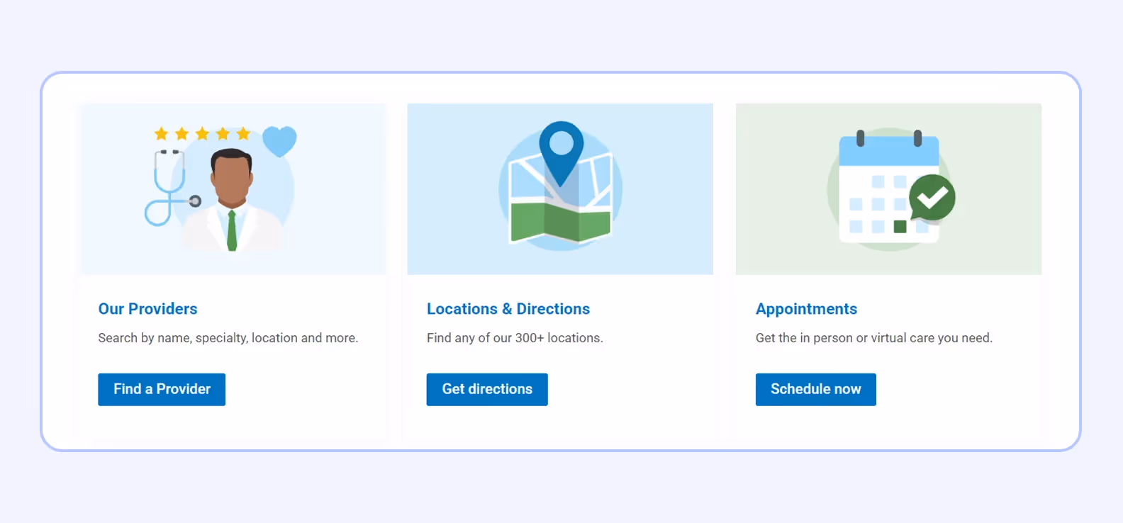
The site provides information from the patient’s perspective rather than around the organization’s structure. Their standout feature is the trio of large action tiles that help users immediately find a doctor, get directions, or schedule an appointment — eliminating friction at critical decision points.
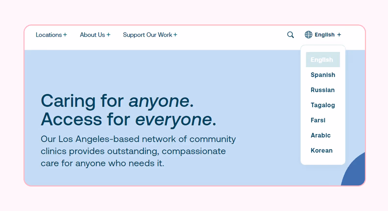
Saban Community Clinic demonstrates how healthcare websites can effectively serve diverse communities. Their multilingual toggle feature allows instant translation of the entire site, making healthcare information accessible to their multicultural patient population.
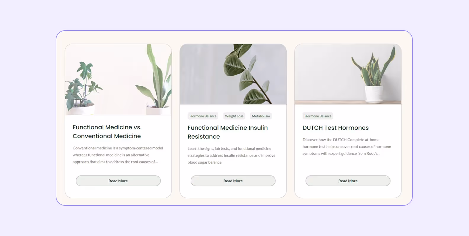
Root Functional Medicine’s website features clearly organized, visually appealing blog content that explains functional medicine concepts. The site effectively uses illustrations and simple language to help patients understand their methodology before the first appointment.
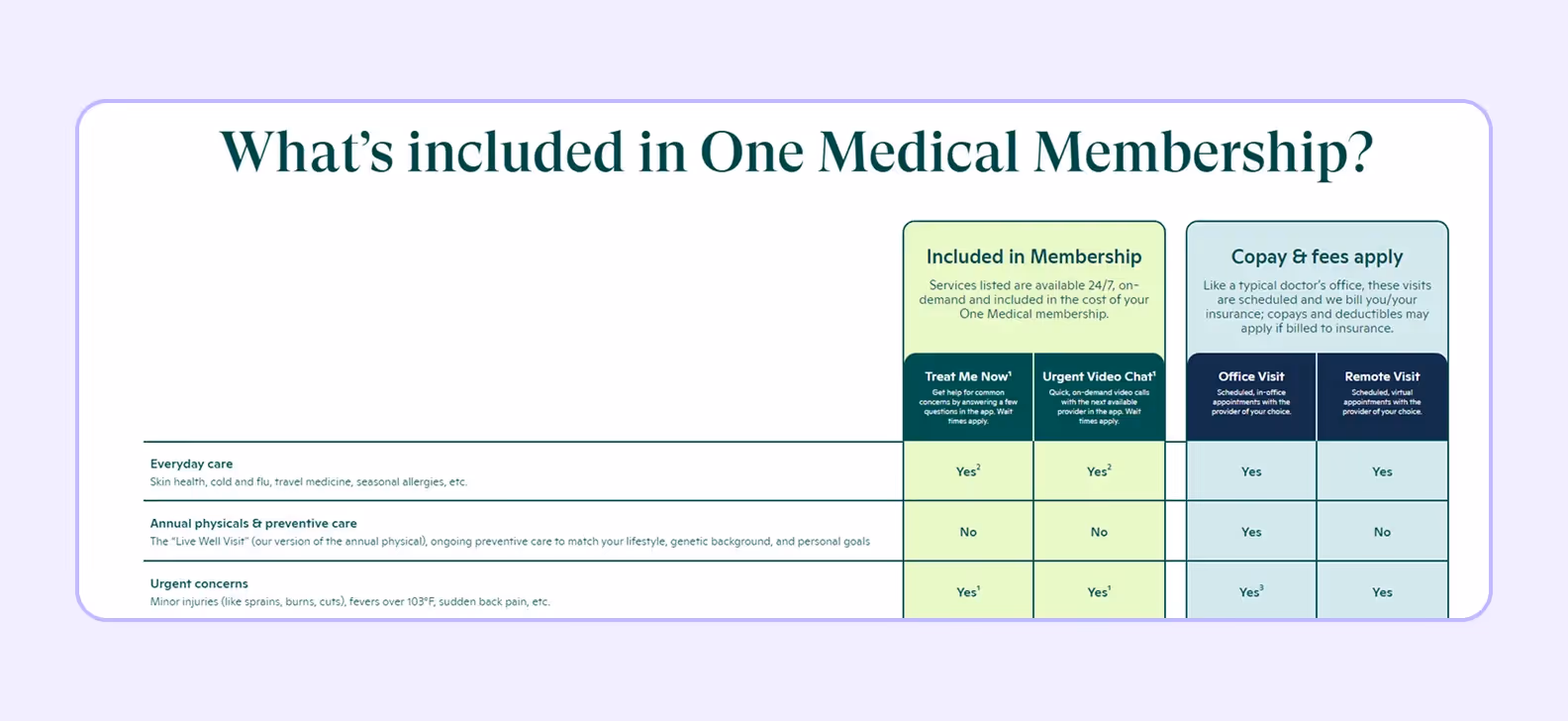
One Medical’s standout element is how they clearly present membership benefits, costs, and insurance information without requiring users to dig through multiple pages. This upfront approach to potentially complex information builds immediate trust and helps patients make informed decisions before committing to care.
BetterHelp’s website stands out with its thoughtful green color palette that creates an immediate sense of calm and trustworthiness. Their strategic use of varied green tones, from lighter mint shades to deeper forest hues, establishes an emotional connection before users read a single word.
Creating a healthcare website is an investment that varies widely based on your needs, features, and who builds it. Here’s the general price ranges can help you budget appropriately.
Remember that these prices typically don’t include ongoing costs like hosting, maintenance, and content updates.
The most cost-effective approach is often to start with essential features that directly improve patient experience and administrative efficiency, then expand your site as your practice grows.
A well-designed healthcare website balances technical requirements with human needs. By focusing on accessibility and trust-building elements, you can create a space that genuinely helps patients while supporting your practice’s goals.
Remember that your website isn’t just a digital brochure — it’s an extension of the care you provide.
➡️ Purrweb is ready to design your healthcare website or app. <a class="blog-modal_opener">Fill out the form</a> and get a free project estimation in 48 hours!

.svg)


-min%20(1)%20(1)%20(1)%20(1).avif)