
Alexander Shulgin, Purrweb managing partner, explains how to avoid ‘popular’ mistakes and create a truly thoughtful mobile app interface.
It’s good to learn from the mistakes of others. Plus, it brings financial benefits. This guide will help you save users’ nerves and make less mistakes in UX app design.
Too big/small buttons
Buttons are common design elements that help users interact with the app interface. By tapping on a button they can upload a Story, record a voice message, or make a purchase.
Button size varies depending on the user’s action and its priority. Buttons that help users navigate through the app to complete a task must be bigger than destructive action buttons (such as Cancel or Close).
If you can’t hit the ‘Next’ button 5 times in a row, while the ‘Close’ button is tapped often and by mistake — that’s a problem.
How to choose a proper button size and improve user experience? Major market players offer their own recommendations. According to Apple’s guideline ( Human Interface Guidelines), the size of CTA in mobile interfaces should be not less than 44×44 pixels, while Microsoft recommends sticking to 34px size with a minimum clickable area of 26px.
You can use heatmaps to check if the button size is appropriate. These UX design principles will help you find out where exactly users tap and understand why they miss important buttons.
Take a look at how we managed it in one of our projects: on the bottom of the screen, there are three buttons of different sizes. Refresh and Location buttons are secondary buttons — their size is only 44x44px, while the Rent button is the primary button — its height is 52px and it has a bigger clickable area.
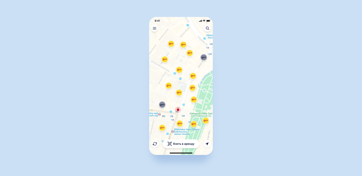 This is the design we made for Energo — a powerbank rental app. Check our portfolio to see more of our projects.
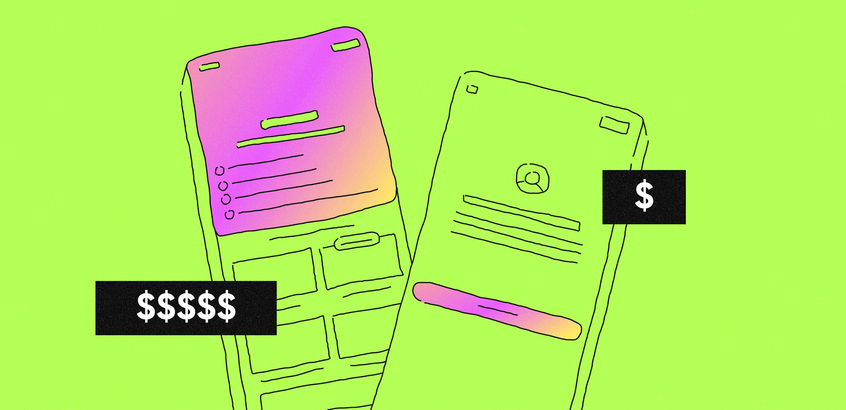
Too many requests
You can’t get access to users’ ‘resources’ without their permission. When an app requires access to camera, location, or microphone, users get a request in a modal window.
Will they allow or deny access — that depends on the user and on the approach you chose to get it.
Users won’t enjoy it if you flood the app with requests. Just imagine: you run an app and get a ton of messages like ‘need access to the contacts’, ‘and the camera’, ‘and the micro too’. It’s just like dealing with a very persistent tech salesman who’s badgering you to take the warranty — and you only wanted to take a look at the new MacBook 16.
If you don’t want to scare users away, you need to be in the right place at the right time. Don’t ask for access right at the start — make sure that your app requests permission only when the user wants to use a particular function.
Complex onboarding
Onboarding is a quick way to introduce the app to users. It showcases the app’s main functions, key benefits (what makes it stand out from competitors), and useful features (for example, hotkeys). It’s an important step in the UX design process.
If you want to encourage users to stay, it’s important to take care of them — don’t turn the ‘introduction tour’ into torture.
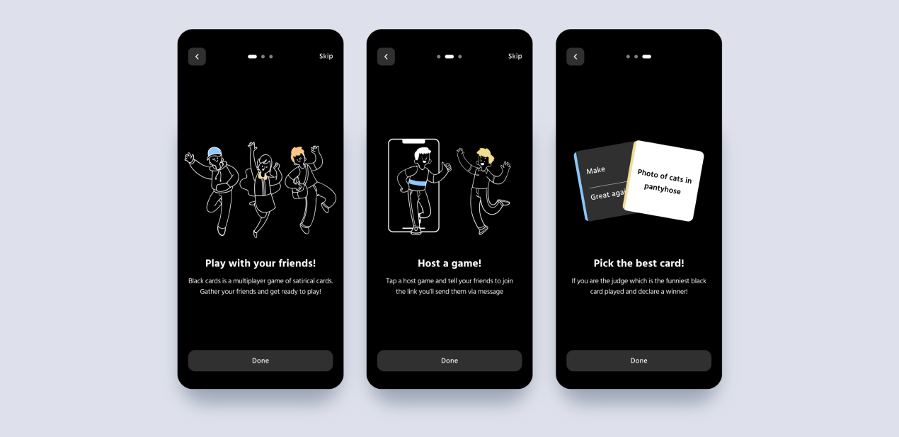 It’s a card game app we designed at Purrweb which allows users to skip the onboarding
Tips are a good way to guide users through the process. But what if the user has updated his/her smartphone and wants to download the app again? The rule ‘repeat actions make perfection’ stops being so definite in the context of UX app design.
To create a truly thoughtful app onboarding, let users decide whether they want to learn about your app or not. Guide them, but don’t be pushy — users who are already familiar with the app will appreciate it.
No autofill
Form is an important element of UX app design. You use them to subscribe to something, to sign up for an app, purchase goods, and much more.
Any form is like a conversation. It can irritate users or become a pleasant experience for them — everything depends on you. You should be consistent and refrain from asking the same questions again and again.
A good form ‘memorizes’ user’s information: name, address, passport details. It’s painful to fill out the form fields every time you use the app. The best solution is to save the user’s information and fill the fields automatically. The user can update the info when it’s necessary.
Inactive input fields
As we have said before, a form is much like a conversation. If you want to design a polite form — make sure that users don’t need to enter their info multiple times. Another good idea is to take the lead and start the ‘conversation’ yourself.
For example, the user opens a page with only one input field. Instead of making him/her tap on the screen, make this field active right after the page is opened.
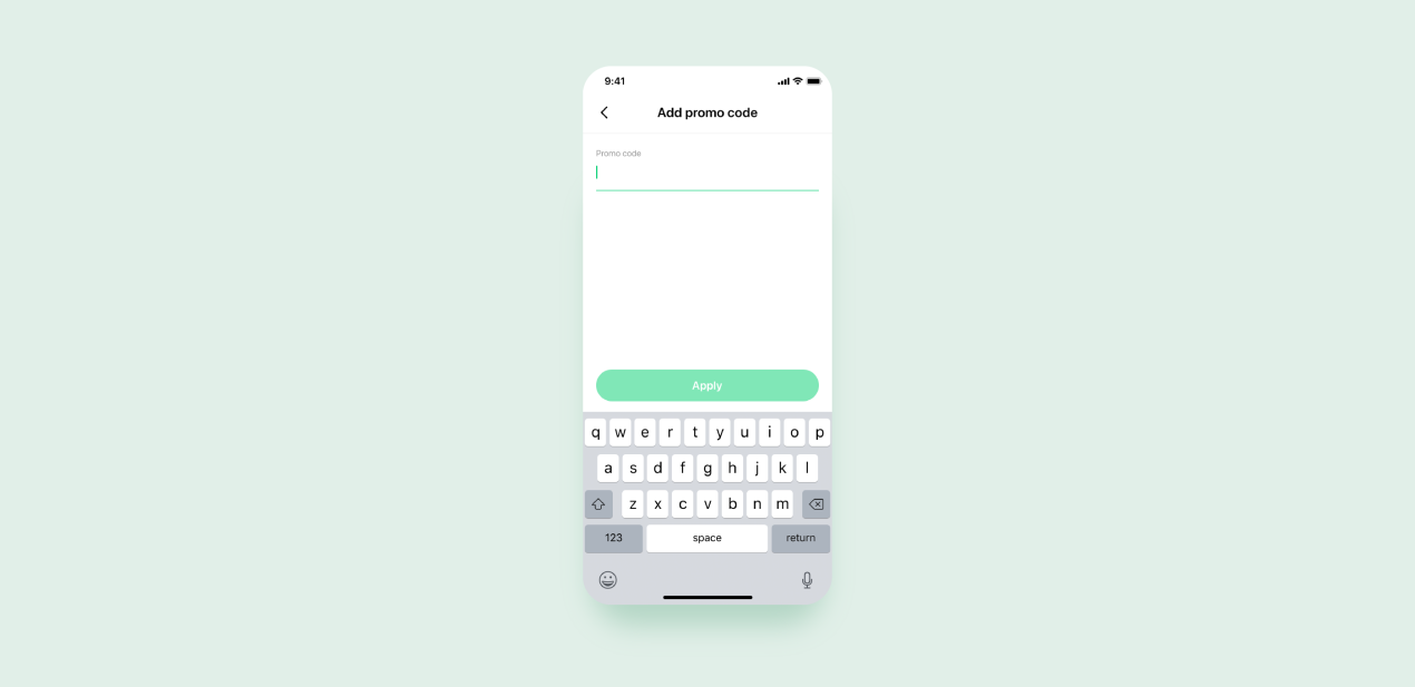 This is how we designed the active input field for Zapp , a powerbank rental app
Indifferent design
The intuitive and good-looking interface doesn’t make sense without response. It’s like talking to someone who looks right through you and doesn’t react — you start wondering if this person is actually listening to you. Sharing your impressions and not receiving a response makes you feel frustrated.
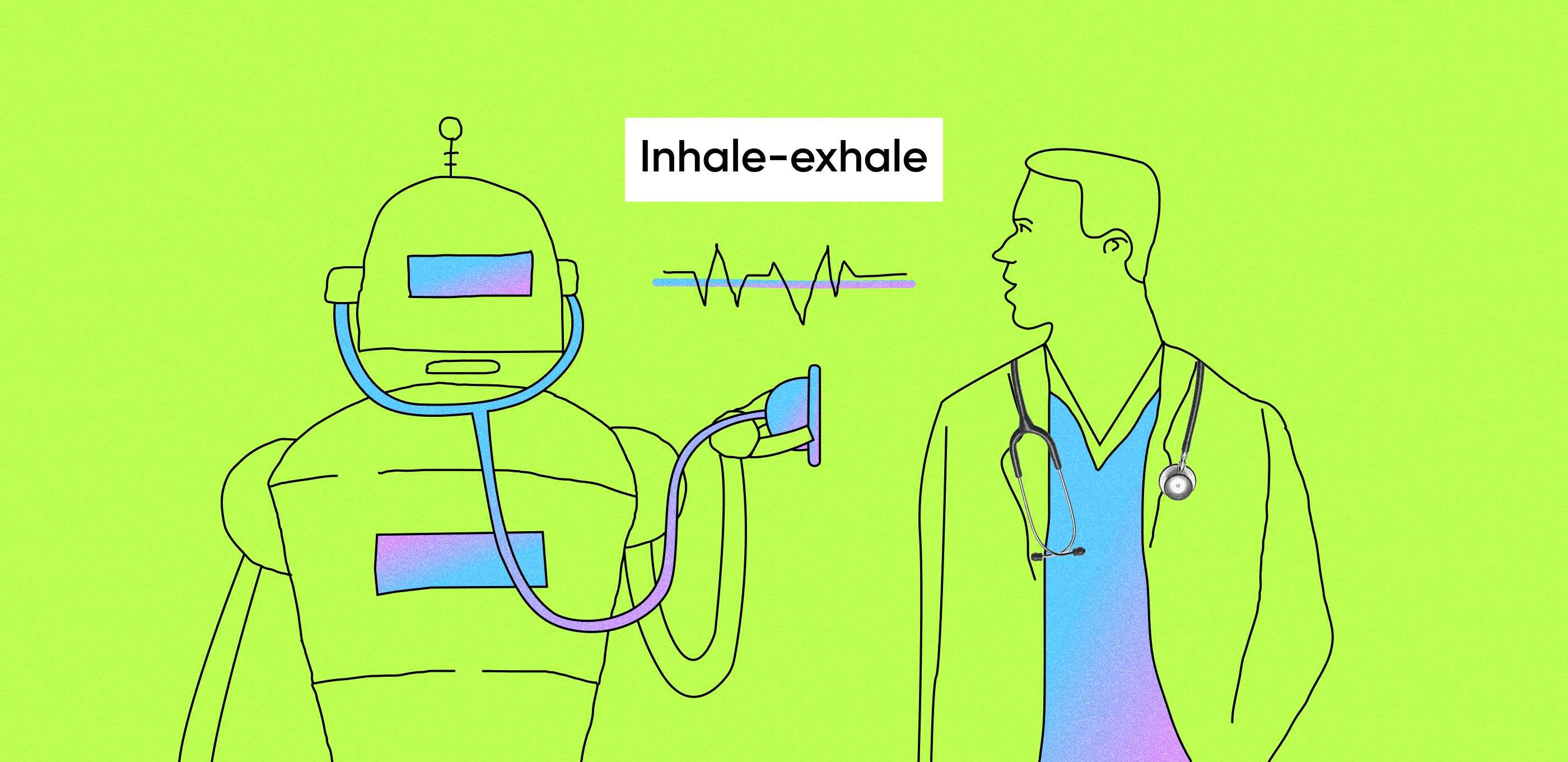
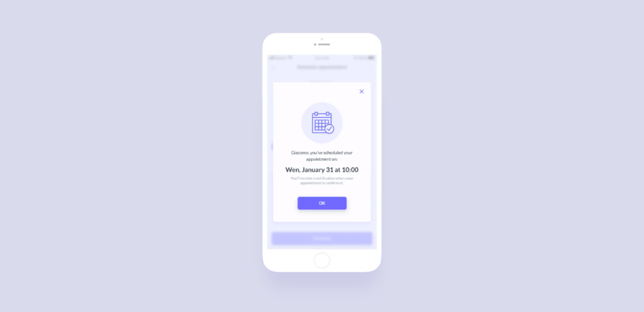 Visual response strongly affects the product experience. This is how we reward users for their actions in Lytic, a medical app.
You can use micro animations to visualize users’ actions or confirm a process — for example, when the user leaves a comment or refreshes a page. This way you can increase user engagement and level up the quality of UX app design.
Inconvenient way to enter information
People tend to avoid obstacles — seems to be simple and clear, but development companies that provide UX design services often forget about this fact.
When you offer a standard keyboard with letters, numbers, and emojis for any purpose, you risk to create a big obstacle. If users are forced to ‘get through’ this obstacle, they feel irritated.
You can and should move these obstacles out of their way! Just customize the keyboard for every type of request. When users need to enter numbers — offer them numbers. When they need letters — offer letters. It will make users’ interaction easier, speed up the process and users will make fewer mistakes.
How to get the best results
In conclusion
It’s not enough to create a good-looking interface. Make sure that your product is not only beautiful but also simple and easy to use: it must solve users’ problems with minimum effort. Take care of the users and you’ll get conversions!