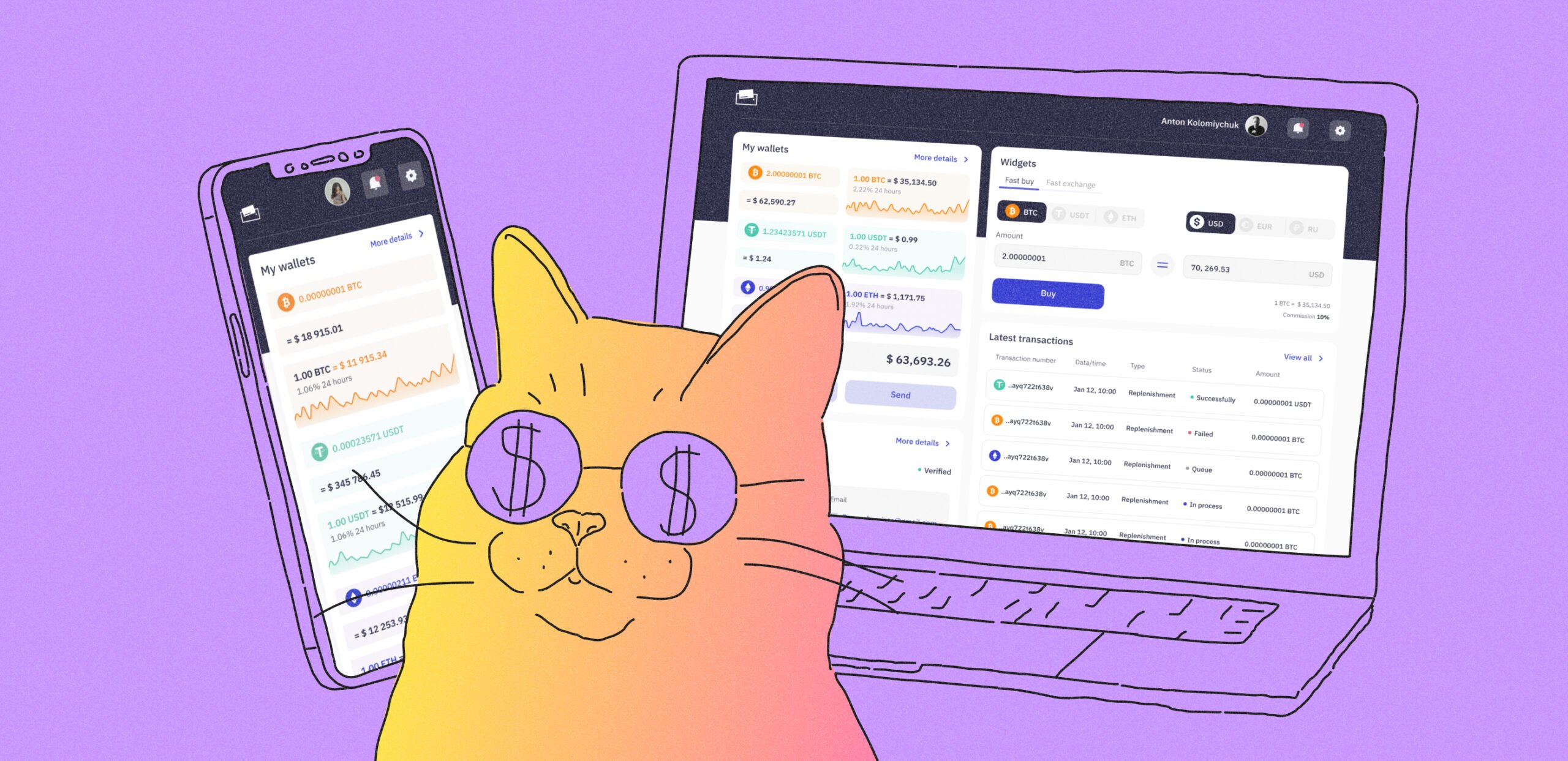
A cashback service for friends
A client from Israel approached us. He already had his cashback service up and running, but the conversion rates were pretty low. The client asked us to conduct a UI/UX audit of the app and develop a new design that would address the conversion issues.
The idea is that users receive cashback when they make purchases through the app at partner stores. If they want to increase their cashback, they can invite friends to join the app and form a group. So, each member of the group receives a higher cashback.
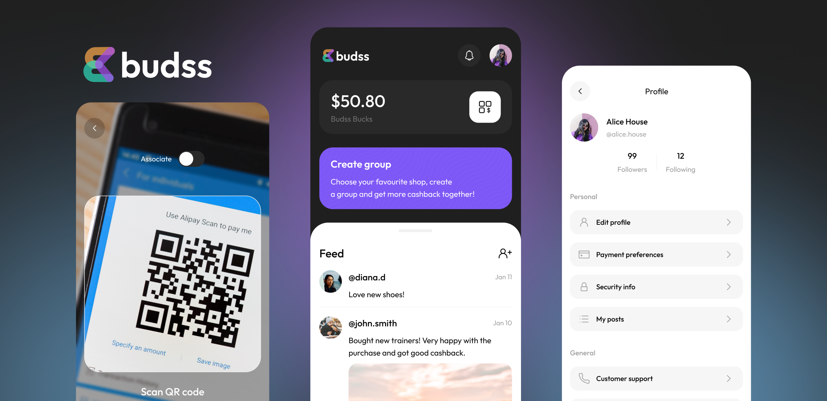
It’s easy to earn cashback and increase it in the app
If someone’s friends aren’t interested, it’s possible to find like-minded individuals directly in the app. Here, there is a feed and the option to share posts about your purchases. This way, users with common interests and favorite stores can follow each other and join together to form a cashback group.
The in-app social network brings together users with similar shopping preferences
We had three interesting tasks to accomplish:
- Conduct an audit of the previous design of the app. Understand what specifically was hindering users and reducing conversions.
- Develop a design that would be modern (reflecting the innovative nature of the app) and seem trustworthy enough for users to conduct financial transactions through it.
- Combine elements of a social network and a fintech app, ensuring they complement rather than contradict each other.
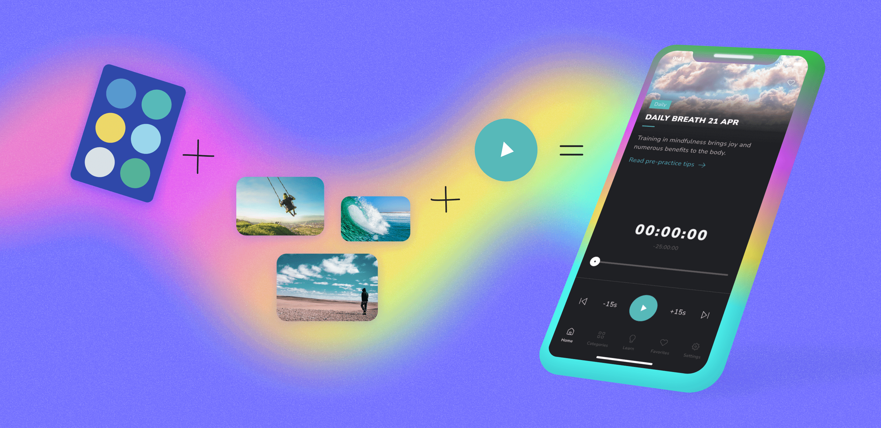
User flow of the app
We started working on the design by figuring out the business logic of the app. As a result, we got such user flow:
- The user registers and adds a payment method.
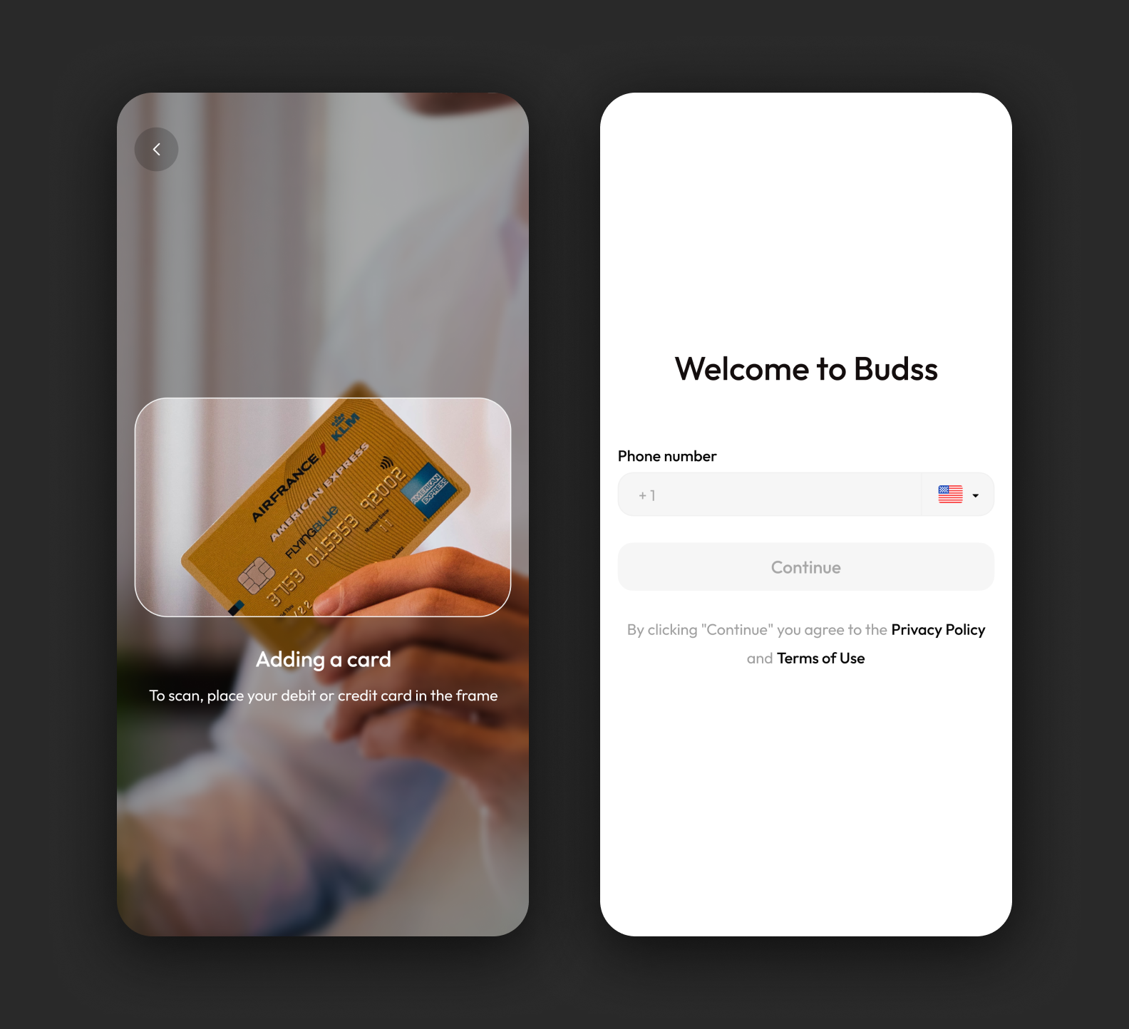
Account creation is quick, requiring just a few simple steps
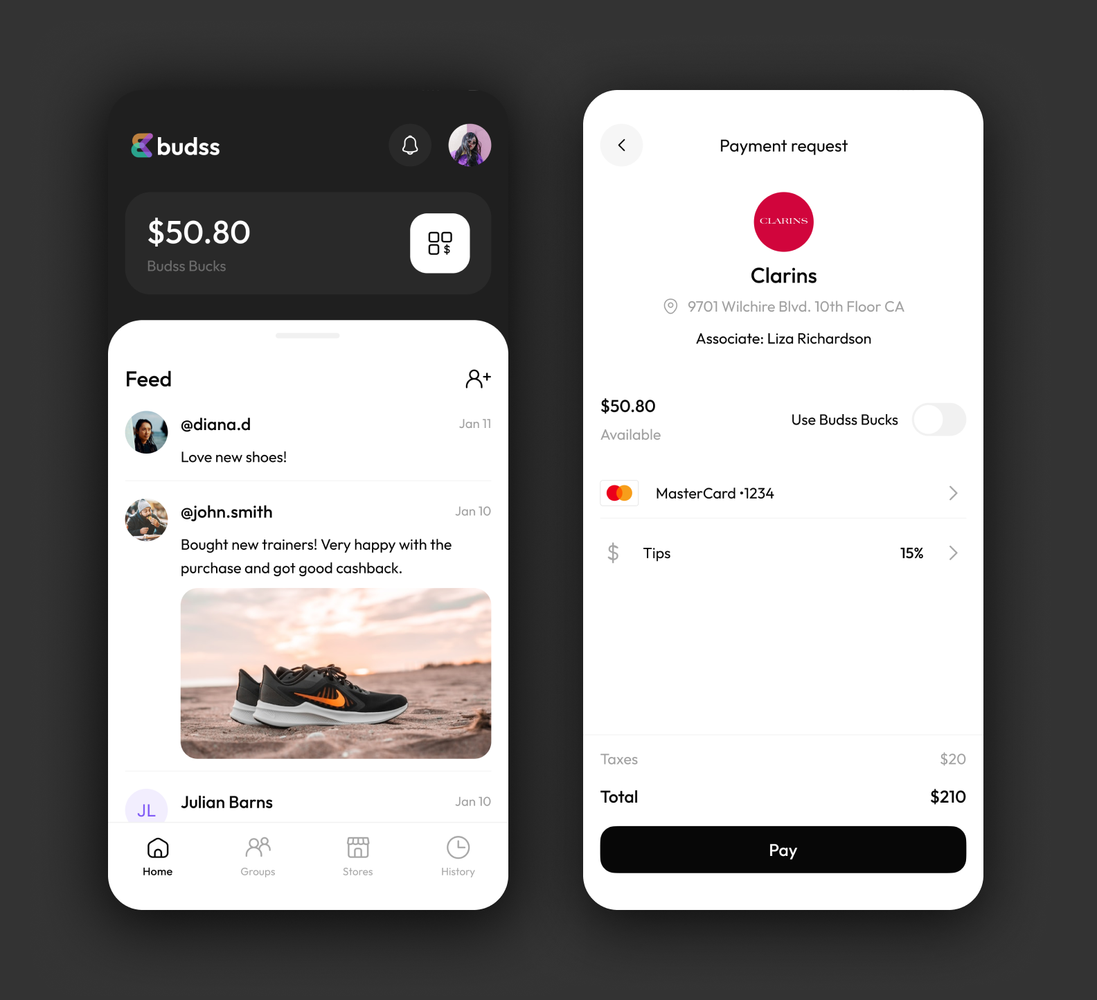
2. The user scans a QR code on the terminal and gets cashback after paying through the app.
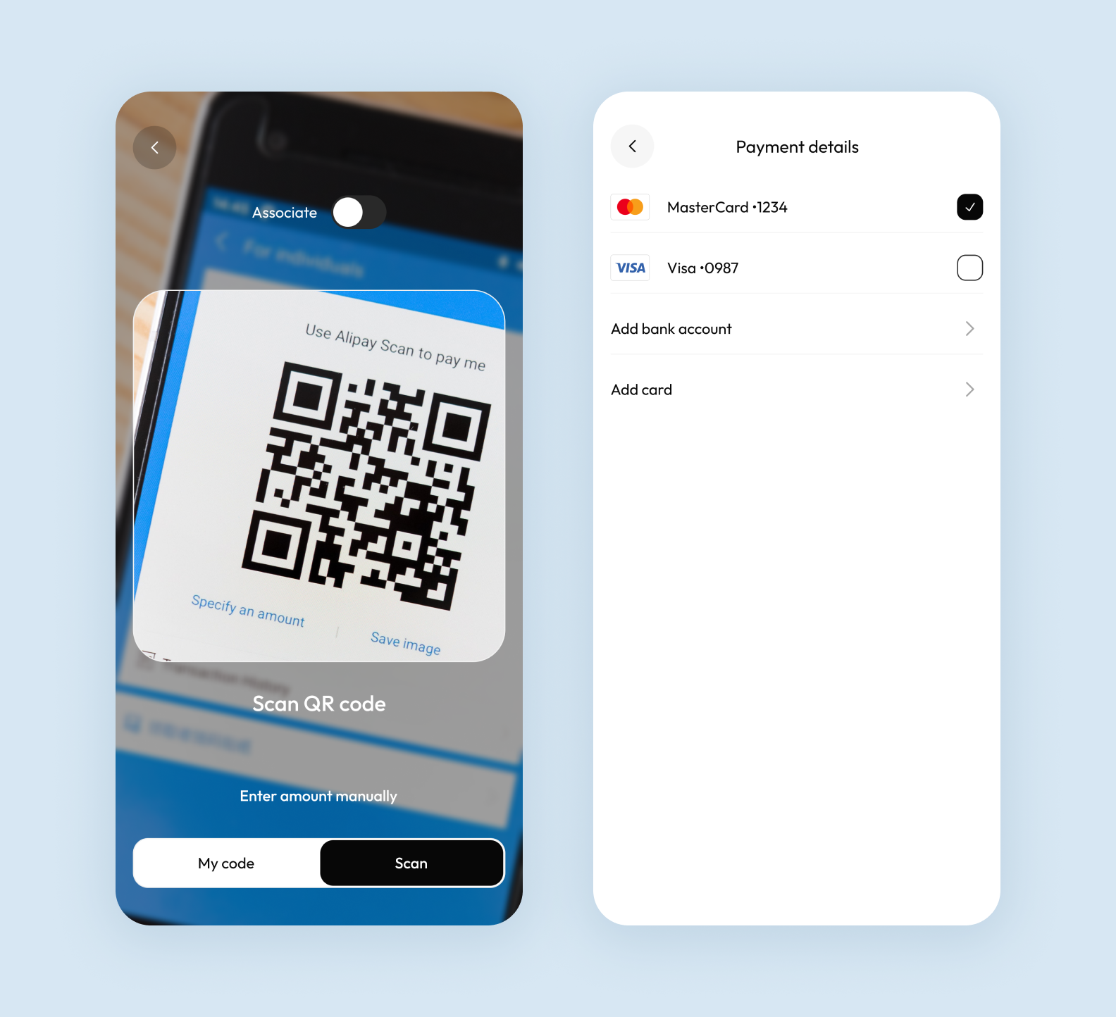
Payment should be processed through the app for the user to receive cashback
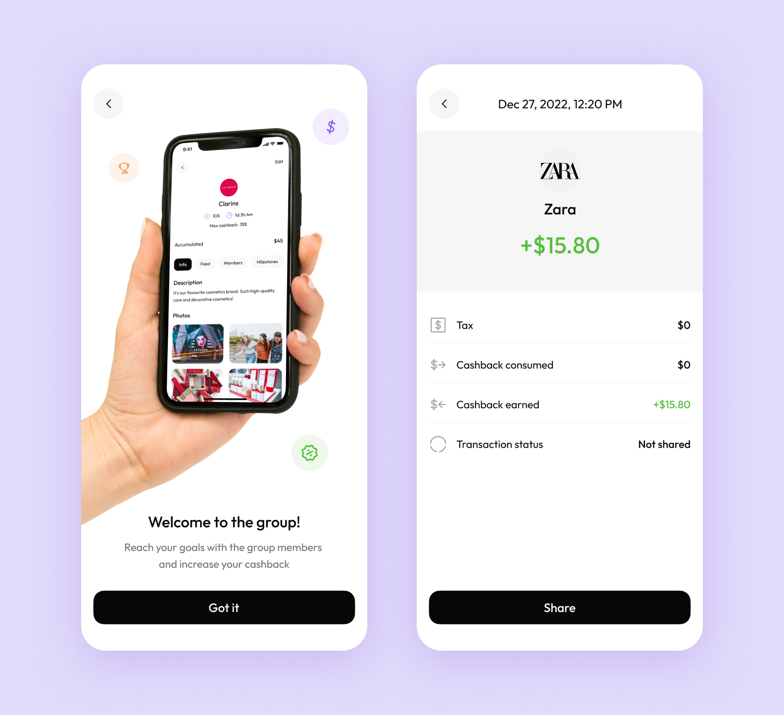
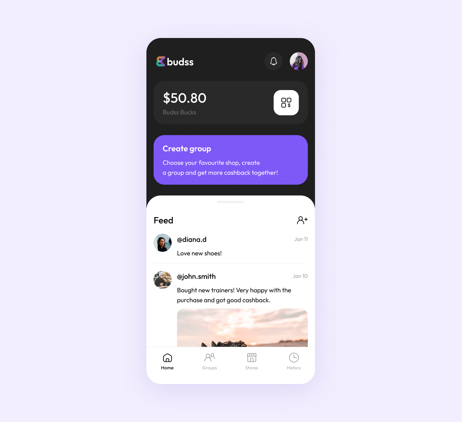
3. The user creates a group with several users to get more cashback.
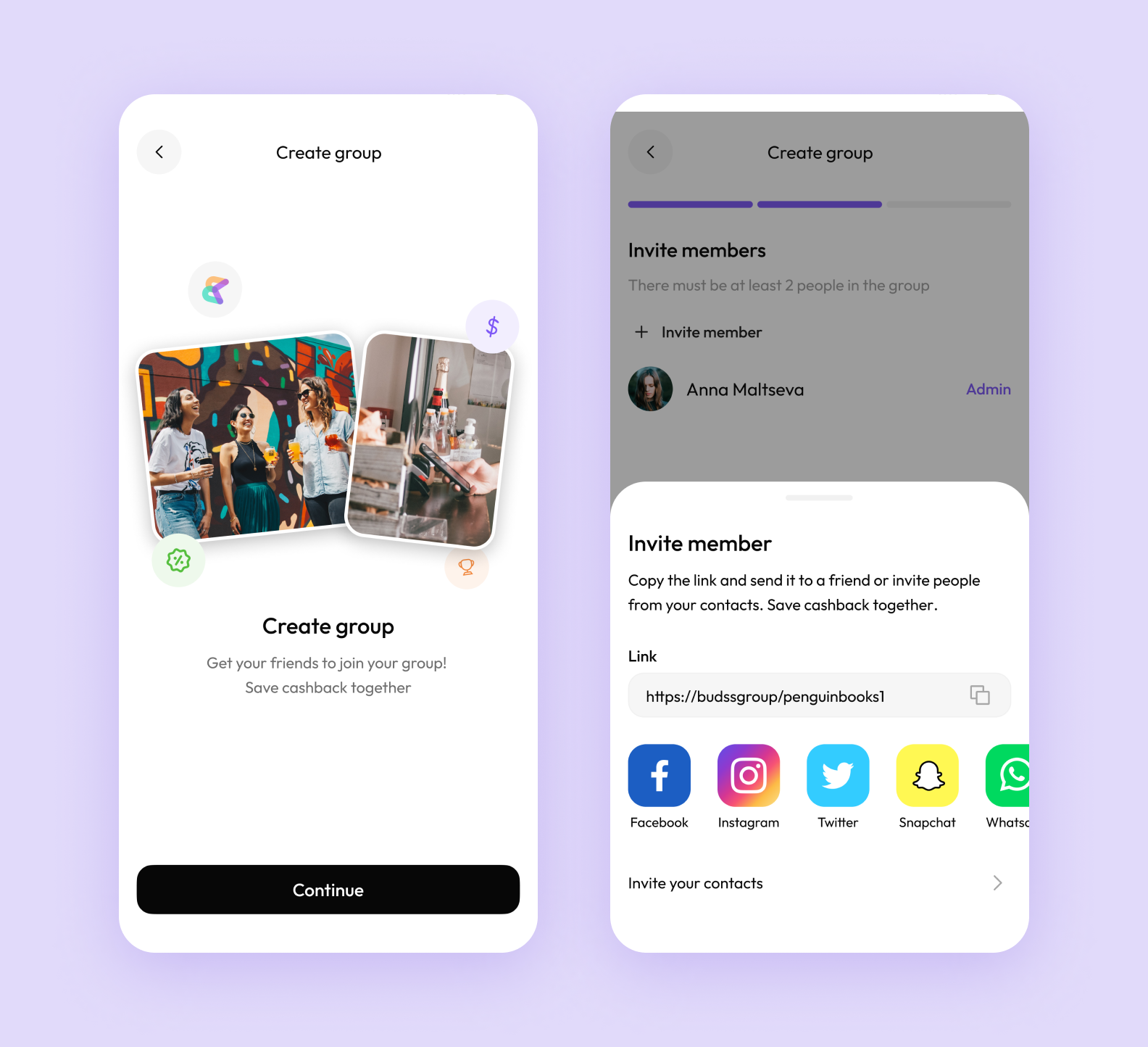
Just send a link to your friends to invite them to the app
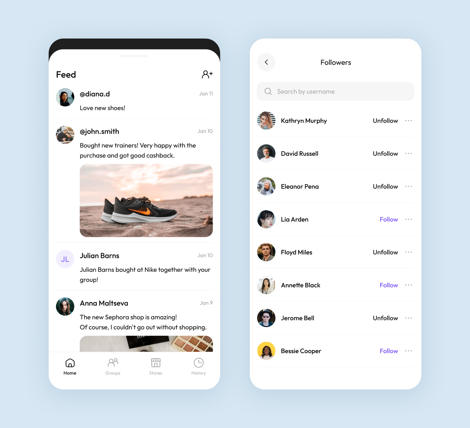
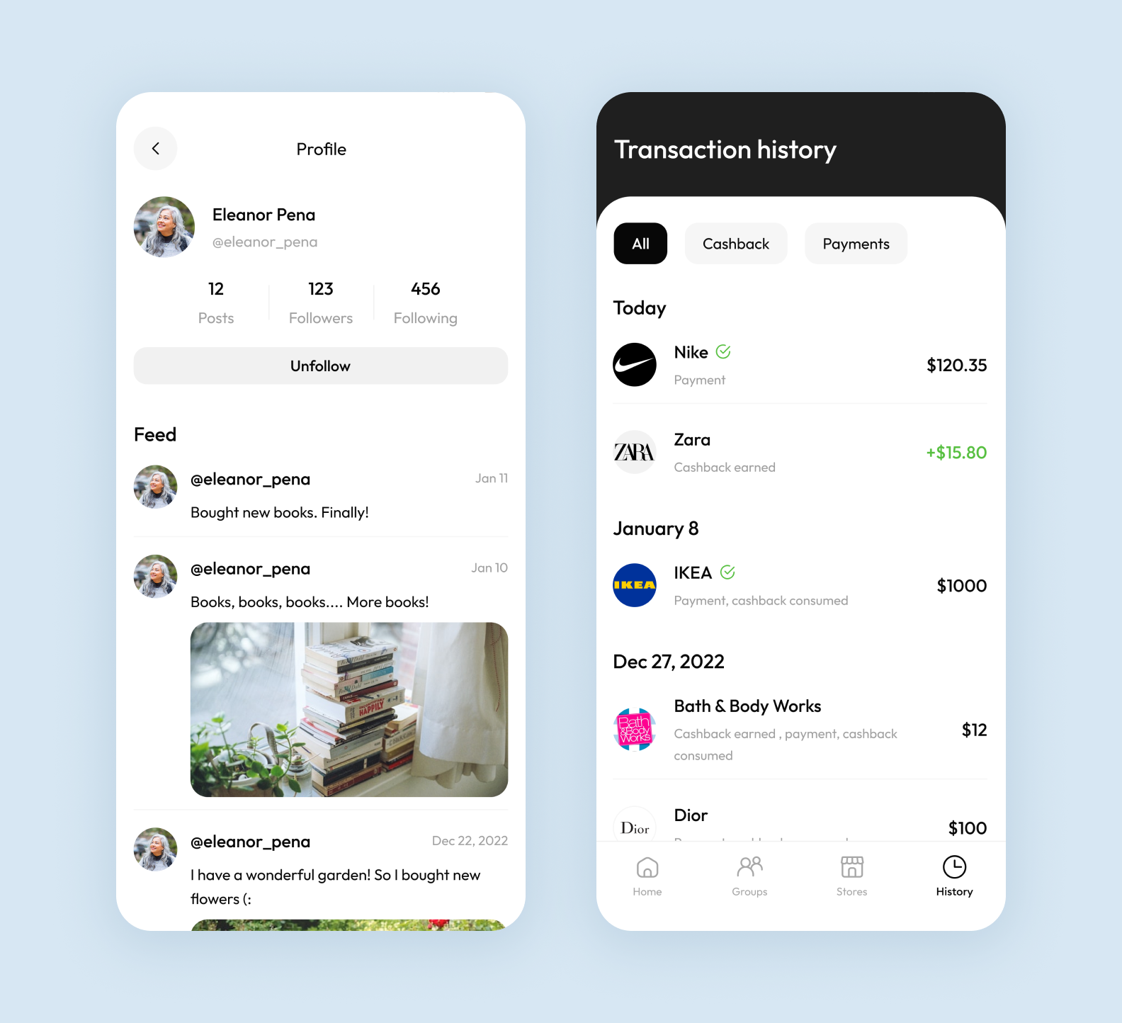
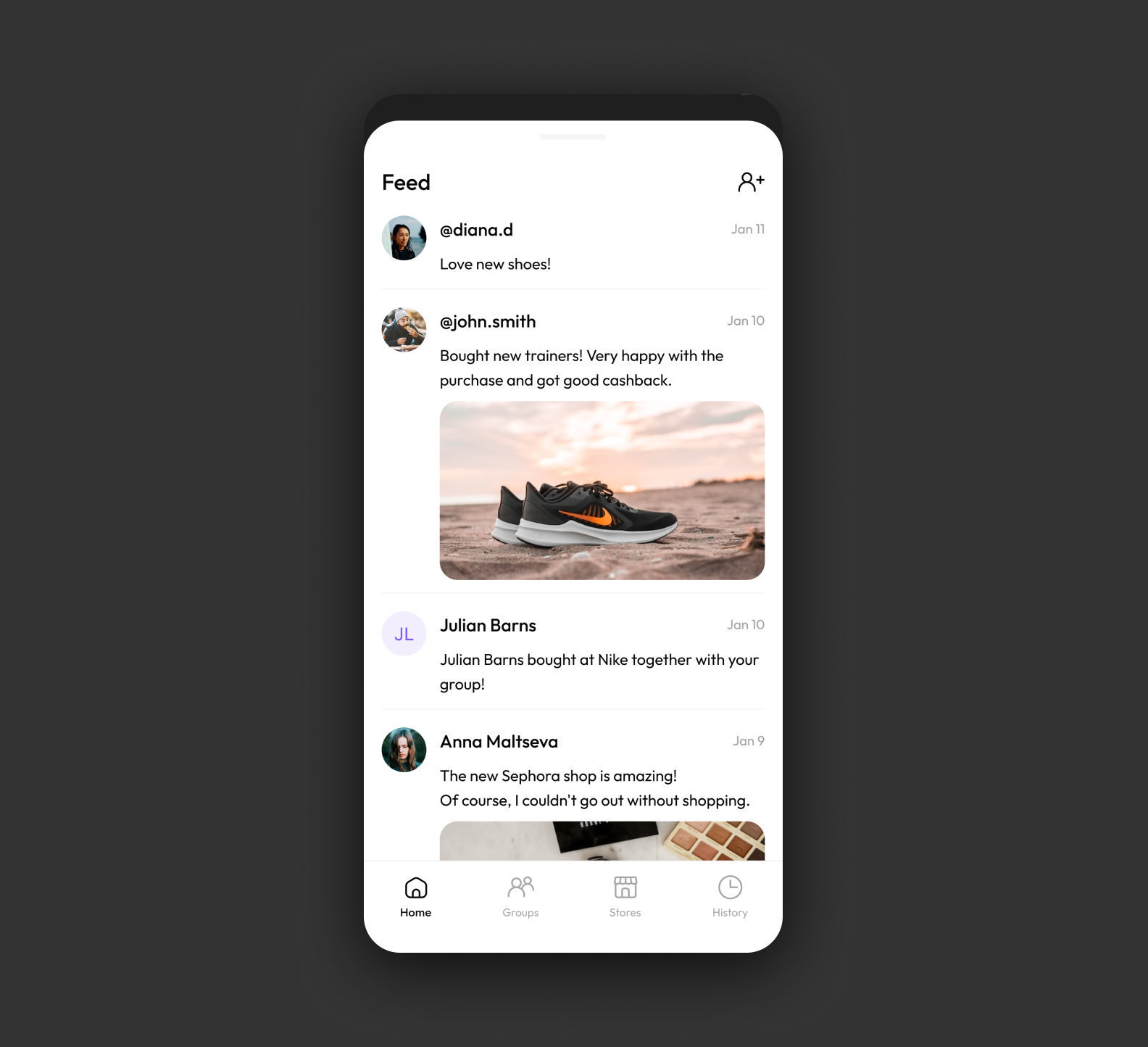
4. The user shares posts about recent purchases to attract more members to the group.
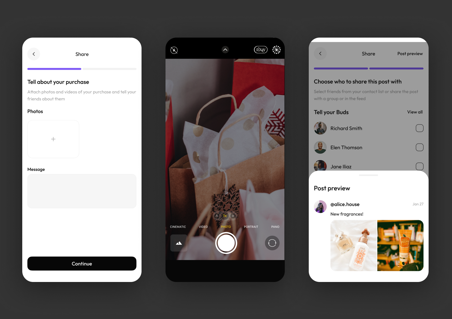
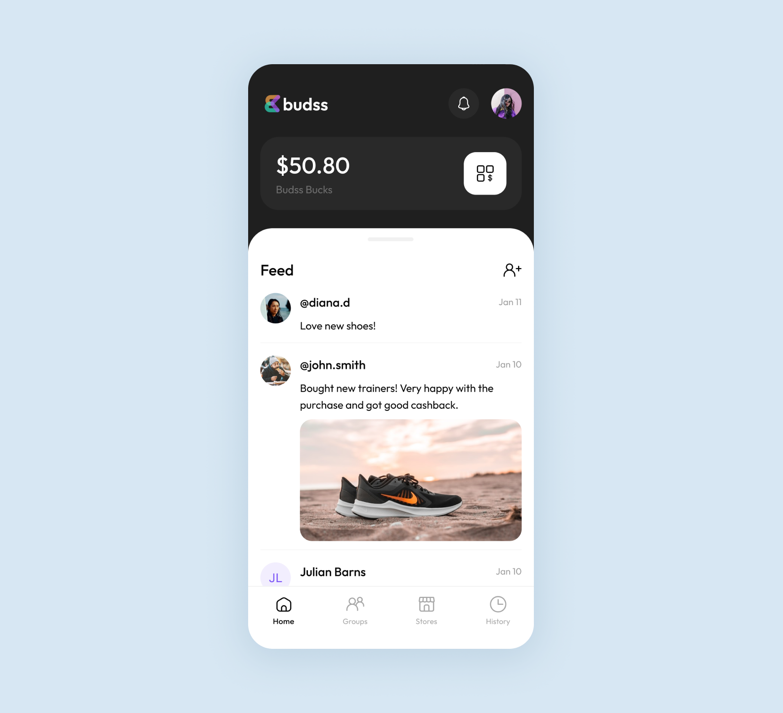
Users can get cashback and find some shopping ideas in the app
5. The user scrolls through the feed, follows other users, and joins their groups to gain more cashback.
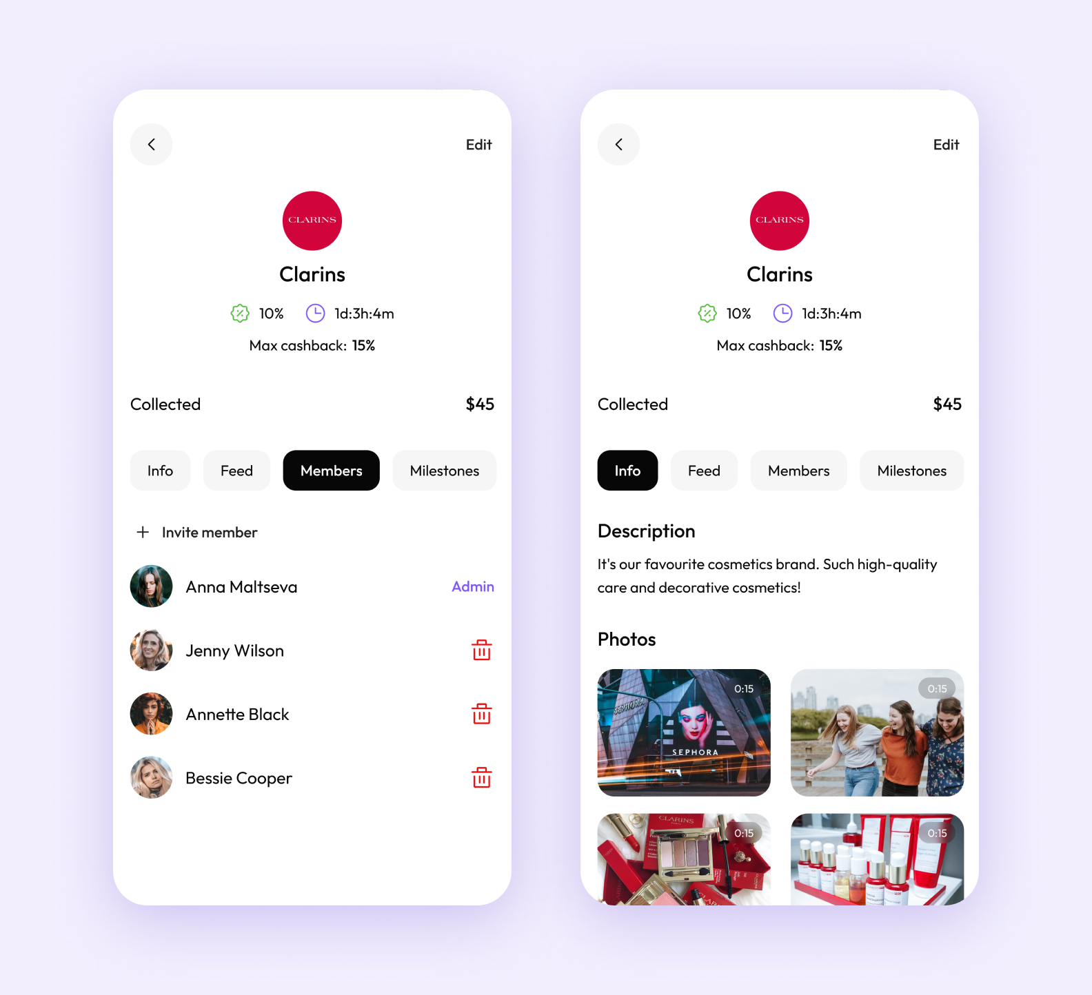
The group preview shows all the necessary information: the name, cashback percentage, and participants
How we conducted a UI/UX audit
We can’t show the design of the initial version of the app by the client’s previous team as we respect our colleagues. We’ll only mention that some decisions harmed the conversion rates.
For example, the screens were visually overloaded. The app combines elements of both a financial app and a social network. Merging them isn’t really easy. As a result, it was hard to navigate, and the overall call to action was lost. Users were confused and didn’t understand what steps to take to get the benefit that they downloaded the app for.
Additionally, the design looked outdated. It seemed like the app hadn’t been updated for several years. This raised concerns among users. They didn’t want to trust their finances to an application whose security measures might be as outdated as its visual side.
We shared those and other thoughts with the client. He agreed and mentioned he also supposed that something was wrong with the design. However, our expert analysis helped break down the issues into specific areas that needed attention.
We suggested reorganizing the interface to make the app more user-friendly and modern. So that users could easily navigate the app and receive cashback in a few taps. We also aimed to make the app visually appealing for users to open the app again and browse through the feed with pleasure.
How we tackled the challenge with our design
Let’s have a look at our eight design solutions that attract users and help them easily navigate the app:
1️⃣ We developed a concise interface following Apple’s guidelines. The app doesn’t seem cluttered despite its diverse range of functions.
The client wanted us to follow Apple’s design guidelines
2️⃣ The black-and-white interface looks sleek and modern which matches users’ expectations from a financial application.
The color scheme
3️⃣ We added a touch of emotion with purple and green accents. Still, the colors aren’t too bright to maintain a consistent business style.
There are purple and green accents in the app
4️⃣ The Outfit font is easy to read on the screen, even when you’re in a hurry and need to make a purchase through the app quickly. The sans-serif letters and numbers look neat but not overly formal. The font fits well both in the user’s balance block and in a post next to vibrant photos.
The Outfit font in the app
5️⃣ We visually divided the start page into two parts: the black and the white one. The functions related to gaining cashback are on a black background. The feed (the social part of the app) has a white background.
6️⃣ The purple Create group button is a bold accent, but it can be easily hidden if desired. On the one hand, the button helps to increase cashback. On the other hand, it facilitates interaction with other users. That’s why we placed the button in the middle between the two functional blocks.
The clear CTA helps users navigate the app
7️⃣ The user quickly navigates through the Payment details and makes payments at the checkout without any fuss. There’s a list of payment methods with checkboxes. The user can easily understand which one of them is selected.
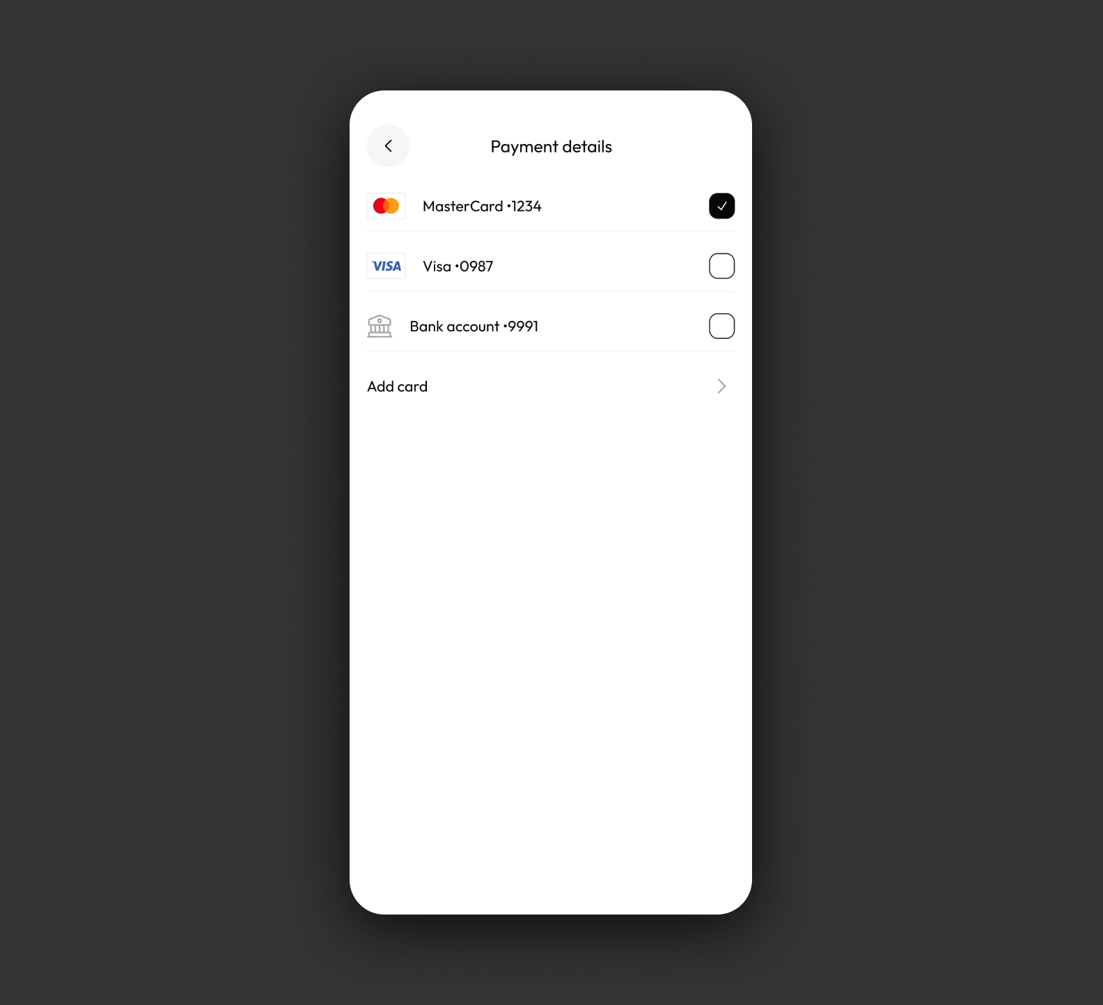
The Payment details screen design
8️⃣ The user can expand the feed with posts to full screen. So that it looks familiar, just like in other social networks.
The feed design
The result in 1 month
In a month of working with us, the client obtained a fully completed design concept with all the necessary screens and UI elements. We successfully merged the social network and financial app elements as well as created a modern and user-friendly interface.
The design is technically feasible. The screen content aligns with the planned features.
Now, our client uses the design concept to illustrate his app idea while presenting it to potential investors. He told us:
I wish I had known about you when I only started developing the app. This way, I wouldn’t have to deal with the previous team’s mistakes.
The client got really inspired to continue working with us and requested a widget design for the app. He also asked us to design and develop a website.
Now, we’re discussing our plans for developing the new app that we’ve designed.