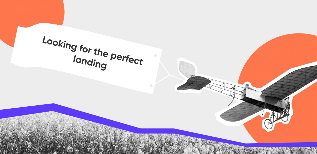
Does a startup need a landing page? (You bet.)
A landing page is usually just that, a what-you-see website that is supposed to motivate clients to buy products, register for events, leave manager assistance requests and so on. The purpose is to promote one particular product or service. All sorts of companies, from startups to market leaders, accompany their releases with such pages, because they are perfectly tailored to the occasion:
- Showcase only one product. Its advantages, the offer and the call to action are all in the same place;
- The user’s attention has nowhere to wander, so the route to conversion is short;
- It is possible to segment the target audience. If you are running a dog-walking service, your employees probably go out with all kinds of dogs: mongrels and purebreds, whiffets and big hounds. But for better conversion you can paradrop your audience on different pages: one oriented at the people who have no time or leisure to walk their own dogs, another at pedigree owners and so forth. Customers will have their doubts cleared right away and be more likely to take advantage of your offer.
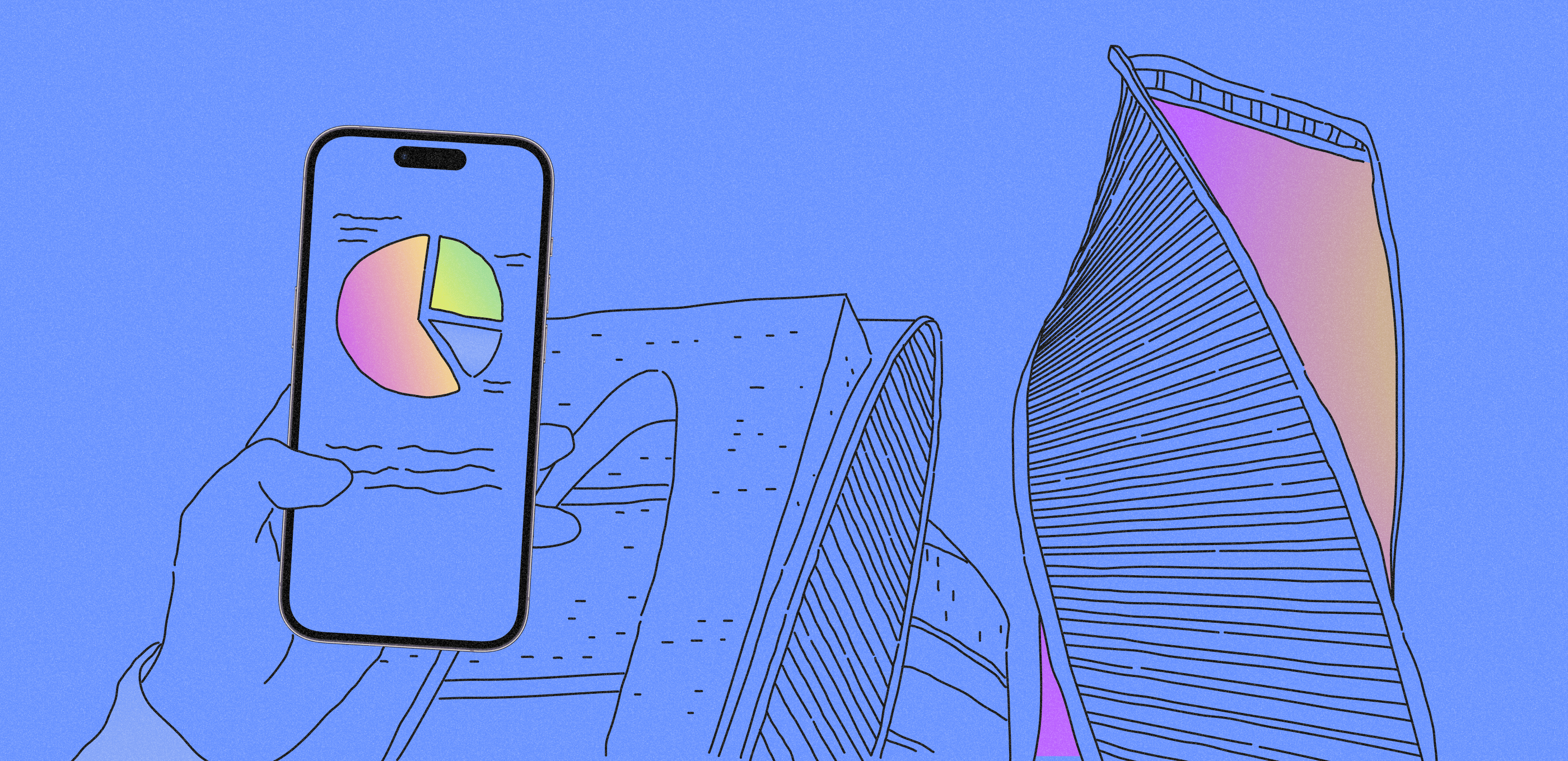
Landing pages’ conversion is 8-10%. For comparison, a full-featured website for startup with many different sections gets only 1-2% of visitors. In other words, people are 3-5 times more likely to spend money on your product. This affects lead generation, of course. According to HubSpot, a company with 10-15 landing pages out there gets 50% more leads (data for September 2020).
As for startup development we can add that MVPs promoted via a landing page tend to be better received.
Drawing up a landing page is also a proven way to test a product before its final release. For startups landing pages are definitely a quicker and cheaper investment than complete websites for startups. They bring results quicker, too: a landing page will let you get an idea of demand or lack of it within a couple of weeks.
Effective startup landing pages: a guide
The most important part of setting up a website for startup is to decide on the purpose, that is, just what you expect from its visitors. The choice of goal will echo down the chain of structure and logic. The usual goals are:
- Selling a product or service: visitors should buy the app, order access, book the webinar and so on.
- Scooping contacts: people need to sign up for a newsletter, leave a call-me-back request etc.
Before you begin
As with any marketing venture, startup landing page creation begins with reconnoitering the competition. You need to know what attractions other companies spread before consumers and how (whether) your startup can stand out against this background. It is these special advantages that your landing page will need to accentuate.
After this preliminary comes the usual massage of the target audience: what it is and what it wants. Let us pick up the dog-walking service example. We have already said that different sets of eyes will be going over a complete and general website and special, segmented landing pages. It follows that you need to learn what the audiences of such targeted pages most often search for, what they request. If you notice that there is strong demand for walking high-breds, there is your page’s slant and specification.
Having decided on the concept and target audience(s) for the landing page(s), you can proceed to the choice of design software. You can either go for special website constructors with landing-page templates or have a developer/designer create a page from scratch. Good results can be obtained either way. Constructors make relatively basic pages and require no special knowledge. Outsourcing takes time and money, but you get to ask for a unique startup website design and complicated functions.
Page structure: adding content, step by step
Text
You might have expected to start from a prototype. After all, doesn’t text presuppose structure, a notion of block position? But text (and images) form the core of the website for startups. It is text that leads visitors from scanning to buying: describes the product, lists its advantages, outlines its capabilities and makes an offer. It persuades and answers questions like a clerk, but not the kind who slithers after you across the floor, rather like a helpful and obliging informative presence.
The structure of the page is going to depend on the text. The blocks, such as they are, need to be logical and fall in synch with the thinking of the prospective buyer. The science of marketing knows at least two paradigms of copy composition: PmPHS (Pain, more Pain, Hope, Solution) and AIDA (Attraction, Information, Decision, Action). Under the first approach the text magnifies the would-be customer’s troubles and sells salvation. Under the second the audience’s attention is stoked to interest, distilled to decision and collected as action.
It is up to you whether to be AIDA, PmPHS or other letters. Just make sure that the landing page makes sense and keep it simple. Below are two possible landing-page structurettes. The one on the right is based on the AIDA mode. That is the good one.
|
❌Convoluted and illogical Buy stuff! A few swinging sentences that motivate to something, the product may not appear. Money, really cheap now Payment plans, discount policy. Tip: make it worse with a small-font discussion of refunds. Hey hey hey! Counting off advantages, how unique everything is… Stuka-screaming pitch The product’s advantages explode in the visitor’s face. Persuasion rages. The visitor is not yet sure if they need this thing at all and may be washed off site by the elements. If they know what’s good for them Listing the target audiences who may want the product and the potential problems without. You basically sell “protection,” capiche? |
✅Simple and consistent Offer A simple, capacious sentence-slogan that will make the startup’s purpose instantly clear. Especially nice for Caress the audiences who will appreciate the product in particular, with a head-shaking regret for their troubles so far. Let me tell you why… Transport the audience into the dreamworld of owning the product – and settle them there. Rub it in The Product does this. The Product does that. The Product is talking to you. Pricing and offers Calmly told rates and discounts help seal the cave. Action The conclusion is inevitable. The only way out of here is to buy the stuff.* |
* The structure will vary with the audience.
By way of example let us consider a simple and consistent landing page of Superforce. Real lettering on the top starts with the offer: ‘Keep your deskless team engaged.’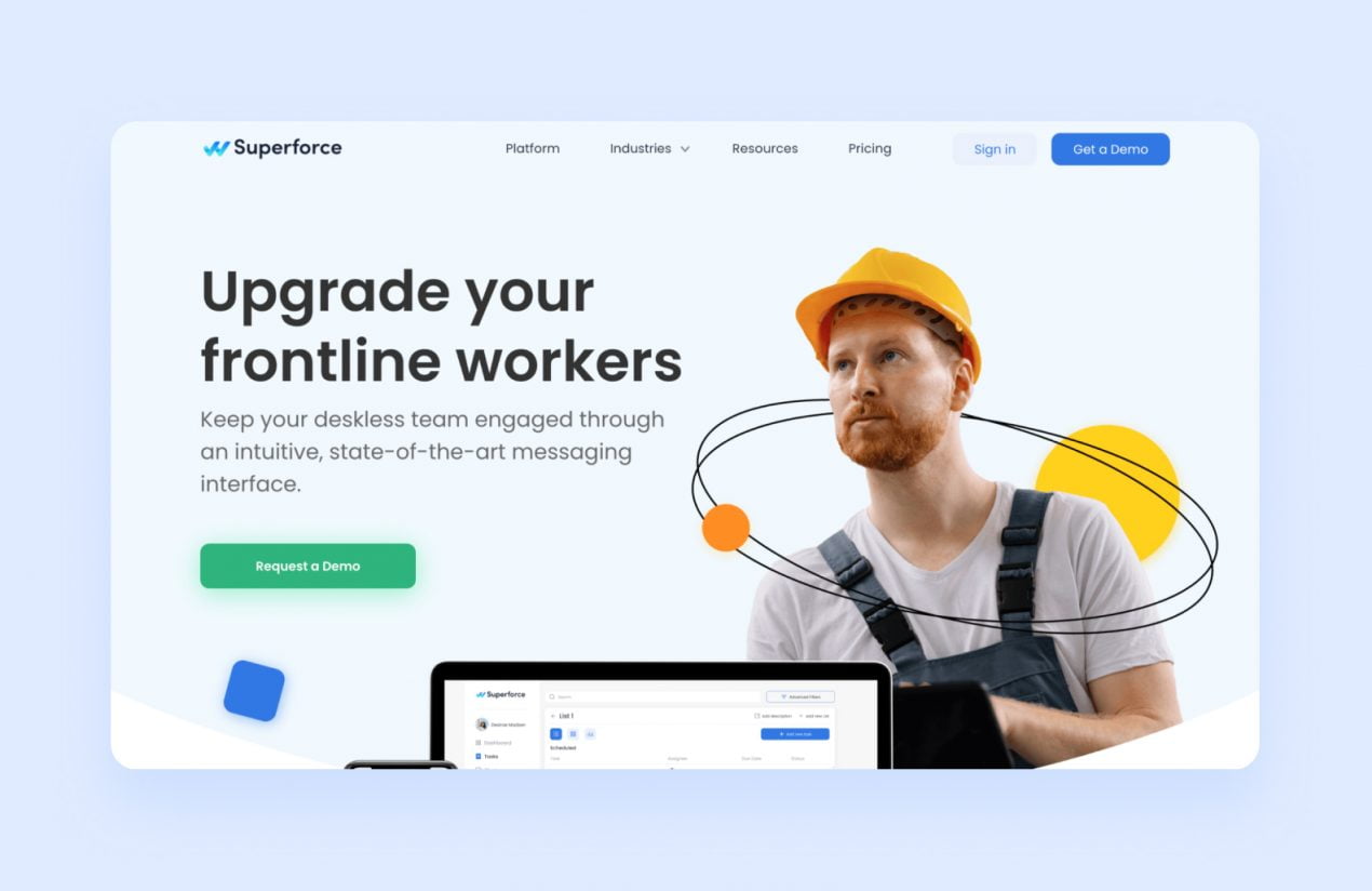
This is followed by an audience-approximating part. The target proletarian materializes before the viewer, a torc of woes around his neck. In this day and age the workers are dizzy from not having a permanent work place whilst supervisors and managers bug them all day long over tasks that they have no way of knowing! Gadzooks! Difficult task allocation just won’t do. Enter Superforce. A manager assigns tasks in his app, the team sees role-relevant directions, to be discussed in a WhatsApp chat room if need be.
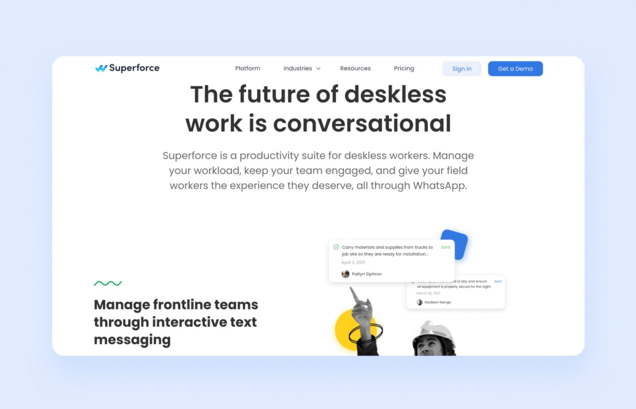 The manager in Superforce, the worker in WhatsApp: everybody knows what and when to do.
The next section explains why the visitor needs the service: its functions and what problems it helps address.
Stressing the advantages is next.
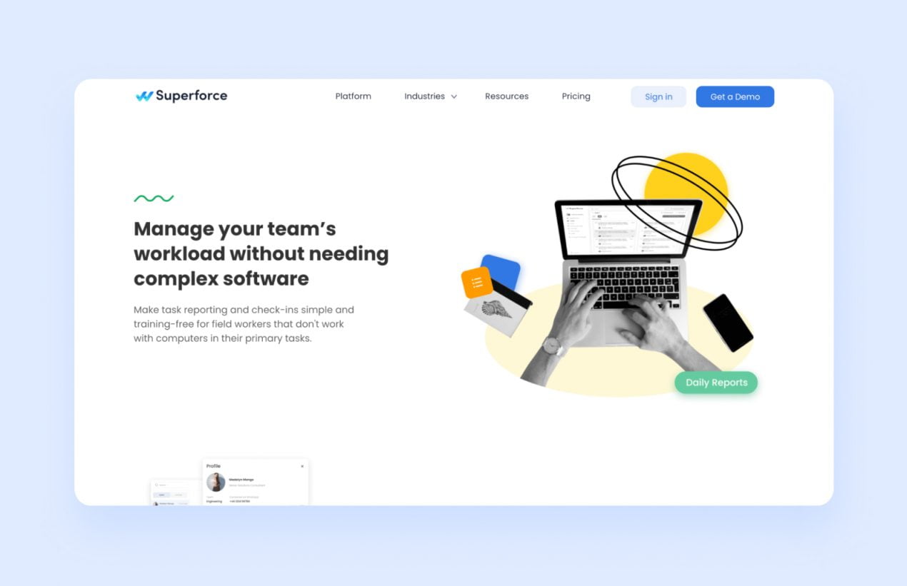
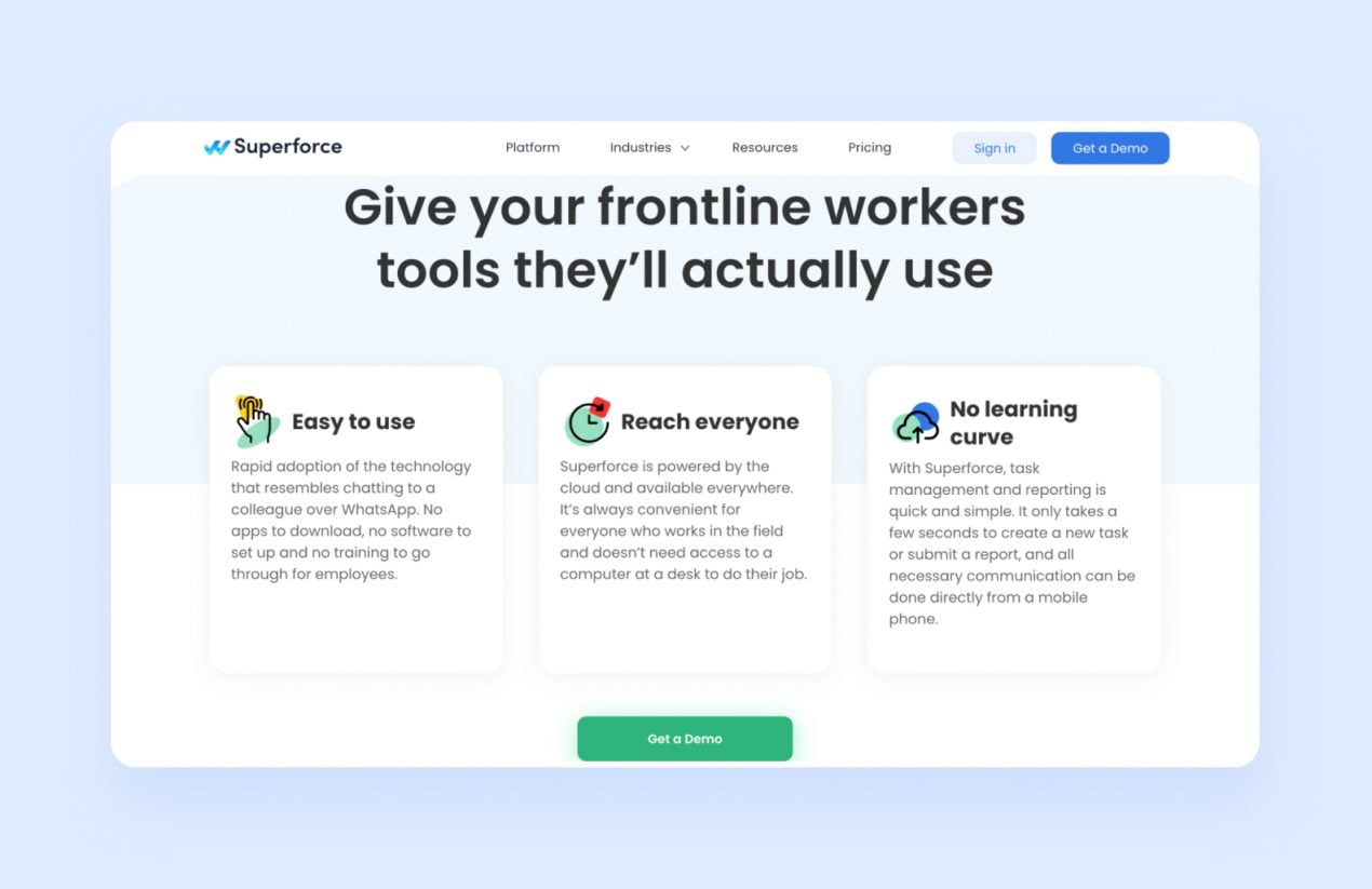 Three advantages upfront: no need for downloads, everything is done over WhatsApp; ubiquitous accessibility in the data cloud; intuitive and easy just seconds in.
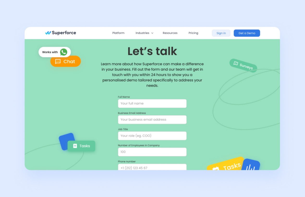
There is no money matter block here, the landing page culminates in another call-to-action section.
Remember, landing page text needs to be short: all of the (catch) phrases and digests must be brief, unequivocal and to the point.
SEO optimization is another important part of the text. Keywords in block or header captions let search engines index the page. Potential buyers will have less trouble finding your website.
Prototype
With the text finished and approved you can begin to work out a prototype for startup development — a draft of the site with placeholders for the rest of the startup website design. Even while the pictures and buttons are in the works it gives the designer a sense of the block arrangement: whether it is logical, whether easy to navigate, how readable the page is turning out to be.
You can draw up a prototype in Figma or, you know, on paper. The end result might look something like this:
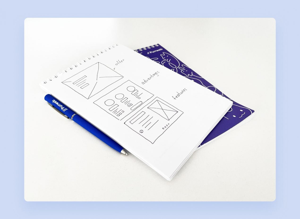
Every pen-drawn horizontal begins a landing page screen. Assume the viewer is fickle and easily confounded and keep the ratio: one screen – one idea or answer to a possible concern.
People often skip this stage of the work on their way to startup’s website designing. We at Purrweb recommend making a prototype for startup development, though. If you want something changed later, an outline will be easier to modify than a complete landing page.
Visual elements
Our experience making startup landing pages has resulted in a few guidelines for engaging and attractive design. They are valid for any startup landing page:
- Color. The page should not be too varicolored, a couple of colors will be quite enough. The first two should be subdued choices, make the third a bright highlighter, but don’t overuse it. Reserve it for buttons, headers and the like, or it will stop catching the eye.
- Front cover. The first screen is your calling card. Glancing at it should let a visitor know if they want to scroll down or not. This screen needs to capture the essence of your offer, and many companies put a good-quality picture of their product here. The text is just as crucial, however, and must be legible.
- Page rhythm. Blocks should be interspersed so as to keep the startup landing page engaging rather than dull. Often this is achieved through use of color, e.g. putting a white block, then a block of another color, then a white block again.
- Structure. The main vein of the message needs to be traceable across the text and accoutrements. Every block ought to have a header so that the viewer has footholds in his descent down your informational boulder.
- Space. Make sure there are enough blanks between the text blocks, elements in the blocks and even lines of text. The information should not come across as a sad tangle of flotsam and jetsam.
To end our startup website design tips, here is an example of a proper structure. The landing page of Pad makes use of contrasting dark blue and white, which keeps the rhythm in and spares the visitor concentration. They also have a solid front cover with a clear offer and application screenshots. During the startup development the team obviously took the time to study their target audience.
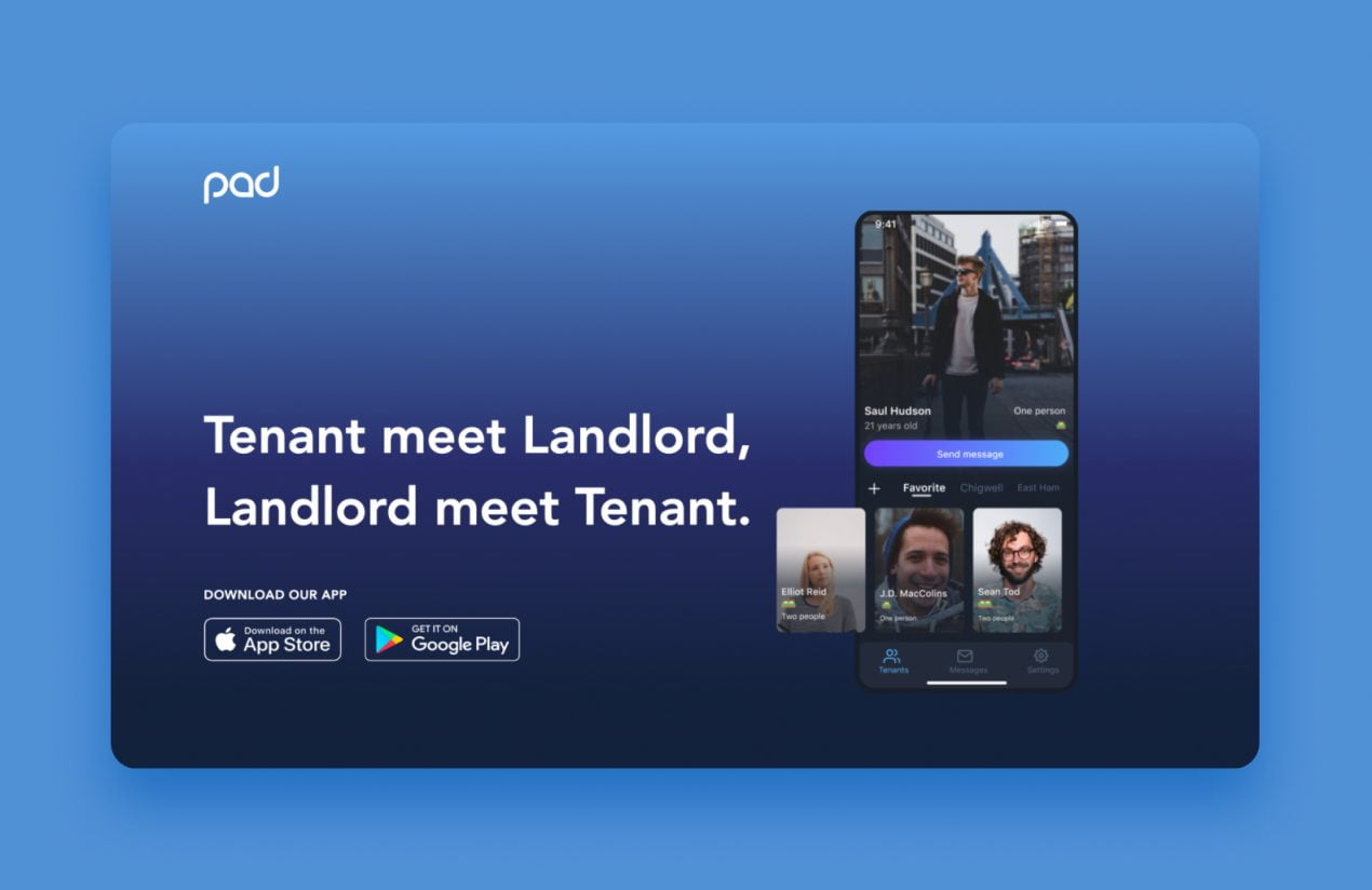 A simple, minimalist presentation of an offer: they help tenants find landlords and vice versa.
Some companies embed full-screen videos into their landing pages, even on the first screen. Purrweb thinks this should be done in moderation, because these videos can drag out the page’s loading time and themselves load slowly, particularly on smartphones.
Functionality: buttons and capture forms
As we have said, landing pages’ raison d’être is to get people to buy products or sign up for services. This means they had better have feedback clickables – buttons and caption forms. Usually these are left for the concluding screen, waiting for the finally convinced visitor, but if there are many screens, they can appear two-three times along the way. The button or form may even park on the front cover of a website for startup. If you do plan to show these elements more than once, you should come up with different captions, or the viewer will be bored and annoyed. An inspirational appeal works better than a banal “Buy me!” or “Order now!”
To our minds, Supercode, a QR generation platform, has gone very cleverly about its buttons. There are two of them here: one for the free trial and the other for registration. Although the actions are different, they both get the visitor to start interacting with the platform. Color blue is used for emphasis and helps bring out the startup landing page’s offer and options.
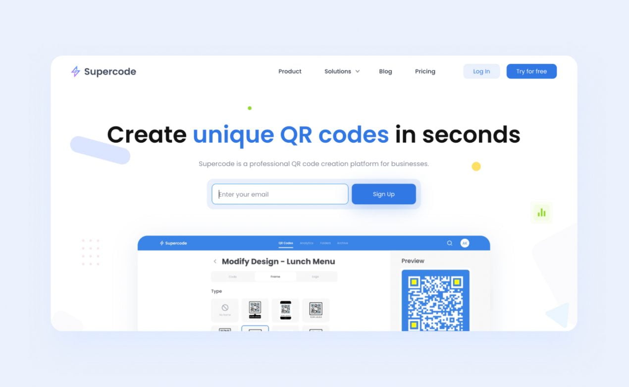 Blue accents for a focus on the essentials – the action buttons and the offer
Mistakes to avoid
It is easy to make mistakes when creating landing pages during the startup development, at every level: text, design, site logic… Here are some of the more common errors and examples of landing pages that in one way or another fly wide of the target.
1. Problems with site logic
A startup landing page can go wrong in different ways. The target audience may be insufficiently segmented, for instance. Then the information in the blocks will be excessive for one group of potential customers and insufficient for others. Unless your dog-walking, human-landing page makes it clear that you do, you will, you crave pedigree canines to pleasure, their owners will remain in doubt as to your expertise and commitment. Impress it on them that you will die for their dogs’ special needs, mention individual walking schedules, or they will walk themselves out.
Above we have already touched on weird block arrangement. If the viewer cannot glide along the screens and quickly understand what it is you are selling and why they should get it, they will join the pedigree-peeved. Avoid calling for two different actions in the same block, too. When users see several choices together, they may very well get lost and make none. Also don’t lead the customer away from the page through links, even to other sections of your website. They may not return to your landing page.
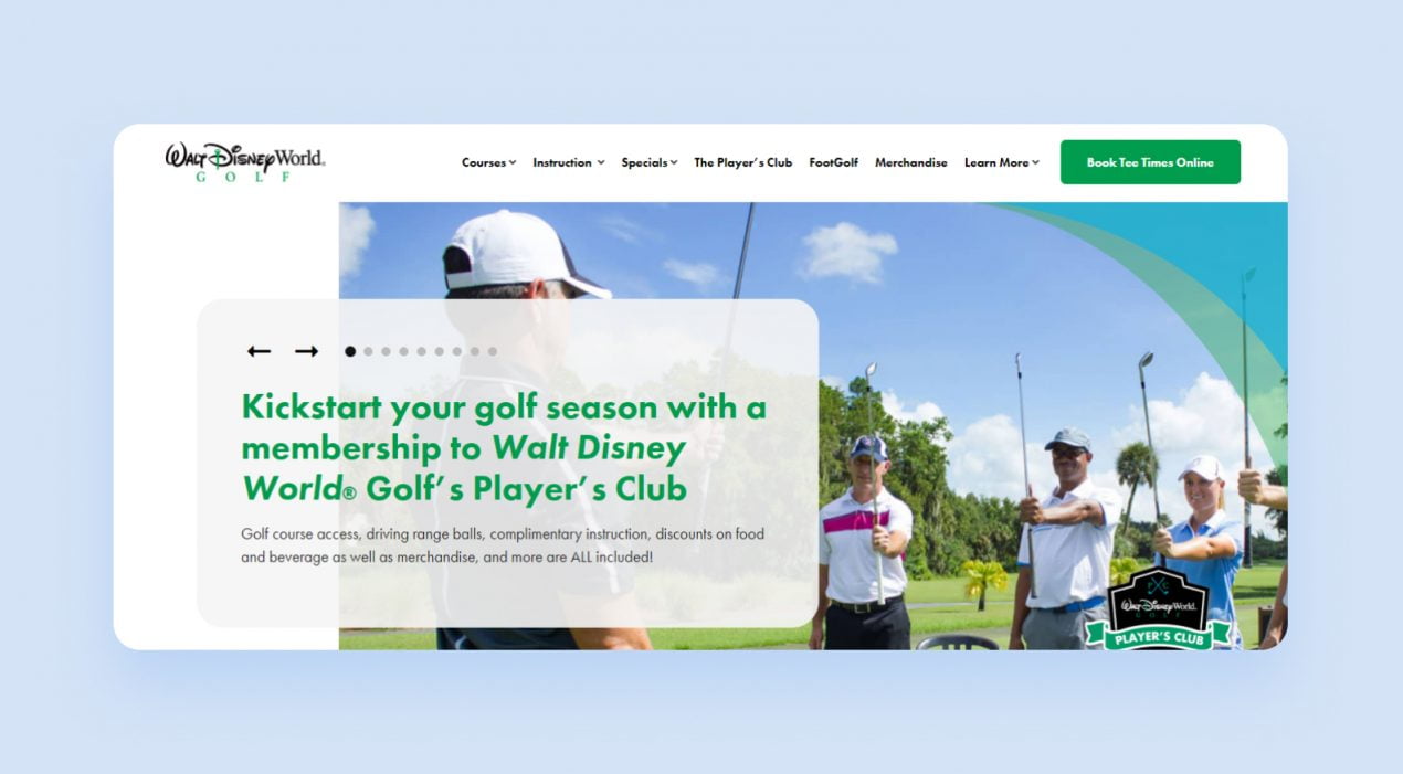
We think the Walt Disney World® Golf landing page has serious problems with its structure. The designers thought they could fit all of the advantages in switching blocks on the front page. But it is not obvious that the blocks can be switched at all, and so visitors may never get to discover the virtues of the offering.
2. Design flaws
Garish colors, crammed blocks, poor device adaptation, slow-loading features are all hallmarks of poor design. They can put visitors to flight. Although some buyers may walk through fire for a genuinely superior product from a startup, you can forget about high conversion, if the browsing experience is torture.
Here is the landing page of Oral-B:
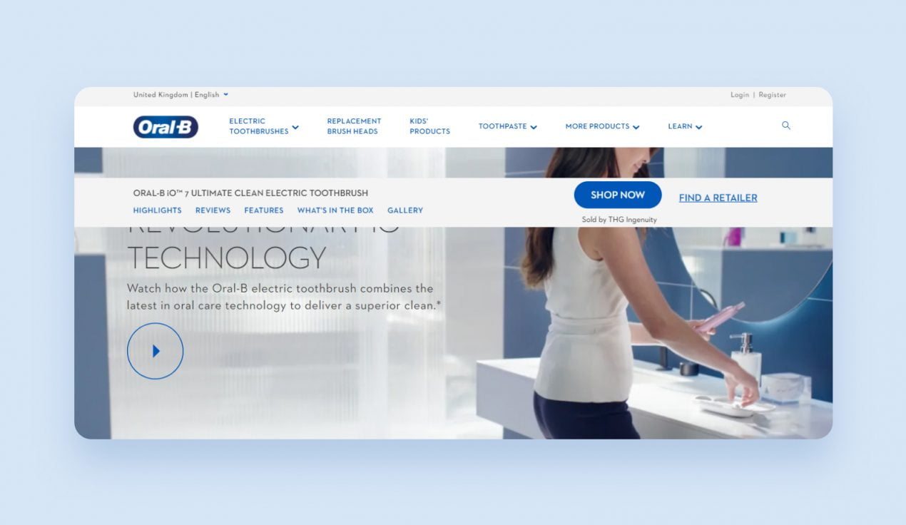
The menu bar with the button is fixed in place and blocks a portion of the screen, desktop and smartphone alike. The page also takes too long to load and the images are slow to materialize.
3. Substandard text
The possibilities of bad writing are infinite:
- The advantages are not described convincingly;
- Customers’ questions, doubts and troubles get no answer;
- No explanation how the purchase will change things;
- Vague phrasing and an unclear offer…
The last item is especially damaging, because the viewer will get no farther than the first screen.
Overloading the text with information is also a mistake, but so is not conveying enough facts. Walls of text bounce people, but bullet points everywhere make them want to pull out a revolver and fire back. Look at this landing page, so overfull from a desire to tell the reader as much as possible. The text would look better with spaces between the blocks, too.
To avoid these mistakes try to keep in mind the path visitors’ attention will follow down the sequence of screens even as you write the text and draw up the prototype. Put yourself in the shoes of someone completely ignorant of your product and dispel this ignorance in a consistent manner. This way you will be able to avoid most logical errors and foresee just when to break off or put a button.
The takeaway: making a landing page vs. hiring people to make one
With today’s abundance of free and paid website constructors and guides to blocking and composition, our own included, there is no need to be a website developer or designer to make a startup landing page. But mistakes are still common at every stage, and we suggest looking at all of the components closely — with potential customers and their convenience in mind. If you have no time or desire to sort through the fine points, yet your startup is going to need a landing page sometime soon, talk to Purrweb. We will analyze your product and design a landing page with a good conversion to boost your reach.