Need help with your project?

Oops! Something went wrong while submitting the form.


Mobile apps and online marketplaces live or die by their user experience. When you make apps easier to use, your potential client base grows substantially, and customer satisfaction rises. But what exactly makes for good UX? It's not just about making things pretty.
In this article, we'll break down what effective user experience really looks like, show you some real-world examples that get it right, and share practical tips to level up your own marketplace's UX.
.avif)
It’s a critical factor in determining the success of e-commerce platforms. Simply put, fleshed-out UX helps users find what they need, make informed decisions, and complete their actions without friction.
Beyond just helping users, great UX impacts your business, too. Here's how:
How do you attract and retain more customers? One way is to make interacting with your product satisfying and engaging.
That’s what corporations like Samsung and Apple do when designing their tech and smartphones. They build their products with a diverse range of customers in mind, from grannies who find phones intimidating to everyday consumers and tech enthusiasts. This broadens their customer base and helps them earn more profits.
Good UX helps you raise the number of active users browsing your online marketplace. The opposite is true as well: if the app has an inconsistent design and its navigation is full of errors, there’s not going to be many active users left.
The simpler the user flow, the higher the chances that the user actually goes through it and does the things you want them to: signing up on an online marketplace, adding items to cart, checking out, and so on.
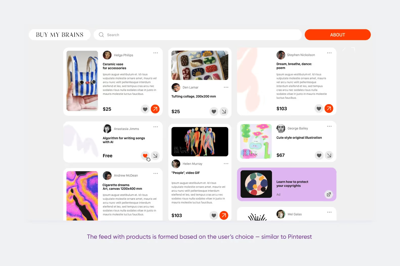
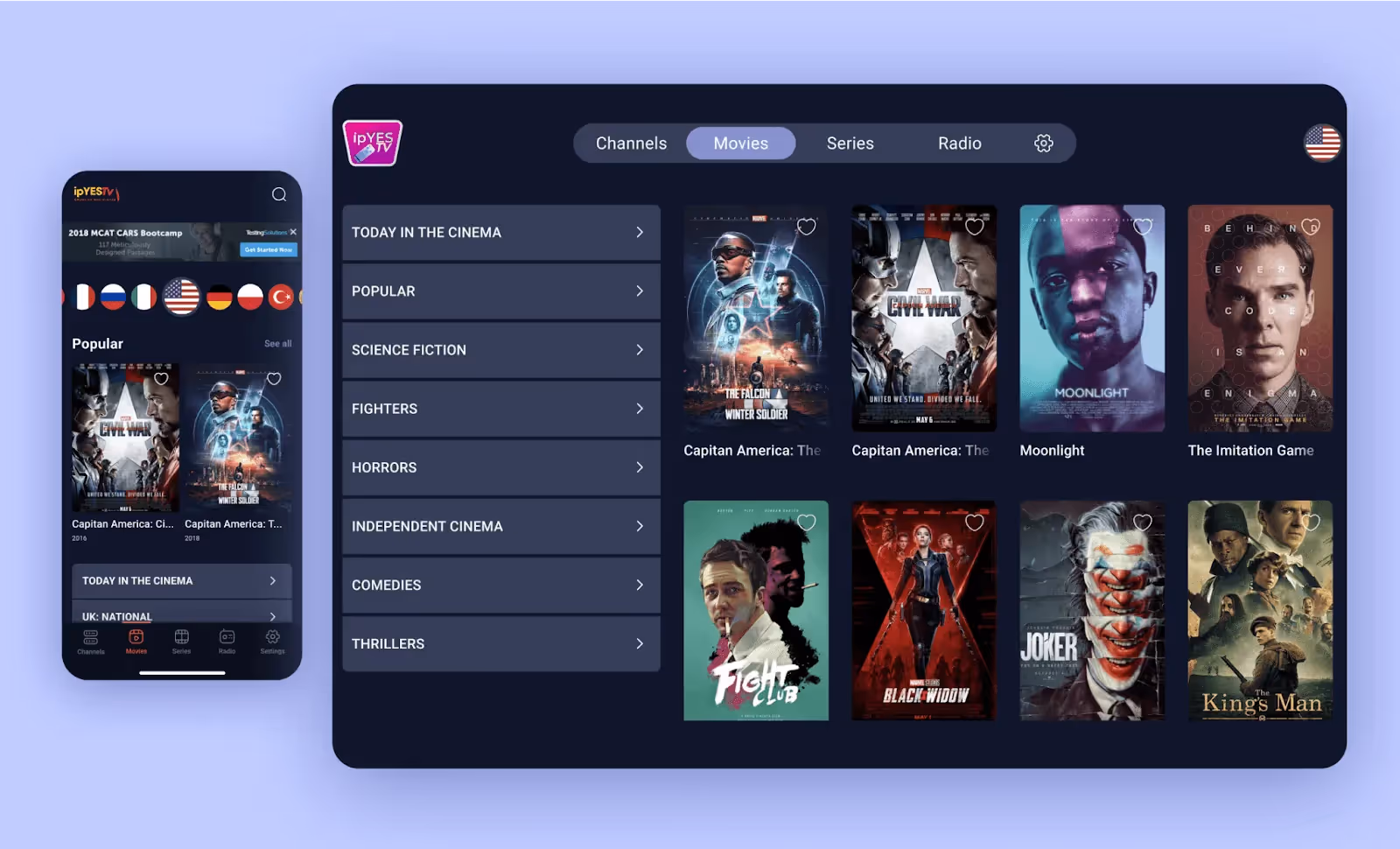
Unlike traditional e-commerce, marketplace UX has to balance the needs of multiple user types simultaneously: sellers, buyers, and admins. Sellers benefit from marketplaces with efficient listing and management tools, while buyers expect seamless search bar usability, discovery, and payment features.
While good UX is a priority for many businesses, this doesn’t mean that the majority of them find success. Take Amazon, for instance: while it has a sophisticated filtering system that helps customers navigate millions of product options, its primary weakness is a cluttered interface that compromises visual clarity.
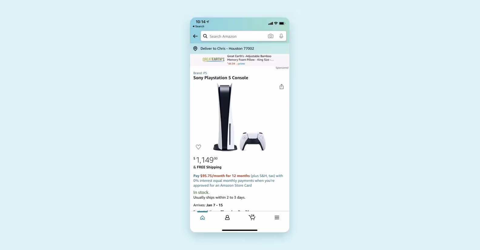
It could be forgiven in their case: Amazon’s yearly turnover is in the hundreds of billions of dollars, and making even a minute adjustment to their current interface could spell the loss of billions of potential profits. For the majority of other marketplaces, improving UX almost always proves beneficial.
How do you go about creating a solid UX for your marketplace app? We’ve highlighted 5 key principles to keep in mind below.
An unorganized marketplace is no better than a flea market. Without intuitive navigation, buyers cannot find what they need, and sellers cannot connect with their audience. That’s why integrating effective navigation is important.
Here are a couple of tips that can help you manage user expectations and improve the navigation of your marketplace app:
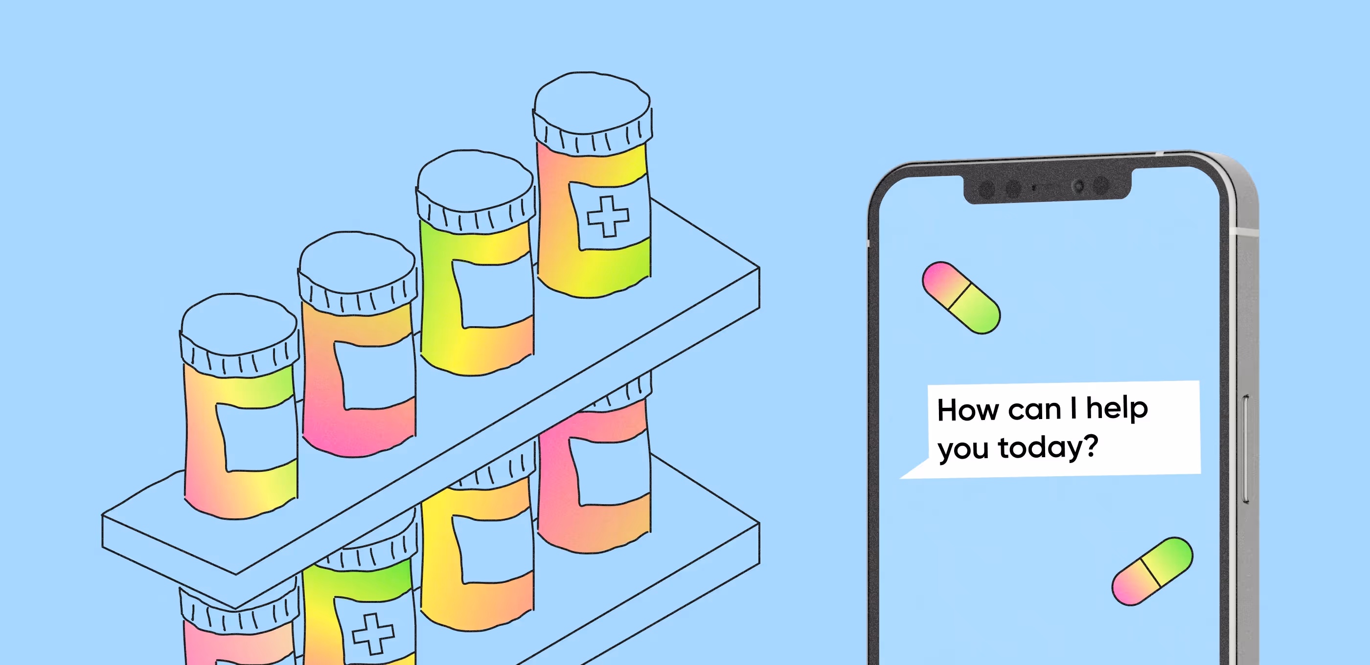
If you want to improve the usability of your marketplace, it’s important to manage user expectations. Every choice they make and action they take should warrant feedback: e.g. success screens for finishing an order, error messages in case the payment doesn’t go through, and so on.
Say you have a competitor whose marketplace is identical to yours in every way, except that it outperforms you when it comes to loading speed. Small delays like this are annoying to deal with and directly translate into tangible business losses. Even a 100-millisecond delay can hurt conversion rates.
A faster-loading marketplace has reduced bounce rates, improved search ranking, and builds trust easier.
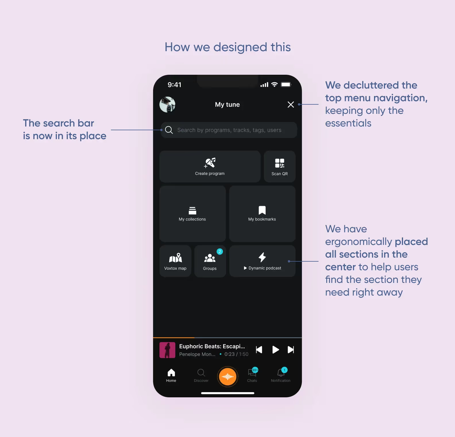
Another way to reduce cognitive load is repeating UI patterns across different sections of the marketplace. To improve UX, try using the same button styles, icons, and typography everywhere. For instance, if clicking a product's image zooms in on desktop, the same tap gesture should enlarge it on mobile.
This predictability builds intuitive fluency and allows a user who learns a task on one device to perform it seamlessly on another.
Just like a new employee needs guidance, a user dropped into a complex marketplace needs a clear path to value.
A great onboarding flow does more than just teach the interface: it helps users complete essential setup, demonstrates core benefits, and builds engagement habits from the very first session. This initial guidance is key to converting a curious marketplace visitor into a regular user.
Some things to keep in mind so that you convert more users into buyers:
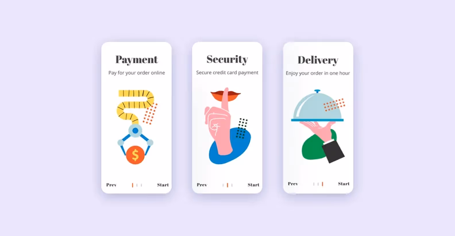
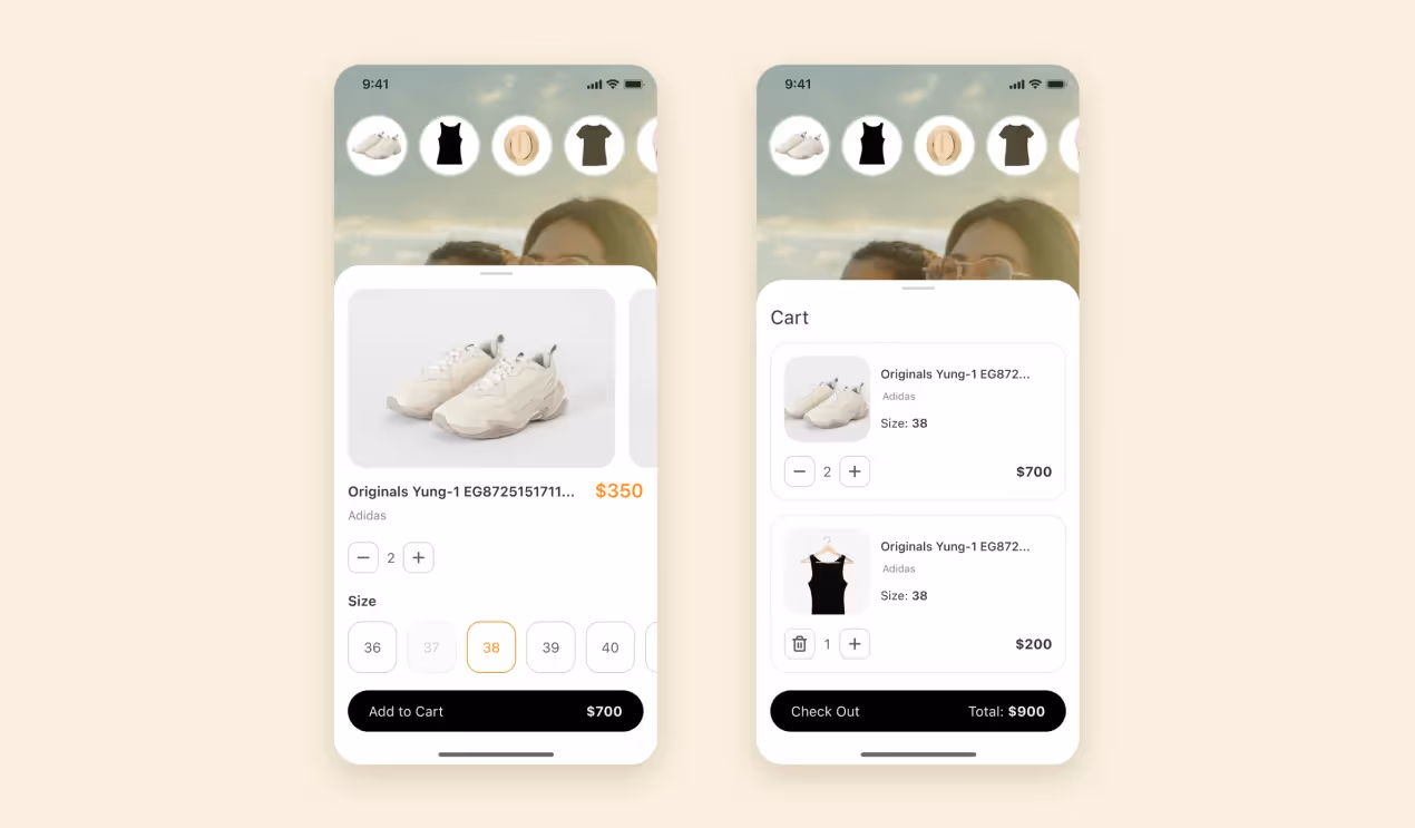
A lengthy checkout process is a primary cause of cart abandonment. Ideally, checkout should take no more than a single page. It must autofill information where possible, offer multiple payment options like digital wallets, and display all costs upfront without resorting to dark patterns. This builds crucial trust and removes final friction, which could scare the user away from making a final purchase.
In an environment where buyers cannot physically inspect items, they look to reviews for validation. You can implement this by including a separate page in your marketplace website or displaying reviews right on the seller’s page.
Marketplaces process and store a lot of user data, and you could use it to your advantage. Leveraging past purchases, browsing history, and saved items can help you curate a unique homepage for each buyer. This proactive approach solves the discovery problem by surfacing highly relevant products that a user is likely to love but might not have found on their own.
Personalized feeds not only improve the shopping experience by saving time and effort, but also directly drive increased engagement, average order value, and customer loyalty.
This is another way to minimize friction at the final stage of the purchase journey. Integrating one-tap options like "Buy Now" and adding digital wallets like Apple Pay drastically reduce the number of steps and fields a user must complete. This approach reduces barriers to payment and increases conversions.
Here are a couple of things to consider so that sellers use your platform more:
A marketplace's success is directly tied to its sellers' ability to operate smoothly. When issues arise, sellers need immediate support channels. This means providing dedicated help centers, live chat, or phone support specifically for vendors.
This not only minimizes operational downtime and frustration, but also makes sellers feel valued. Proper UX and customer support can help your marketplace build loyalty and trust. In turn, this encourages sellers to list more inventory.
Instead of leaving sellers to guess, the listing interface should guide them to optimize their content. It should provide sellers with structured fields for compelling product titles, detailed descriptions using natural keywords, and alt-text for images. Marketplaces with good UX often do the heavy lifting for sellers.
This approach helps sellers' products rank higher in both internal and external search results. It drives organic traffic to their listings and, by extension, to the marketplace itself.
Just as the marketplace itself uses data to refine the user experience, sellers themselves should have the tools to determine what resonates with buyers. This means letting them test different elements of their listings:
To get data-driven insights into which versions drive more clicks and conversions. This not only boosts their individual sales and confidence, but also elevates the overall quality and effectiveness of the marketplace's inventory.
While admins may not generate as much revenue as buyers and sellers, they’re still a vital part of the business. In this section, we’ll talk about UX changes that will improve their experience and make their job a tad bit easier.
A good admin dashboard must provide robust tools to pinpoint specific information, whether it's locating a user by email, filtering sellers by payout status, or searching for listings flagged for review. That’s why advanced search and filtering features work great for investigating disputes, identifying trends, and enforcing policies effectively.
Not every admin requires full system access. By defining distinct roles like support agents and moderators, you can minimize risk, and prevent errors.
This role-based access control lets team members have the precise permissions needed for their tasks, protects sensitive information and maintains a clear audit trail. It can also streamline onboarding for new staff and safeguard the platform's integrity.
At Purrweb, we’ve had a fair share of experience in e-commerce and marketplace app design. Let us walk you through some cases we’ve had a hand in, read on to take a closer look:
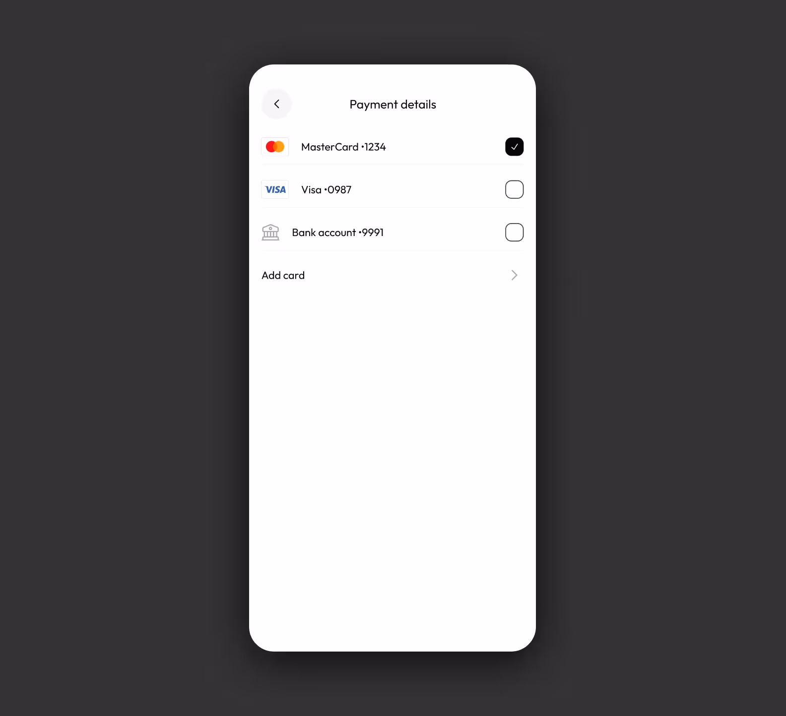
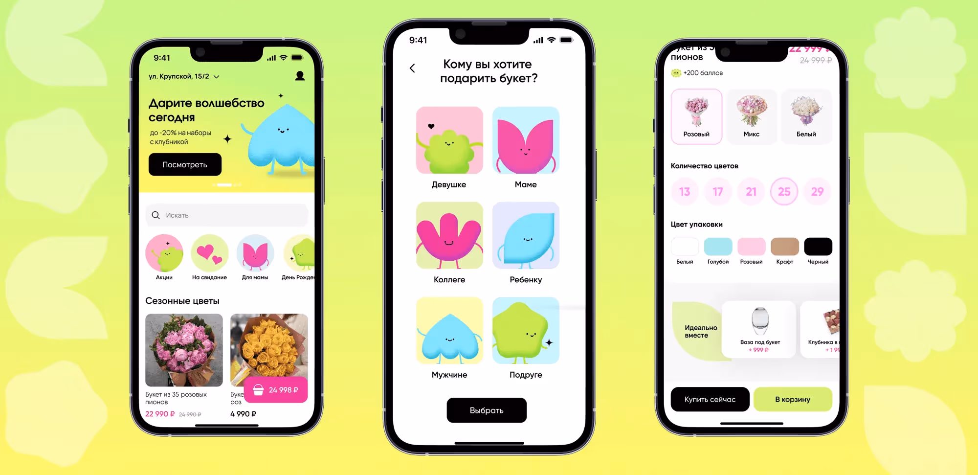
We had to create a design concept for an online wholesale flower marketplace. The first step we took concerned the discovery phase of the project: our specialists conducted a competitor analysis, created detailed user personas, mapped out a user flow, and decided what kind of screens we had to make. This took us 3 weeks.
One of the more challenging parts of this project was creating a marketplace app design from scratch. Our designers settled on three kinds of feelings we wanted our design to convey: magical, modern, and moody. To integrate them, we had to:
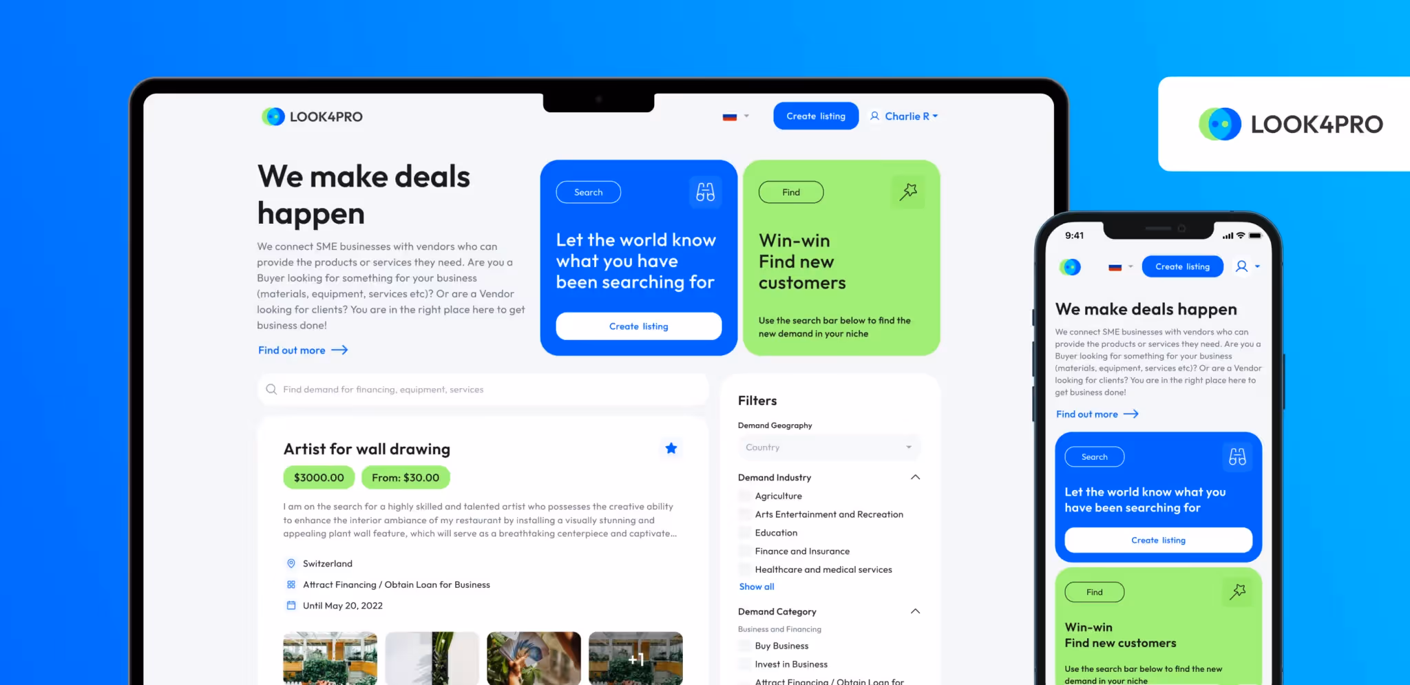
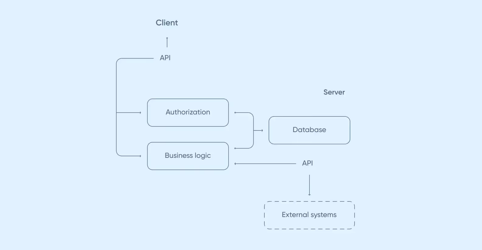
One of our cases involved a classified ads platform for the European market. Think of it as an eBay-style marketplace, but with a twist: instead of listing products, users connect with service providers and suppliers.
We had budget constraints, so we sat down with the client to prioritize essential features. After pinning down exactly what would deliver the most value, we dove into design and development.
Livestream shopping (LSS) lets you watch a live stream and buy products on the spot. Our client, who had been closely watching the booming Asian e-commerce market, approached us with an idea for this app. His research showed that livestream shopping was still a wide-open opportunity outside of China.
Seeing the clear potential, our team built a prototype in just one month. We tested it with a few small showrooms, and the initial results were promising. Our early streams ran smoothly for up to 40 unique viewers, with 25 watching concurrently, without a single crash.
The real breakthrough came with a later stream, which attracted 500 unique viewers.
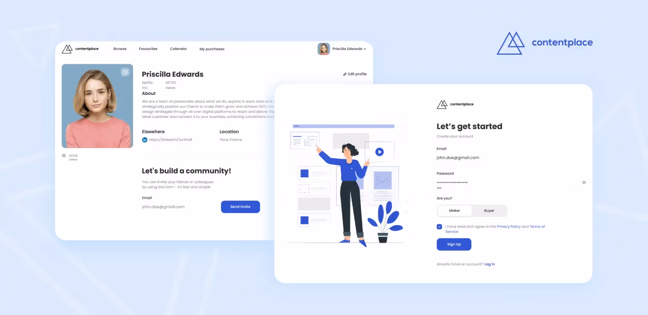
This is a marketplace that’s designed to facilitate communication between content creators, producers, and businesses.
After several discussions, we successfully guided the client to focus the MVP on its core functionality: a streamlined registration and onboarding process and a simple role selection upon sign-up. We delivered this MVP in the spring of 2020. The client then spent the subsequent months rigorously testing the product and refining their go-to-market strategy.
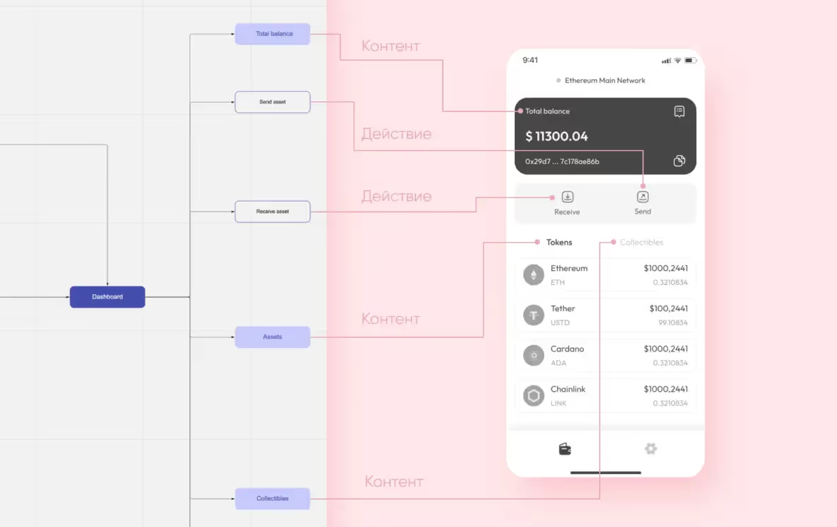
We divide this process into three steps: creating mindmaps, creating wireframes, and finalizing UX design.
To create a solid design and ensure user satisfaction, it’s important to outline every possible user scenario beforehand. Diagrams make it impossible to forget key scenarios along the way.
Before moving on to the marketplace UI, our designers convert the mind map into wireframes. These are black-and-white drawings that display components of the marketplace and their position on the screen.
Once the client greenlights wireframes, we begin perfecting the future marketplace UI. Our designers take a few key screens and create a design concept, which can be used for presentations later.
There are three main reasons:
Now’s the perfect time to create a niche online marketplace: companies specializing in certain spheres are thriving, e.g. Etsy getting an x2 increase of active buyers from 2019 to 2024. We can help make your dream a reality.
➡️Don’t hesitate <a class="blog-modal_opener">to contact us</a>, no matter if you already have a marketplace or you’re looking to create one from scratch.

.svg)