Need help with your project?

Oops! Something went wrong while submitting the form.


%20(1).avif)

No matter how unique your product features are — great design still makes all the difference. A cluttered interface and outdated visuals can easily turn users away. So how do you keep them from jumping ship to a competitor? Simple: redesign.
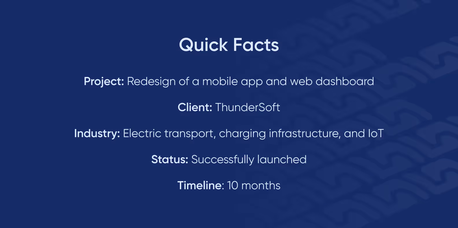
In this case study, we’ll show how we redesigned the mobile app and web dashboard for ThunderSoft — a software company building solutions for EV charging infrastructure. You’ll see how we brought clarity and modern aesthetics to a complex, tech-heavy product.
We'll also share how the project manager at Purrweb pretended to be an employee of a transport company and conducted reconnaissance of ThunderSoft's competitors to find the best solution for the client.
ThunderSoft develops software for managing EV charging stations and is building an ecosystem that connects EV drivers with station owners. Their solutions are used by companies like Yablochkov — one of Russia’s leading developers and manufacturers of charging stations.
The ThunderSoft team came to us with a request to redesign two of their products: a mobile app for end users and a web dashboard for specialists managing the charging infrastructure.
The client's in-house team had serious technical expertise but they lacked experience in design, and in terms of UI/UX, the product was lagging. Developers simply added new features to the application without adapting the interface.
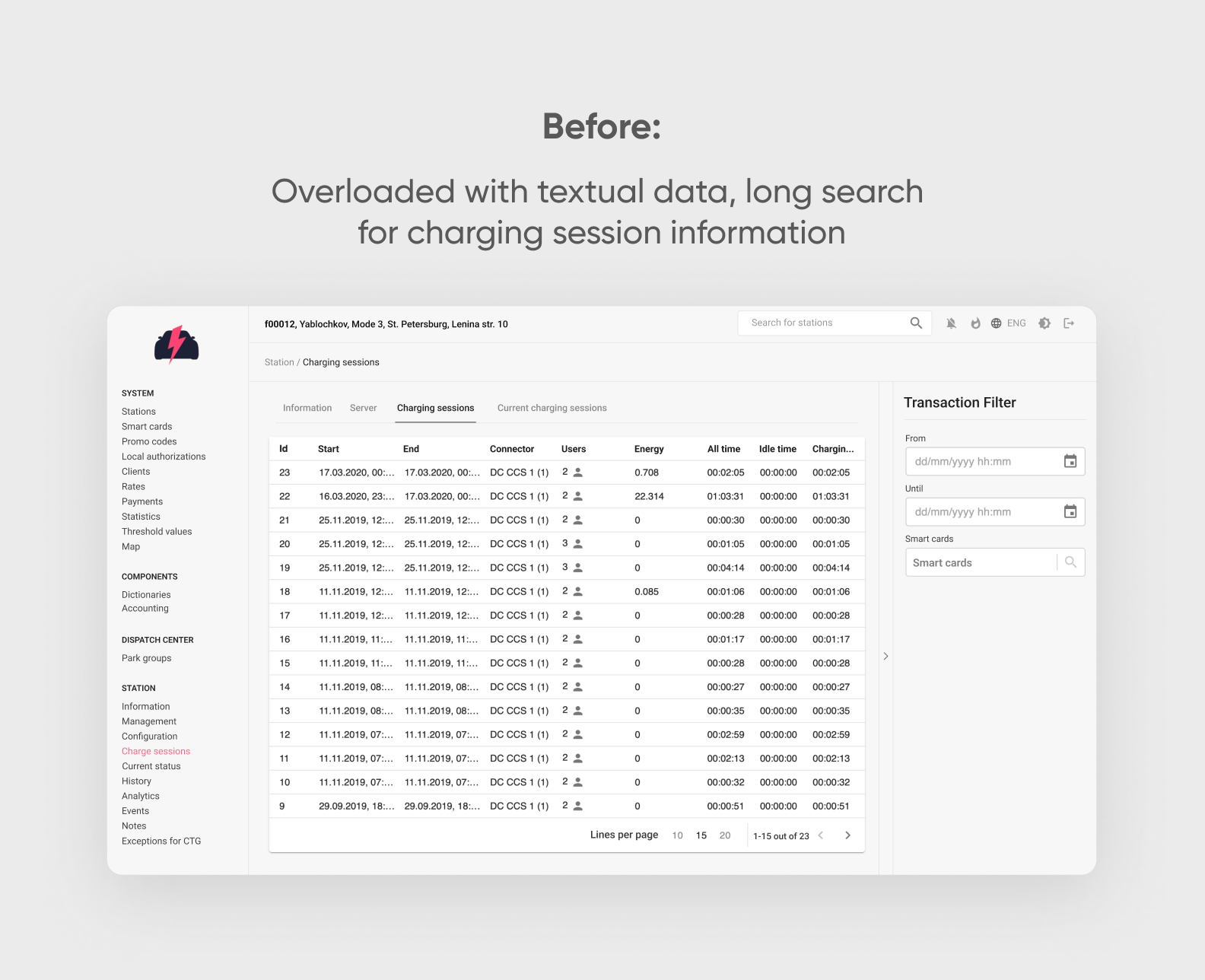
The web service was also developed without a designer, resulting in complex navigation and an interface that was confusing for beginners.

While the company outpaced other market players in technology, it was clear that in terms of UI/UX, their product lagged significantly behind competitors. This was off-putting to users.
ThunderSoft wanted to fix this. They decided to bring in an external design team that could understand the task and independently propose solutions. They chose from three contractors. Our portfolio stood out due to the variety of cases from different sectors and interesting design.
Additionally, we understood the client's business needs well — they wanted to increase the competitiveness of their product through attractive and user-friendly design that simplifies life for the user rather than complicates it.
The client set the following tasks:
If everything was clear with the app, it needed to be made convenient for users — the task with the web panel seemed more complex. This is a tool for specialists, and to simplify the web interface, we first needed to understand how everything was organized 🙂
The client shared internal documentation with us, provided access to the working version of the platform, and demonstrated how to use Swagger for API exploration. This allowed us to get up to speed quickly and gain a thorough understanding of all project details.
Redesign goes beyond just updating fonts and colors — it’s about rethinking your product’s functionality and user interaction. We’ve already explained why a redesign isn’t just a cosmetic makeover.
To fix the flaws of the old design, we analyze the current user experience and identify pain points — a process we call UX audit.
For the ThunderSoft redesign project, we started with a UX audit. Here’s what we did:
We want to tell you more about each step of the UX audit.
By the way, if you've noticed that users visit your site or app and leave after a second or two, you might also need a UX audit. Check this out: we'll analyze your situation and suggest where to start 😉
The client had no visual references — they wanted us to analyze competitor designs ourselves.
How do you conduct such research? The easiest approach would be to Google "EV charging app" (in our case) and browse company websites… That’s probably what another UI/UX agency would’ve done. But at Purrweb, we got creative 🐱
<div class="post_divider"></div>
🕵️♂️ Purrweb’s Masterclass in "Competitive Intelligence"
Our project manager went full undercover — creating three fake accounts, preparing tailored presentations under different company names and locations, and crafting a solid backstory: she was a rep for a major transport company planning to switch to electric vehicles. The result? She secured live demo presentations with several competitors.
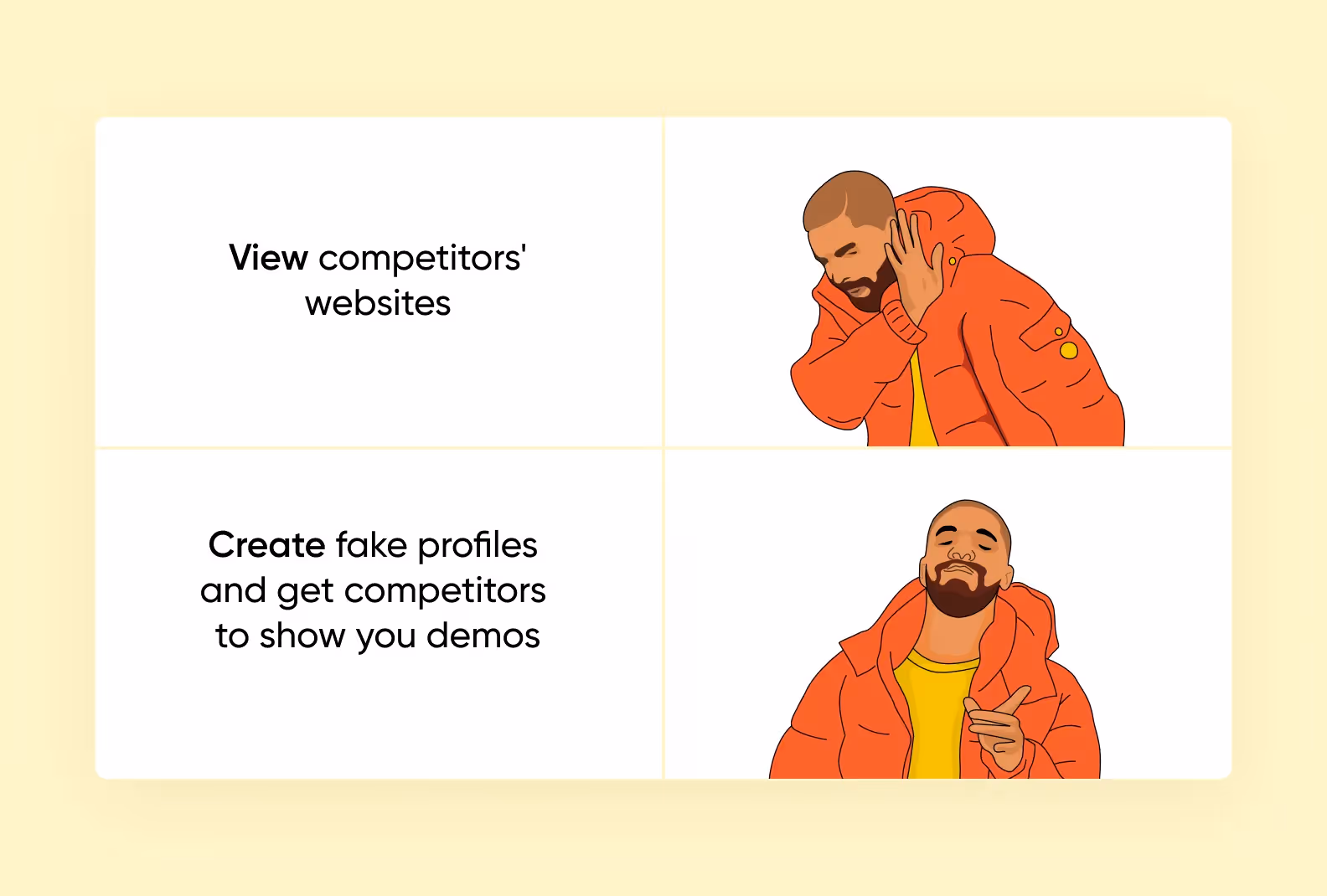
We knew a simple Google search wouldn’t cut it. Why? Companies rarely share their latest product details publicly — but they’re always eager to showcase their best features to potential clients. So instead of scraping the surface, we went straight to the source, letting competitors pitch their strengths directly to us.
And this wasn’t our first rodeo. When developing Grecha.pro, a restaurant management app, we used the same stealth approach — crafting a convincing cover story to gain test access to a rival product and gather killer insights for our client.
<div class="post_divider"></div>
This way, we gained insights not only into design but also into the industry situation: helping the client assess their market position. ThunderSoft is using these insights to shape its product development strategy.
Competitive research also helped during the project: we already knew the strengths and weaknesses of competitors and which solutions would be great to implement in ThunderSoft products.
While working on the project, the designer simultaneously analyzed competitors' applications, walked through user paths, and evaluated the usability of these applications, identifying their strengths and weaknesses. This was done to understand how ThunderSoft could stand out in the market.
The UI/UX designer examined the entire user flow to understand which patterns repelled or confused users and how to address these issues.
We won’t repeat her entire path and take you through the whole ThunderSoft app and web panel. Instead, we'll show a few screens with our designer's comments as examples of what to focus on during a UX audit.
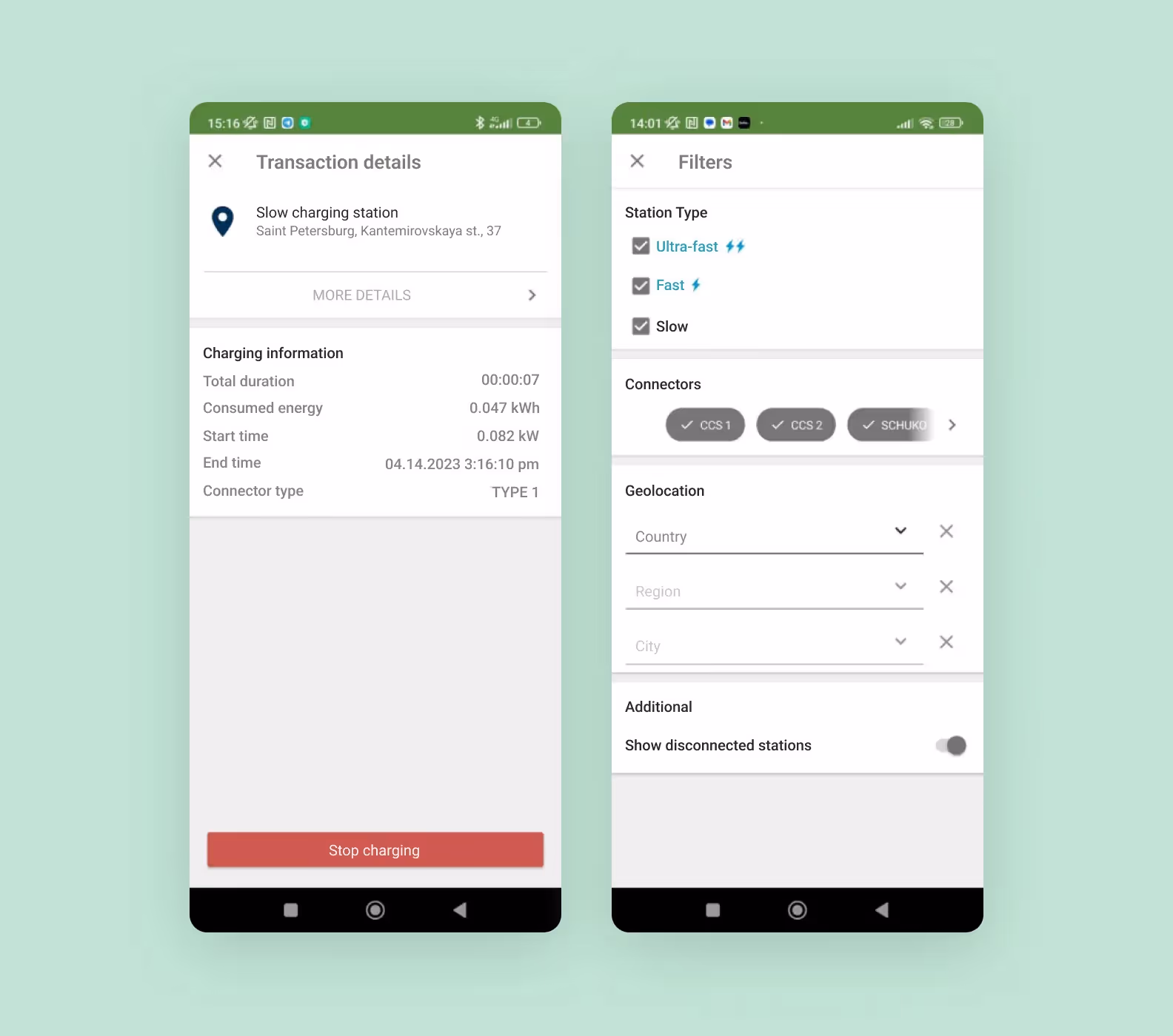
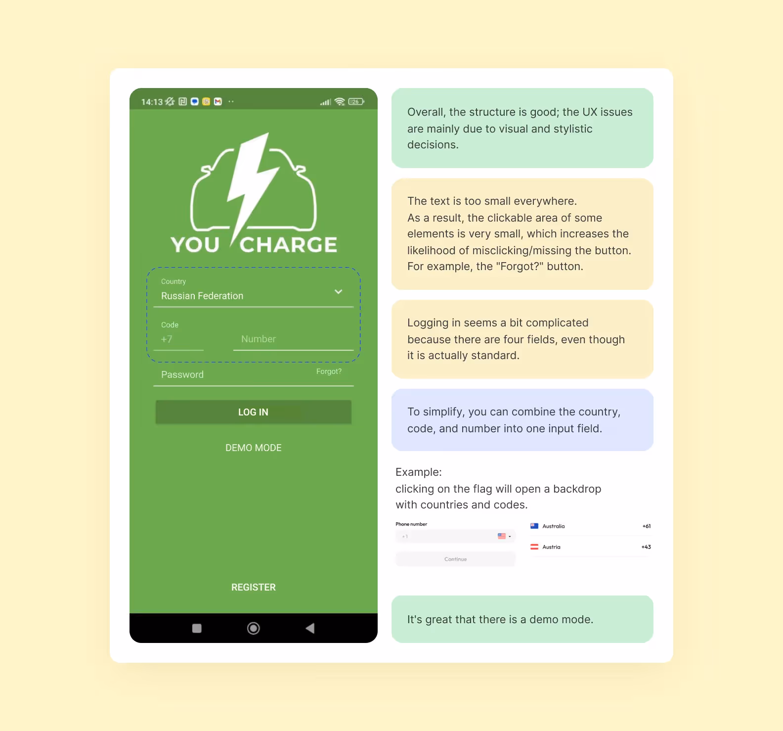
Mobile app. Registration and login Interface
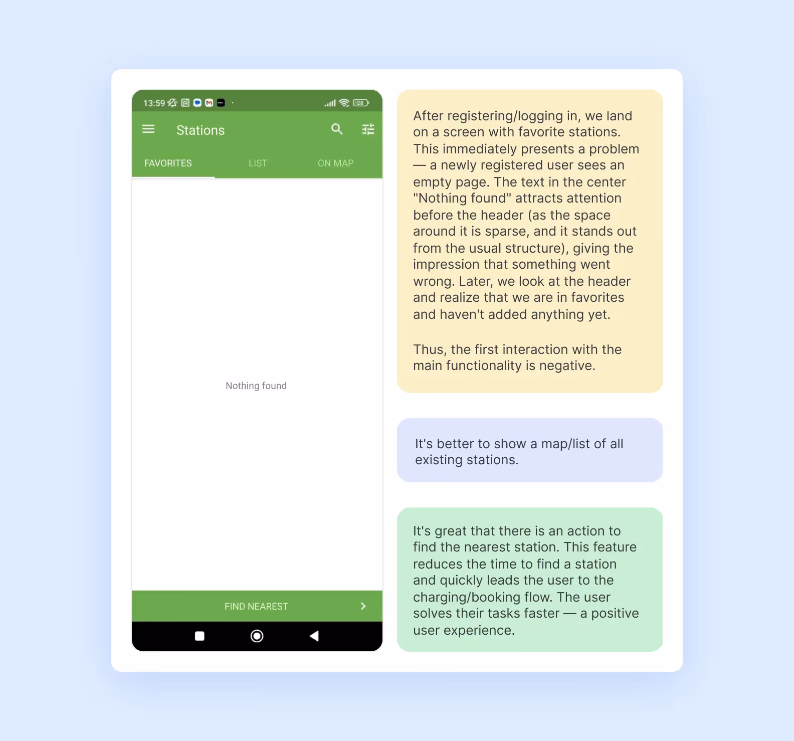
Searching, filtering, and viewing stations
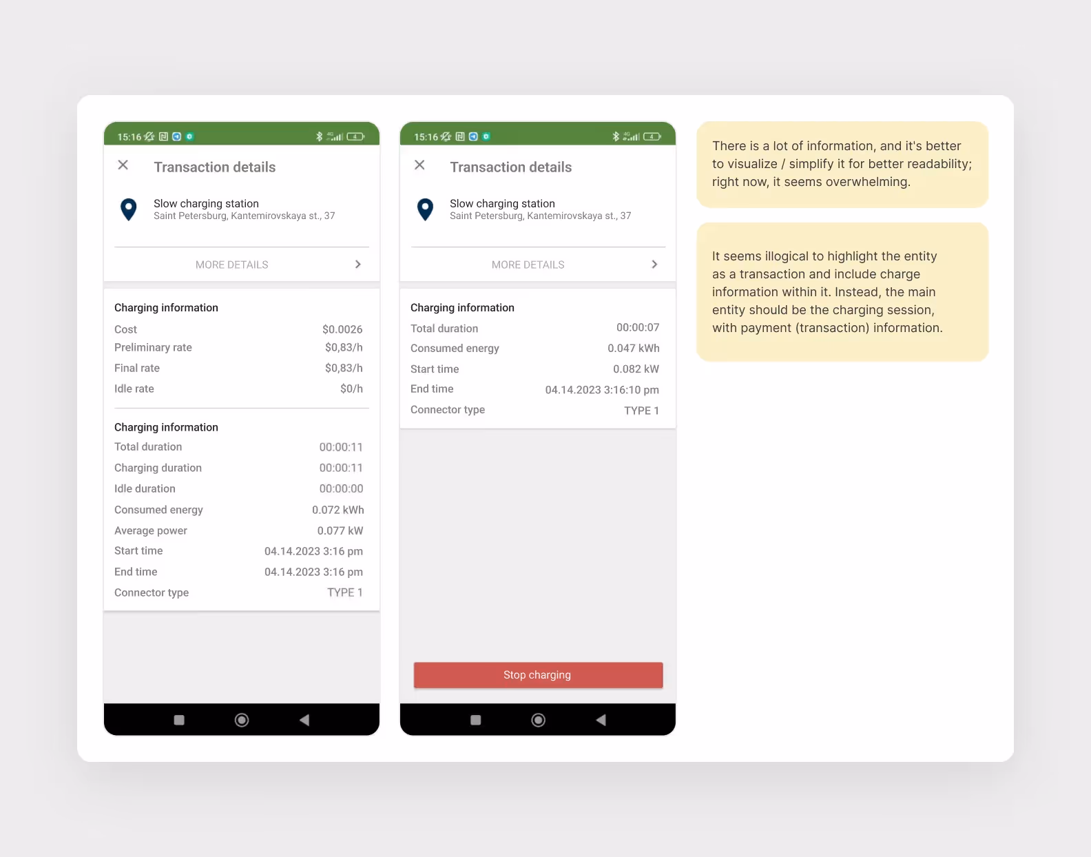
Charging
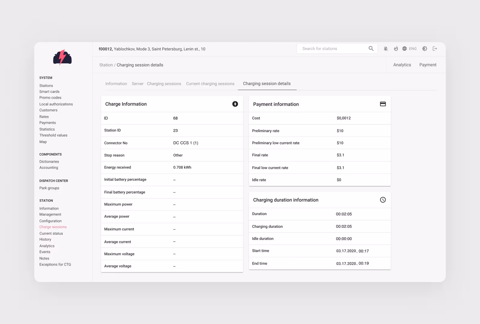
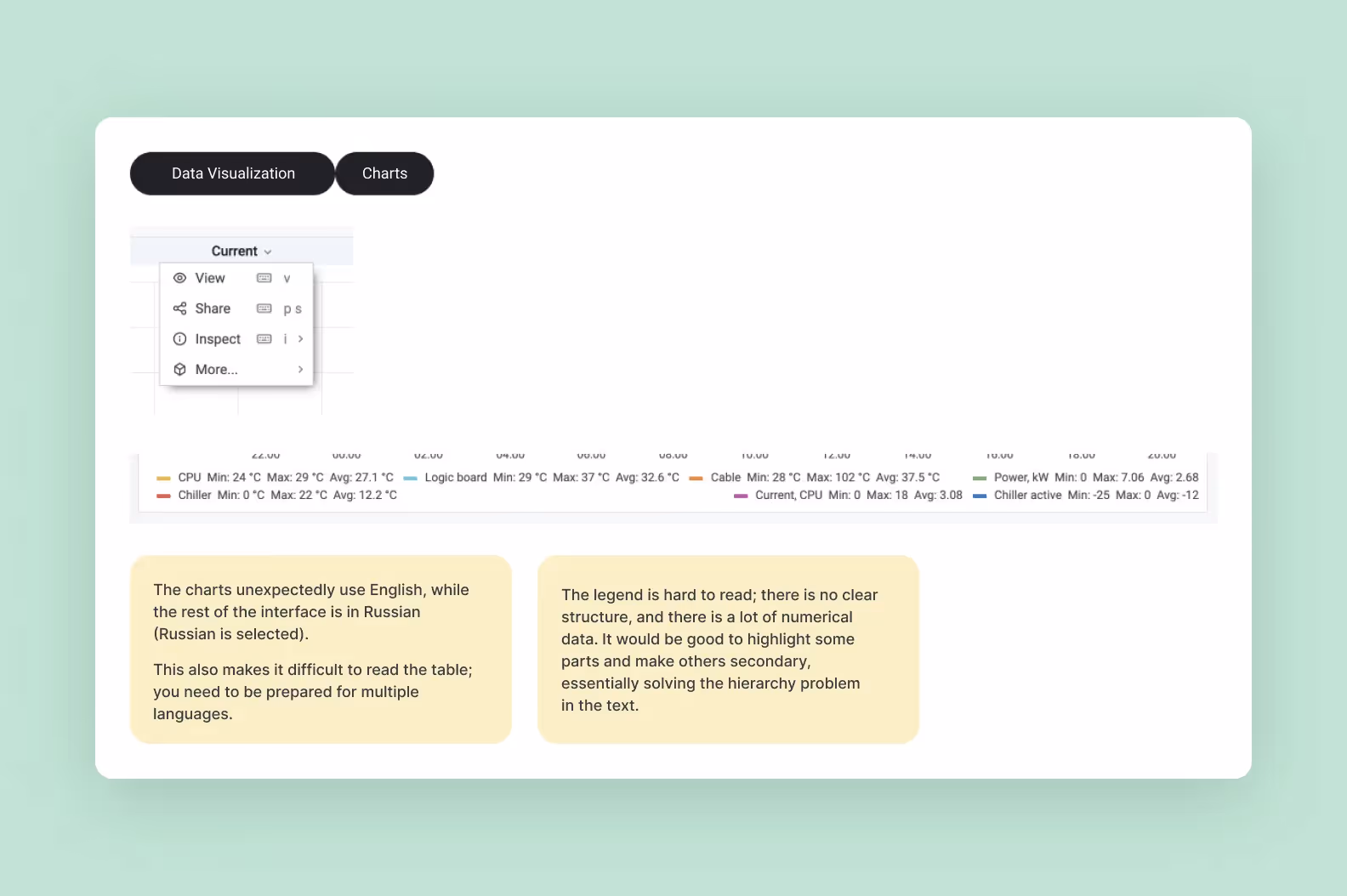
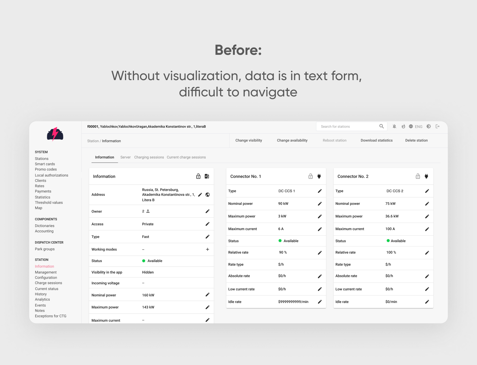
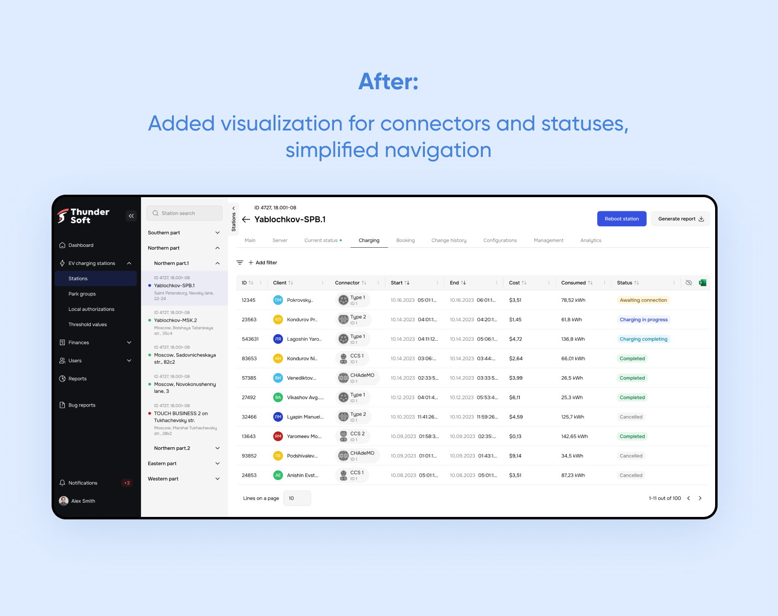
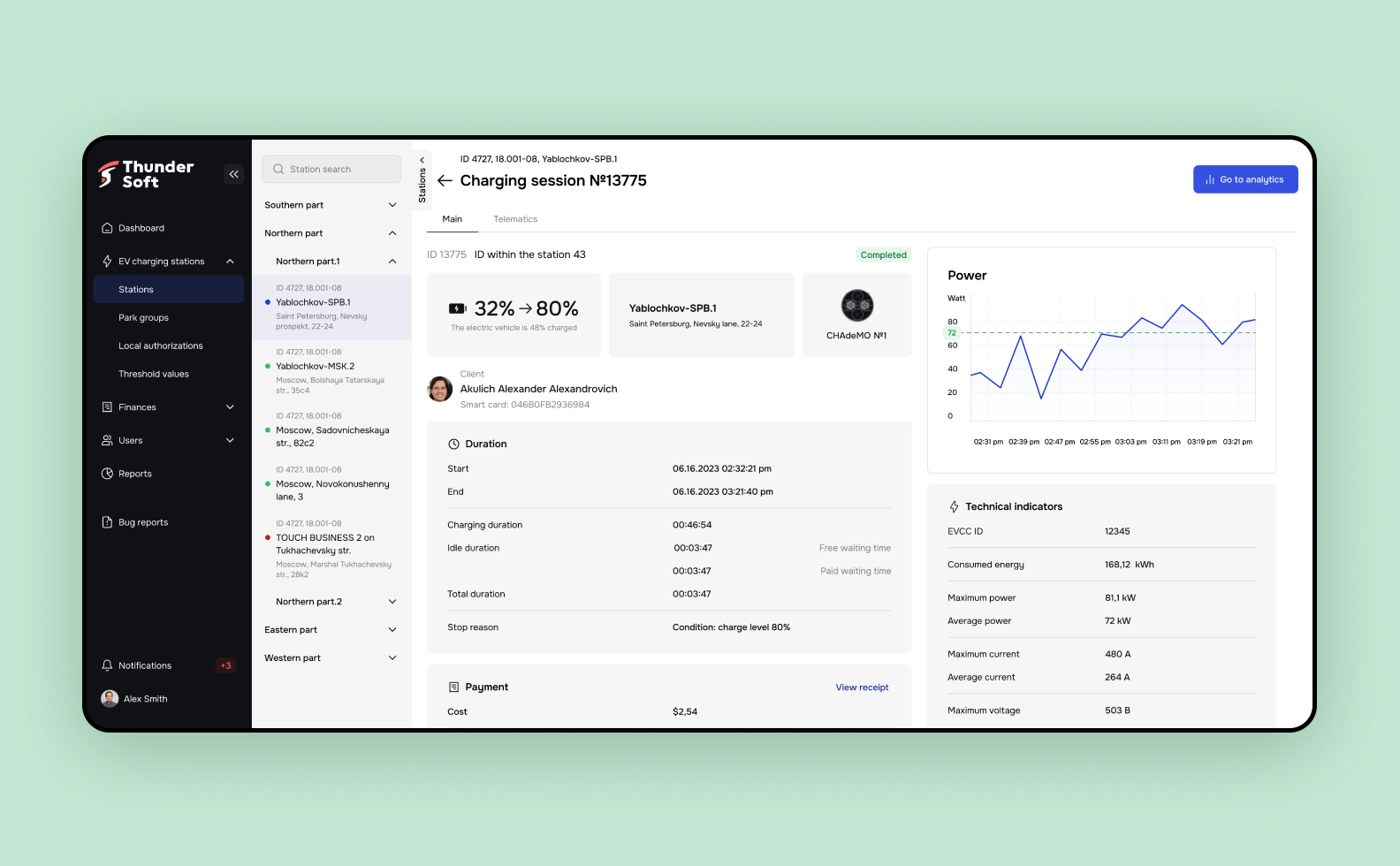
Data visualization in the web dashboard

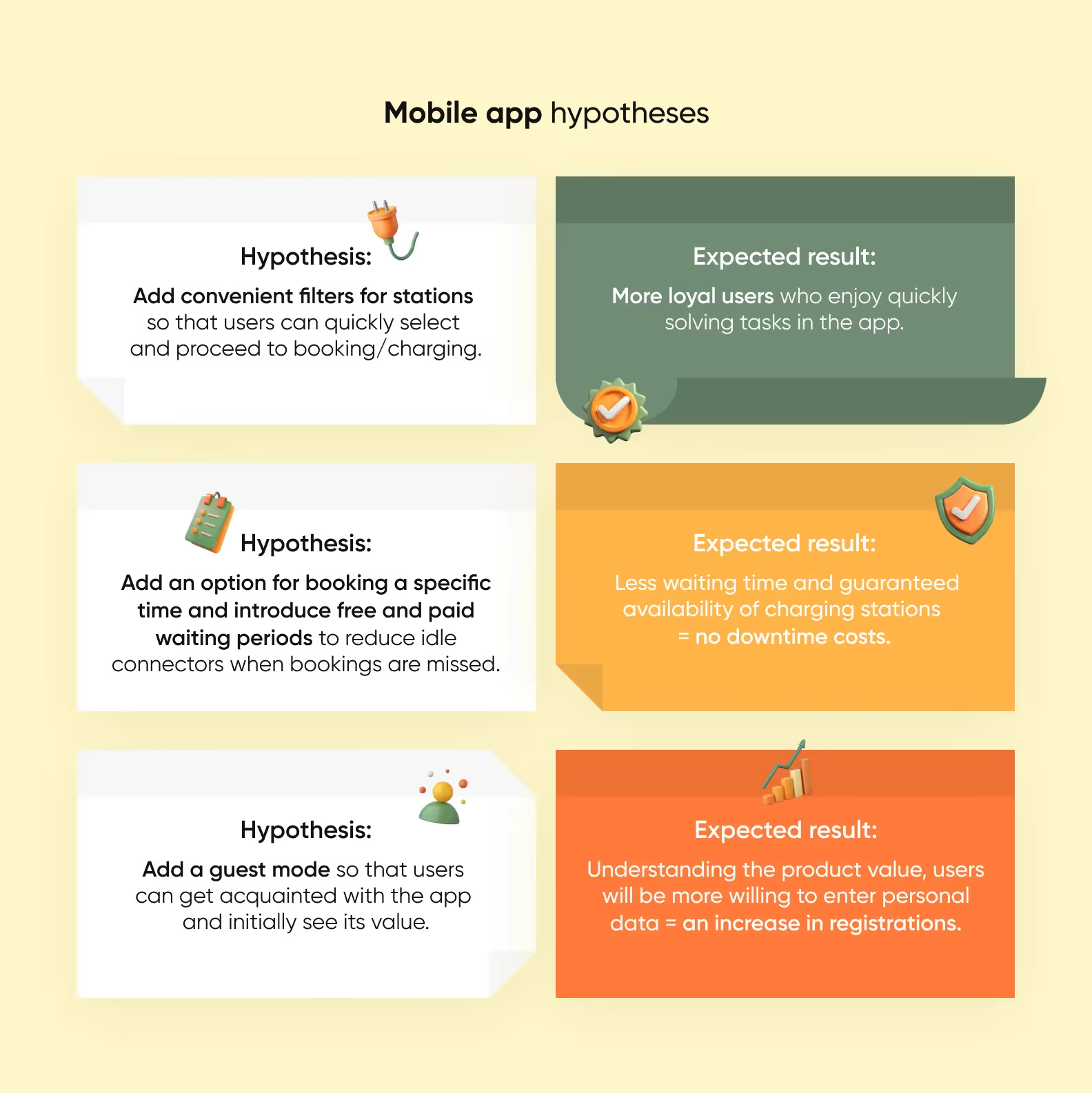
We formulated hypotheses in the format, “If we change or add this feature, we will improve the user experience and help solve the client's business problem.” Here's how it looked:
We had previously created an audience profile — electric vehicle drivers who regularly use apps to book charging stations and make payments. We surveyed them using a questionnaire.
We asked users about their daily tasks, experiences, and problems they encounter when using such apps.
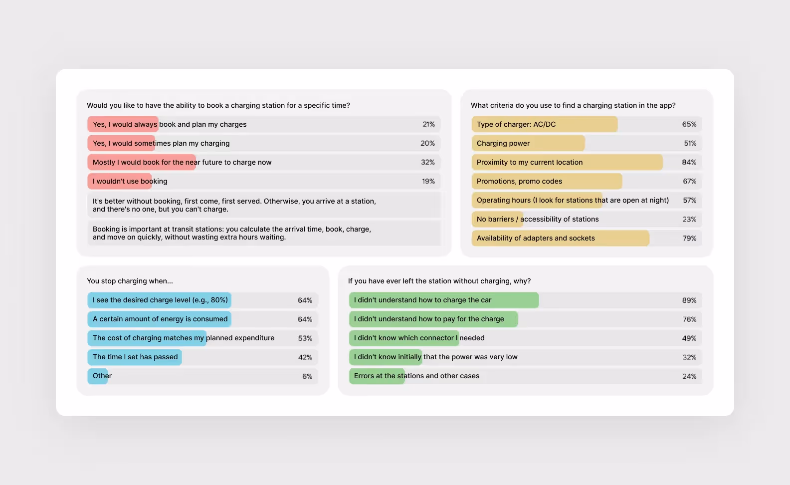
We found that the target audience's pain points matched our hypotheses. Therefore, we need to adjust the interface and flow based on this information to help the app meet users' needs effectively.
We formulated hypotheses for the web panel.
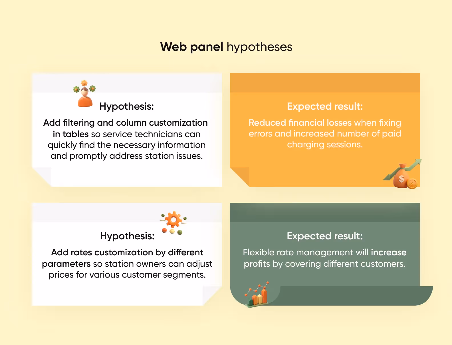
The web panel has a different target audience — service center employees, station owners, and service admins. To test the hypotheses, the project team conducted several in-depth interviews with them to understand current solutions and problems.
So, the UX audit is complete, and we have all the necessary information and a clear understanding of user needs. It’s time to start the redesign! We'll skip the process and show you the results.
Remember, our designer reviewed existing interfaces and pointed out weak spots? See how we reworked them! Where necessary, we simplified; in some cases, we added what users were missing. We made the app as user-friendly and straightforward as possible.
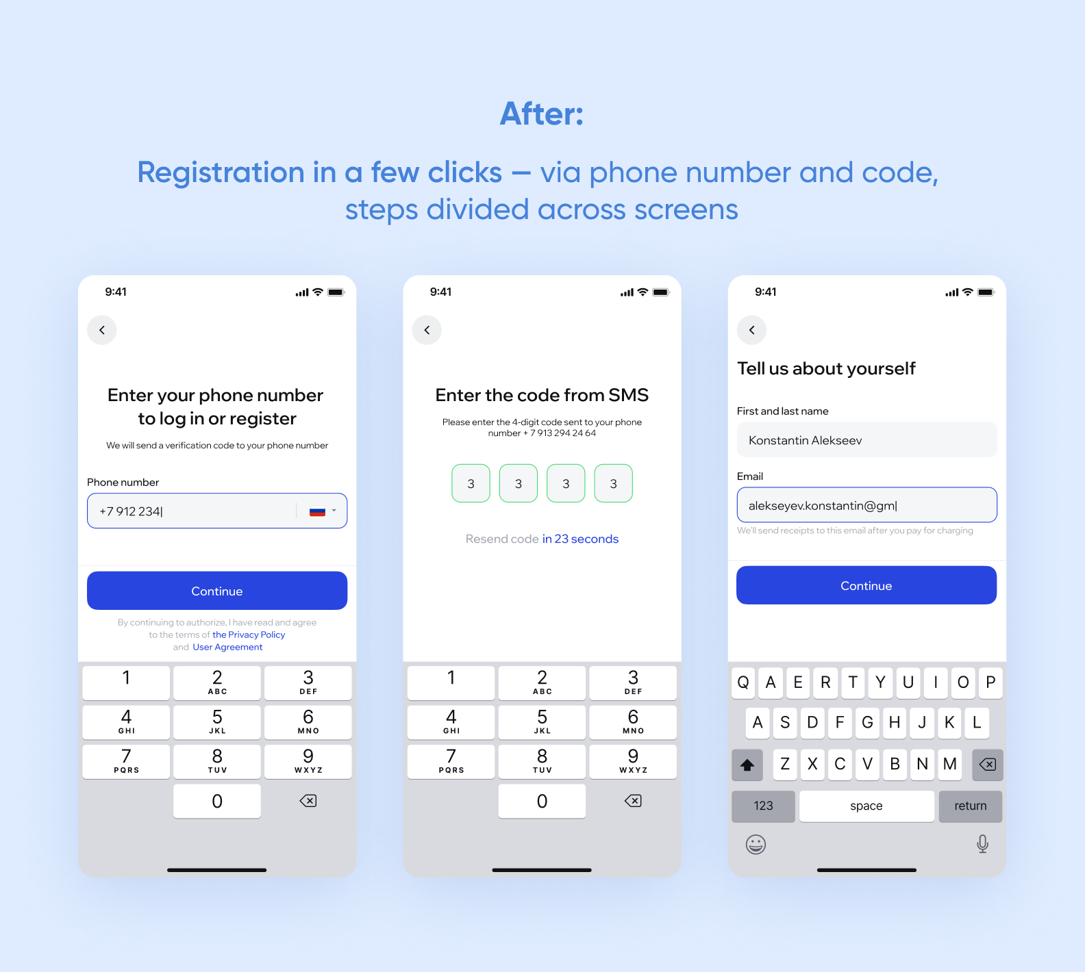
Registration and login: removed unnecessary steps

Main screen: brought the most important elements to the forefront
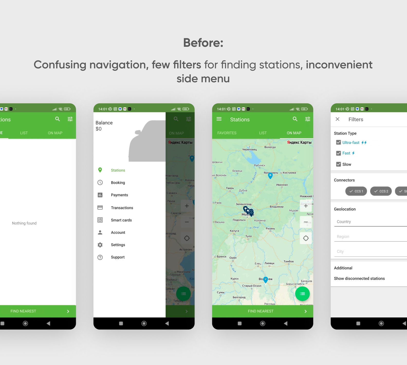
After logging into the account, users landed on a page with favorite stations, but for new users, this list was always empty. The main navigation was in the side menu.
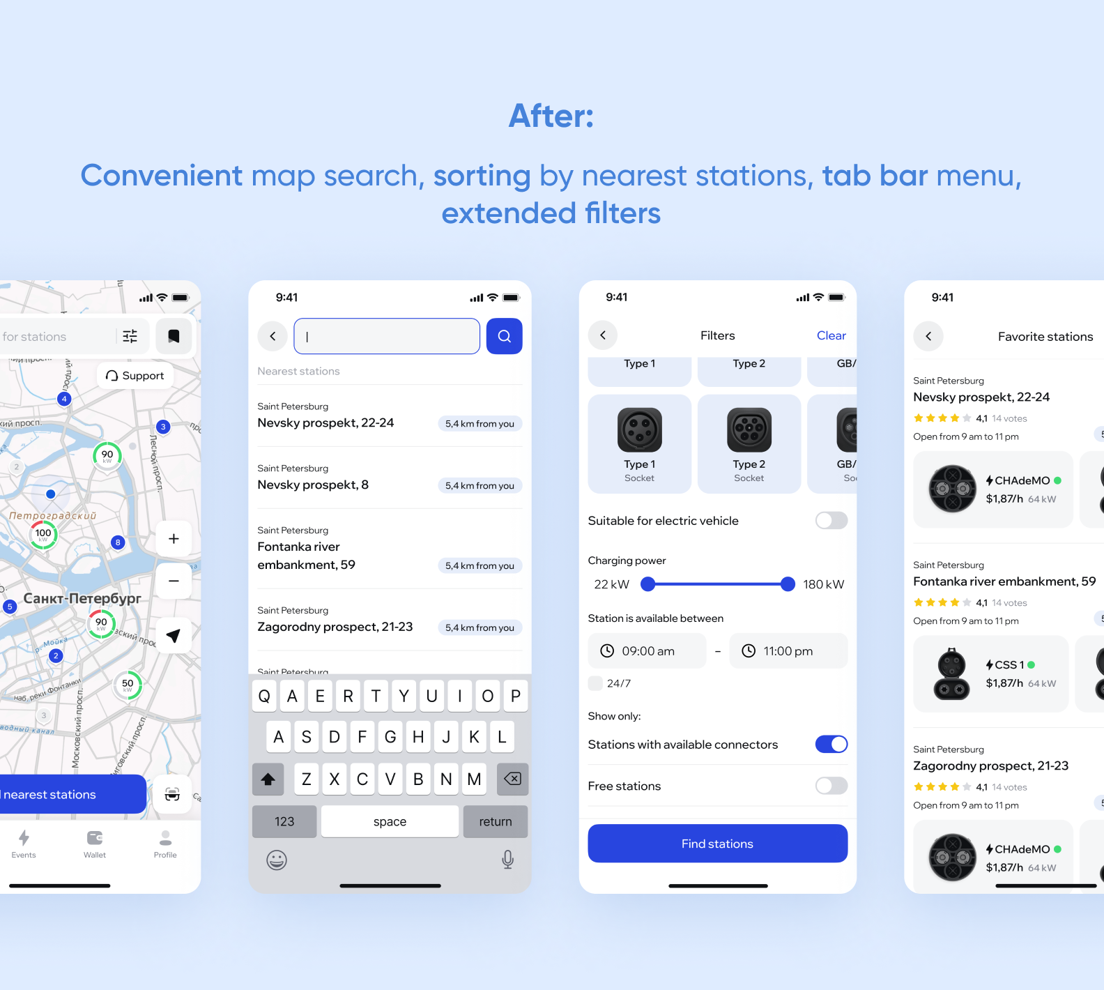
According to surveys, users mostly search for stations on the map, not through favorites, so the map screen opens first. There, users see all nearby stations. Navigation was moved to the tab bar, and more filters were added, along with images of different connector types for easy station selection.
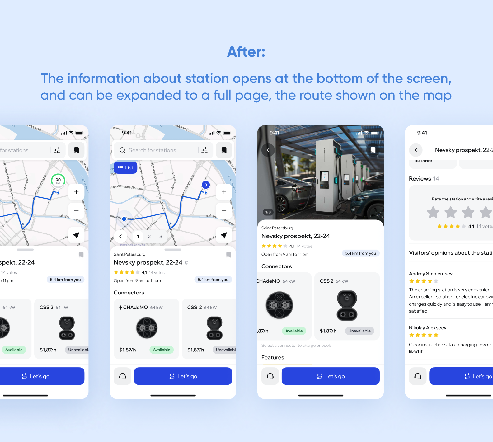
Station page: optimized information display
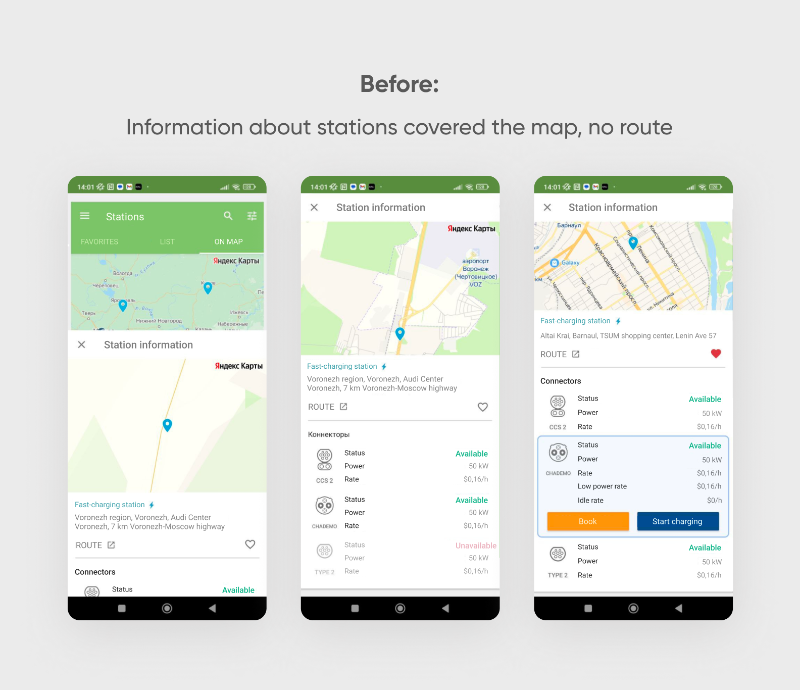
Previously, navigating the station page was inconvenient: the route wasn't displayed, the information partially obscured the screen, and the schematic representation of connectors didn't provide complete data.
We optimized the information display — now, the user can immediately see the route, and learn more about the station, and we redesigned the connectors from scratch, adding a 3D effect. This makes it easier to understand that there is a suitable type of connector at the station.
Booking: added new features
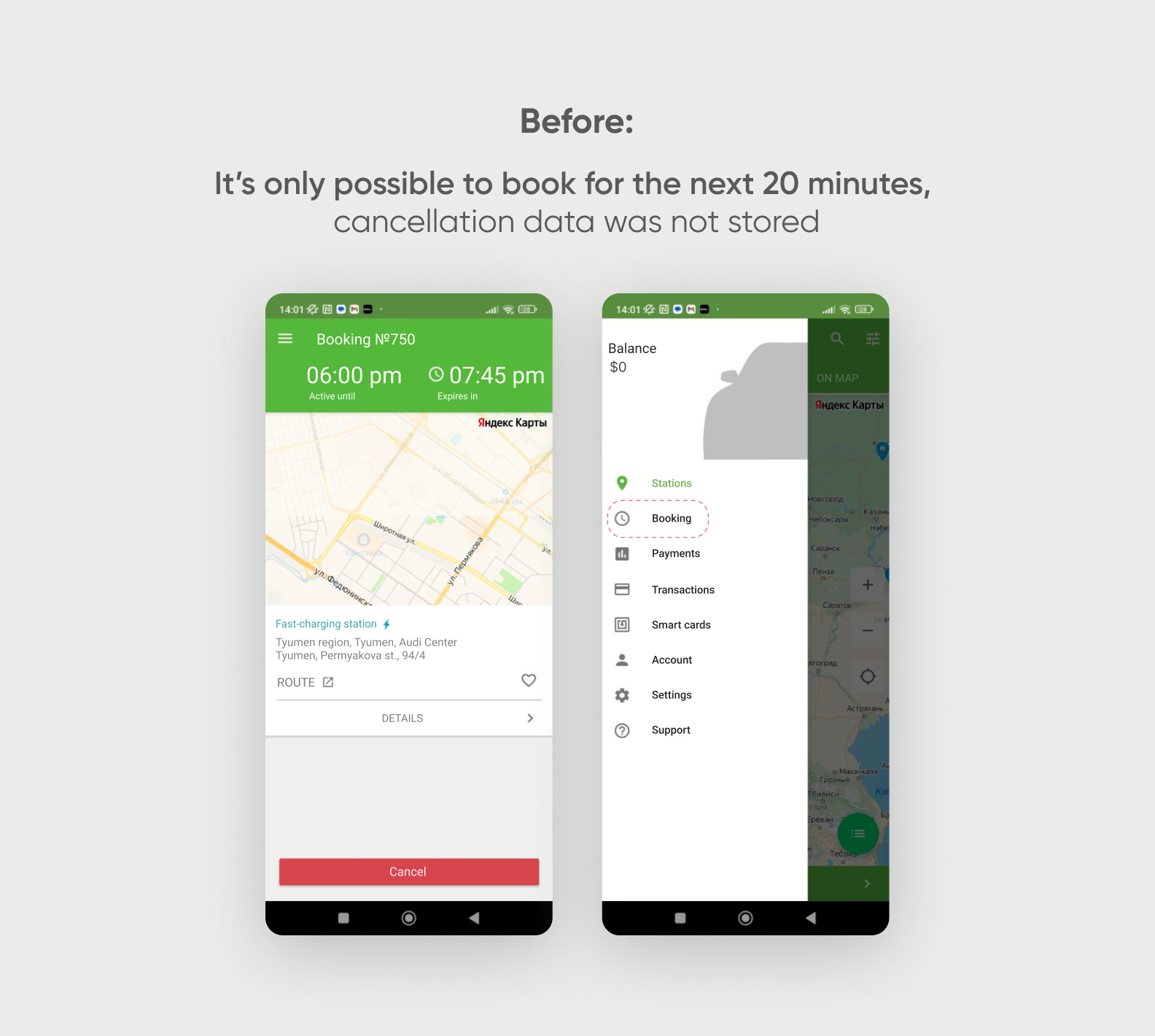

Previously, the app did not allow booking a station for a convenient time — only for the next 20 minutes. We kept the option to book "now", but improved the flow for selecting a specific date and time.
We also added the ability to view the history of canceled bookings and the reasons for cancellation as this option did not exist before. And if a booking was canceled, the page just closed, and the user didn't understand what happened. All booking features will be available in the general release version of the app.
Charging: visualized the process


We also changed the user profile and the payment page and added an onboarding mode for the first interaction with the app.

The team did a tremendous job, completely transforming the user interface of the web panel. The main goal was to make a data-heavy and complex service easy to navigate, with the interface guiding the user on what steps to take.
Check out how we achieved this. We won't show all the hundred-plus screens we redesigned, just a few examples — feel the difference! 🙌
Currently, the ThunderSoft team is preparing to release a web panel with an updated design.
Filters: optimized information display


Station page: added visualization

Charging and booking: simplified navigation
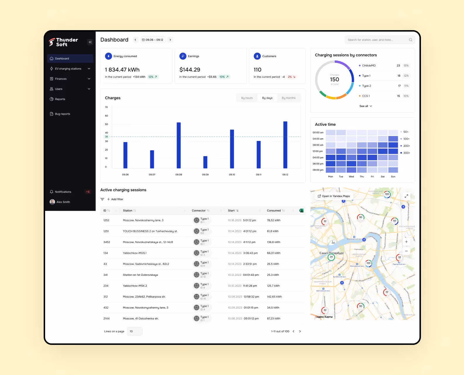
Dashboard for station owners
Initially, there was no dashboard, but to make it convenient for station owners to view all information in one place, we added it. The dashboard shows statistics on consumed energy, revenue, and active charges. This makes it much easier and faster to analyze data.
Dark and light themes for the design system and white label
We designed the system so that when developing an interface for another brand, you only need to change 9 colors in the code, and everything will adjust automatically. And you can switch to the dark theme right in Figma. That's design magic! 🔮
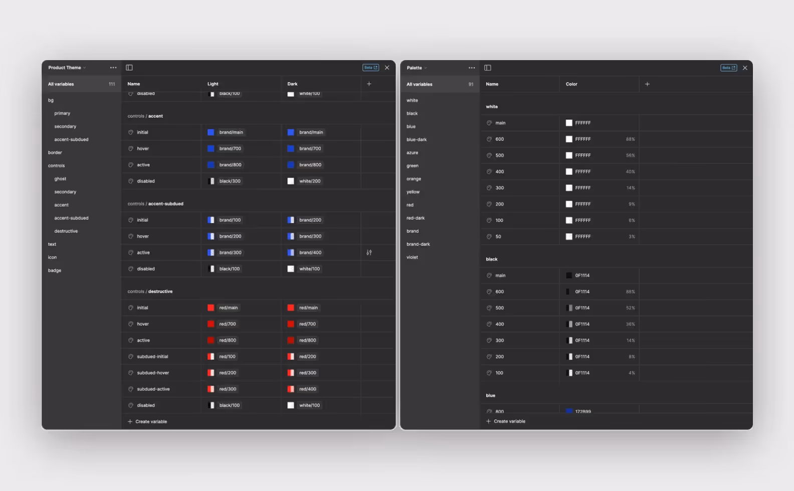
Light and dark themes:

We created an interactive prototype of the web panel to test it with service employees on a call. We gave them a task: identify a problematic station in the list, understand the reason for the malfunction, and describe how they would solve the problem. We used real data from the platform in the prototype to make the process as close to reality as possible.
We gave the same tasks in the old design. According to the technicians' feedback and the time it took to complete the tasks in the new version, finding errors now takes much less time.
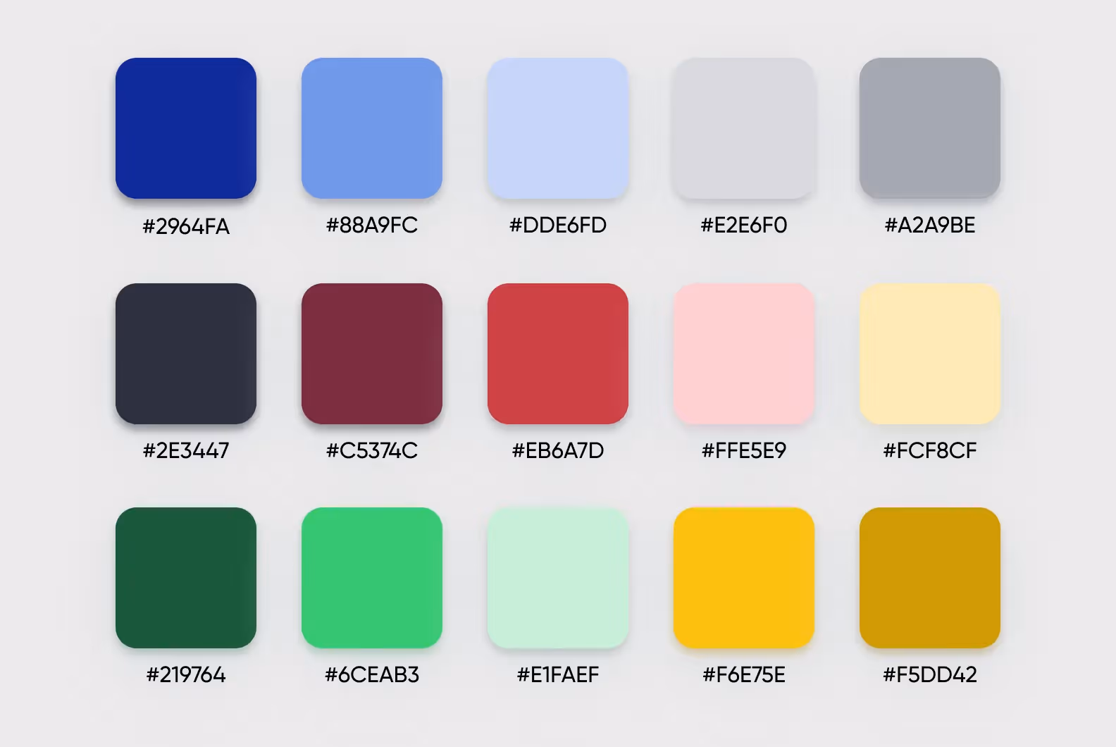
Since the mobile app and web panel are white-label, we didn't stick to a specific color palette. We chose a neutral blue color as the main one which is also very popular among corporate software.
We configured the color scheme so that some colors can be customized to match another brand's identity (variable colors), while others remain fixed.
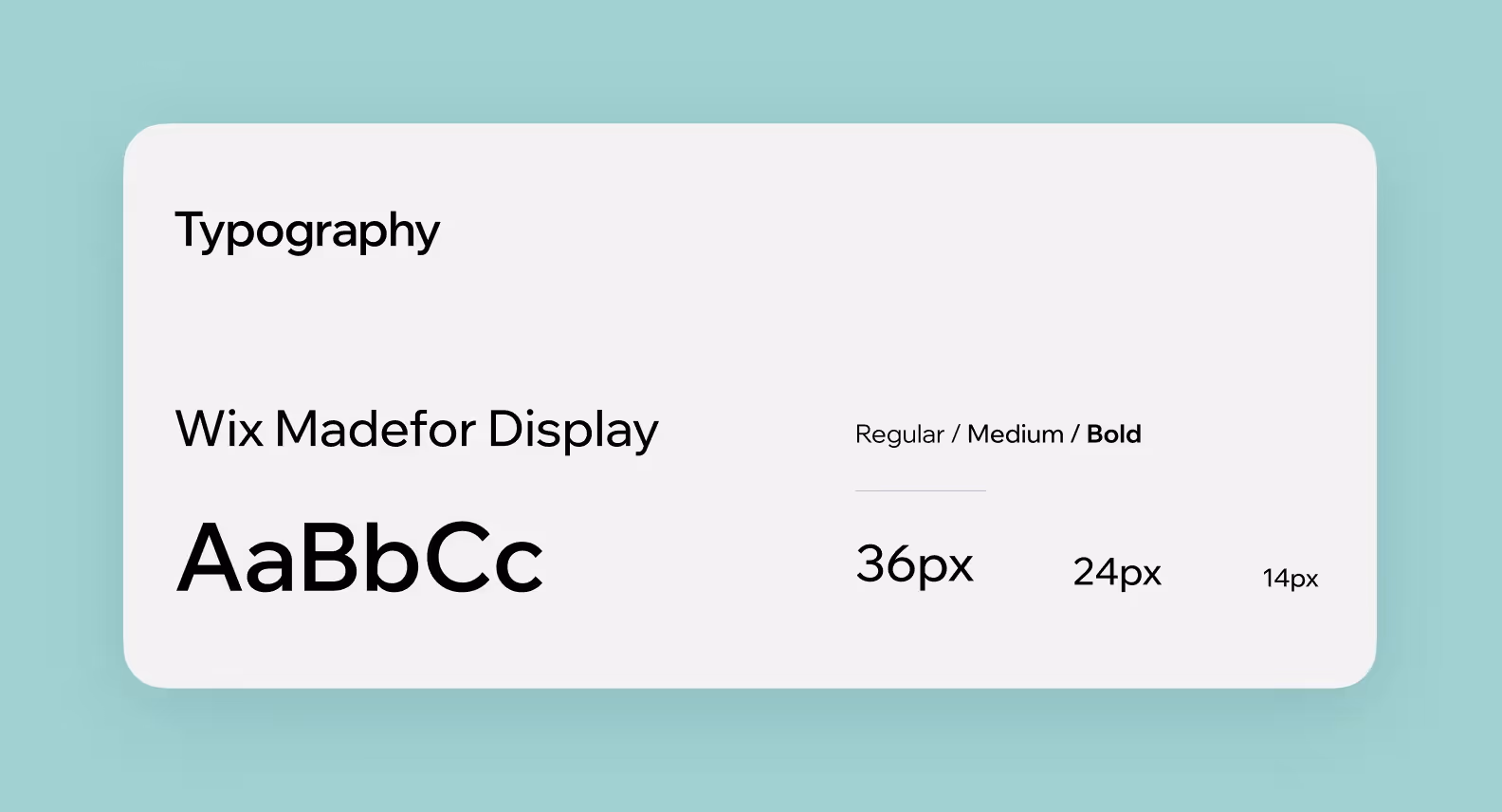
We selected a modern font, Wix Madefor Display. It is elongated and unconventional, yet easy to read. The font has many styles and an open license.
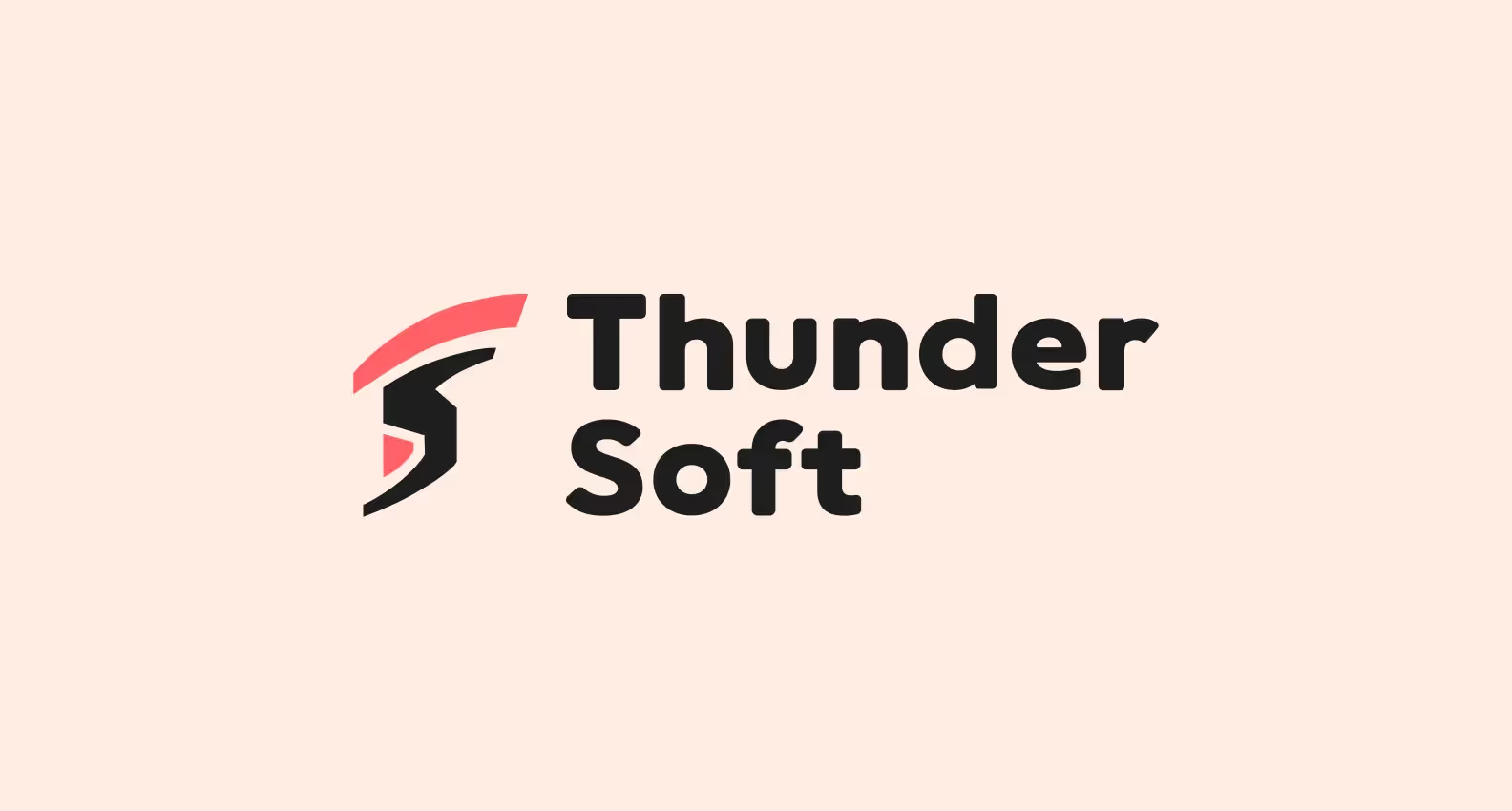
As part of the project, we also updated the ThunderSoft logo and created a brand book. We studied the brief, took the client’s wishes into account, analyzed the market, compiled mood boards, and developed several concepts.
We presented two logo options and selected the best one together with the client.
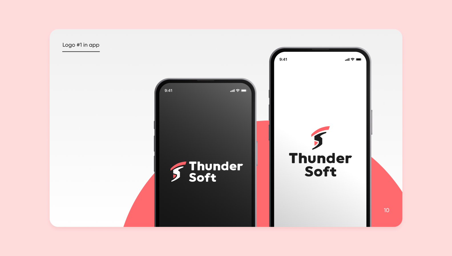
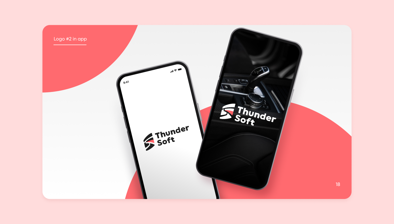
The logo consists of a symbol and a wordmark.
ThunderSoft recently released the MVP version of the redesigned app, now available on Google Play and the App Store. The web panel release will follow later.
The ThunderSoft team was pleased with the results. Now, the mobile app has a modern design with good usability, and the data display in the web panel has become much more convenient and compact.
The clients are confident that the new product design will help successfully solve the company's business challenges: attract loyal users and motivate service centers to switch to the ThunderSoft web panel for station management.
We successfully adapted to the requirements and deadlines of the ThunderSoft technical team. They appreciated it. Many specialists from their side were involved in the project, and we managed to synchronize and establish communication with them.
Throughout the project, the client thoroughly explained the system's logic to us. This is a complex high-tech niche, and understanding its specifics was really important for success. The client was not afraid to spend time (and therefore, budget) on explanations to ensure we fully understood all requirements and delivered quality work. This approach paid off completely.
➡️ Need a deep and thoughtful redesign? We at Purrweb are ready to help. We will immerse ourselves in the context of your business, analyze problems and weaknesses in the design, study best practices in the market, and figure out how to adapt them to your product.
Got a task? <a class="blog-modal_opener">Contact us</a>, and we will offer implementation options, discuss deadlines and budget.
Expertise in design. We have been creating IT products with cool designs for over 10 years. Our portfolio includes 550+ projects in a wide variety of fields: IoT, EdTech, marketplaces, dating apps, and much more.
Advocates of “smart” redesign. We understand that redesign is serious work, not just swapping buttons around. That's why we start with a UX audit, look at your competitors, and study the market situation. If necessary, we conduct castdev with users and usability tests. We only offer solutions that are backed up by figures and real feedback.
We know how to work without detailed technical specifications. You don't need to come to us with a detailed technical assignment. A general request and context are enough for us to understand the task and offer a solution that is ideal for your project.

.svg)


.avif)