Key takeaways
-
- The key value of web apps impacts their design principles placing utmost importance on user interaction and experience.
- Properly designed applications can drive engagement, contribute to brand image and create an enjoyable user-centric UX.
- Web app design consists of a thorough UX research, development of a design concept, creating mockups, prototyping, and UI kit.
What’s a web app and why it’s different
First, we have to draw the line between web apps and websites once and for all. Only here we’re speaking in terms of design, leaving out technical details.
A website is a heap of related Internet pages that are interlinked with each other and devoted to a particular subject. It stands out for its abundance of textual and visual content on the pages. For instance, right now you’re on our site, with our articles and project examples, which are used to help you while showing our experience. This is a website in a nutshell – useful, informative and helping you to get an idea of who we are and what we can do.
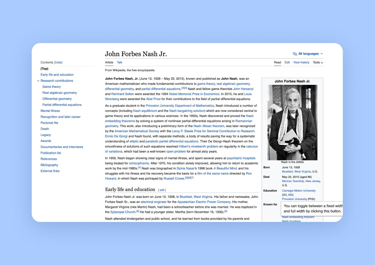
Wikipedia is a vivid illustration of an informative site with masses of textual content
A web application is an application that visually resembles a mobile app but is accessed via browser. Some of them offer direct downloading without going to any store. Just like their mobile “siblings” web applications allow users to manipulate data. Interactivity is their distinctive feature.
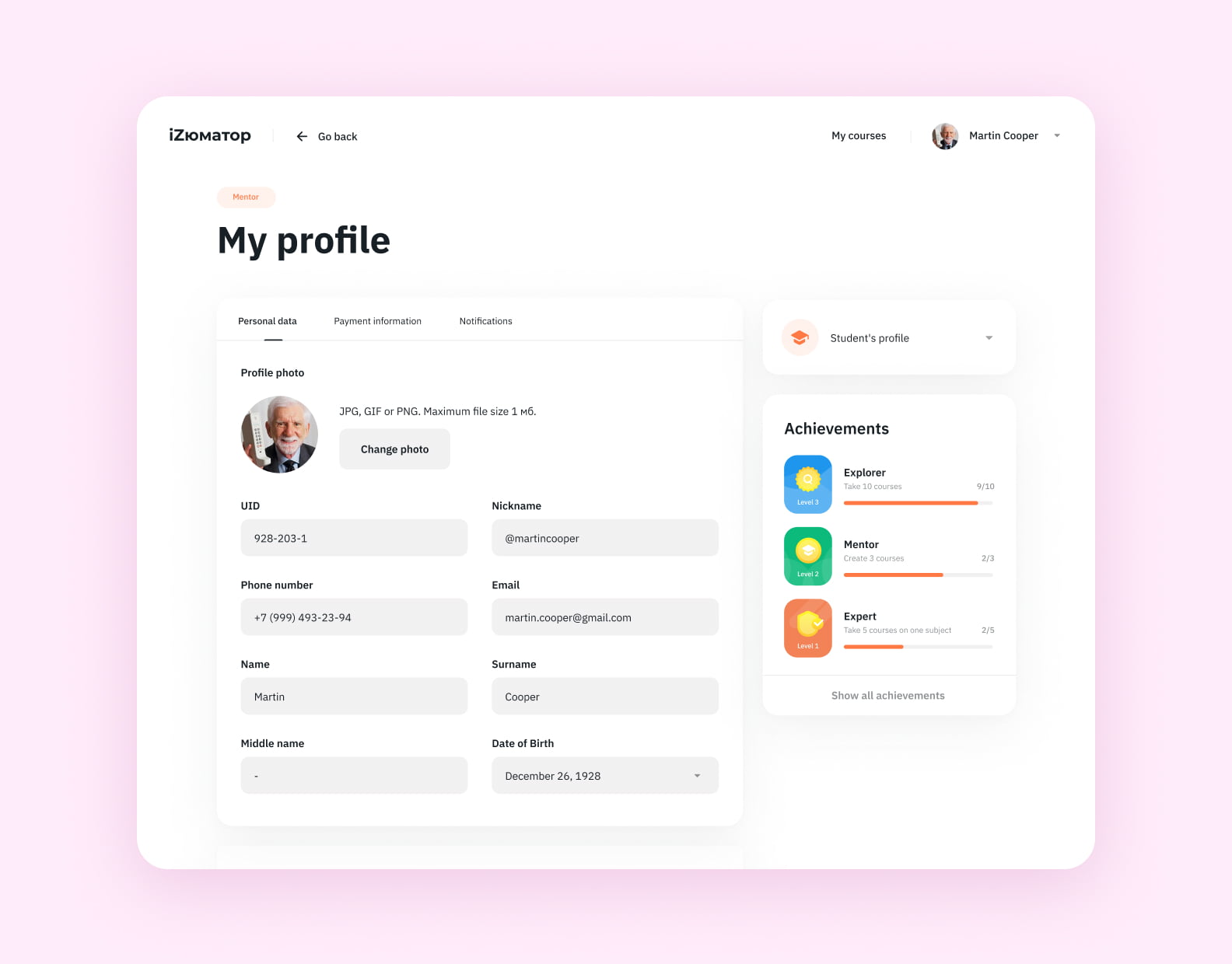
This is Izumator, a platform for internal education. Users can take courses and launch them, either way it means interaction, which makes iZumator an application
Web apps are there to assist us in getting to some goal whereas websites bring awareness about something or somebody
You see that the intended purposes of the two categories are slightly different. As a consequence, design approaches, aims and principles should differ as well.
3 key differences in website vs. web app design
As much as a web app and a website are two different things, the design will also be distinctive for each type of development. Here are 3 main differences in website vs. web app design that determine the UI/UX approach and shape optimal user experiences across platforms.
Design focus
Websites serve a broad audience who is looking for information. The functional intent of such platforms is to output information, therefore they prioritize layout, visualization, and universal web design rules.
Web app design targets users engaged in specific tasks, which demand intuitive navigation and dynamic space. Such products need interactive graphic design elements to engage users in the context of a platform. For example, customization, swipes, buttons, comments, zoom-ins, and others.
Complexity
A website is a static page that users open in a browser — either on a computer, a tablet, or a phone. Therefore, an effective website UI/UX is a simple one. Low-complexity is one of the main principles when creating a product look.
In contrast, web apps often contain multiple pages with broad context, so such platforms are naturally more complex. For a sleek and engaging user interface, developers have to consider various scenarios, devices, and customer behaviors.
Integration with device features
Websites primarily deliver content without deep device integration, so you don’t need to consider any features of users’ phones and computers.
In turn, web apps seamlessly use device capabilities to enhance their functionality, for example, access to a phone’s camera or photo uploads. This ultimately impacts the web app design.
What makes the design of a web app
Just like web and mobile, web application design consists of two major components UI (user interface) and UX (user experience).
UI refers to the aesthetic aspect of a product interface while UX focuses on the emotions, feelings and impressions users get during interaction.
| User interface (UI) | User experience (UX) |
| Design system | User research |
| Typography | Interviewing |
| Animations | User perception |
| Color palette | Information architecture |
| Images | Scenarios and personas |
| Icons | User journey |
| Design patterns | Usability |
| Interaction |
With web applications being all about engagement and interactivity, the UX part comes first here. Although, that doesn’t mean omitting visual style for apps or ignoring experience in web design. That’s just the part you should put emphasis on, in order to bring value to the users.
When you design a web app, you have to bear in mind the following factors.
Continuous use. Applications are products of repeated use. That’s why the app design process mostly focuses on efficiency, where everything is plain, easy and intuitive.
Covering the demand. Hardly anyone will return just to enjoy the color scheme, but if the interaction culminates in reaching a goal, then you’ll earn customer loyalty through the well-thought-out web app design.
Adequate interactivity. The process of using any web application should be consistent and predictable. For instance, you don’t want to add a form requiring personal information for a product like maps or store location checker.
Why is web app design important
When it comes to interface concepts you probably can borrow a page, but adopting the entire experience doesn’t seem like a viable idea at all. Entrepreneurs hire teams to render UX/UI design services owing to the importance of the matter.
Boosts engagement
Properly designed experience takes into account all the pains and obstacles users face. These efforts don’t go unrewarded. People appreciate this attention to detail in web app design and will be more likely to use your product.
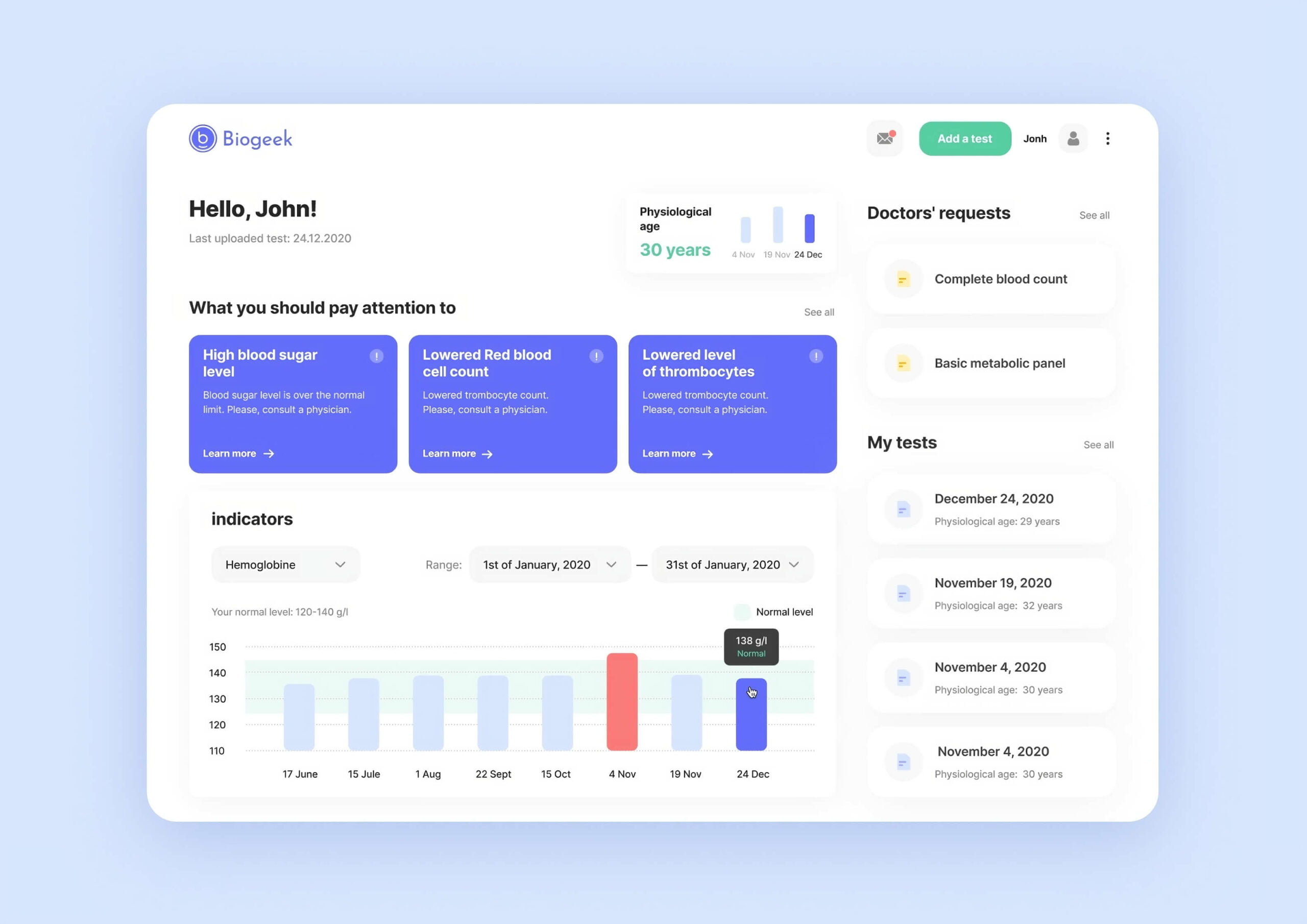
Dashboard on Biogeek is built on the understanding that patients take lab tests to track health progress, spot issues and get doctors’ diagnoses. This “recognition” provides the experience you want to repeat
People judge by the product
Apps and websites, just like any other products, impact the perception of a brand in people’s minds. Say, if you can’t do something as simple as adjust the font to be more readable, it will have a negative effect on the user’s impression of your business.
User-centric experience
The web app design process builds upon a user-centric approach when experts focus on audience needs first. This is a way to an intuitive interface structure that makes people more inclined to use your site.
4 examples of modern web application design
As you plunge into UX matters, you realize that interfaces basically have a lot in common. Think of Discord and Slack, TikTok and Instagram, WhatsApp and Viber. Still, their being similar doesn’t interfere with user orientation, high engagement and trustworthy reputation.
Familiar patterns bring predictability, a highly respected product feature. And if you want to design a web app, make sure to take inspiration from the golden standard. Here are some examples to consider about.
#1. E-commerce — Amazon
👍 cards, visual accents, several types of navigation
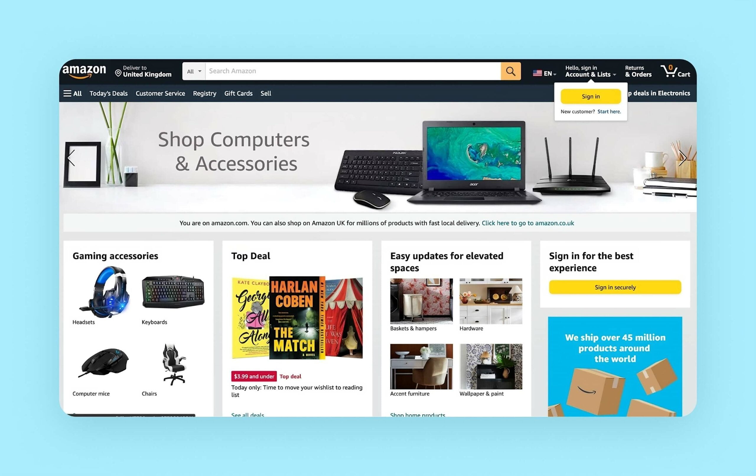
Classy Amazon homepage
This is a web application designed to be framed on the wall as a benchmark for other e-commerce platforms. Don’t judge by its plain looks, just study how functional the UX is. There are three ways to navigate for items, distinct buttons and messaging visuals for categories just to name a few.
#2. Healthcare — Lytic Health
👍 simplicity, visual clarity, structure, color coding, plenty of white space
Lytic Health is a web application where patients and doctors get in touch for preliminary diagnostics and scheduling appointments
Blank space is useful in design, as it brings “air” where nothing distracts the audience. See how we used it in the Lytic Health case. Doctors mostly have dozens of visits daily and it was vital to design a web app where they could grasp a patient’s history after briefly skimming.
#3. Management — Notion
👍 data manipulation, emoji, interactivity, neat design
Notion resembles an online pocket-book
This web application design is worthy of hype due to high customization capabilities and multi-purposeness. The design concept looks neat and plain. It supports flexible UX that remains the focus of attention here.
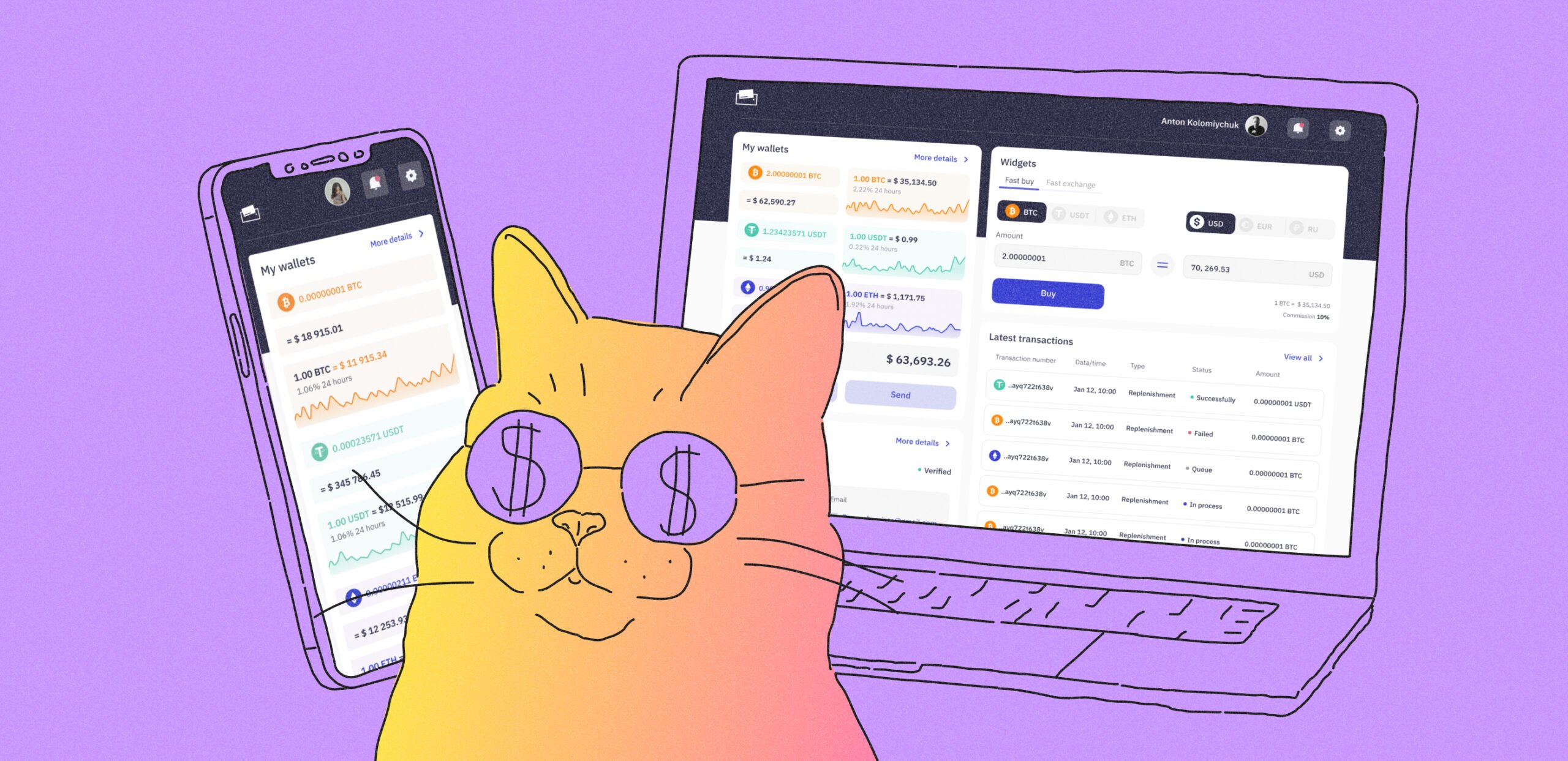
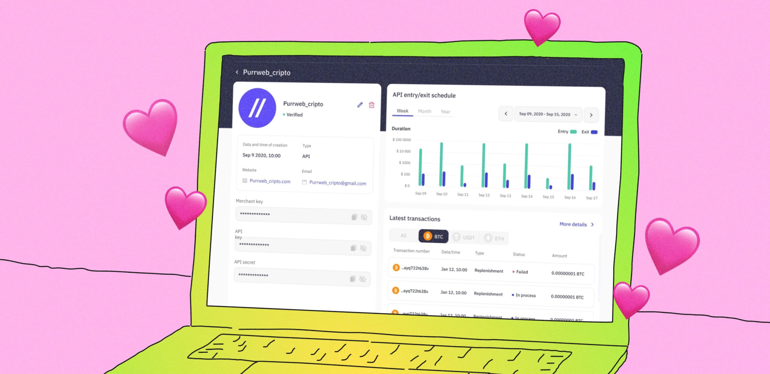
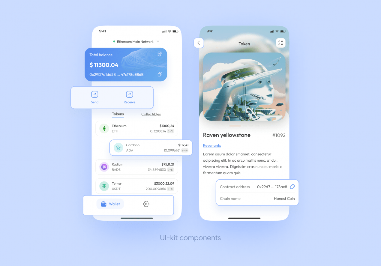
#4. Fintech — E-wallet
👍 grid, intuitive structure, widgets
Managing cryptocurrency is challenging and we tackled it partly by making the interaction self-explanatory
E-wallet is our design case for an online wallet where you can buy, keep, transfer and exchange cryptocurrency assets. All the controversy and stress people experience while interacting with financial products impacted UI/UX. Widget structure, simple navigation, and CTAs on the main screen help mitigate user emotional imbalance.
How to design a web app: 6 steps
There is plenty of psychology in interface design and consequently lots of subtle aspects to consider. Seek assistance from professionals who render UI/UX design services if you are unsure how to design web apps. We can offer you a helping hand with free project evaluation.
Step #1. UX research
Cases like Notion and Amazon are the kings of collecting information about their audience. Make sure to follow their steps at the initiation of the app design process and conduct UX research.
UX research uncovers attitudes, actions, patterns, loves and hates about interaction with the product. Our experts stick to the ultimate guidelines developed by Nielsen Norman Group, a widely-respected powerhouse in the field mobile and web app design.
As a product owner, don’t hesitate to participate in the app design process as well. Here are some tips on what you can handle.
-
- Study Betalist to find out if there are any early-stage startups sharing the same ideas and concepts. Insure your product from accusations of plagiarism.
- Explore forums, communities on social networks, and blogs of your target audience to gather market demands.
- Boost awareness about market trends to see what people search for. Google Trends is at your service.
Step #2. Functionality and sections/pages
No expert, whatever their qualification, can structure your product without knowing what it should consist of. Prior to the app design process itself, make sure to list all the sections, actions and functions you want your web app to have.
Let’s say the feature list for a mental health application can look like this:
-
- Users can log in and sign up via email / phone number / social accounts.
- Users can set goals for their self-therapy.
- Users can get daily positive affirmations.
- Users can take notes of their emotions and feelings.
- Users can talk to a chatbot.
Real illustration for this taken from our case about the development of a mental health app
Based on this you can also finalize the sections. In our exemplary case, these can be “Goals”, “My mental health diary”, “Support”, “Daily inspiration” or something like this.
Step # 3. Moodboard and reference pack
At the next stage your design team will ask you to provide some references. Both negative and positive. You can refer to the whole functionality of some applications and also choose certain features, design hacks and visual touches you like.
The design team doesn’t know yet whether you want a huge banner on the first screen or can make just a plain text greeting. Try peeping into Behance, it has a convenient search that can simplify the task. And don’t forget about higher-ups in your field.
Then share the findings with the team. They serve as grounds for a moodboard which is a rough reflection of the visual style, atmosphere and tone of the product.
Step # 4. Wireframes
All the insights about functionality and desirable structure from the references form the basis for wireframes. These are colorless structure drafts made to ensure the design team is on the right track.
When you design a web app wireframes are a must, as they let you double-check the choice of UX. You don’t correct flaws only after all is done, but do testing and evaluation of the flow convenience from the start.
Step # 5. Design concept
When all parties have agreed on the application structure, the design team adds visual style to 2-3 screens or pages. Again, this stage saves a lot of stress. Imagine if the web application design presented to you a day before the release was far from expected. Not ideal.
Step # 6. Mockups and UI kit
The juiciest stage of the app design process is the final version of your product. Here’s when you get mockups for the entire application. Check if the design file has all the screens and states you’ve agreed on with the designer.
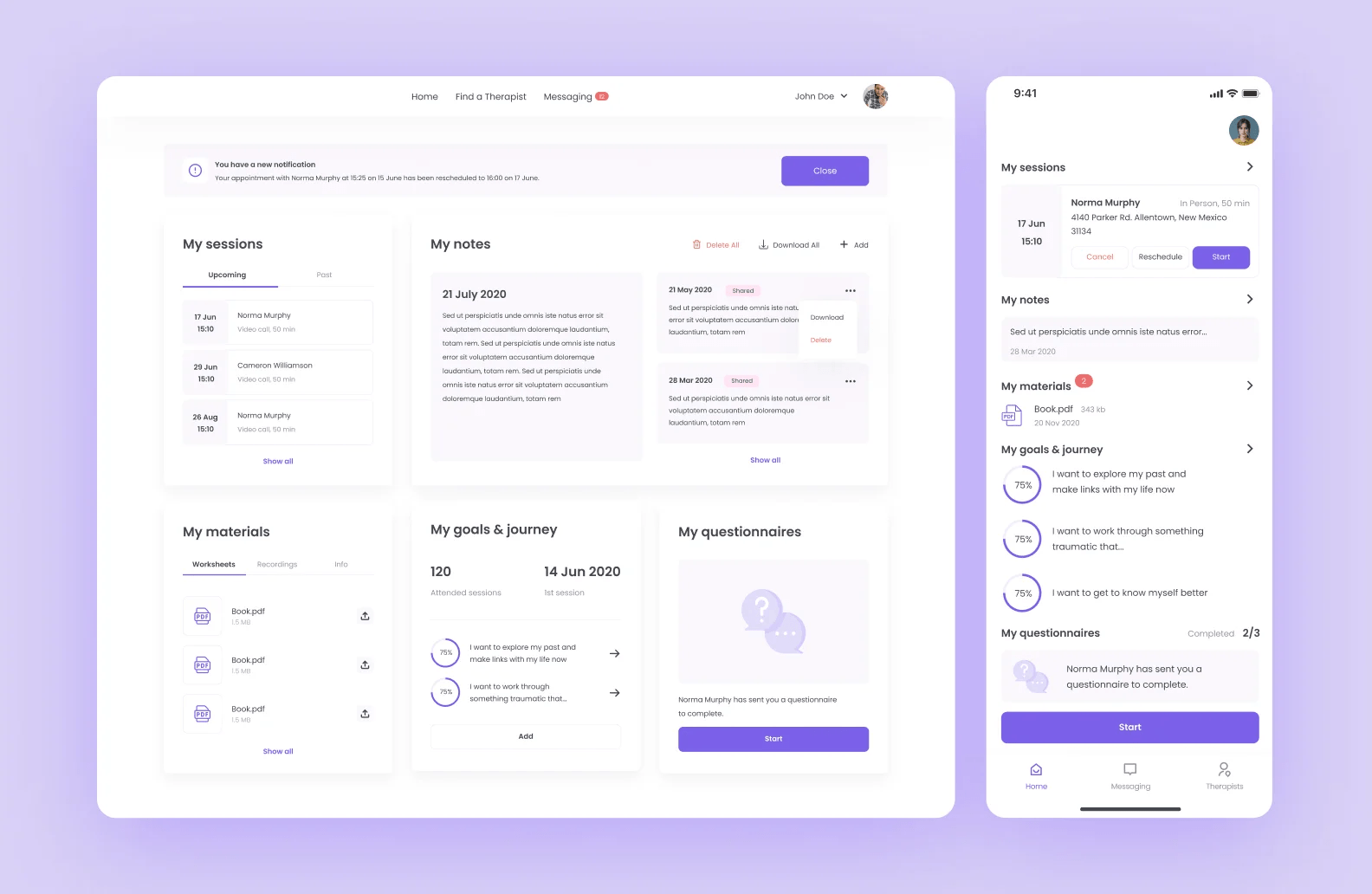
Besides, it would be useful to ensure you have a UI kit too. This is a pack of graphic design elements to reuse in later product iterations.
Such components as highlighted above can make up the UI kit for the first iteration, as the possibility of reusing them is high
We recommend adding the following components into the UI kit, to help you design a web app better in the future:
-
- color palettes and styles (gradients, color numbers)
- dark mode
- typography
- grid
- icons
- buttons (with states: initial, hover, focus, loading, disabled)
- inputs (with states: initial, active, typing, filled, disabled, success, error)
- dropdowns
- cards
Step #7. Refine and keep up with trends
Congratulations, your web app is out. It doesn’t mean you can sit back and relax — new web design trends emerge and user behavior changes over time. To keep the buzz alive, you need to update UI/UX and release new versions consistently. There is a secret sauce to this:
Listen to your users. The real MVPs are your users, and their feedback is gold. Dive into reviews, social media comments, emails, and direct messages. If they’re asking for a smoother onboarding or demand a more intuitive user interface, listen up. Look at leaders of web app design like Instagram; they didn’t stick with the original UI/UX forever. Instead, they kept testing and updating to deliver a user-friendly platform that is popular globally.
Consider data. Numbers can back up users’ requests and suggestions. Dive into analytics, and track user behavior to identify pain points and opportunities for improvement. If users are dropping off at a particular screen or struggling with a specific feature, it is your cue to polish up a web app design and release an update for a smoother journey.
Pick trends wisely. All trends come and go — a few of them stick, but most fade away. Don’t just follow them blindly. Imagine if you pour all your web app design resources into a fresh update that will become irrelevant in a month, only because it features a trend with a short life span.
3 examples of our web app design
Our team has developed and designed 300+ successful projects, including websites and web apps.
Here are some web application design examples executed by Purrweb specialists.
My Therapy Assistant
The dashboard in My Therapy Assistant
One of our favorite web application design examples is My Therapy Assistant, which exists as both a mobile and a web app. We decided to develop two UI versions during the web app design process, for a client, and a service provider, as they need different sets of features. Check out how it turned out here.
Carbon accounting
Carbon accounting is sort of a digital eco consultant who helps businesses monitor their greenhouse gas emission and find effective ways to neutralize it. One of the main screens in its web app design is a dashboard with all the data. We used visualization tools and a light color scheme to reduce the feeling of information exhaustion. Peak at the user interface here.
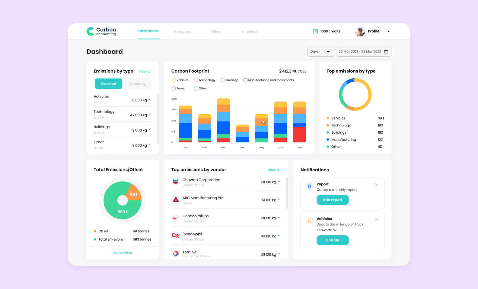
The dashboard in Carbon Accounting Platform
Shockers
Our clients, a stun gun manufacturer in multiple countries, requested to design and develop a desktop app that would analyze data collected by their products. We jumped in to create a web app design based on the Call of Duty UI: darker shades, contrasts, highlighted charts, and other graphic design elements. Though it is a desktop app, our project journey was very similar to the web app design process. You can look at the final result here.
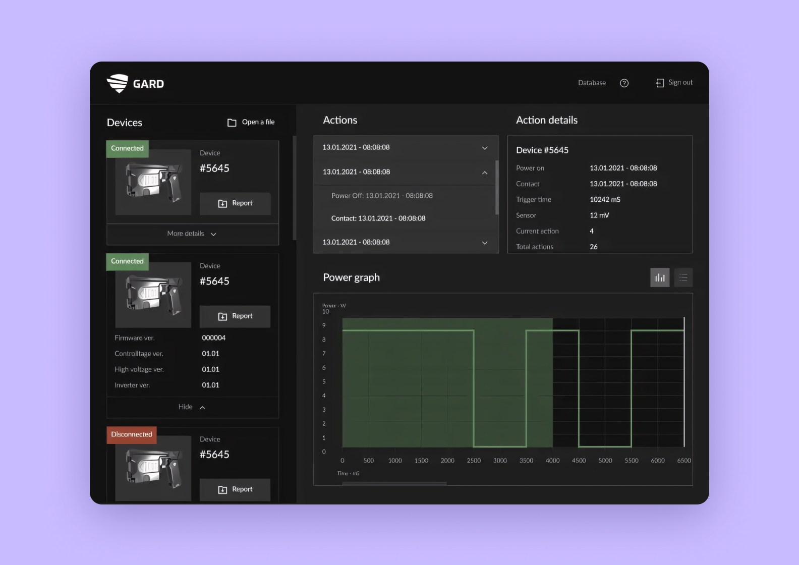
The app gets the data about the shots made by the gun and visualizes it
Final words
As you see, this web design job has plenty of twists and turns that those without the proper experience can fail to see. We encourage you to entrust the task to professionals with proven expertise in UX/UI design services and a solid portfolio, to keep your project safe.
If you have any concepts or ideas for a web application, feel free to share it with our team using the form below. Purrweb has 9+ years of experience in MVP development and your app has every chance to be successful.