Explore
Need help with your project?
This field is required
Incorrect phone number
Incorrect Email
This field is required
Please fill in all fields
Next
Next
Your role in the project
Services
Budget
Please select one option in each category
Submit
Submit
several colorful figures
Request sent
Our manager will contact you shortly.
Oops! Something went wrong while submitting the form.
Budss: a cashback service with social media features

Budss
Purrweb
2024
Case
iphone screen phone image

Idea of the app

Users receive cashback when they make purchases through the app at partner stores.

They can also form groups with other users, increasing the cashback for each member of the group.

Task

A client from Israel asked us to redesign the existing Budds app. The previous UX solutions were reducing conversion rates, and the interface didn't match today's trends.

The challenge was to combine elements of a social network and a payment app, so that they wouldn't contradict each other but rather complement each other.
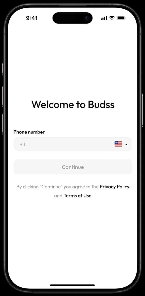
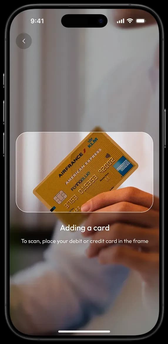
User flow

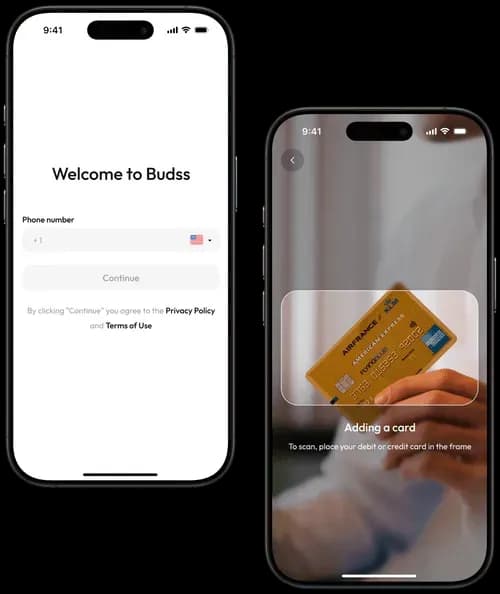
The user registers
and adds a payment method

Mobile app onboarding screen for BudssMobile app screen for adding a card

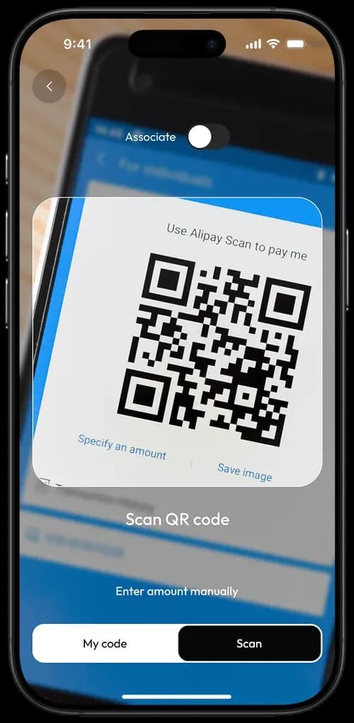
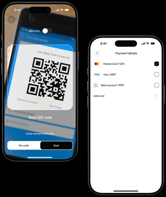
The user scans a QR code on the terminal and gets cash back after paying through the app

Mobile app QR code payment screenPayment details screen with card options

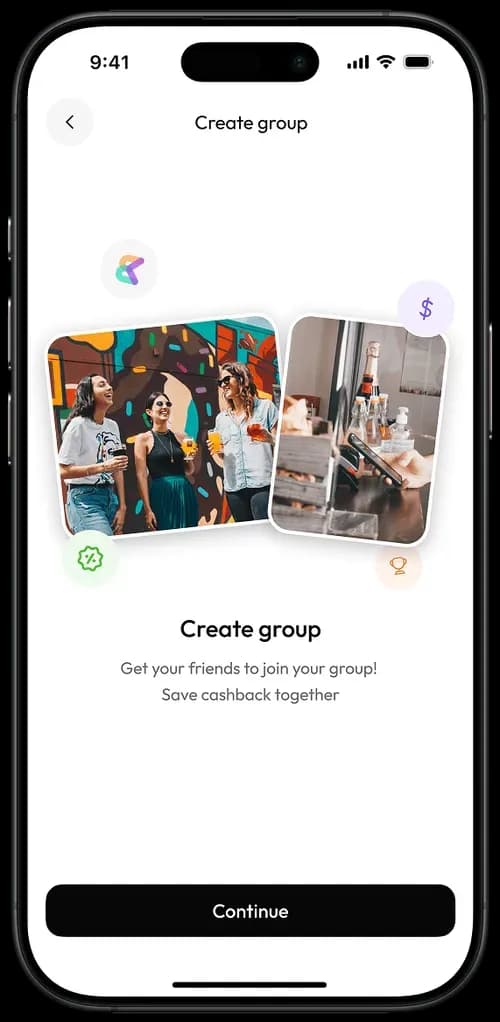
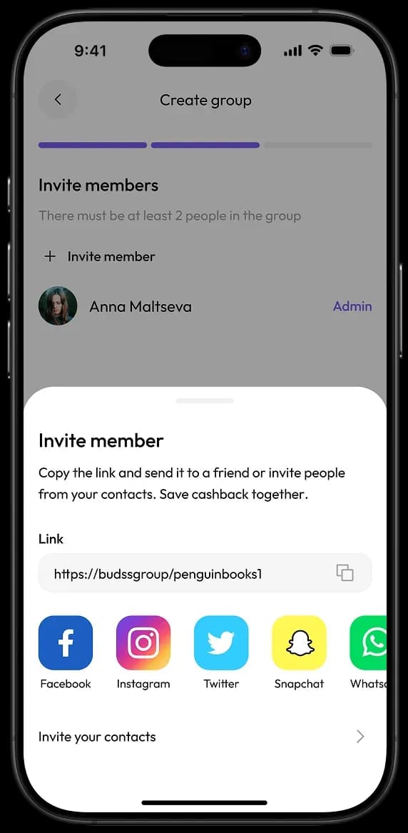
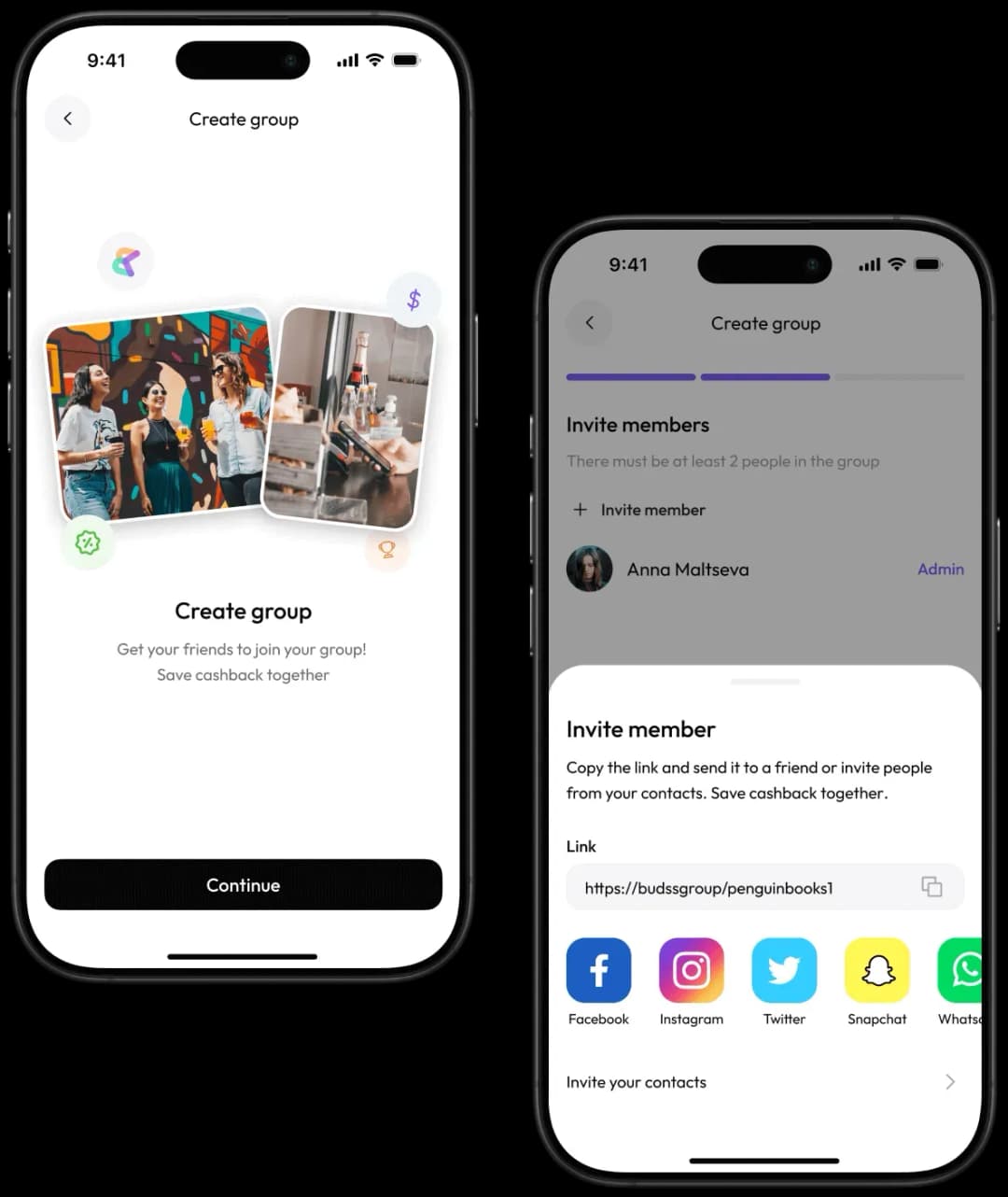
The user creates a group with several users to get more cash back

Create group screen in mobile appGroup creation and member invitation screen

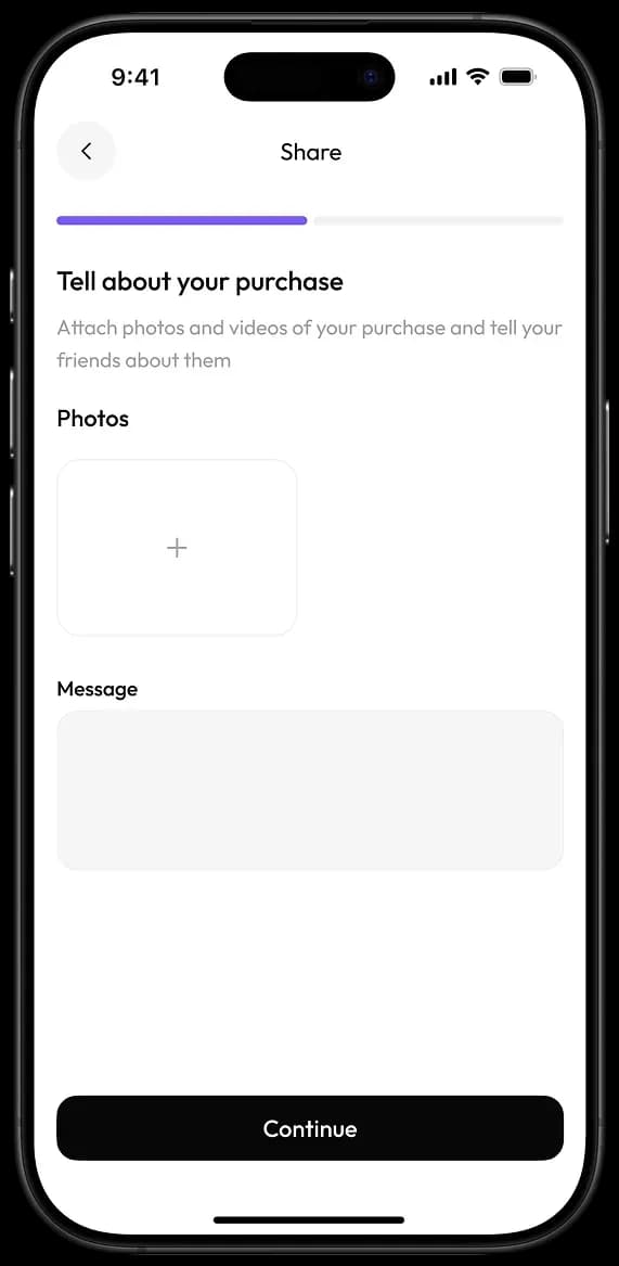
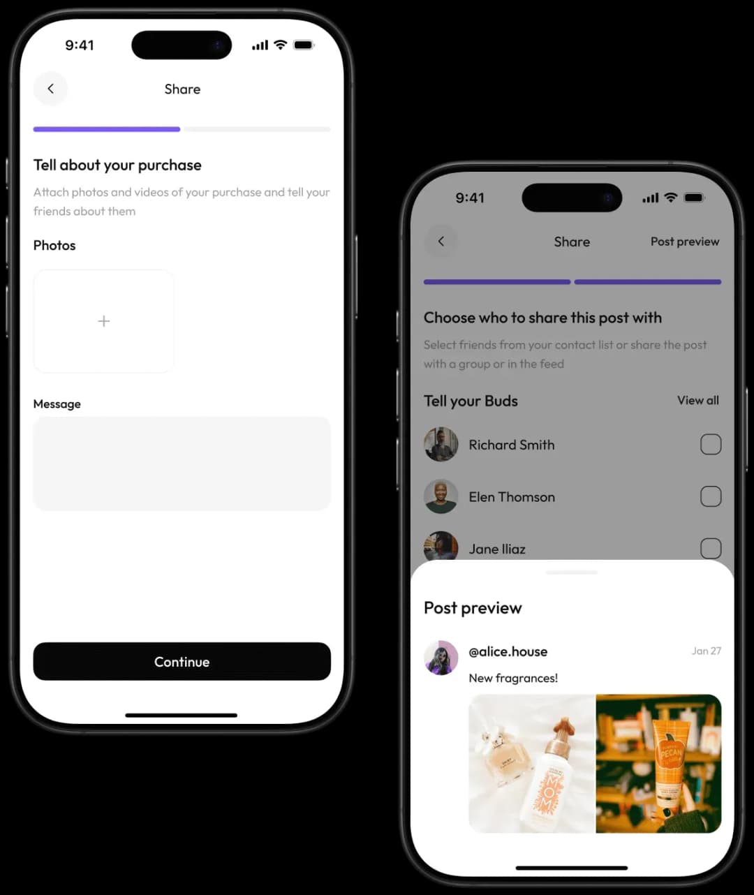
The user shares posts about the recent purchases to attract more members to the group

Mobile app share purchase screenMobile app content sharing screen

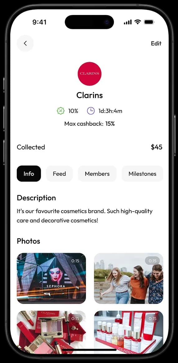
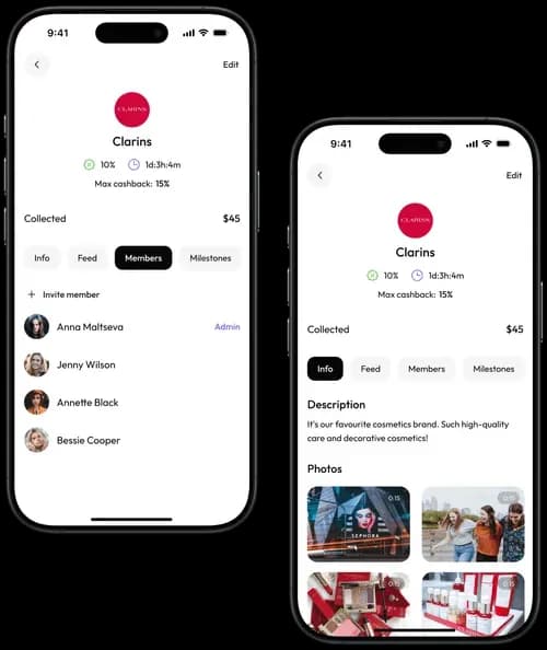
The user scrolls through the feed, follows other users, and joins their groups to gain more cashback

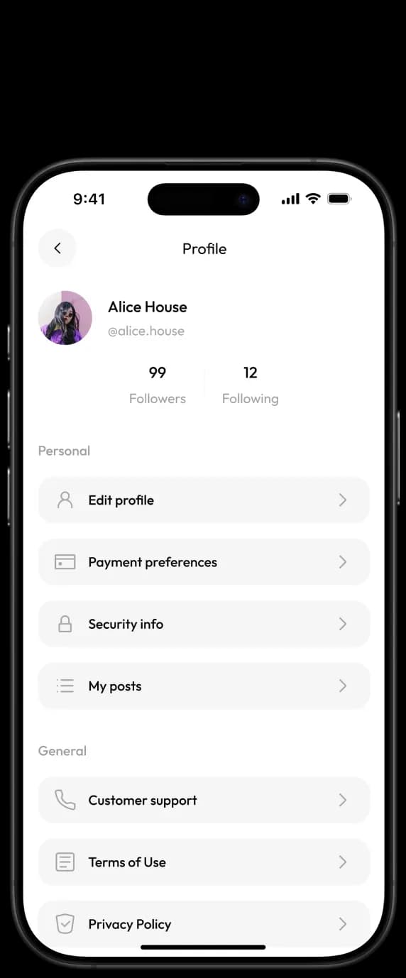
Mobile app user profile screenMobile app cashback program overview screen

User flow

The user registers
and adds a payment method

The user scans a QR code on the terminal and gets cash back after paying through the app

The user creates a group with several users to get more cash back

The user shares posts about the recent purchases to attract more members to the group

The user scrolls through the feed, follows other users, and joins their groups to gain more cashback

phone image
phone image
phone image
phone image
phone image

How we tackled the challenge with our design

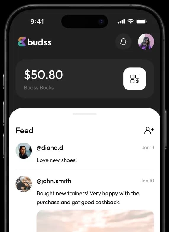
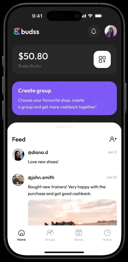
We visually divided the start page into two parts: the black and the white one

The functions related to gaining cashback are on the black background. The feed (the social part of the app) has a white background

Mobile app dashboard showing user feed and balance

The purple Create group button is a bold accent, but it can be easily hidden if desired.

On the one hand, the button helps to increase cashback. On the other hand, it facilitates interaction with other users. That's why we placed the button in the middle between the two functional blocks

Mobile app interface showing balance and group creation features

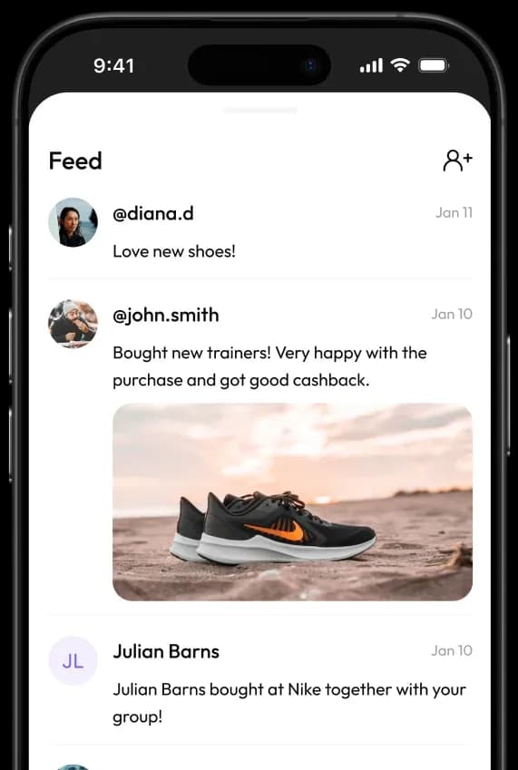
A user can expand the feed with posts to full screen.

So that it looks familiar, just like in other social networks

Mobile app feed screen displaying user posts

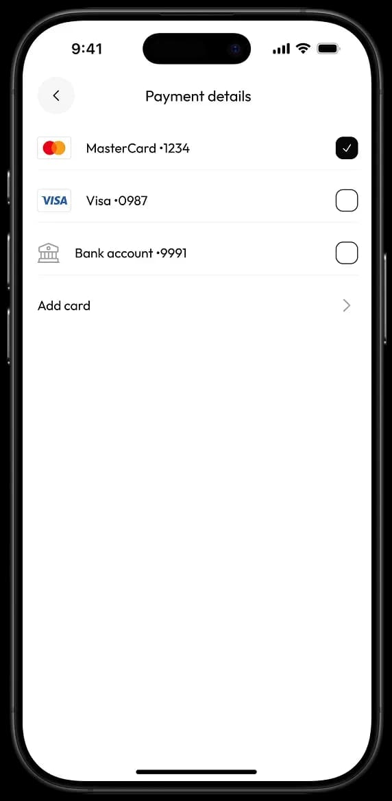
The user quickly navigates through the Payment details and makes payments at the checkout without any fuss.

There’s a list of payment methods with checkboxes. The user can easily understand which one of them is selected

Payment details screen on mobile app

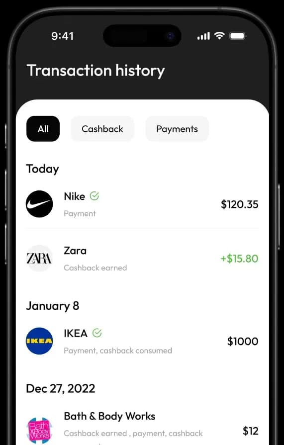
We developed a concise interface following Apple's guidelines

The app doesn't seem cluttered, despite its diverse range of functions

Mobile app transaction history screen

How we tackled the challenge with our design

We visually divided the start page into two parts: the black and the white one

The functions related to gaining cashback are on the black background. The feed (the social part of the app) has a white background

Mobile app dashboard showing user feed and balance

The purple Create group button is a bold accent, but it can be easily hidden if desired.

On the one hand, the button helps to increase cashback. On the other hand, it facilitates interaction with other users. That's why we placed the button in the middle between the two functional blocks

Mobile app interface showing balance and group creation features

A user can expand the feed with posts to full screen.

So that it looks familiar, just like in other social networks

Mobile app feed screen displaying user posts

The user quickly navigates through the Payment details and makes payments at the checkout without any fuss.

There’s a list of payment methods with checkboxes. The user can easily understand which one of them is selected

Payment details screen on mobile app

We developed a concise interface following Apple's guidelines

The app doesn't seem cluttered, despite its diverse range of functions

Mobile app transaction history screen

Colors

The black and white

The black and white interface looks sleek and modern, which matches users’ expectations from a financial application

We've added a touch of emotion with purple and green accents. Still, the colors aren’t too bright to maintain a consistent business style

Typeface

Outfit

The Outfit font is easy to read on the screen, even when you’re in a hurry and need to make a purchase through the app quickly

The sans-serif letters and numbers look neat but not overly formal. The font fits well both in the user's balance block and in a post next to vibrant photos

The result

In a month of working with us, the client obtained a fully completed design-concept with all the necessary screens and UI elements.

The design is technically feasible. The screen content aligns with the planned features.

Now our client uses the design concept to illustrate his app idea

while presenting it to potential investors.