

med care
Design for the medical service MedCare
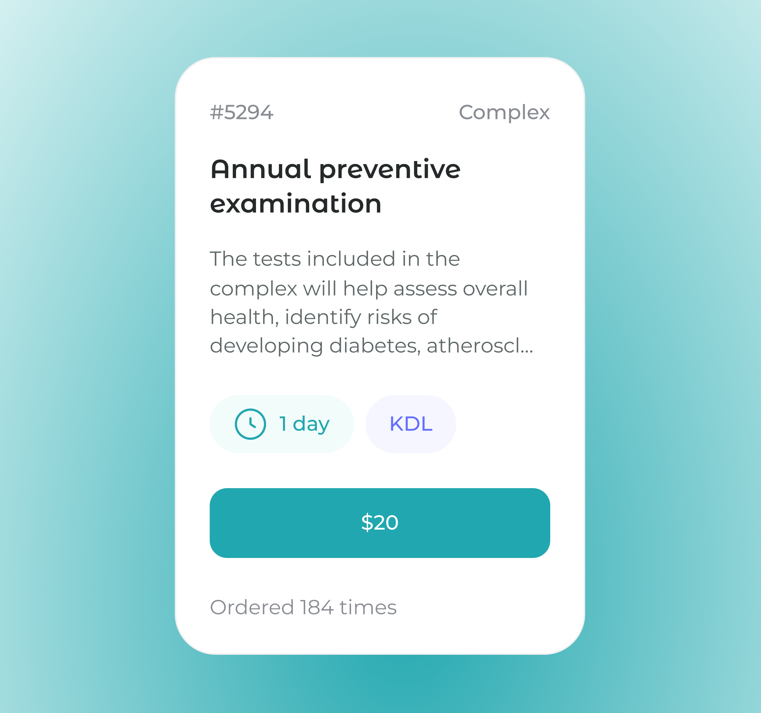
The interface has many accents: buttons with calls to action, information about laboratories, deadlines for test results, prices. To avoid overwhelming and confusing the user, we selected a specific color for each type of information
If the user is logged in, they can go directly to the cart from this page. If not, we suggest they first enter their details. At the bottom, we added tips for similar tests.
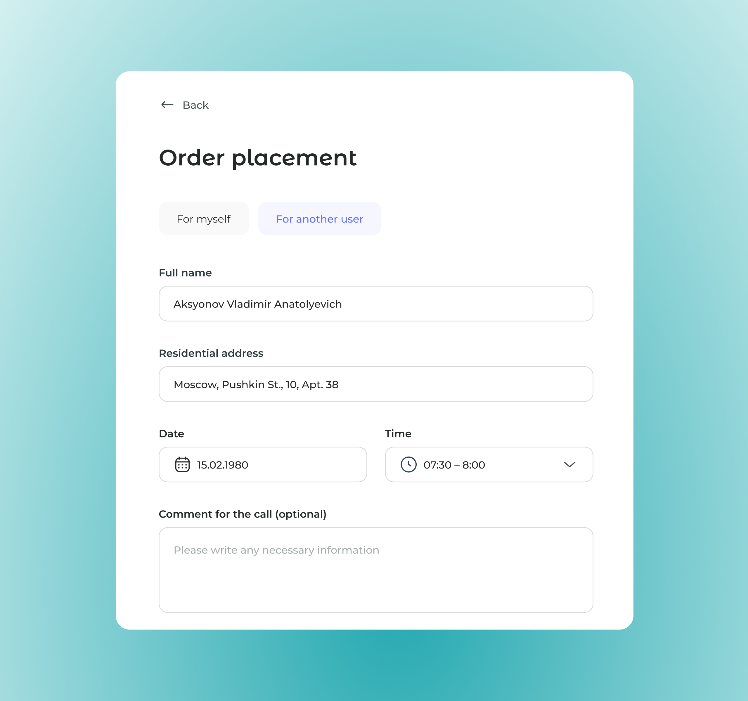

On the website, you can order tests for yourself or for another person — for example, an elderly relative or a child. When placing an order, it is necessary to provide the name and details of the patient so that the laboratory can process the tests correctly.
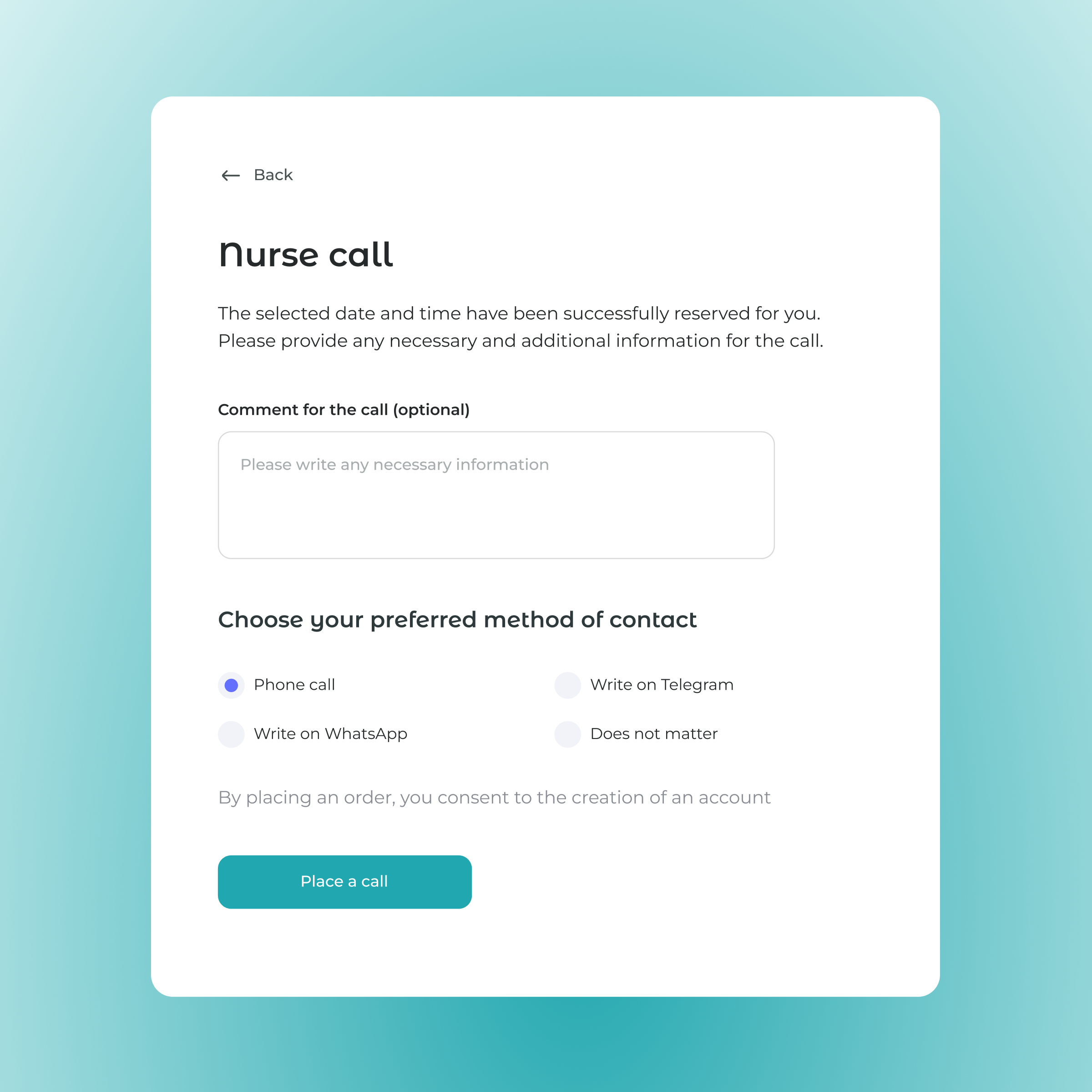
To take tests, you need to arrange a nurse call. First, the user specifies a convenient date and time. Then, on a separate page, they write additional information in the comments and choose a method of contact.
In medical services, it is especially important to respond to user actions so that the person understands that everything has been done correctly. Confirmation screens are essential in the design: they alleviate questions and anxiety when performing actions.
Clients were satisfied with the result — convenient navigation, thoughtful design, and improved interaction logic made the service clearer and more comfortable for users. Also, thanks to the UI kit with ready-made blocks, the client's in-house team can easily maintain the site and add new elements.
Our collaboration with MedCare turned out to be not only productive but also long-term: a year after the project was completed, clients returned with minor improvements for the main page.
Is there a service that you want to make more convenient and efficient?
Contact us — we will help identify growth opportunities and suggest improvements.