Explore

Need help with your project?

Oops! Something went wrong while submitting the form.
We started by exploring a metaphor for the visual concept. We briefed the ProductCamp team, studied participant feedback and landed on three directions.
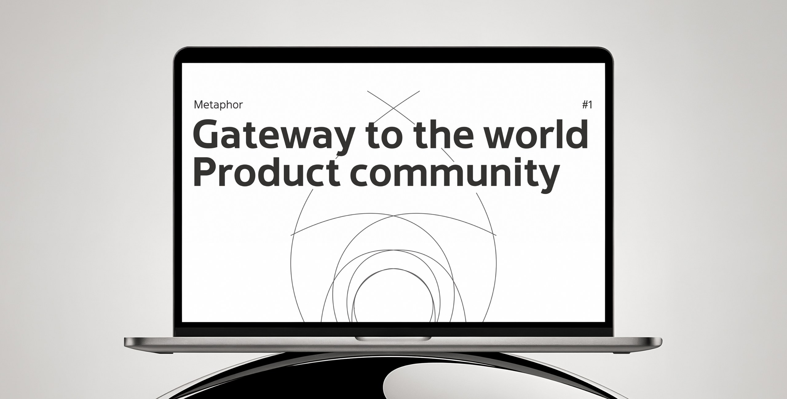
It came up often in stories about the event. We developed the gate image — a symbol of stepping into a new space and community, a meeting point between discipline and play.
We drew inspiration from pioneer camps and Soviet signage, with their rhythmic typography and dynamic shapes.
Technological optimism, faith in scientific progress and space exploration — dreams of the future born in the past. The sphere-of-competencies metaphor points to knowledge, learning and the architecture of tomorrow.
Visually: brutalism, grotesque type, metal textures, spirals.
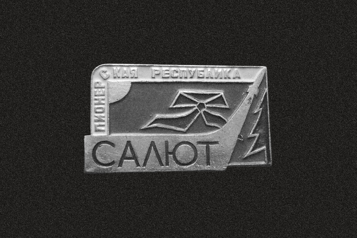
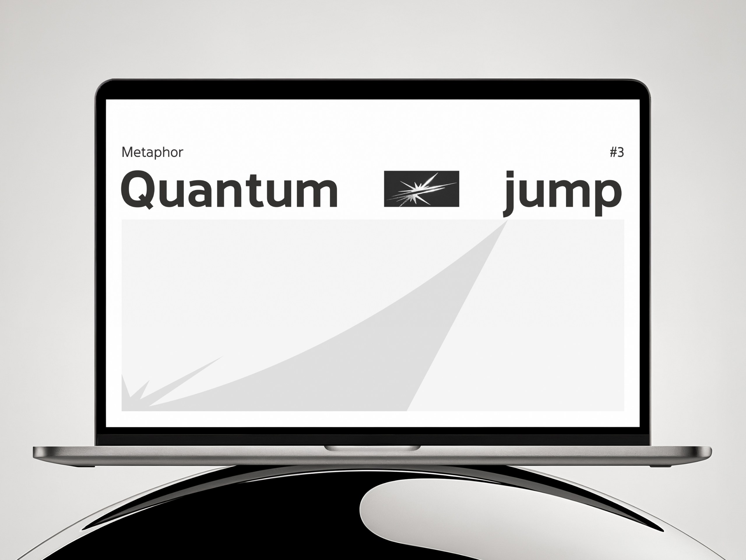
The vertical composition of Soviet space posters — the rocket flight as a symbol of a powerful leap forward.
The metaphor conveys the drive for innovation, progress and reaching a new level. Visually: dynamic typography, cosmic blue, textures.
While searching for the best option our designers went through several concept iterations…
…and two core colors — from blue to orange-red.
But we kept tweaking and exploring. The final result came out a little different — and that's normal for creative projects like this.
Write to us — we'll help find growth points and suggest improvements.