

WIT
Design and Identity for a Fintech Product
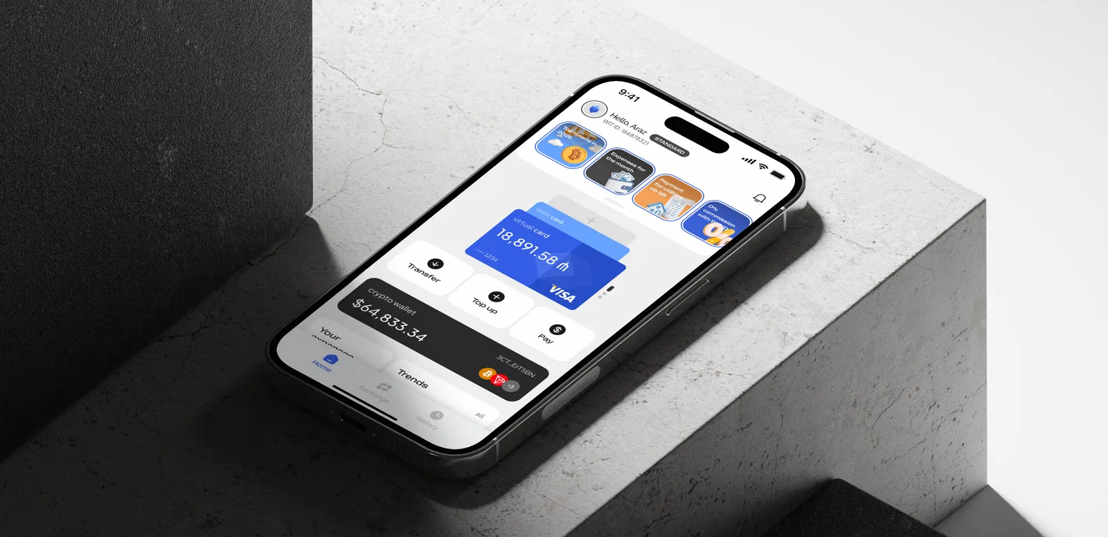
The product requires users to adopt a new behavior model. Therefore, the main focus is on trust. The design should evoke a sense of reliability of a serious banking product while remaining bold to attract advanced crypto users and youth.
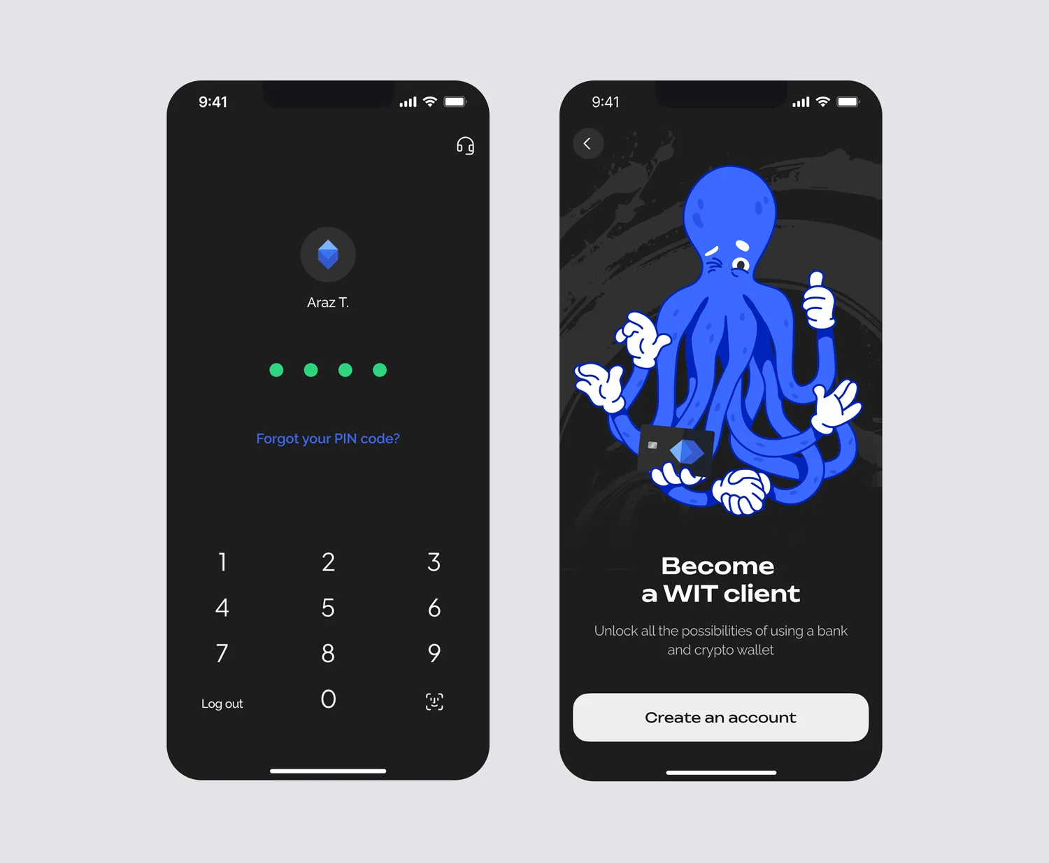
Our portfolio already included bold projects for crypto startups. We understood the tasks of users of such services and knew how to combine seemingly incompatible elements: seriousness and playfulness.
We started with market analysis and references — looking at direct competitors and products from other fields. We created a map of associations to capture key images and emotions of the brand.
The name ‘wit’ — meaning ‘sharpness of mind’ or ‘cleverness’ — opened the way to grotesque, humorous images.


We developed two metaphors:
Bee — systematization, efficiency, diligence, and stability of the hive.
Iceberg — the dual nature of the product: a familiar bank ‘on the surface’ and hidden crypto ‘underwater’. Massiveness and stability.
The iceberg won: sharp forms, deep blue color, a sense of strength and technology. It became the logo of WIT.
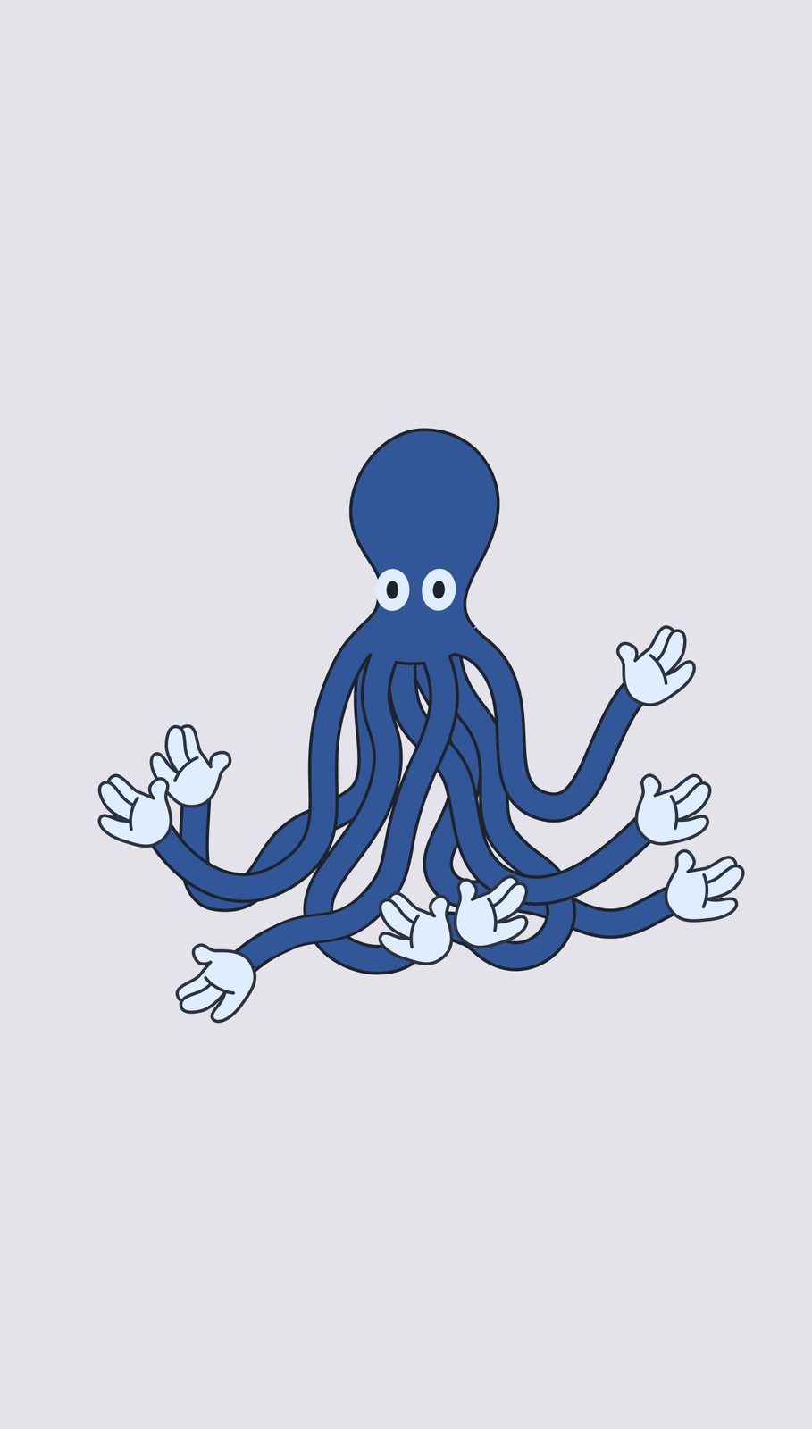
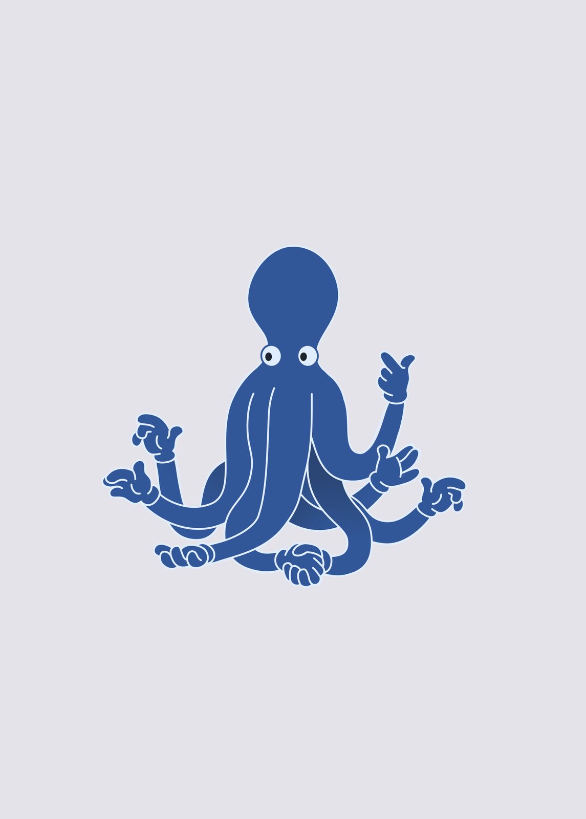
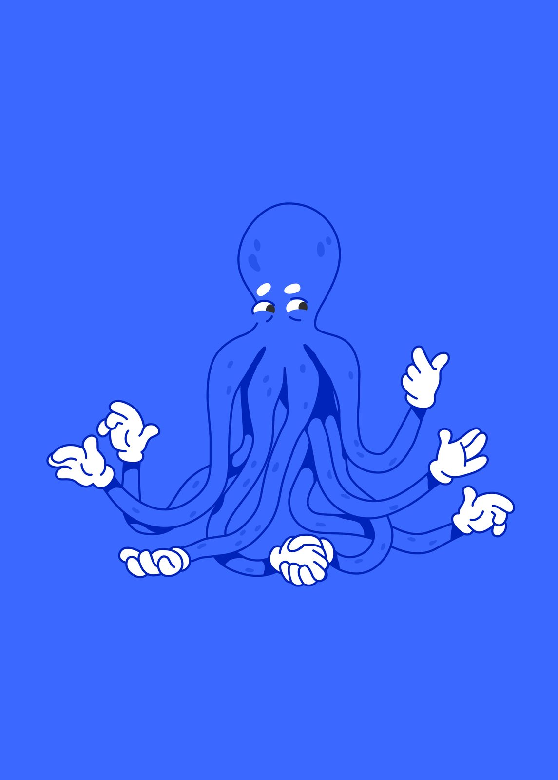


The concept turned out to be strict and clean — but the client wanted to add some boldness. Thus, the octopus was born.
Octopuses are cool and smart, but they are rarely chosen as mascots. The idea was fresh and perfectly rhymed with the oceanic theme.
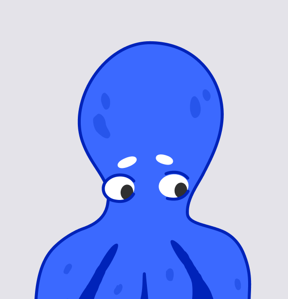
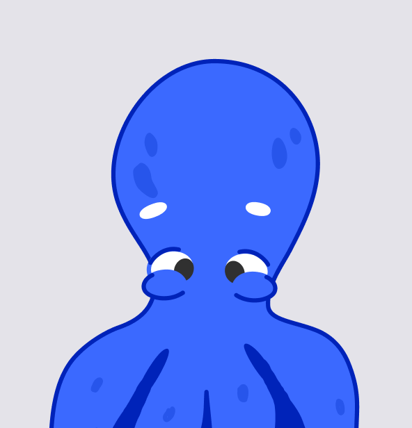
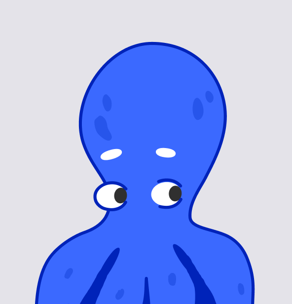
The mascot went through 17 iterations and became not just an accent but a part of the communication: its emotions indicate to the user what is happening and set the mood.
The functionality is broad, so there are many screens. The application is available in both dark and light themes.
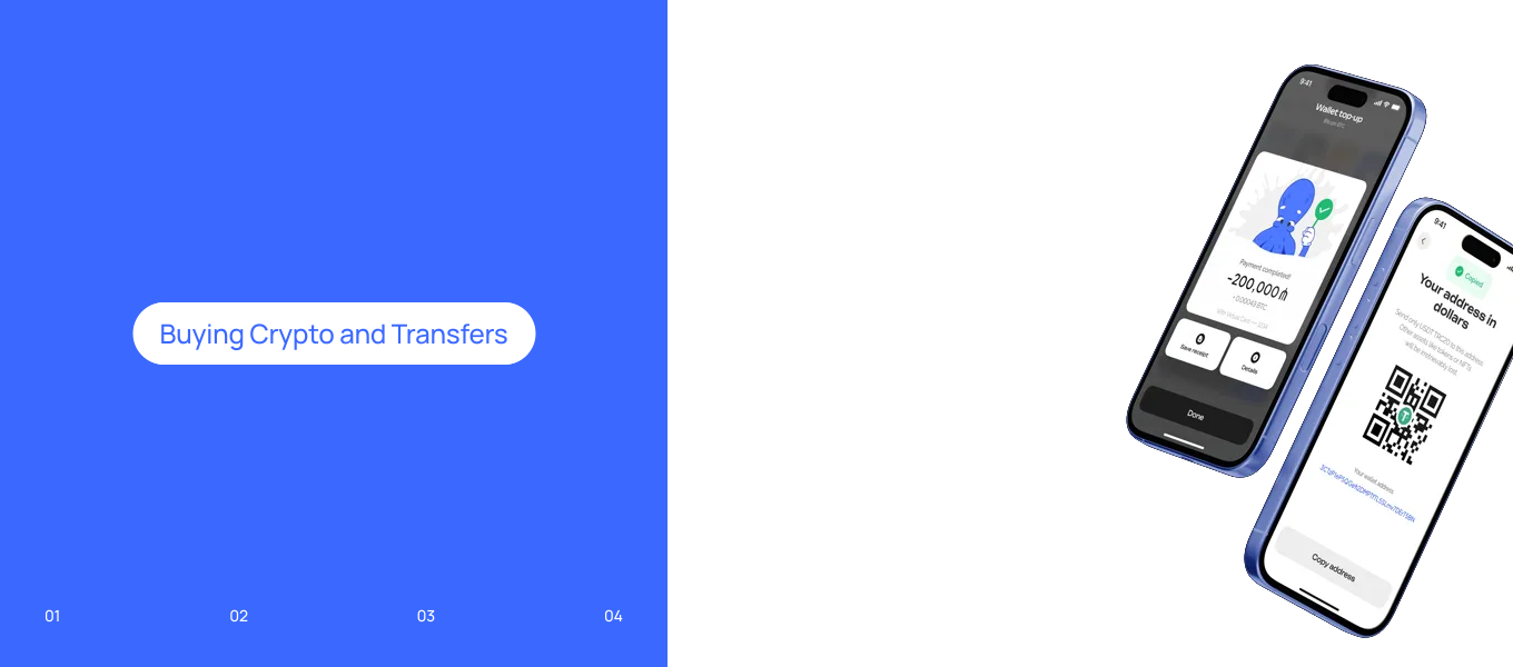
64 screens across four flows. The foundation is identity verification, critical for the security and legal operation of the product.
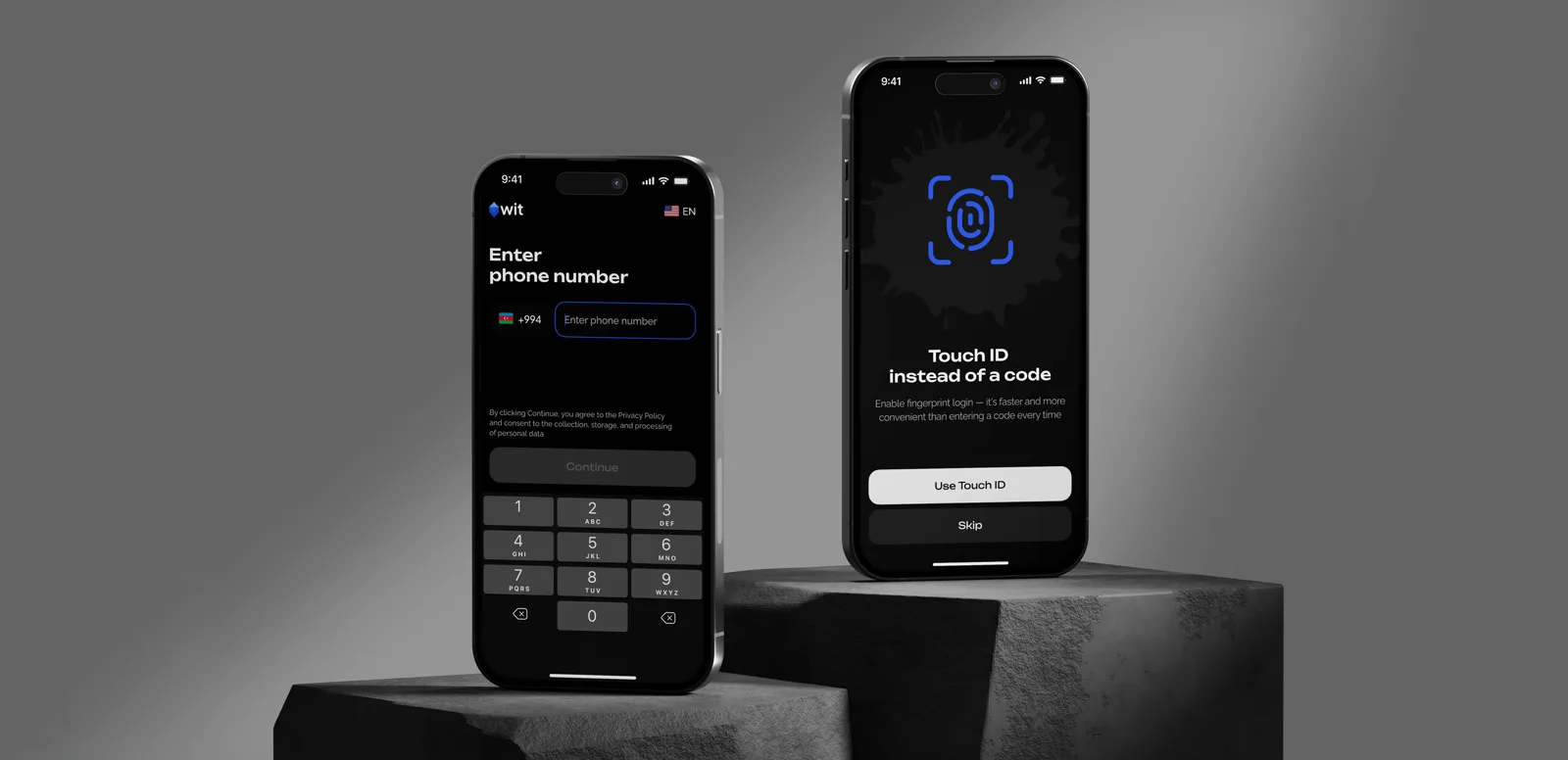
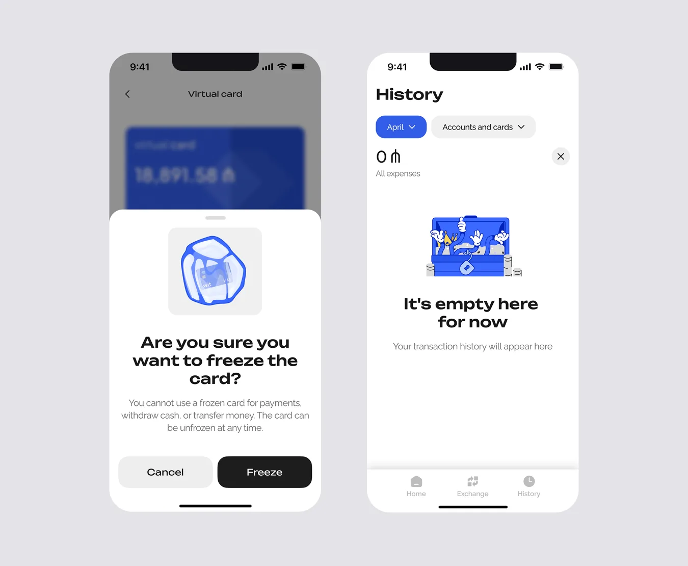
The design is based on two pillars: strict functional elements like those in banking applications — and bold illustrations, ‘ink blots’, ironic details that add character without distracting.
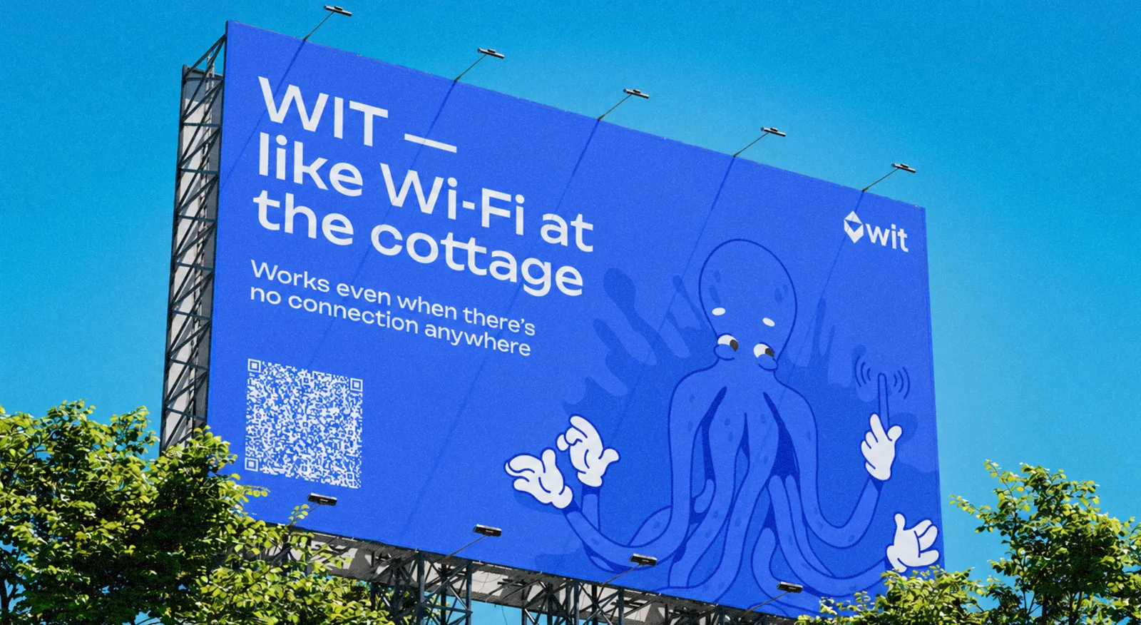
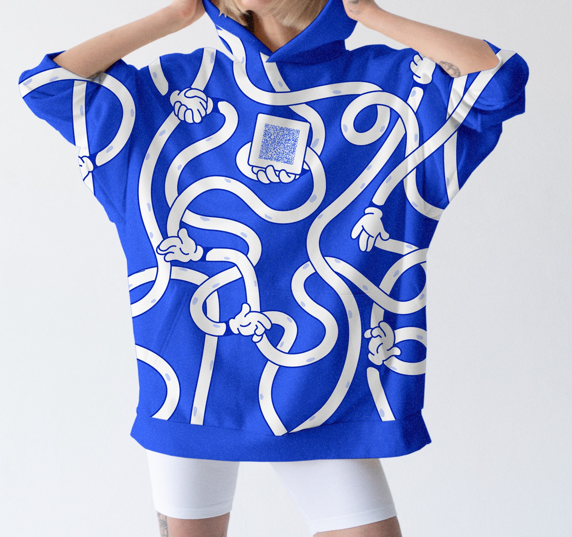
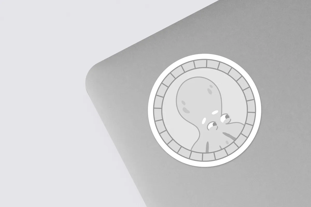
Simultaneously, we created merchandise concepts: notebooks, t-shirts, hoodies, bracelets, stickers, cases, billboards, roll-ups, and office signs.
We played with characteristic interface elements — tentacles in gloves, ink blots, the mascot, and slogans.
In 3 months we:
- created the UI/UX design of the application considering user experience;
- developed identity and corporate style;
- prepared merchandise concepts;
- compiled a guidebook.