

NTES
Factory scale, in one working window
Key page designs, a visual concept, a component library and a refined brand mark.
Related services: UI/UX design, Branding.
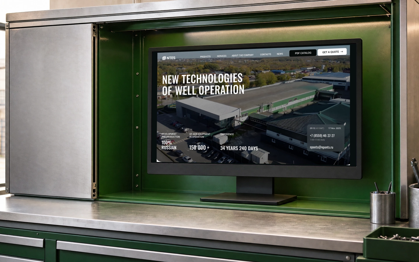
Over 35 years, NTES developed several business areas while its website grew gradually; professional buyers need the overall picture: what the company makes, how its services work and where to find specifications. We started there, keeping the brand recognisable. The workspace in these visuals is conceptual scenography, not an actual factory interior.
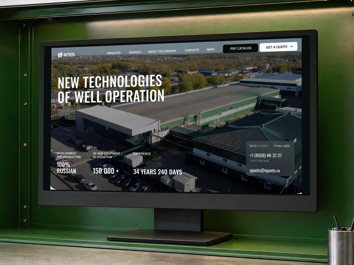
We deepened the green and strengthened the typography. Oswald brought out the engineering character without bright decorative effects.
A sidebar of banners gave way to emphasis within the main page flow. Business areas share a card design, while mini loaders have a dedicated entry point. The range now belongs to a continuous homepage presentation: the company, its business areas, advantages and services.
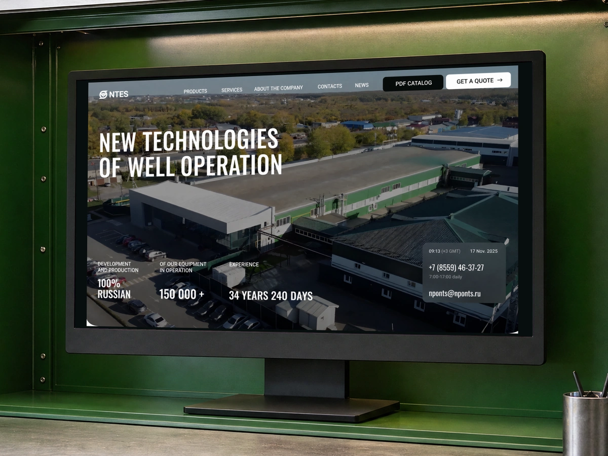
The product page goes beyond a photograph: specifications and technical information take priority. Contact options sit nearby, letting visitors approach the company after studying the equipment. Shared navigation connects the product sections, so a detailed page remains part of the catalogue rather than an isolated destination.
Have a service that deserves a better, more efficient experience?
Write to us — we'll help find the growth points and propose improvements.