Explore

Need help with your project?

Oops! Something went wrong while submitting the form.
Design isn’t just colors and slick graphic effects. Above all, it’s logic, a convenient user flow, and thinking through every scenario. You can’t do without a UI/UX designer who’ll build a well-considered website. Our client MedCare learned that the hard way.
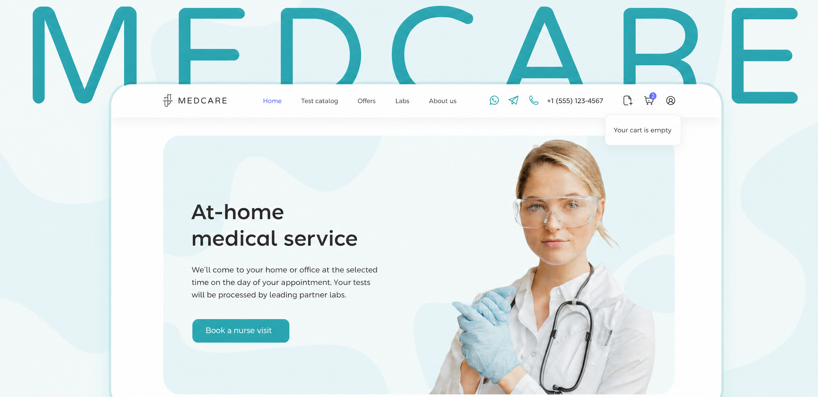
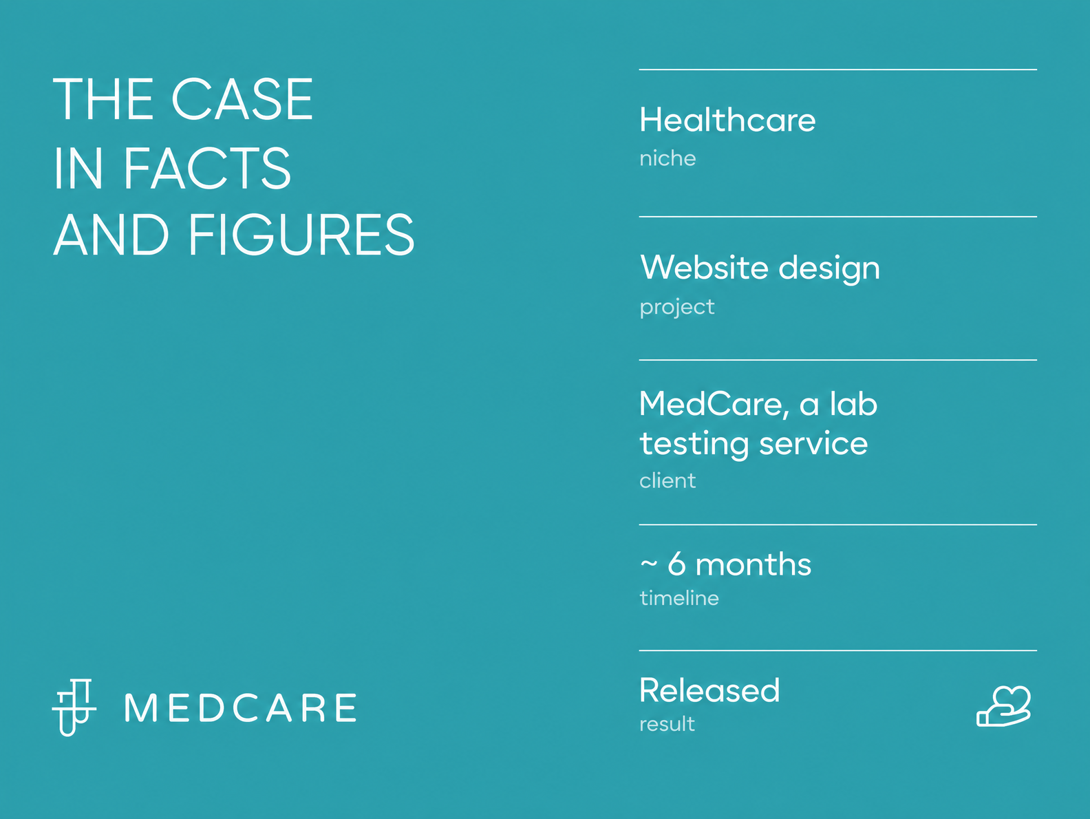
They launched an MVP built by a developer alone and quickly realized something was off. That’s when they came to us, and we fixed the mistakes and got the design in order. We’ll walk you through the process in this new case study.
MedCare came to us — a healthcare service that lets patients book a nurse visit at home for sample collection. MedCare aggregates offerings from different labs, so users can pick the tests they need in one place. It’s convenient: if the tests are spread across several labs, a single nurse visit collects the samples and delivers them to the right centers. The company operates in the capital and its surrounding region.
MedCare partners with leading laboratory chains, and its catalog holds over 2,000 tests — everything from a basic blood count to genome sequencing that flags health risks.
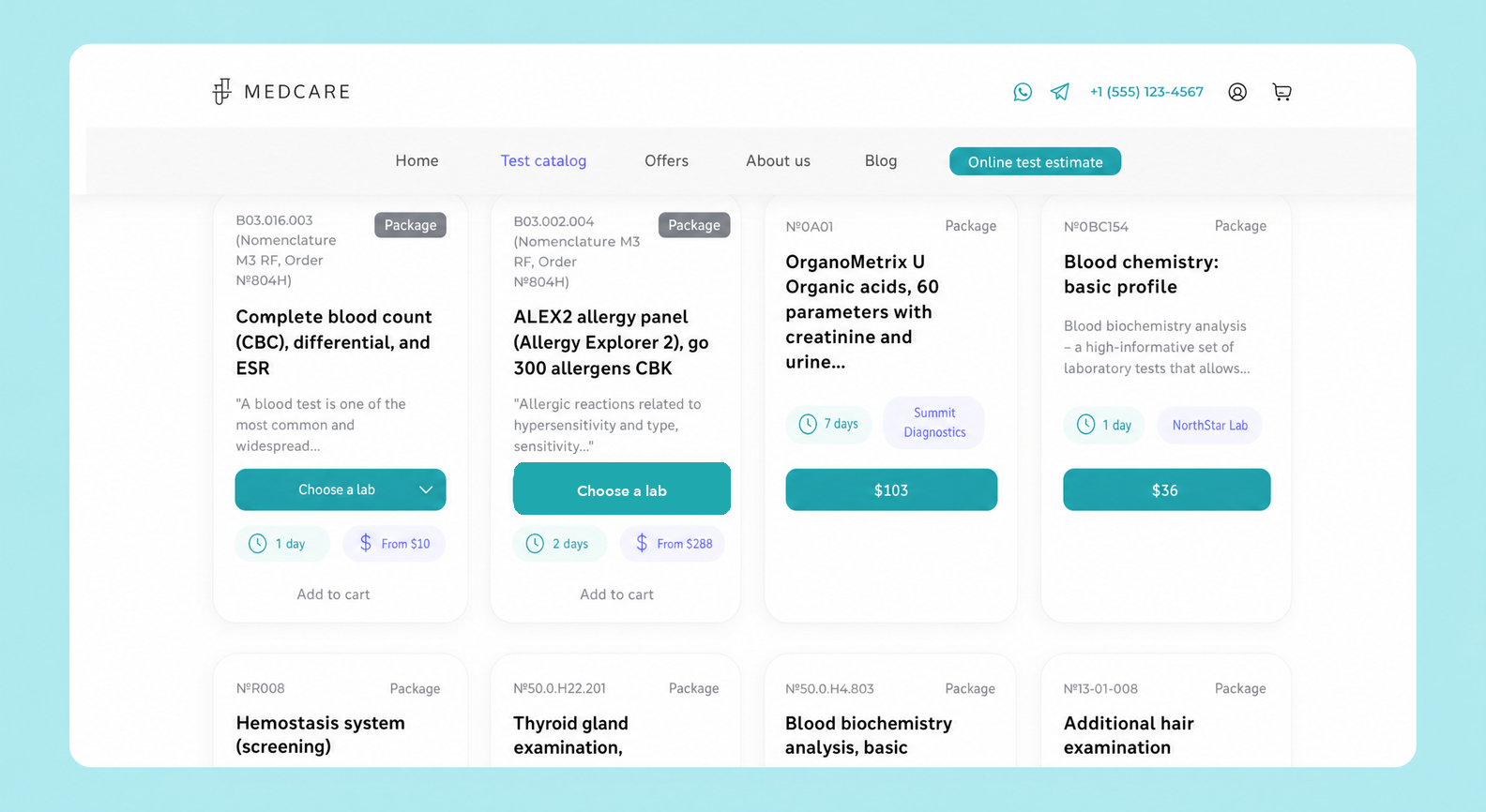
The MedCare website was originally built by web developers with no designers involved. The product worked, but the design had plenty of rough edges that hurt the user experience and dragged down conversion rates.
Some buttons didn’t do what they were supposed to, the service was awkward to interact with, and the interface was overloaded with text. The layout looked different across screen sizes, and modern UI/UX solutions that could have driven engagement simply weren’t there.
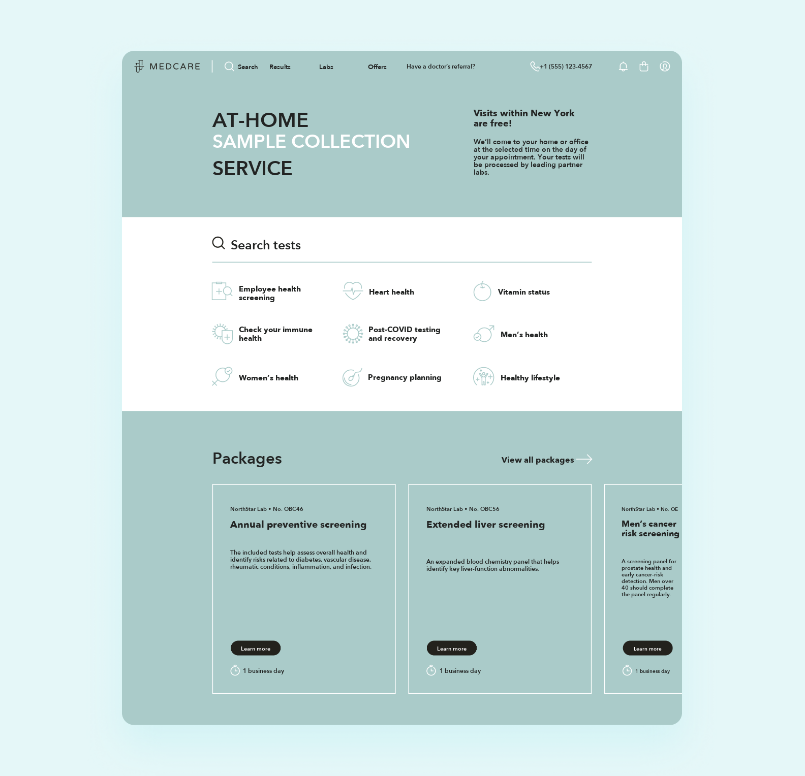
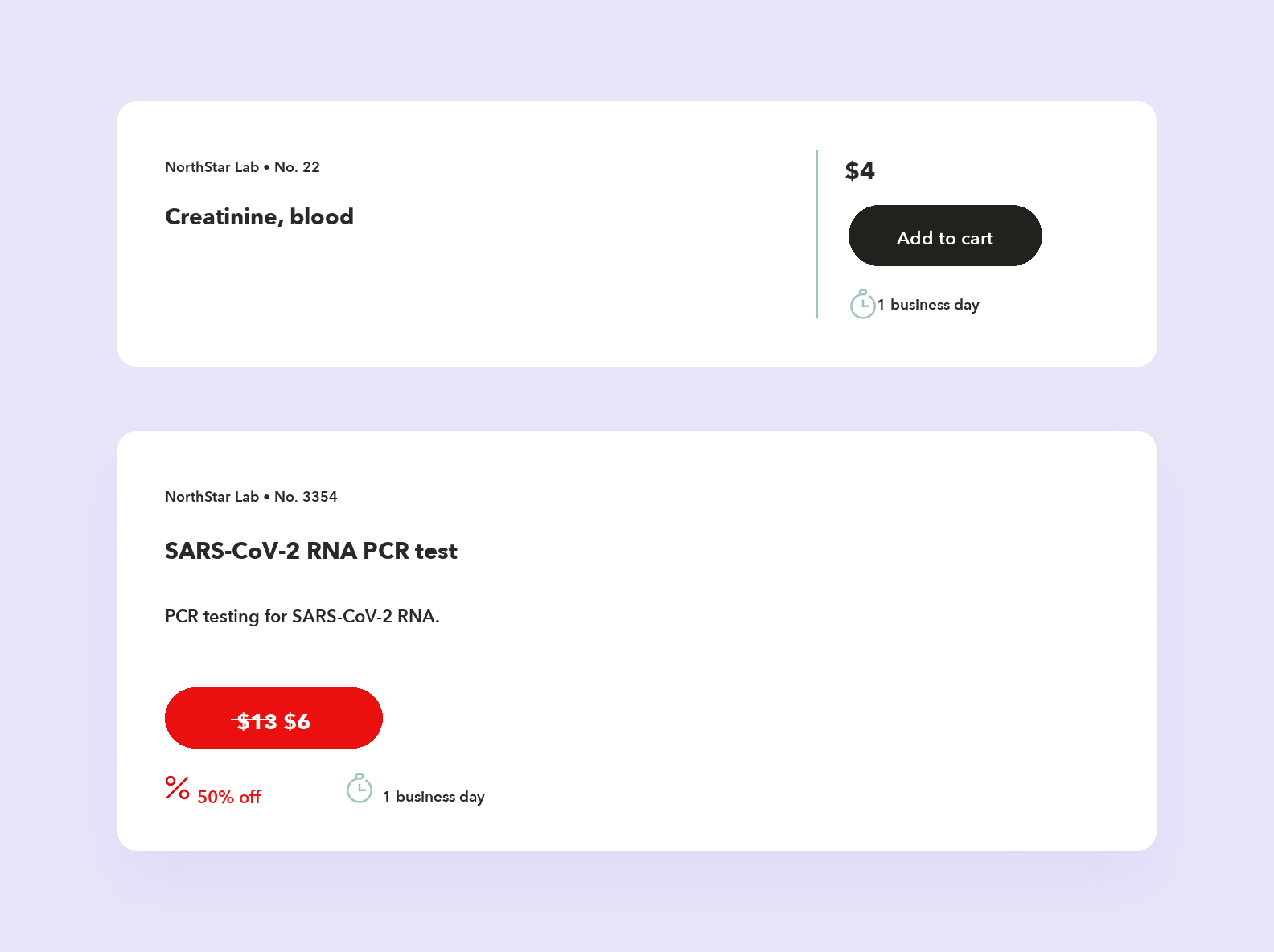
New visitors found the site clumsy, and existing users struggled to place orders, which could chip away at their loyalty. As a result, MedCare risked losing ground to competitors with more convenient, better-looking platforms.
To keep MedCare from falling behind its competitors, the client decided to bring in an outside team with strong expertise in UI/UX design to rework the site’s logic, map out a clear user flow, and improve the visuals.
That team turned out to be us, Purrweb. We’d already worked on healthcare projects. We built the Lytic Health platform, which helped the client raise $400,000 in funding. We also made Biogeek, a web app for analyzing lab results, and Talk to Me, a service for online consultations with therapists. So we understood what a healthcare website needs to deliver — both for the business and for the people using it.
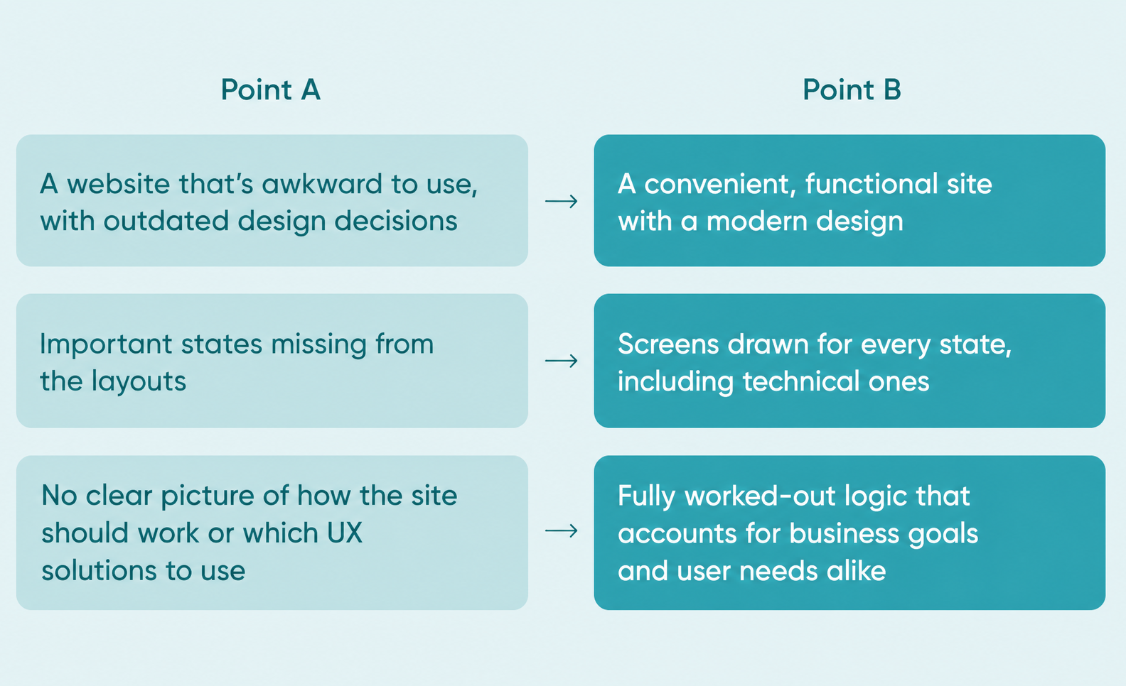
We talked with the client, went over their wishes and pain points, and studied the existing layouts. Once we had all the inputs, we dove into the work.
Here’s what we had ahead of us:
Below we’ll go through the stages of the work in more detail.
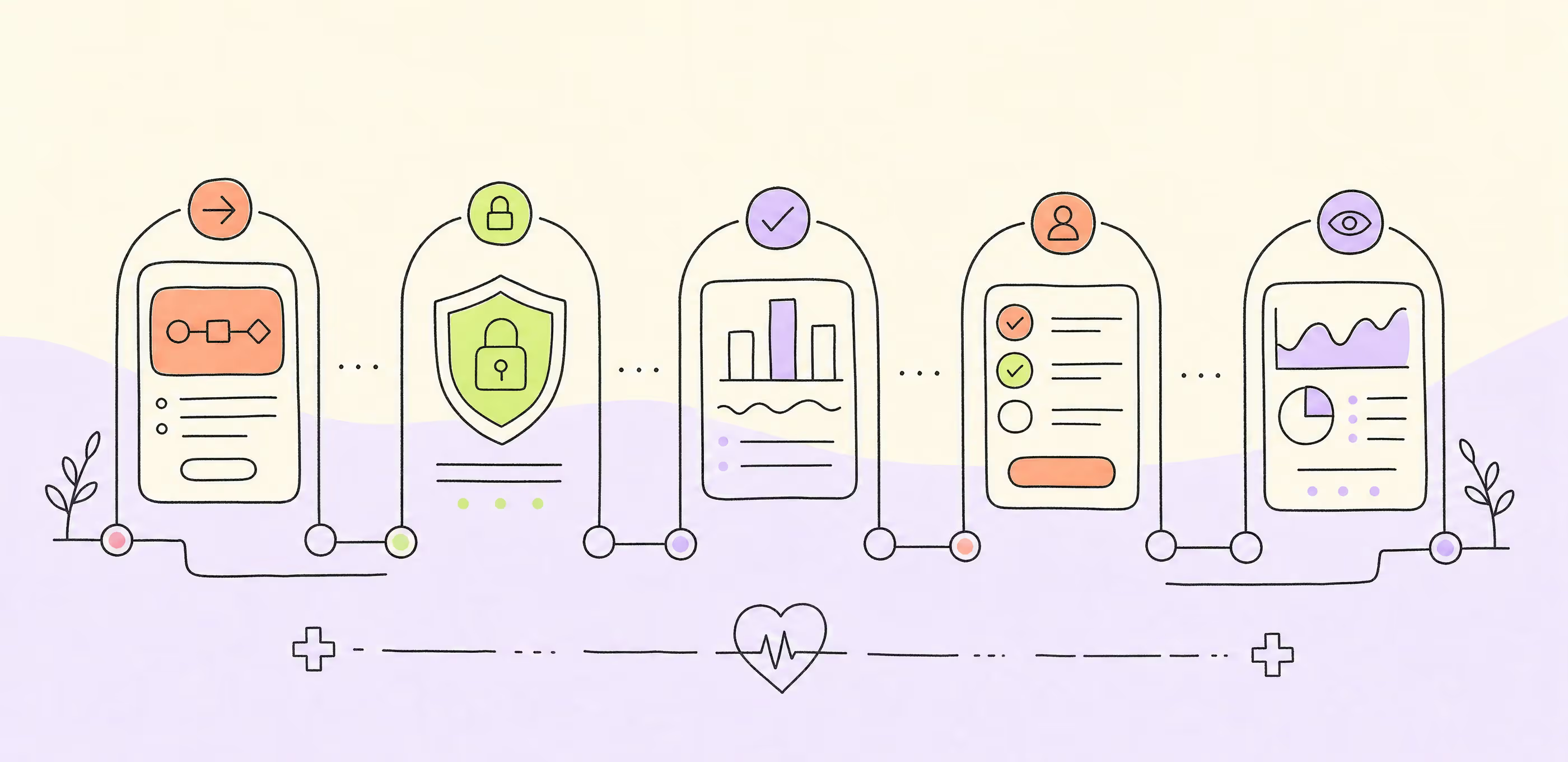
To think through how a service should work, we always bring in a systems analyst — and MedCare was no exception. They prepared BPMN diagrams: charts that show the steps a user goes through and how data is handled inside the system.
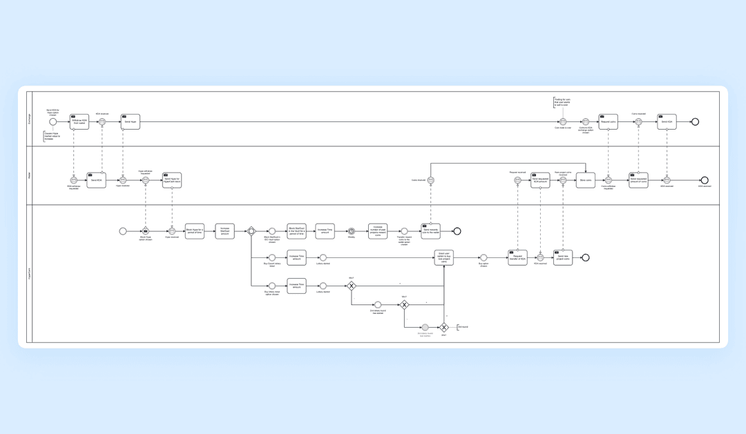
Why does design need this? Charts like these let us account for every possible usage scenario upfront so nothing slips through. It saves us from the situation where the site is already built and developers suddenly discover a missing screen or button the system can’t work without.
Before we build the final design in color, we always make wireframes — simplified page schemes with no graphics or fine detail, but with the flows fully worked out.
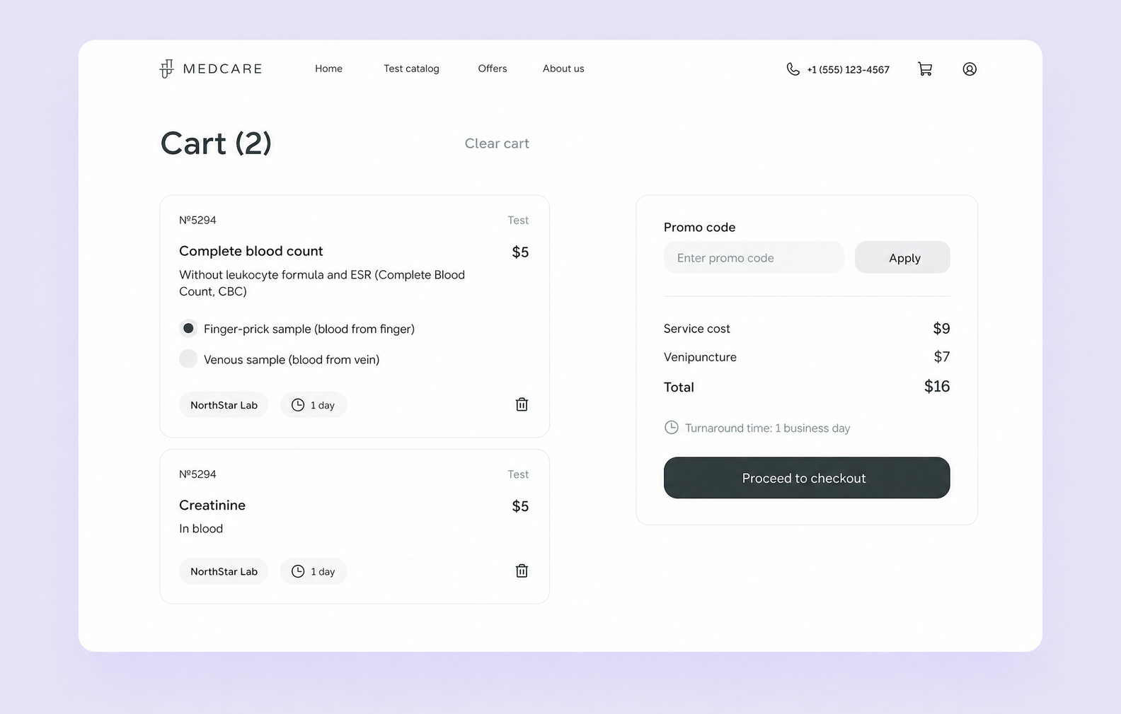
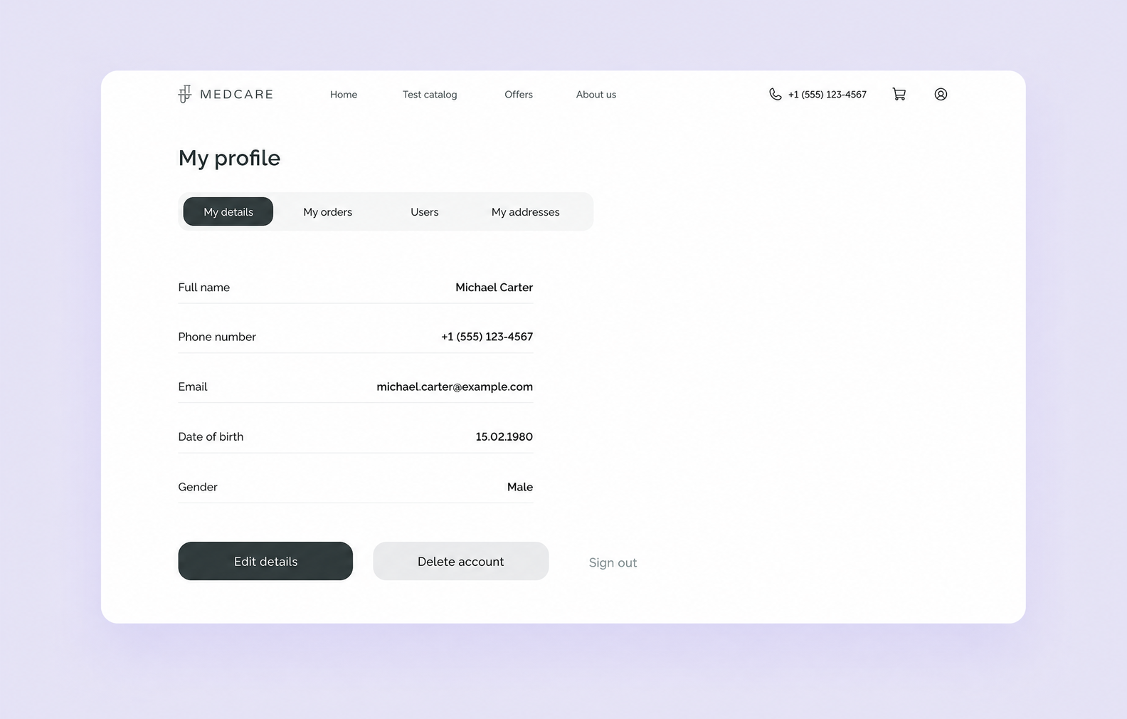
This is what the wireframes for the MedCare site looked like
It’s an important stage that solves two problems at once. First, the client sees the structure of the future site and can send feedback early, which cuts the risk of revisions to the final design. Second, the designers themselves get a clear picture of page logic and how elements interact — and the end product comes out more convenient and better thought through.
You’ll sometimes hear that wireframes are a wasted step on a project. We don’t see it that way: in this article we explained why the Purrweb team never skips the wireframing stage.
The client wanted to keep a few elements from the old design in the update:
We reimagined these elements to create a modern, clean, visually appealing design. Here are some examples.
We worked on the colors and brought in a more modern, more interesting palette.
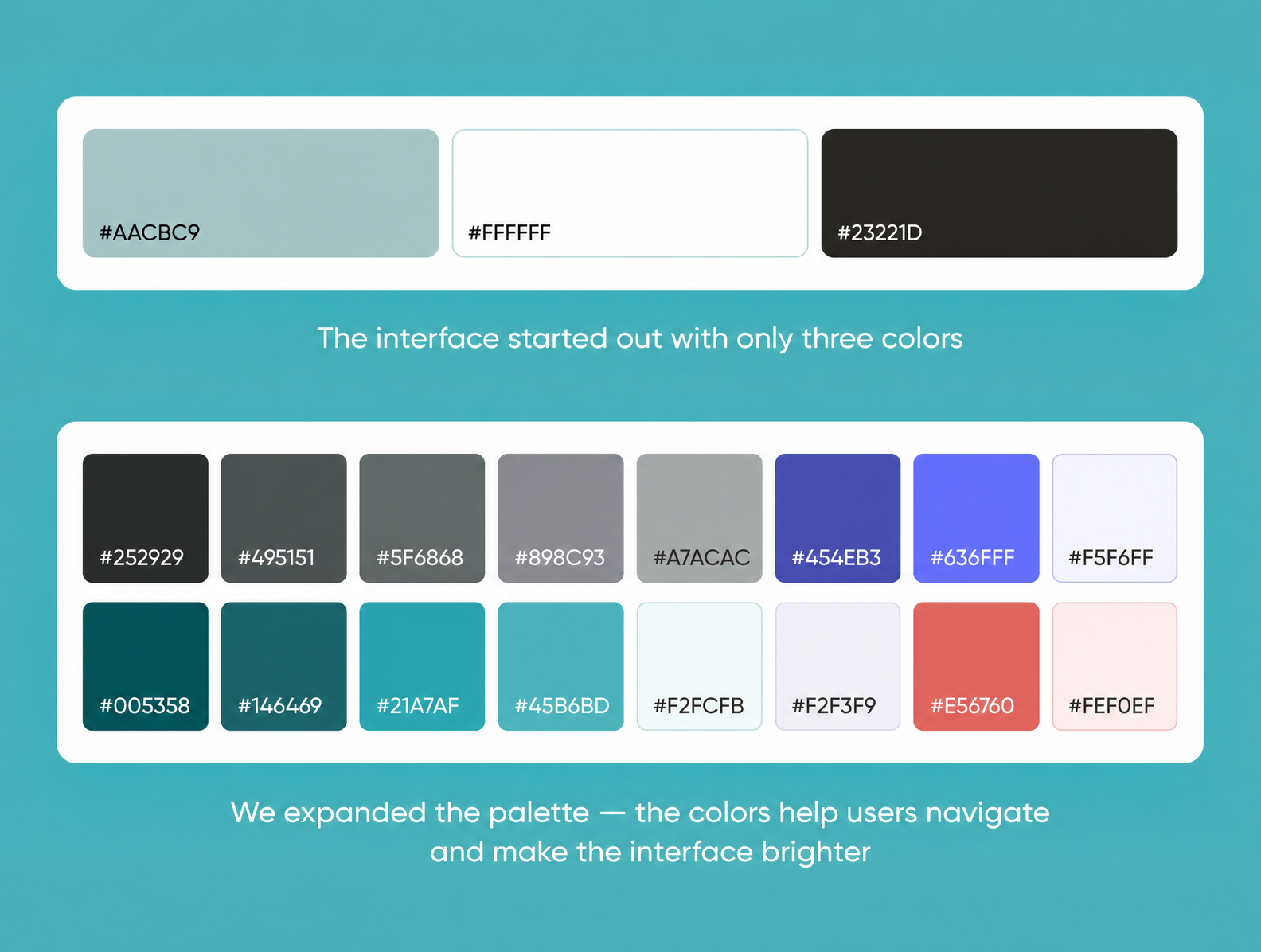
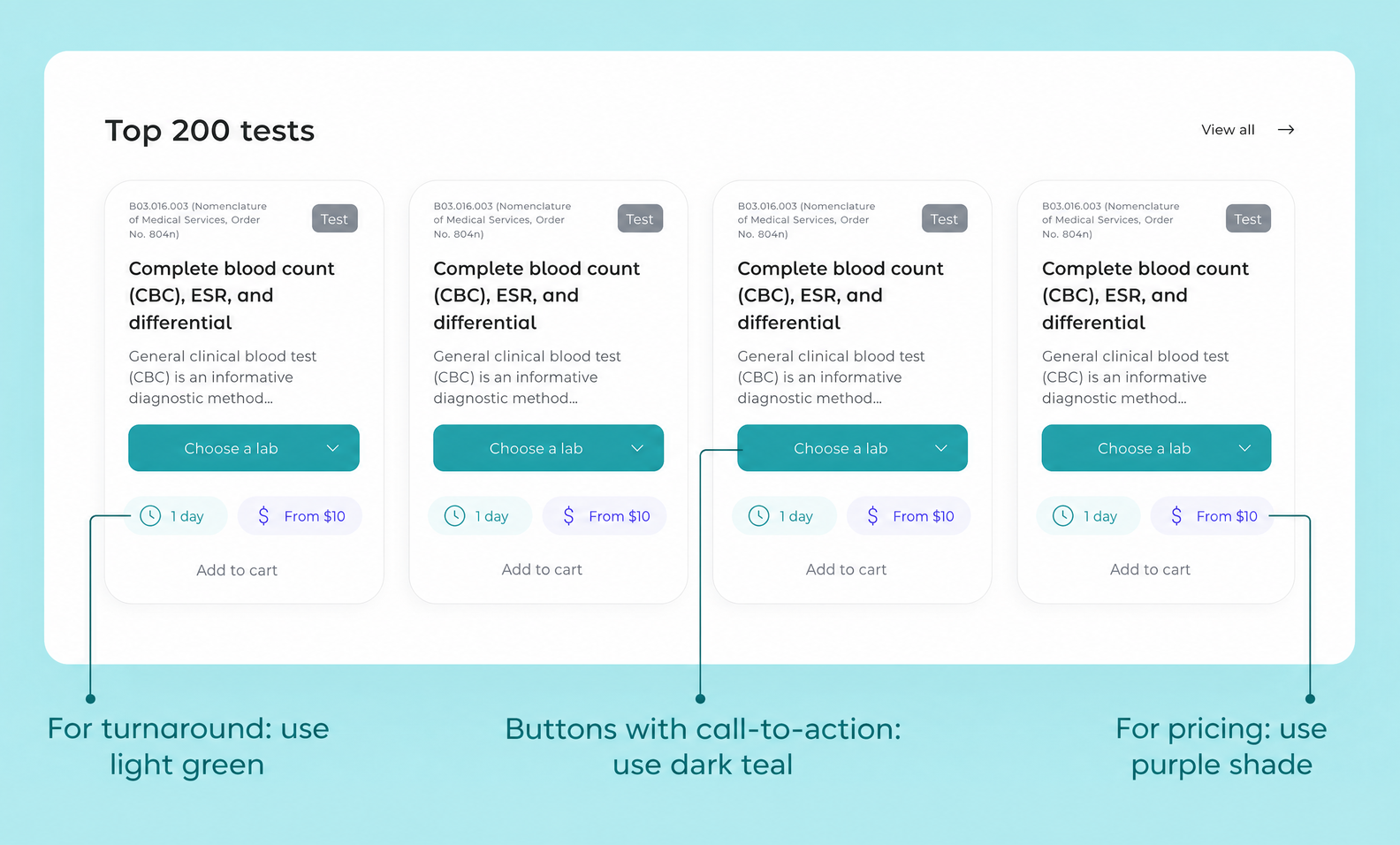
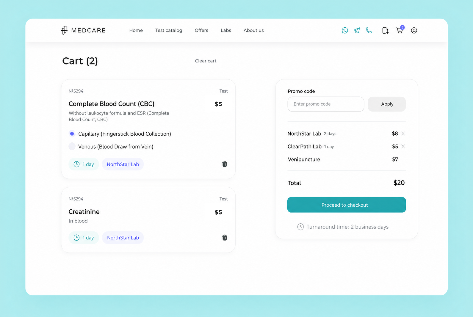
The MedCare interface has a lot of accents: call-to-action buttons, information about the labs, turnaround times, prices, and other important elements. To keep users from feeling overwhelmed or confused, each type of information has its own color.
We made the interface friendlier with rounded corners and softer shapes. The original design leaned on sharp, brutal forms and the geometric Raleway typeface. Together, those decisions felt strict and distant.
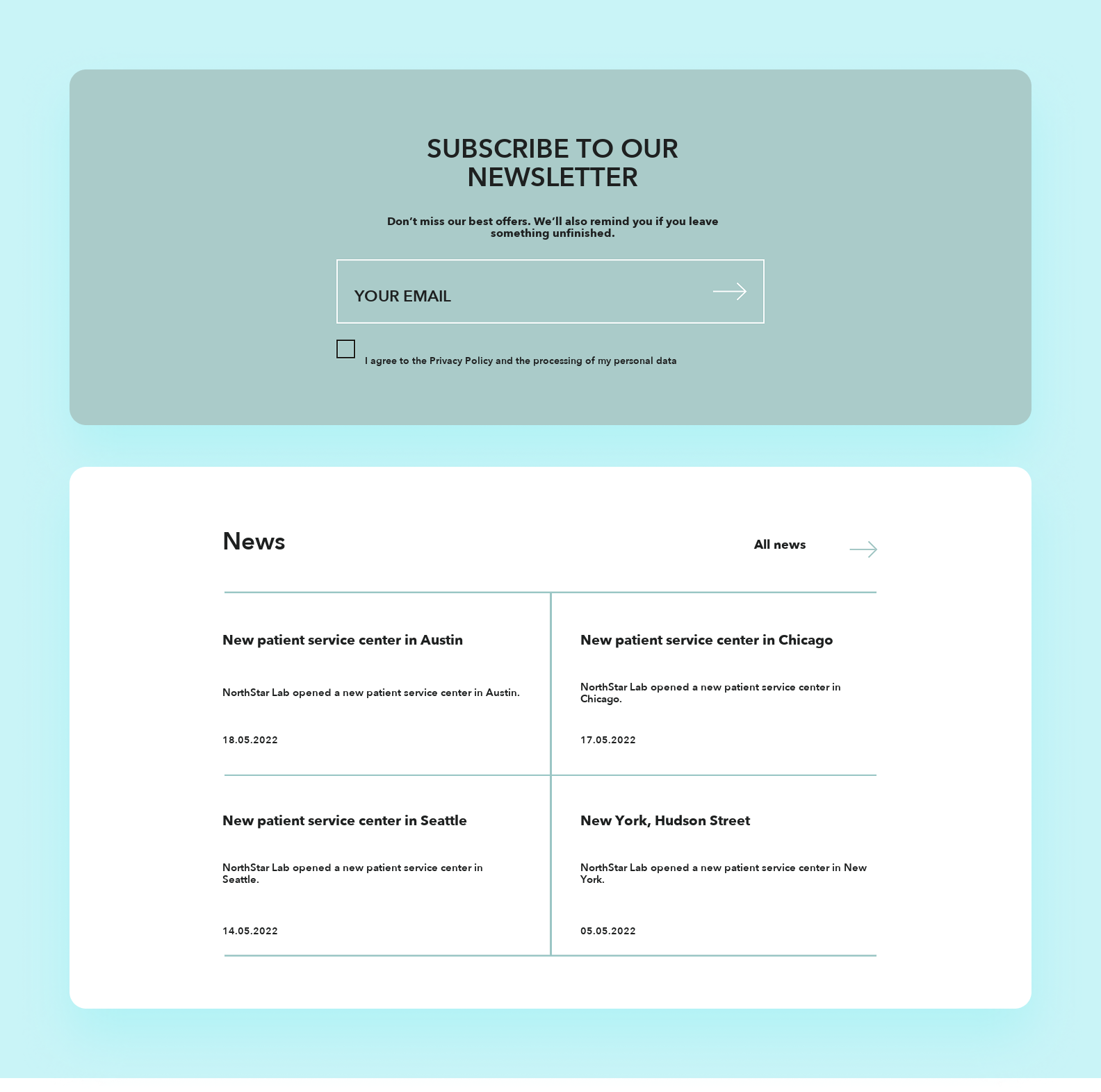
That design ran against MedCare’s core message — getting tested should be a calm, comfortable experience. To better convey the brand’s values — care and attention to patients — we softened the visual style and rounded off the cards, buttons, and other elements.
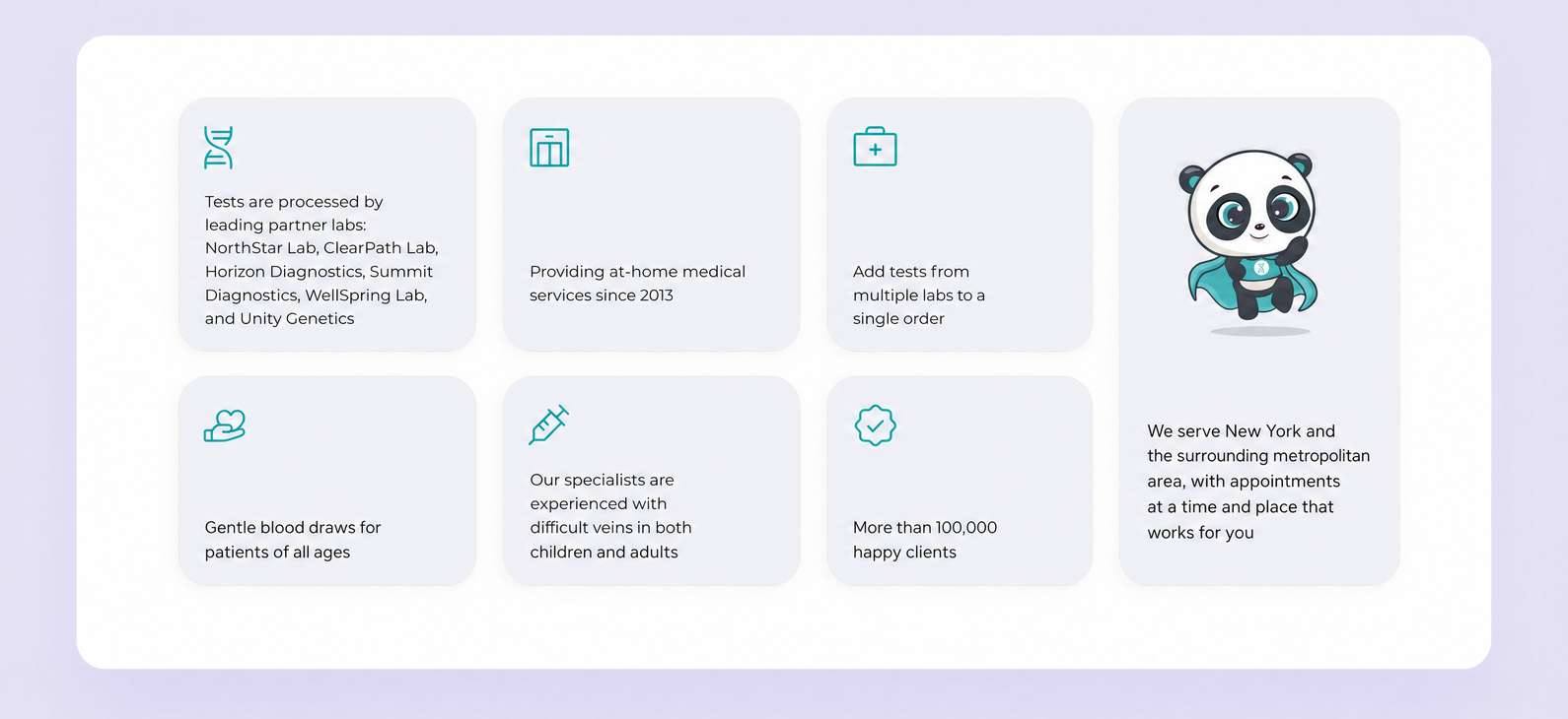
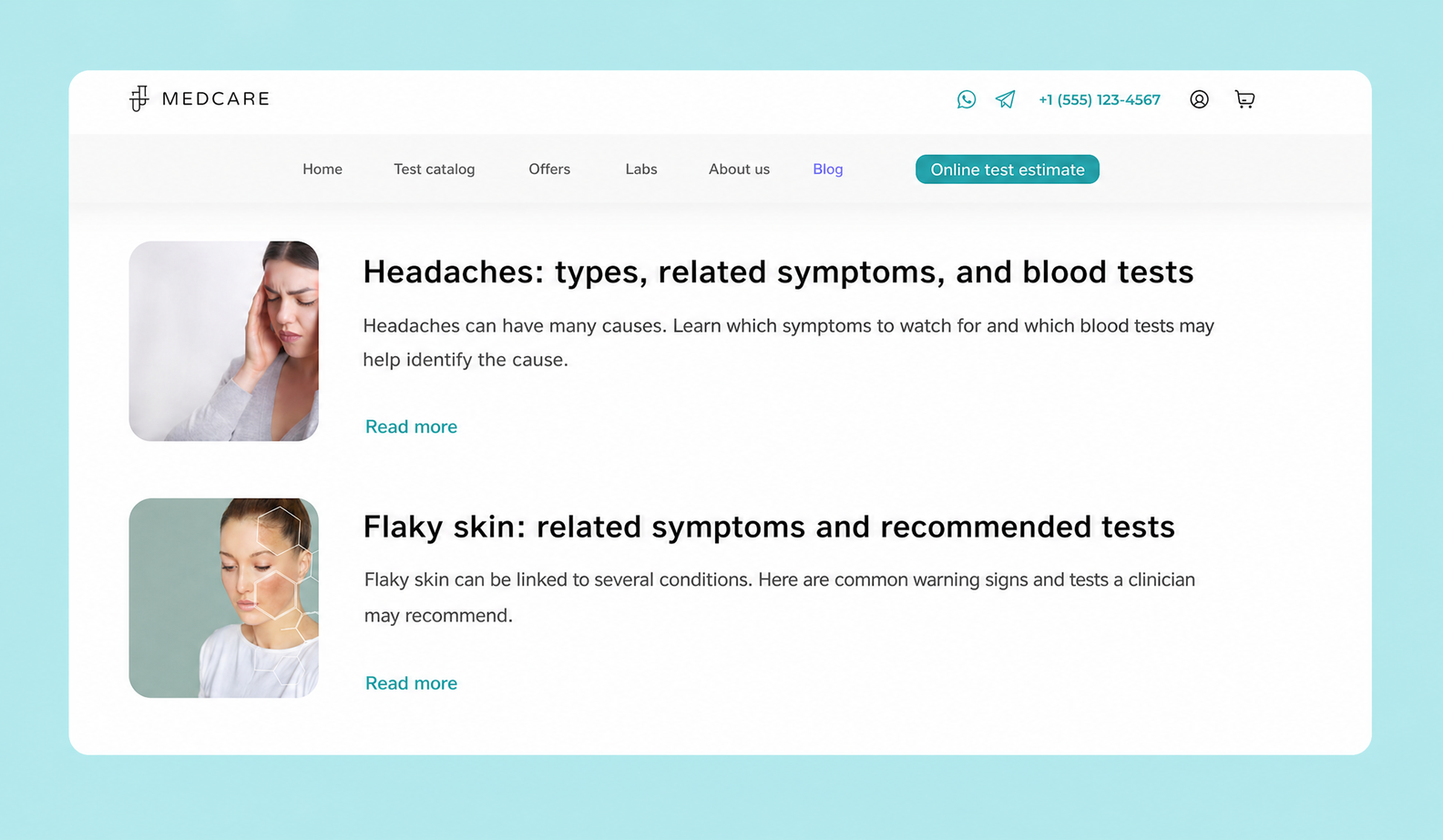
For typography we picked the Montserrat Alternates typeface — it looks smoother and friendlier.
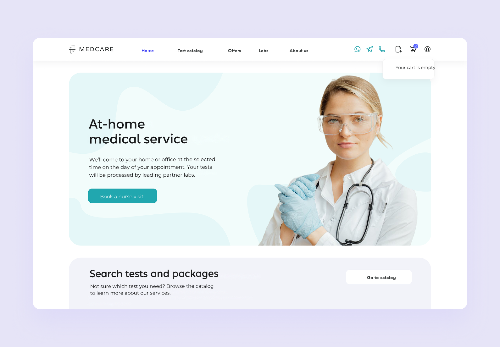
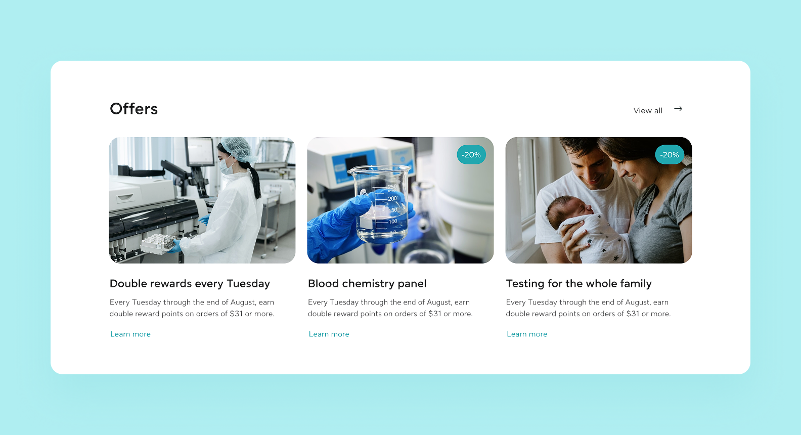
We worked photography naturally into the homepage design. Photos build trust and make the site feel more alive and relatable. In the hero section of the homepage we placed a photo of a medical professional to underline the company’s expertise, and we added more healthcare-related shots throughout.
We added interactive elements and built an animation for the blog section that suggests which tests to take for different symptoms.
We pulled everything together into a UI kit — a library of ready-made components that speeds up adding new pages and blocks while keeping the design style consistent.
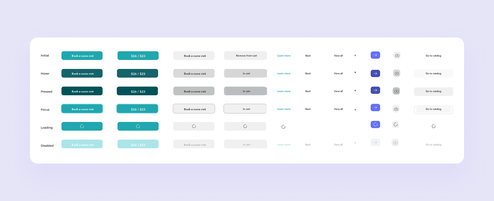

.svg)

The platform has two roles: patient and nurse. Anyone can view the patient page, while access to the nurse interface is limited to registered professionals.
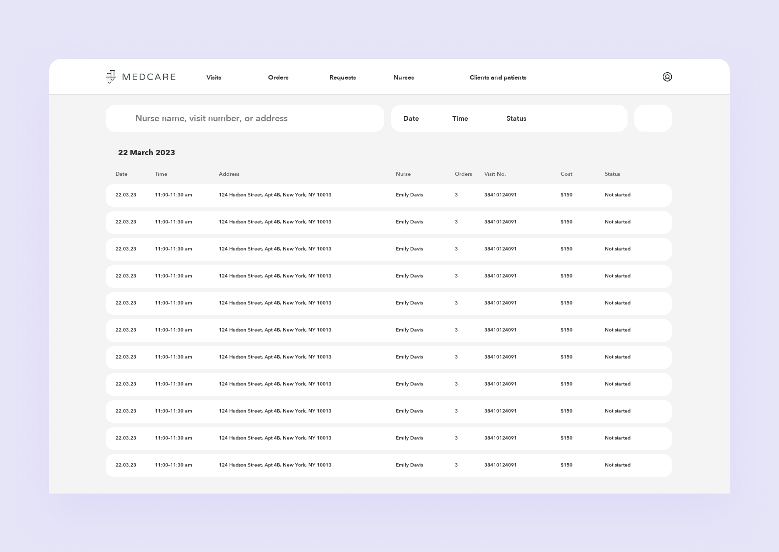
A patient can pick the tests they need, order them for themselves or for someone else, pay, and book a nurse visit at home. The nurse, in turn, gets a list of visits, sees client details and the tests required, and builds their own schedule.
Let’s walk through the main flows on the patient side.
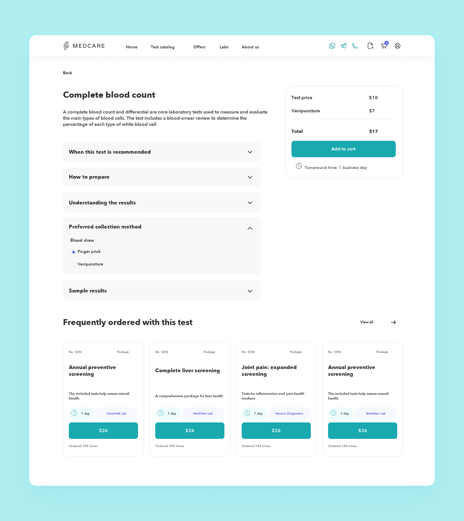
From the general test catalog, a user can open a dedicated page for a test and dig into all the important details. This is also where they can state a preference for the blood draw method — finger prick or venipuncture. Not the most pleasant subject, we know, but there’s no other way to run the diagnostics 🧑⚕️
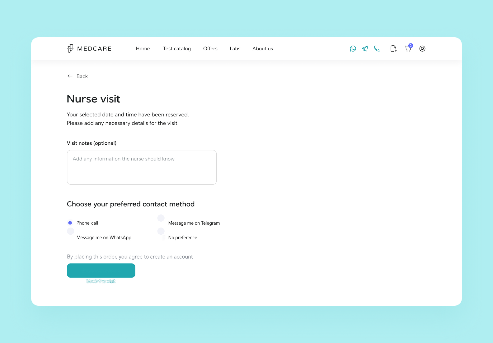
To get the samples taken, the user books a nurse visit. First they choose a convenient date and time. Then, on a separate page, they add any extra information in a comment and pick how they’d like to be contacted.
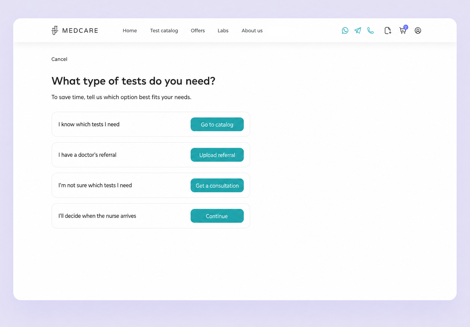
Once the user taps the “Book a visit” button, we ask them to specify the type of test — it saves time for the nurse and the patient alike. But we always leave room for choice and offer a few options: pick a specific test from the catalog, upload a doctor’s referral for the nurse to see, or get a consultation.
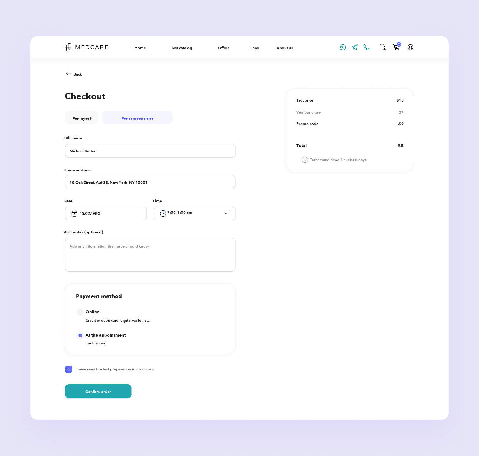
The site lets you order tests for yourself or for someone else — an elderly relative or a child, for instance. When placing the order, you have to enter the patient’s name and details so the lab processes the samples correctly and returns reliable results.
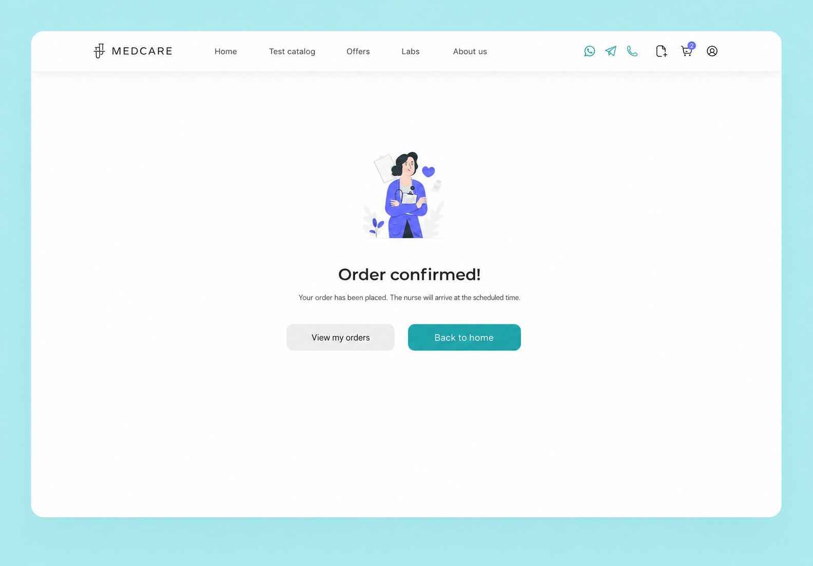
After the order goes through, the user sees a confirmation screen telling them it worked — that way they know they did everything right.
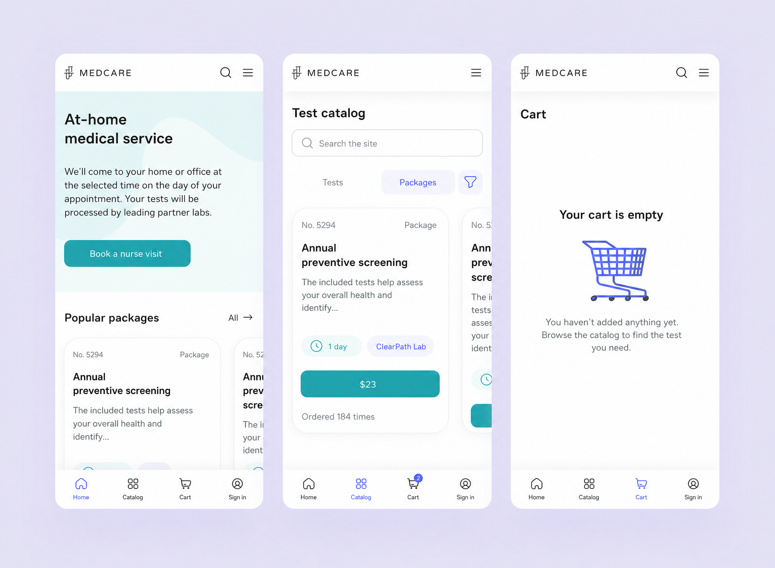
A large share of users open the MedCare site on their phones, so we built a responsive design for the mobile version.
The updated MedCare site is live. The client was happy with the result: clear navigation, a well-considered design, and improved interaction logic made the service easier and more comfortable to use.
Our collaboration with MedCare turned out to be productive and long-term: a year after the project wrapped, the client came back with a few improvements for the homepage.
For us, that’s the best possible sign: if clients come back, the work really did live up to their expectations 😀
➡️ Need a modern, user-friendly design that works for your business? The Purrweb team is ready to help! For 10+ years we’ve been creating UI/UX design for websites and mobile apps, working across industries and turning ideas into convenient, appealing products.
Drop us a line — we’ll dig into your task, get into the details of your business, and propose the best solution.
Design expertise. We’ve been building digital products with great design for over 10 years. Our portfolio has 550+ projects across all kinds of fields: IoT, EdTech, marketplaces, dating apps, and plenty more.
We handle every design task. The Purrweb team has experts in UI/UX design, graphic design, motion graphics, and 3D. We cover any request: from designing interfaces and creating a stylish brand identity to building animations, illustrations, and 3D models.
We turn ideas into real products. You don’t need to show up with a fully specced brief. We’ll take your ideas, flesh them out, propose creative approaches, and turn the concept into a working product.