Explore

Need help with your project?

Oops! Something went wrong while submitting the form.
Good UI/UX design helps a product stand out from competitors, and the team behind fintech startup WIT understood that. They asked us to create an expressive design for a banking app aimed at Azerbaijan. It combines a conventional online bank with a cryptocurrency wallet, a feature that sets it apart. The client placed particular emphasis on trust. The product takes an unfamiliar approach and asks users to change their habits, so the design had to feel reliable.
In this case study, we'll show how we brought playfulness and seriousness together. We developed a bold brand identity, created a mascot, and designed merchandise concepts for items people would actually want to use.
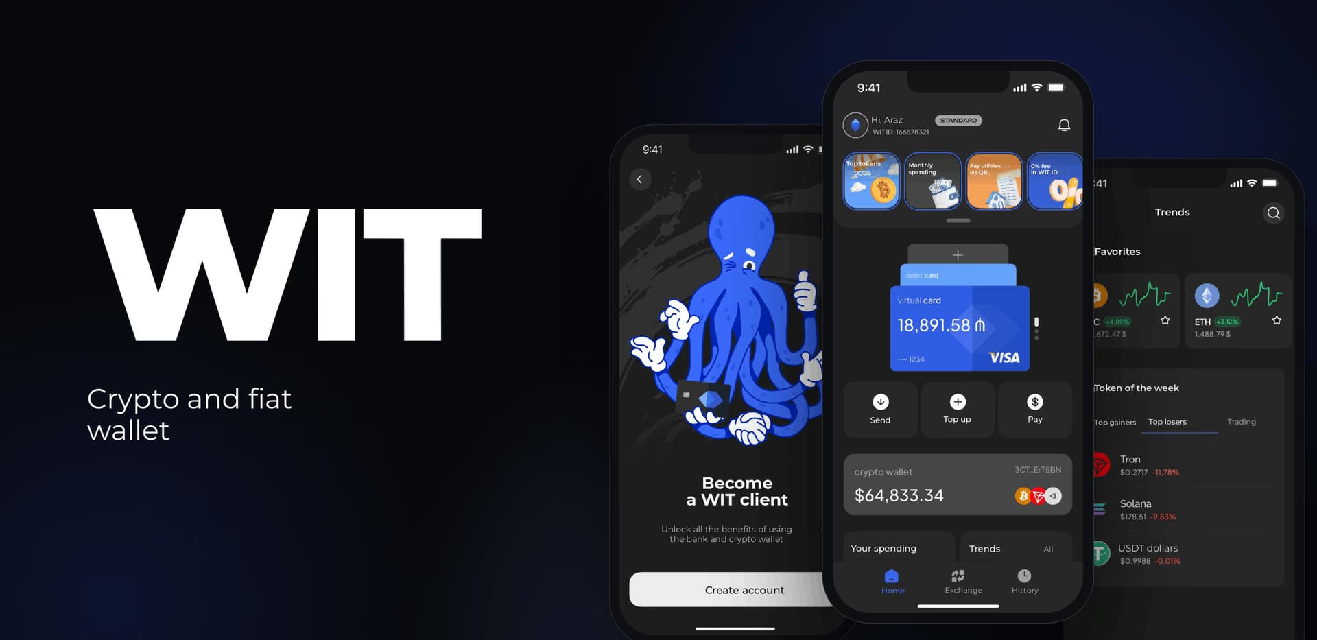

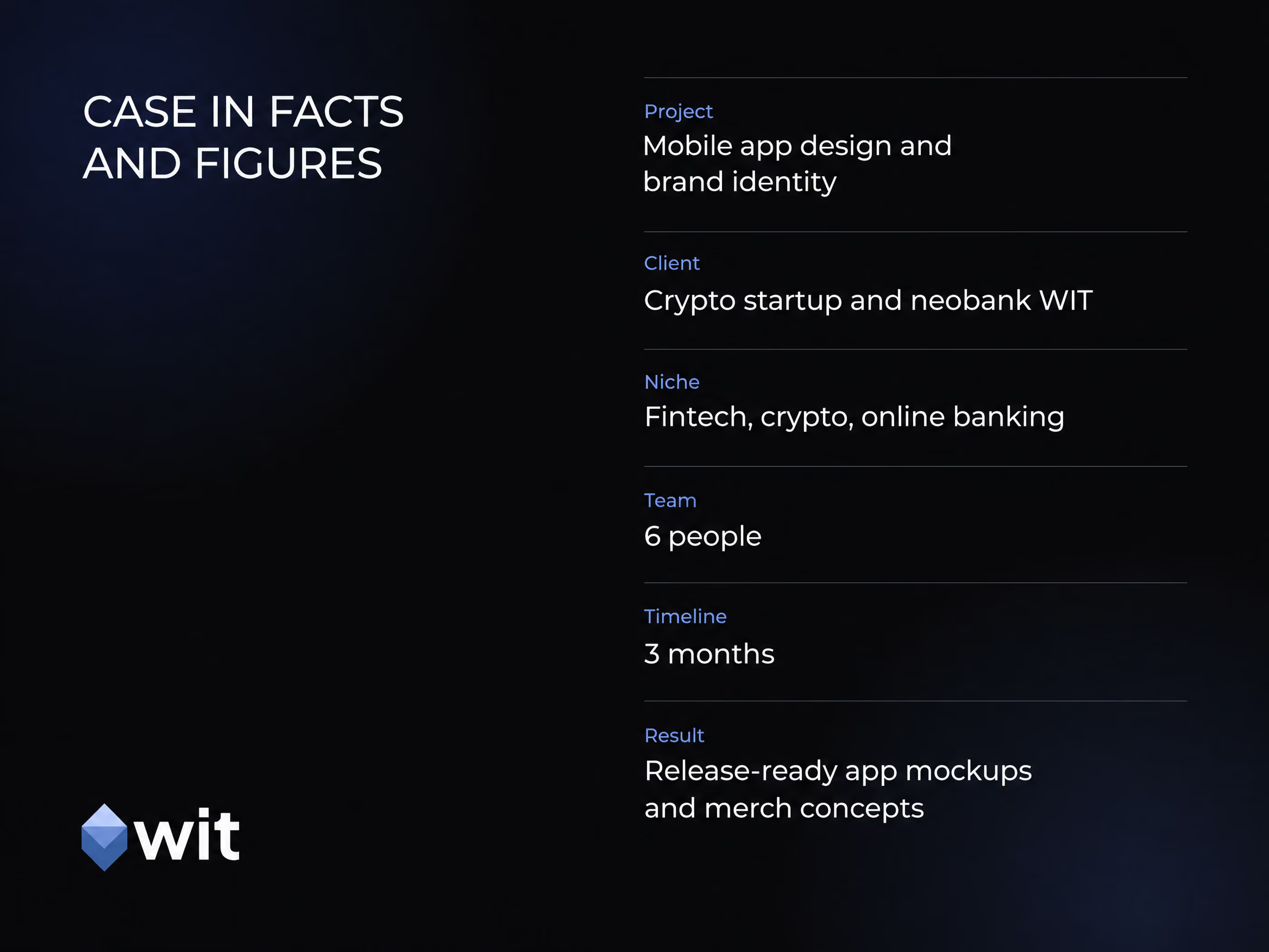
The app is already live, so you can see the result for yourself. Find WIT on the App Store.
Digital wallets usually hold either fiat (traditional money) or cryptocurrency. Banks generally don't handle crypto assets. That leaves users with separate apps for everyday finances and crypto management. The WIT team decided to close that gap by combining online banking and a crypto wallet in one product.
In the WIT app, users can:
The app targets Azerbaijan and is set to become the first product of its kind in the region. Launching a fintech product like this takes substantial legal preparation. The WIT team obtained regulatory approval before development began.
To introduce WIT to the market and earn users' trust, the team needed a design that matched the project's ambitions. They had already worked with local studios. None of the proposed options captured the fresh approach or what made the idea different, so they came to us.
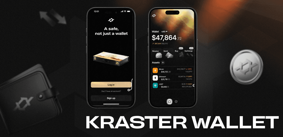
The Purrweb portfolio includes several crypto startup projects with bold, memorable designs. For example, we created an expressive UI/UX design for the crypto wallet Kaiju and helped develop several similar products. We understood the tasks crypto service users face and how to design a user experience that makes those tasks straightforward.
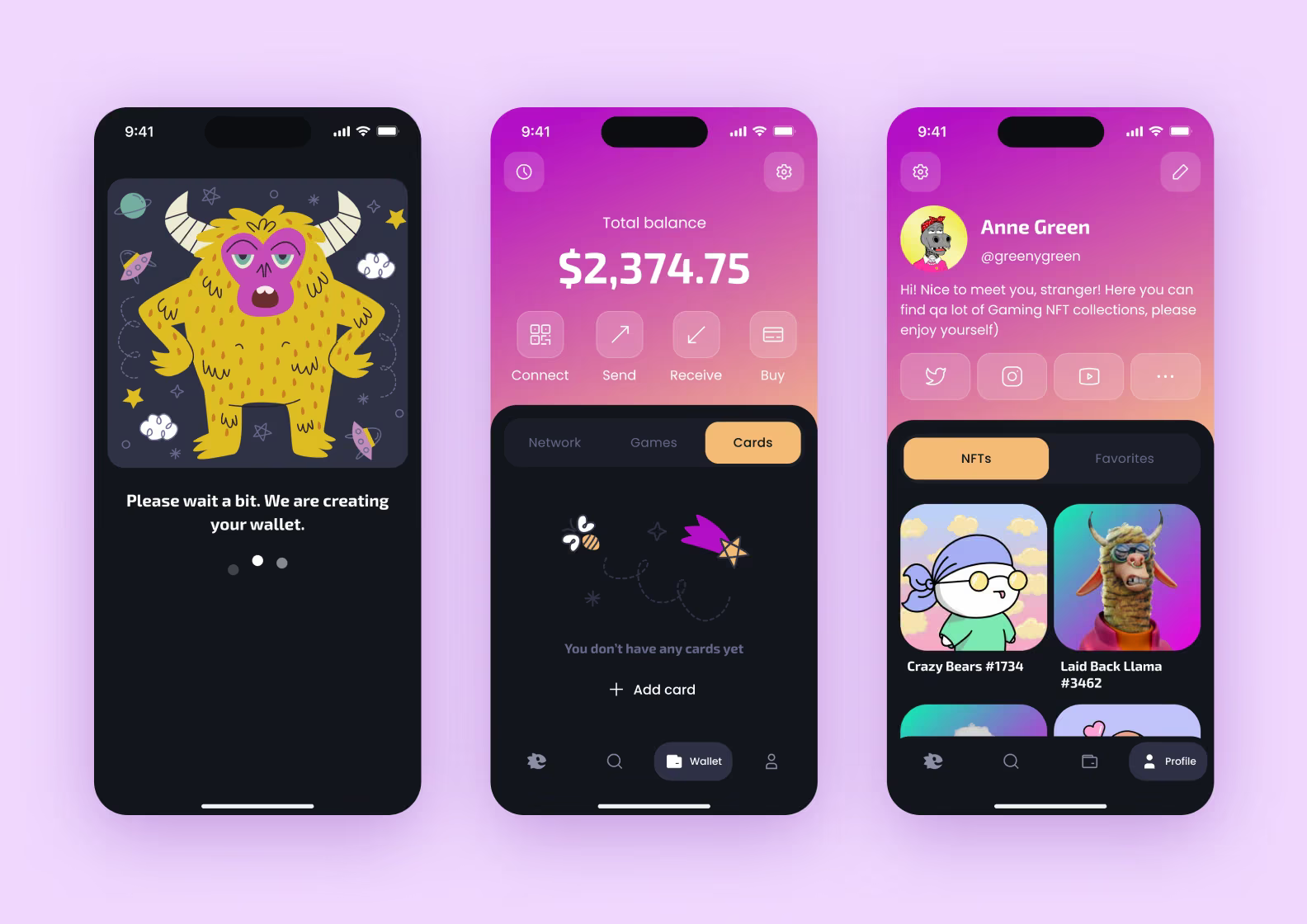
WIT presented a more interesting challenge. The design had to inspire trust and show that this was a serious banking product. At the same time, it needed a slightly daring feel for experienced crypto users and younger audiences. Those goals might seem incompatible, but we found a solution. Here's how 😉
For this project, we set out to:
🐙 Develop a cohesive brand identity, visual style, and visual metaphor from scratch
🐙 Create a design concept
🐙 Design the mobile app's UI/UX
🐙 Work through user flows
🐙 Create design concepts for WIT-branded merchandise, including hoodies, T-shirts, and notebooks
The client's main request was a distinctive visual identity that would set WIT apart from everything else on the market.
Market analysis and reference gathering came first. Alongside our own research, we asked the client for screenshots of digital products they wanted WIT to resemble. As a required step in our process, reference research helps us understand competitors' design choices, assess them, and find ways to stand apart.
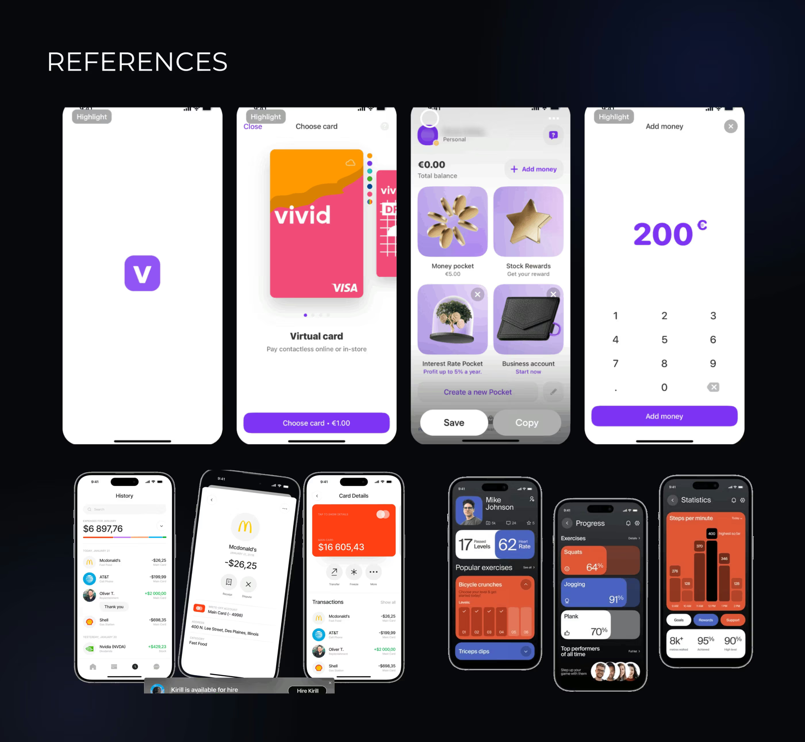
We looked at direct competitors in banking and crypto wallets, as well as products in other fields. These included marketplaces, delivery services, and workout apps. Interesting ideas often turn up in unexpected places.
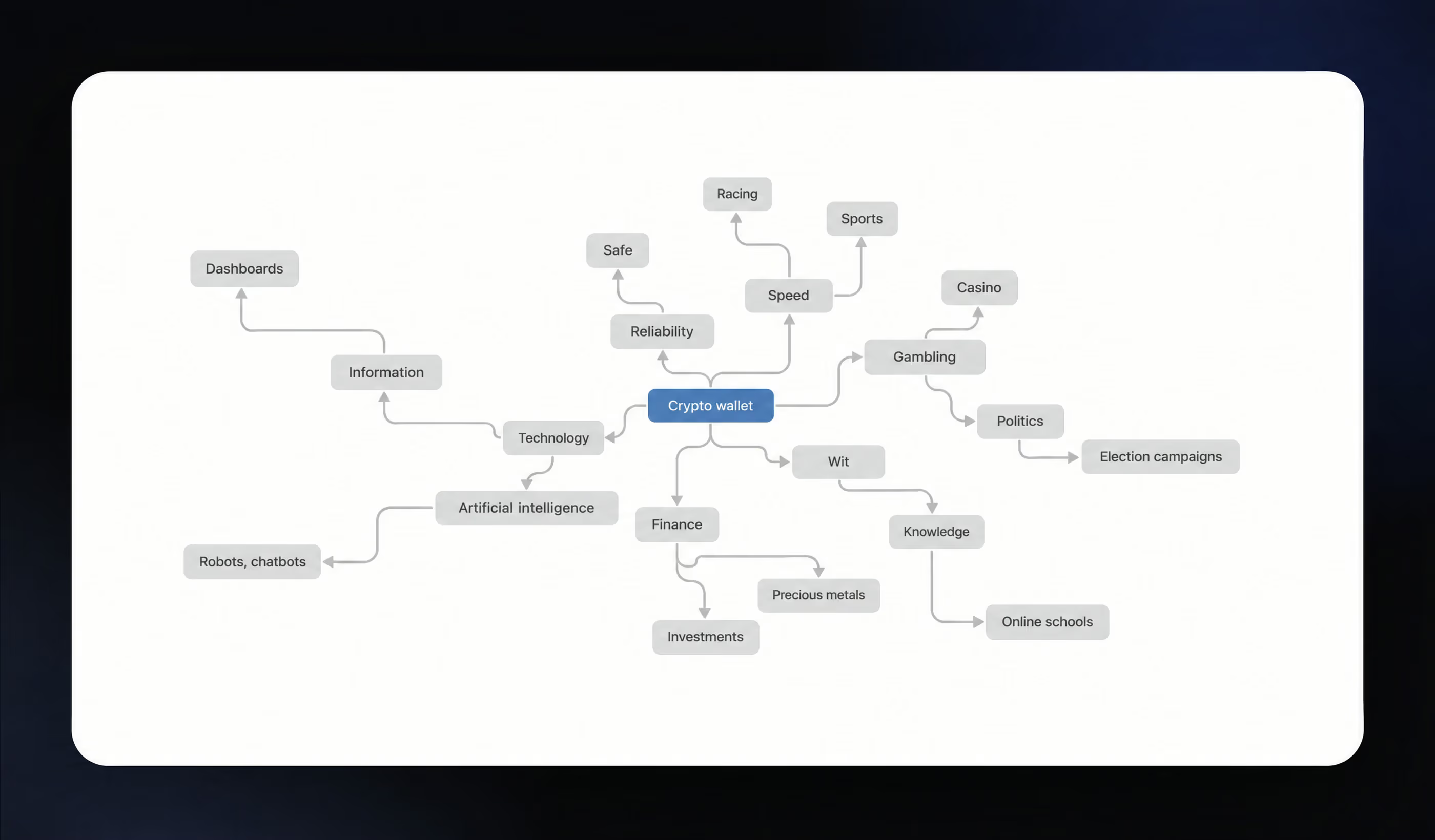
We put together an association map to capture the key images, emotions, and meanings the brand should evoke.
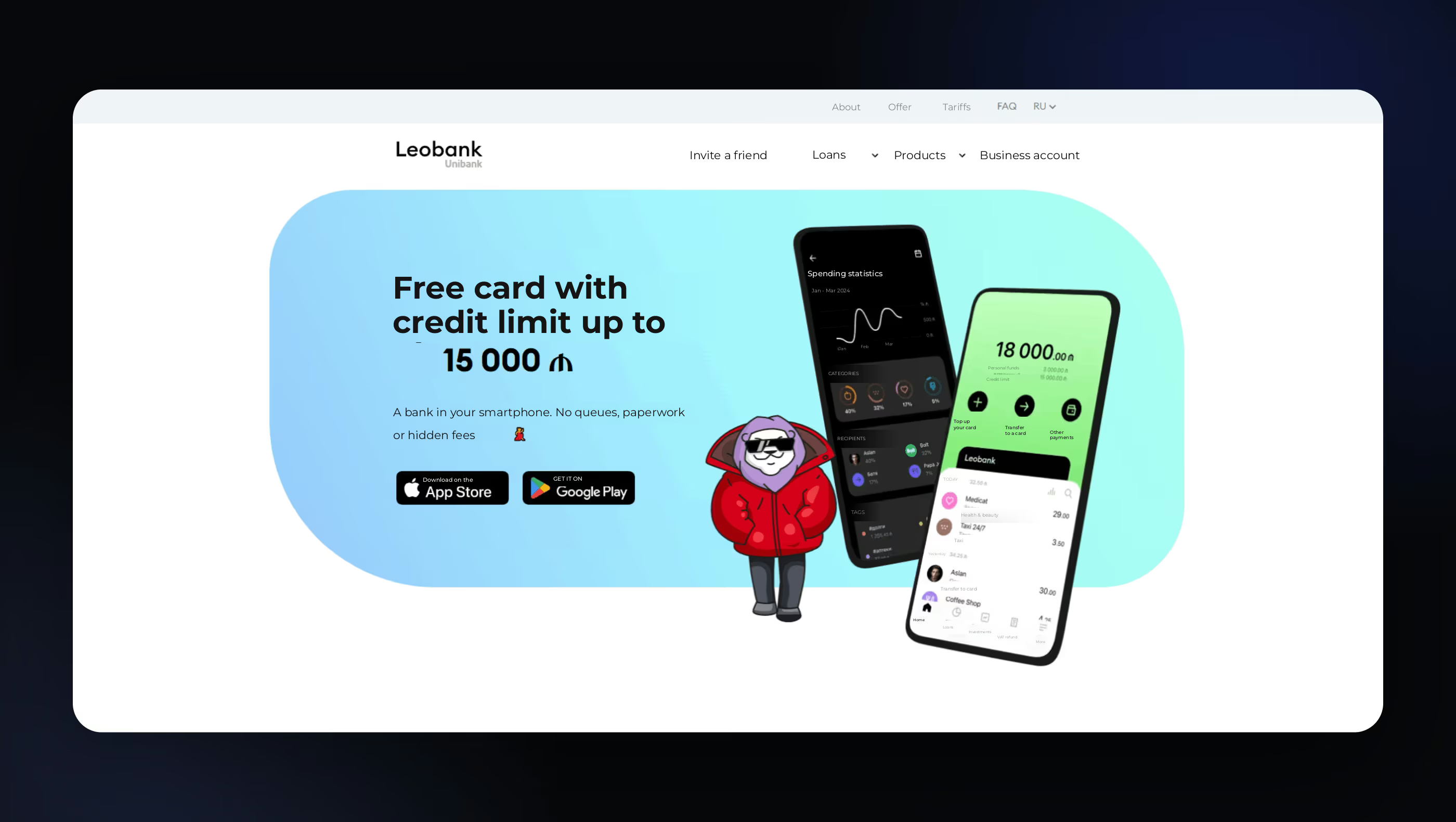
One of the client's main references was Leobank, a mobile app popular in Azerbaijan. It pairs a restrained design with a funny mascot that adds a playful feel.
Once we'd gathered references and agreed on what the product should convey, we began developing its visual metaphor. This would inform key design elements, including the logo, color palette, and typography.
The product name, wit, suggested sharp thinking and quick understanding. That gave us room for exaggerated, humorous imagery. The app also had to feel welcoming and bring some emotion to the experience.
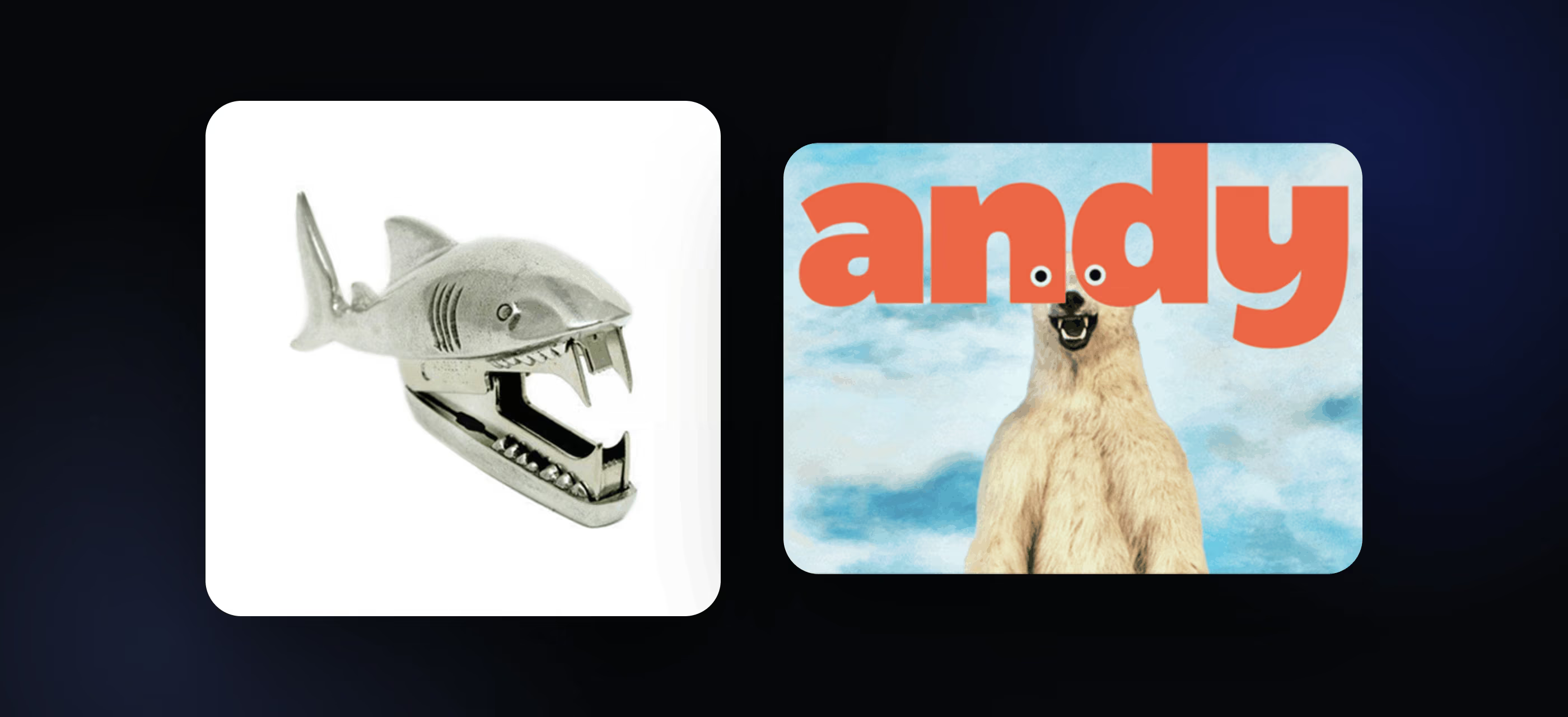
We explored several metaphors and narrowed them down to the two most interesting options. One of them won :)
A metaphor needs depth to convey several meanings, while remaining clear and easy to recognize. For WIT, we developed two visual concepts: an iceberg and a bee.
🧊 The iceberg represents the product's two layers. A familiar banking interface sits on the surface, with crypto functionality underneath. Like a real iceberg, most of it is underwater. An iceberg is also a massive block of ice that withstands collisions and even sinks ships. That adds a sense of strength and stability.
🐝 The bee was another metaphor inspired by the name. WIT suggests quick thinking and wit, and bees are among the smartest, most organized creatures. They represent order, efficiency, and hard work. Resilience matters too. Even if one bee drops out, the hive keeps functioning. That echoes WIT's central message of stable operation and security.
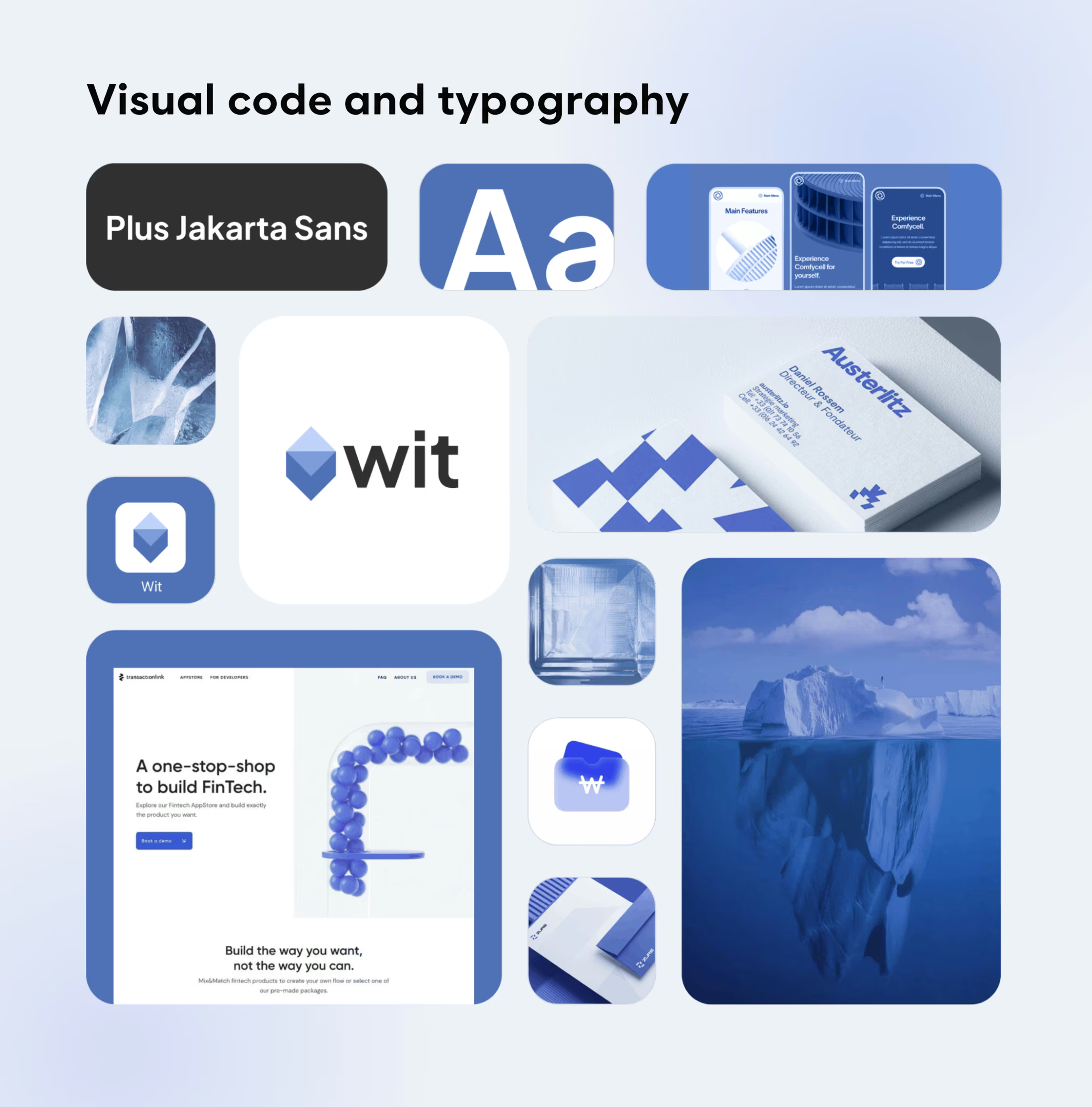
The client found both ideas interesting, but the giant won this contest. The iceberg concept resonated more strongly with the WIT team. We built a mood board around the icy metaphor, and a stylized iceberg became WIT's logo.
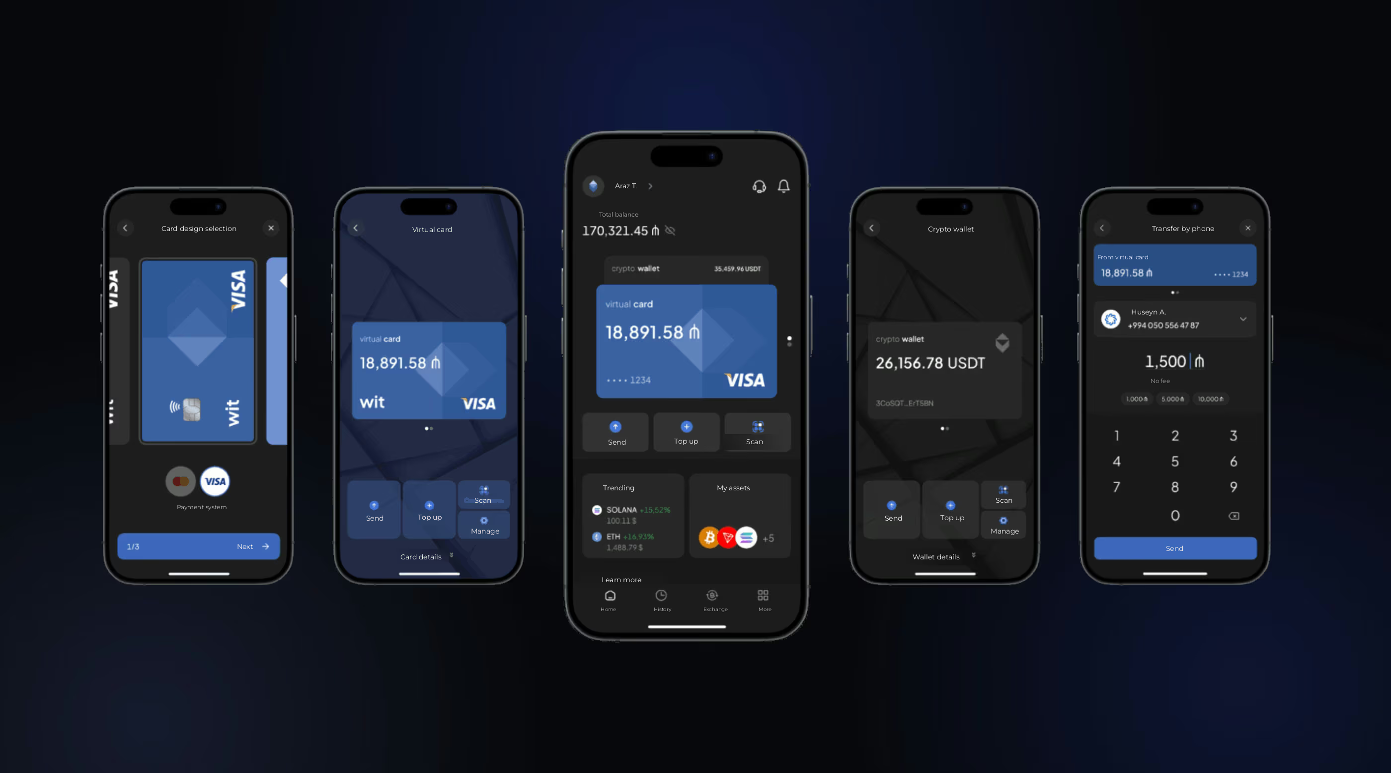
After agreeing on this direction with the client, we created design concepts for the key screens. These covered the home screen, crypto wallet, and transfers from a regular debit card.
The concept was clean, concise, and fairly formal. But the client wanted something brighter, bolder, and a little more daring. We needed a mascot that would become an important part of the app's UI/UX design.
Why an octopus? Octopuses are smart and full of character, yet they rarely become mascots. That hardly seems fair! The idea felt fresh and original, and it fit the ocean theme perfectly 🐙
Here's how our character evolved:
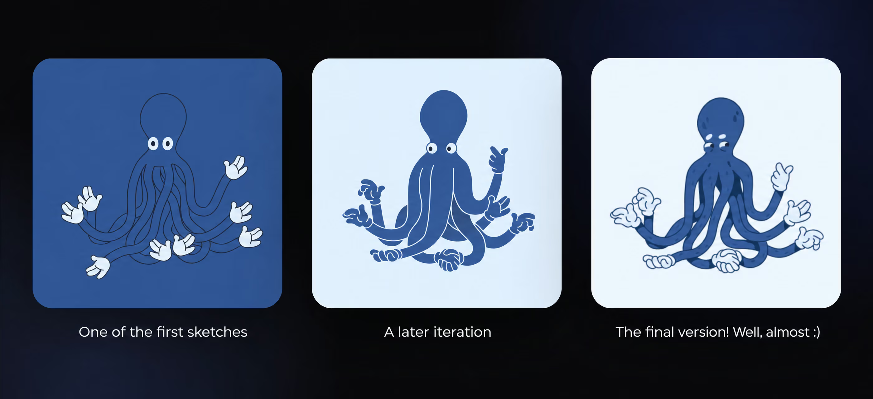
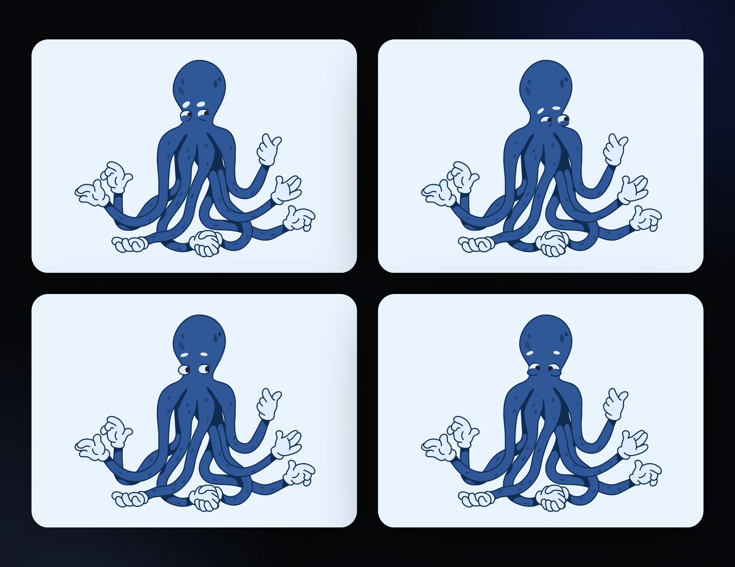
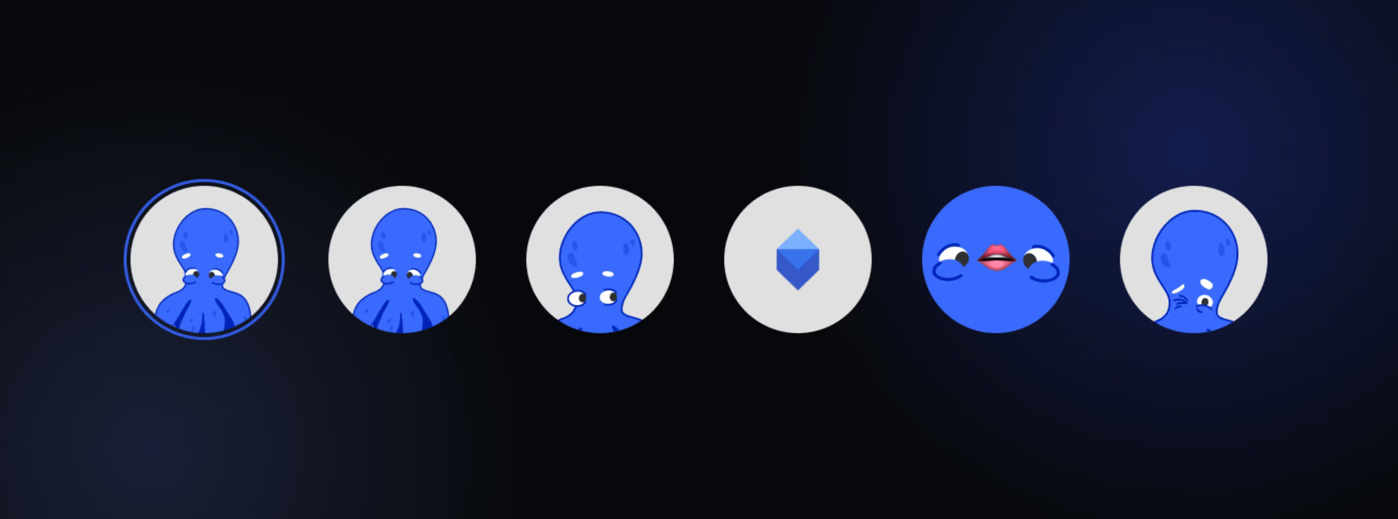
Our mascot does more than add a bright accent to the app. It also communicates with users. Its facial expressions hint at what's happening and set the mood.
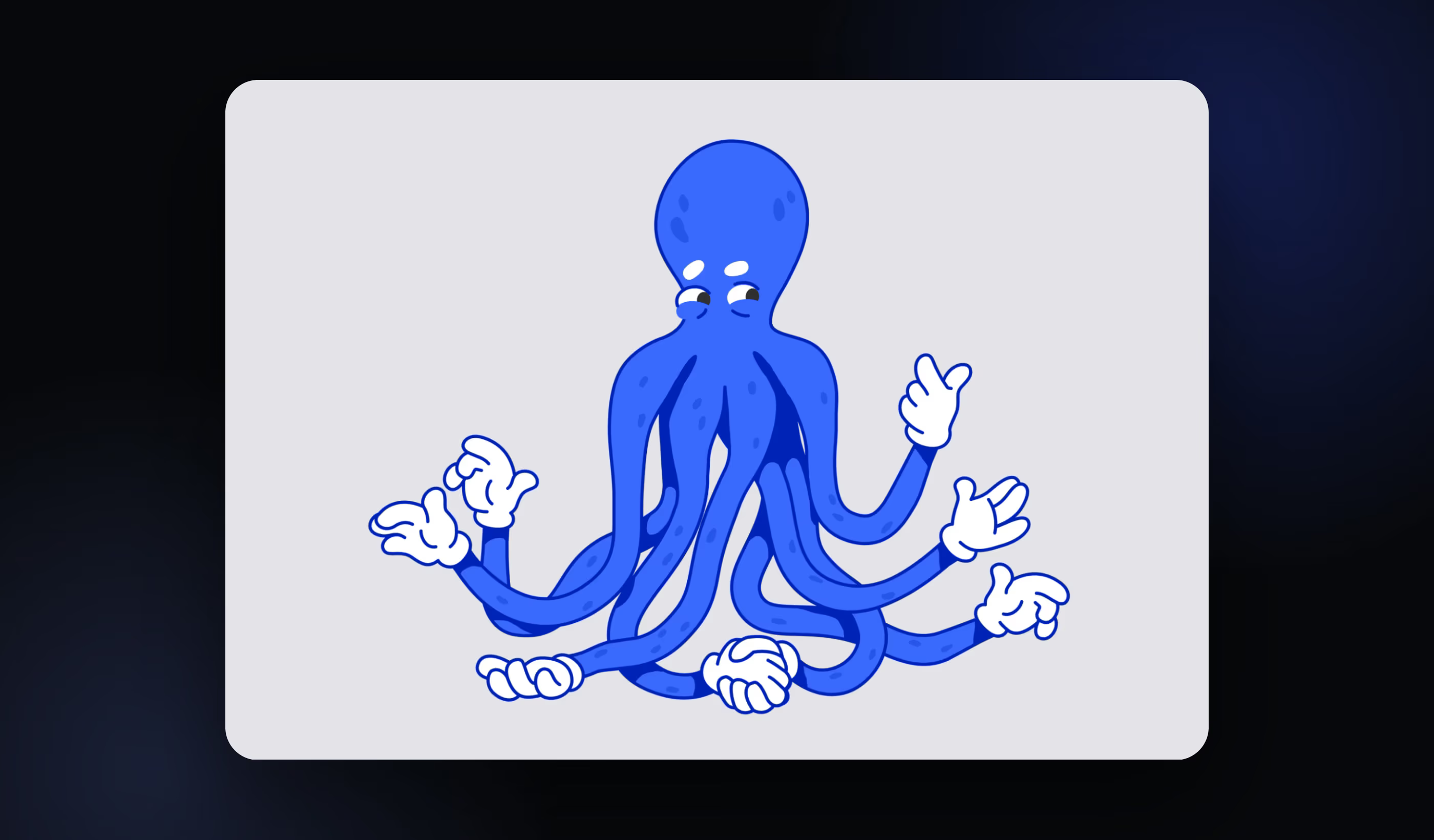
Later, we changed the mascot's color to bright blue so it would fit the updated interface design better.
The app has a broad set of features, so we designed plenty of screens. We won't show all the hundreds of layouts we created in Figma 😀 Instead, we'll walk you through the key user flows. The app supports light and dark themes, so we'll alternate between them ☀️🌑
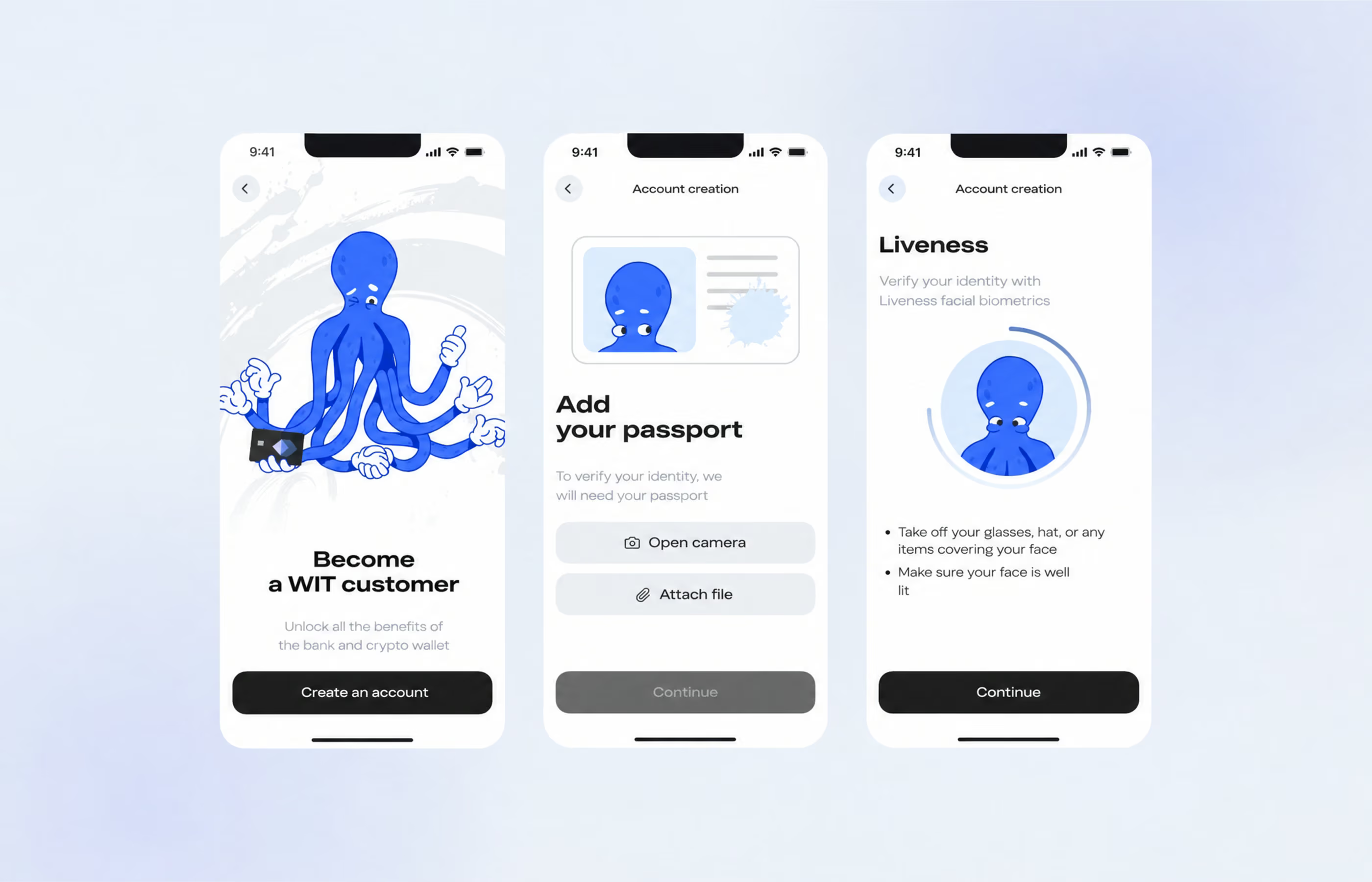
Registration and sign-in. This covers four flows: registration, PIN creation, and identity verification for both Azerbaijani citizens and foreign users. At this stage, the app collects a lot of information. It asks for a phone number, verification code, citizenship, passport details, and biometric data.
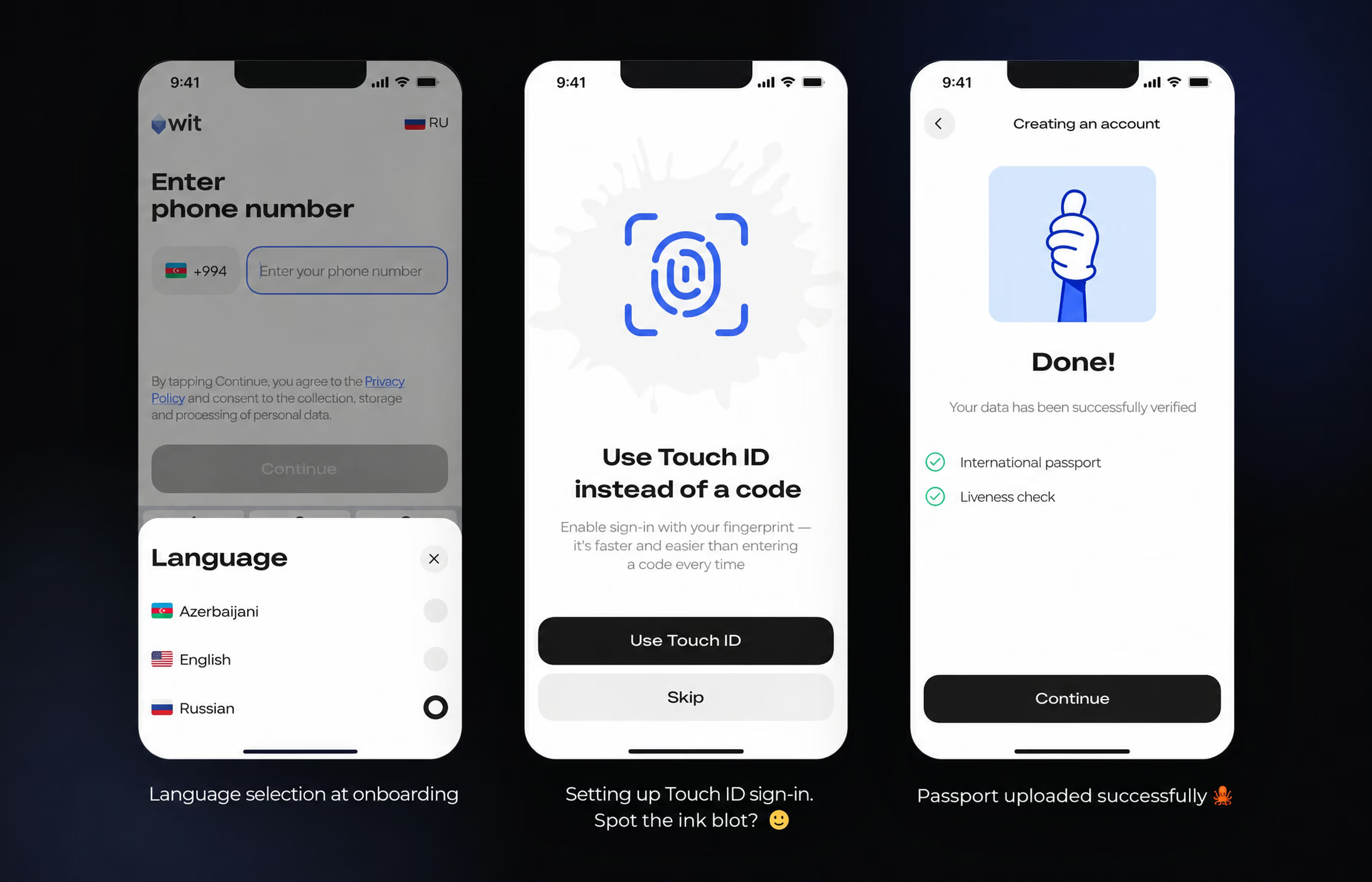
The flow was fairly long, with 64 screens covering four functions. Identity verification accounts for most of them and is critical to security and legal operation
Home screen. This screen brings together everything users need in the app. It shows all their bank cards and the crypto wallet balance, with access to top-ups, transfers, spending, and crypto exchange rates.
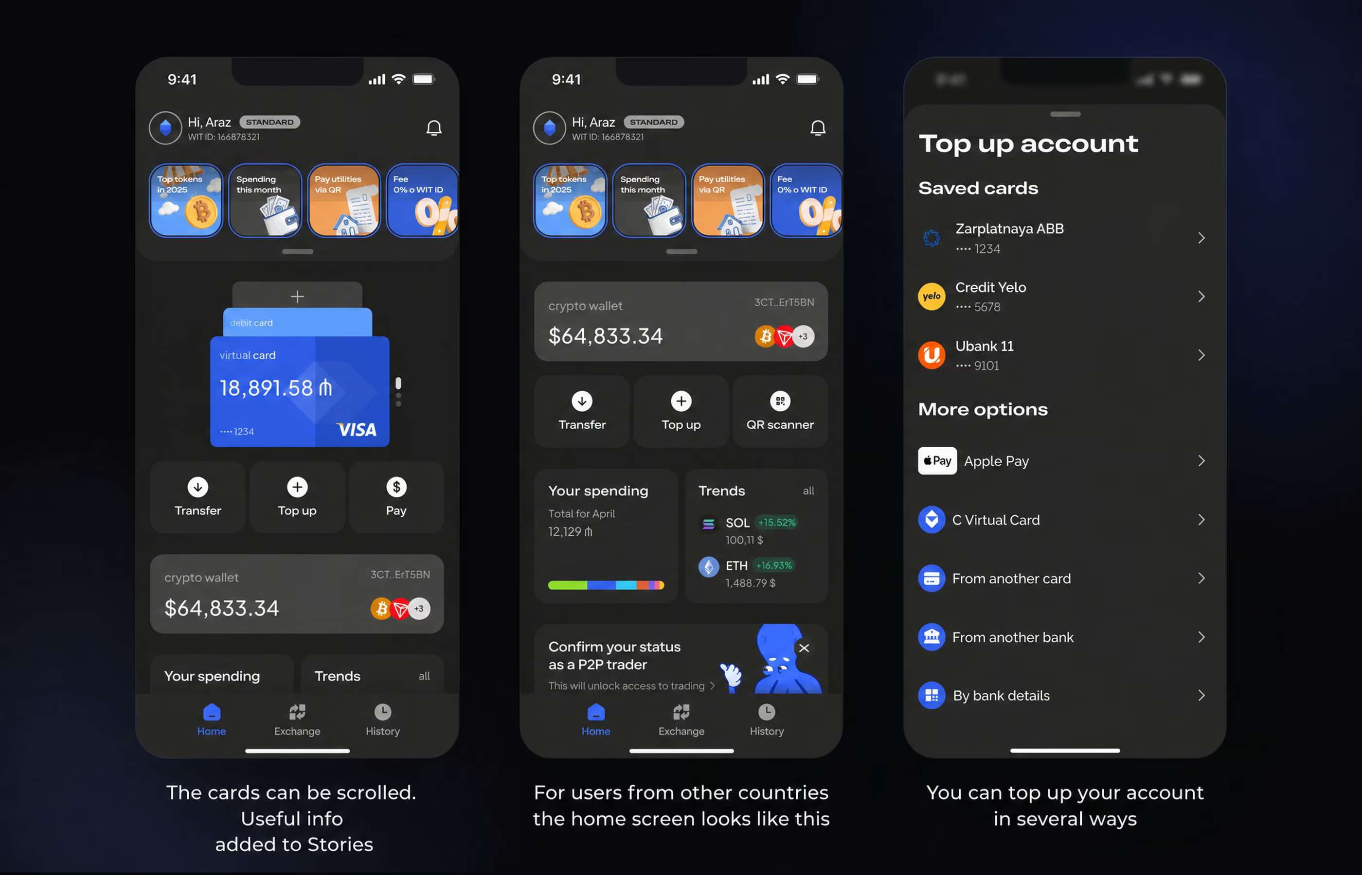
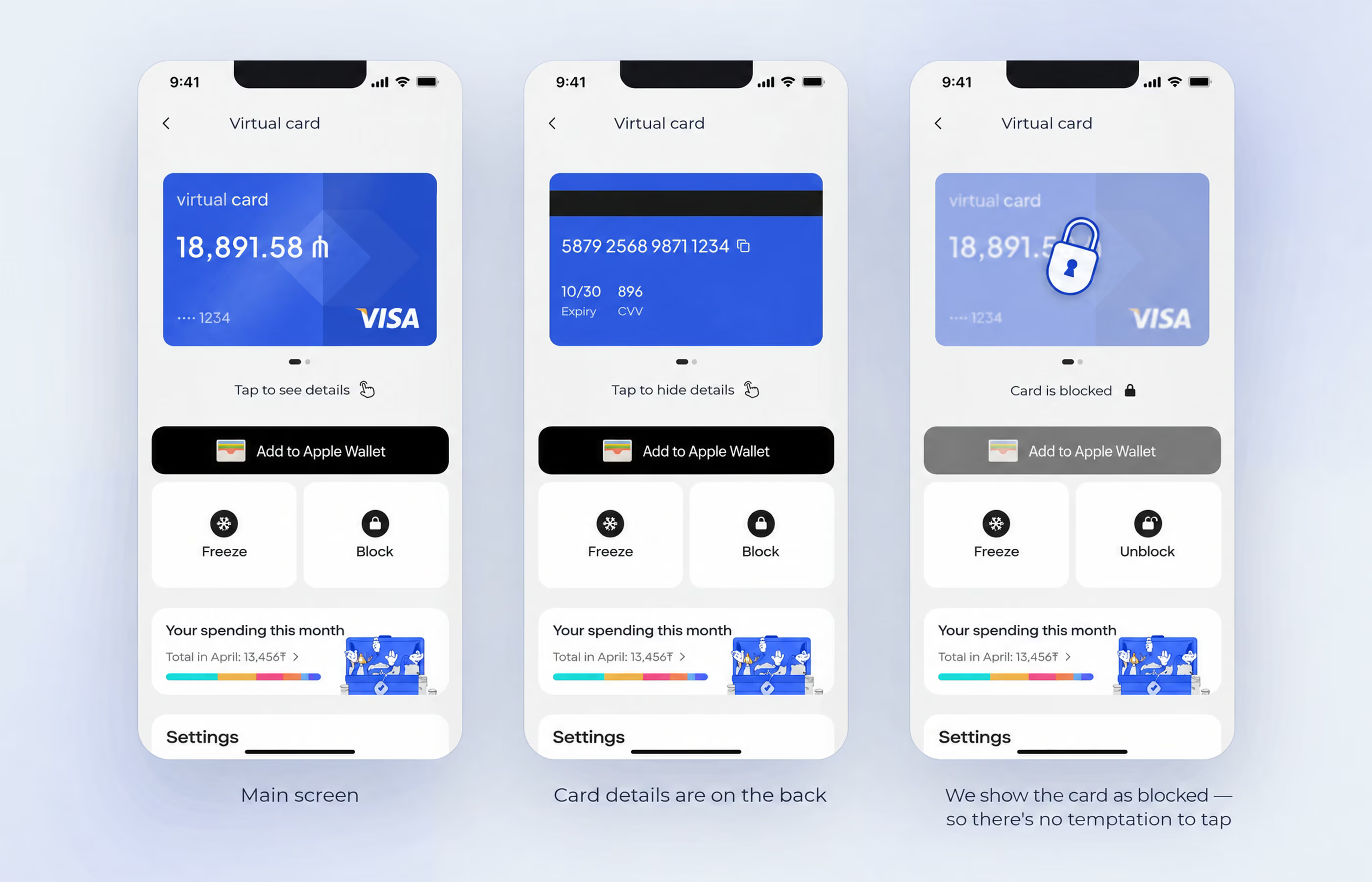
Virtual card screen. This section covers card settings, freezing, blocking, and PIN changes. User actions affect the state of interface elements, so we designed plenty of additional screens.
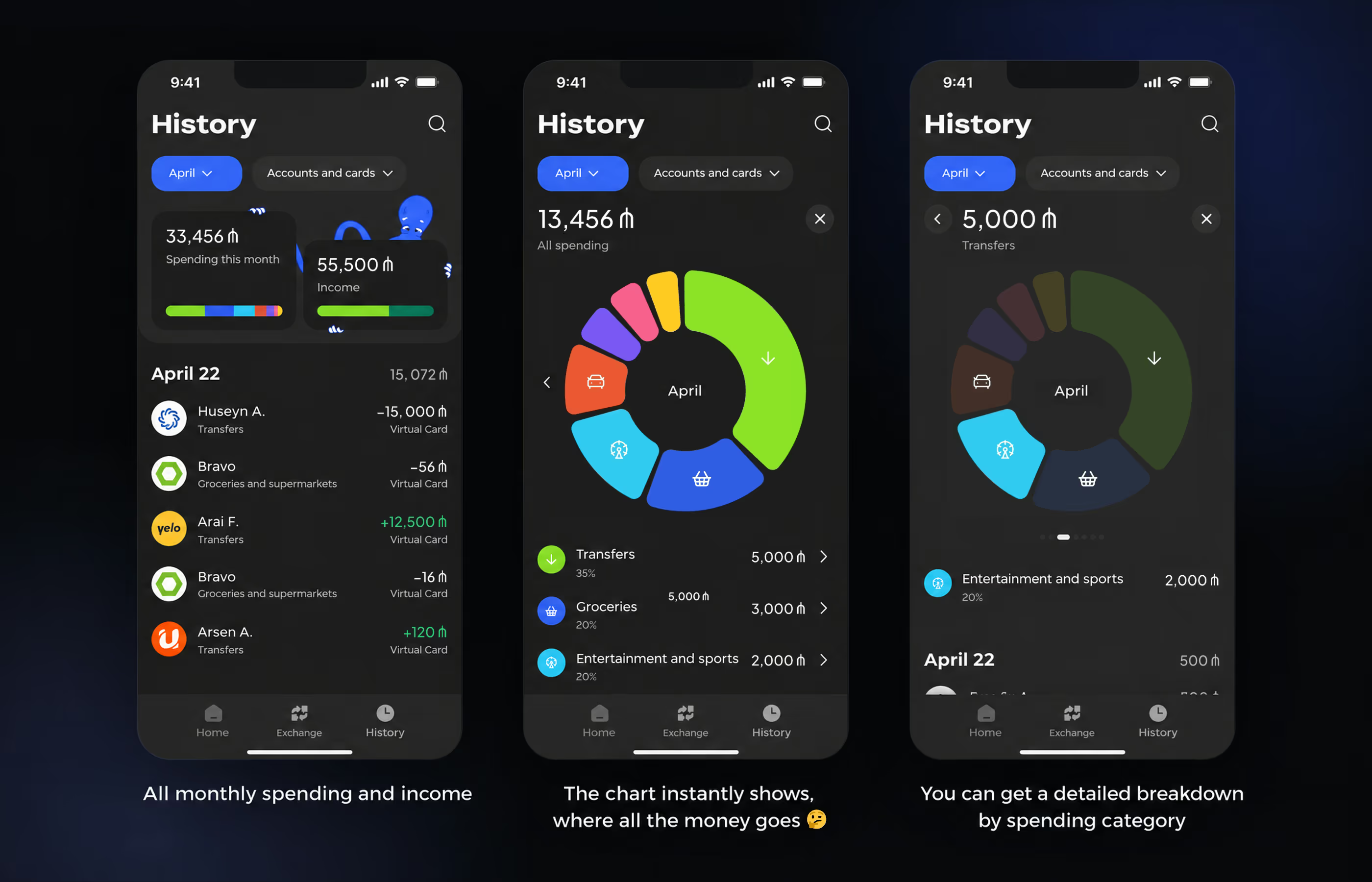
Spending and income history. Users can view spending and incoming payments for a month or any selected period. A chart shows which categories account for the most spending.
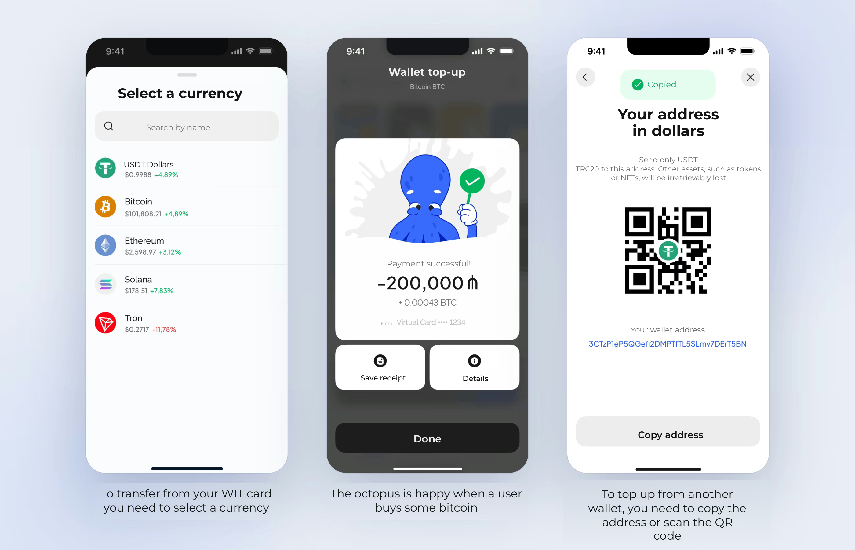
Buying and transferring crypto. Users can top up their crypto wallet from a WIT card or another wallet, and transfer funds to another address.
WIT's visual design rests on two pillars 🐋🐋:
Functional elements are restrained and concise, as in familiar banking apps.
Illustrations and visual details are bold and mischievous. They set the mood and express the product's personality.
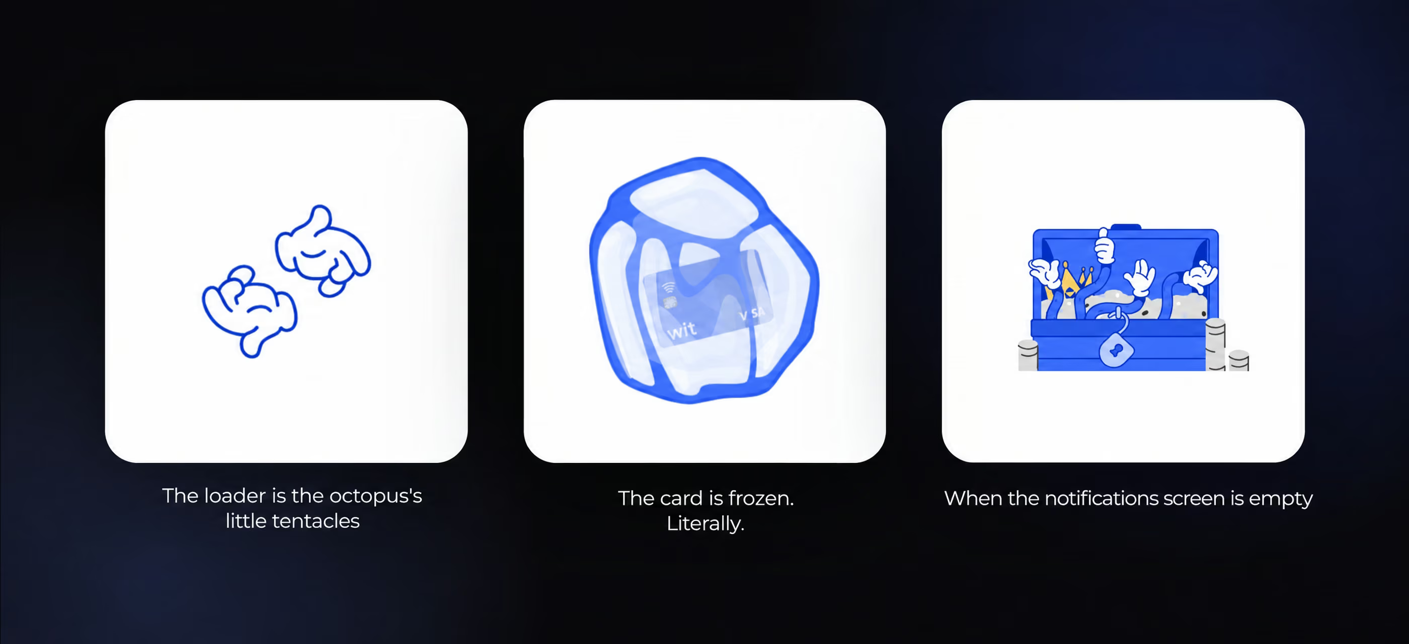
We wanted the interface to bring serious banking patterns together with a more upbeat, relaxed feel. Attention to detail helped us find that balance. The mascot's changing moods, ink splashes, and slightly ironic illustrations give the product character without overwhelming users or distracting them. In fintech, after all, it's important that users don't make mistakes.
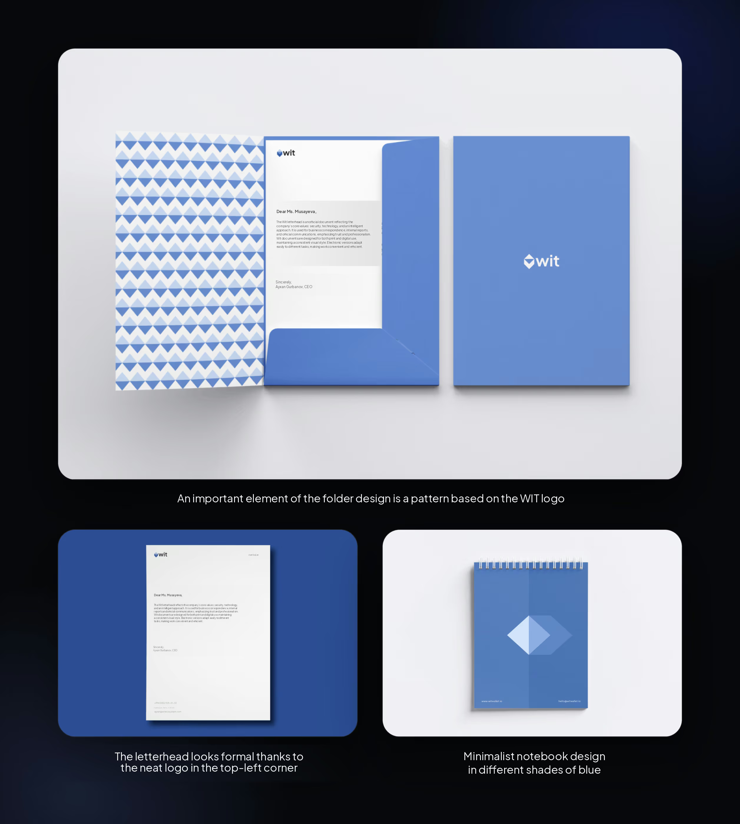
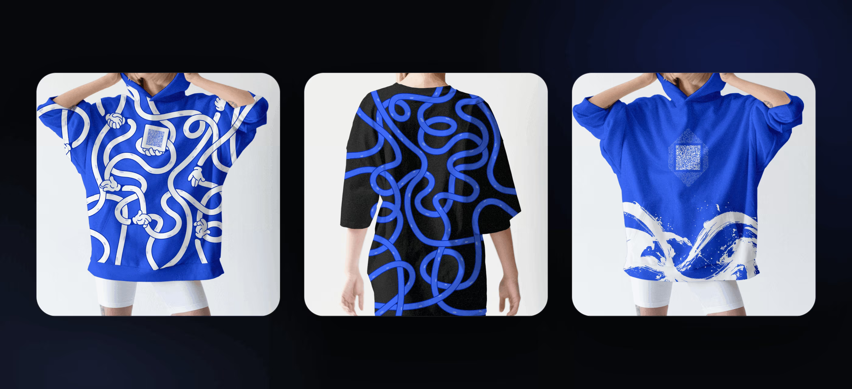
Alongside the app design, we developed concepts for a range of branded merchandise. We created visuals for:
Here's what we came up with:
Minimal design for stationery. We used three colors: white, blue-gray, and royal blue.
T-shirts and hoodies with octopus tentacles. For the clothing designs, we played with recognizable elements from the app's interface: tentacles wearing gloves and ink splashes. We used the logo too.
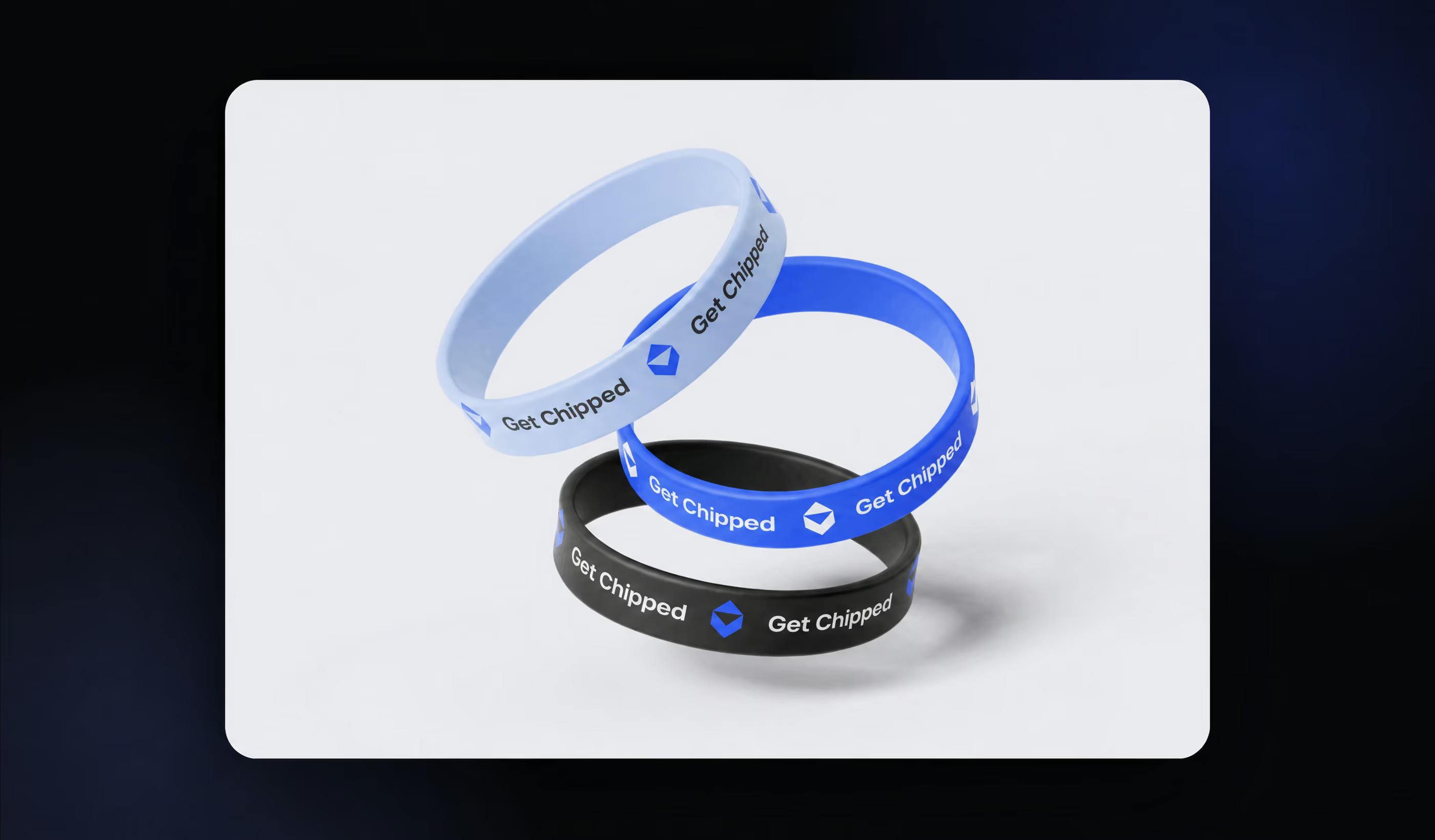
Wristbands came in the interface's three main colors: lavender blue, ultramarine, and dark charcoal. We added the logo and an ironic slogan.
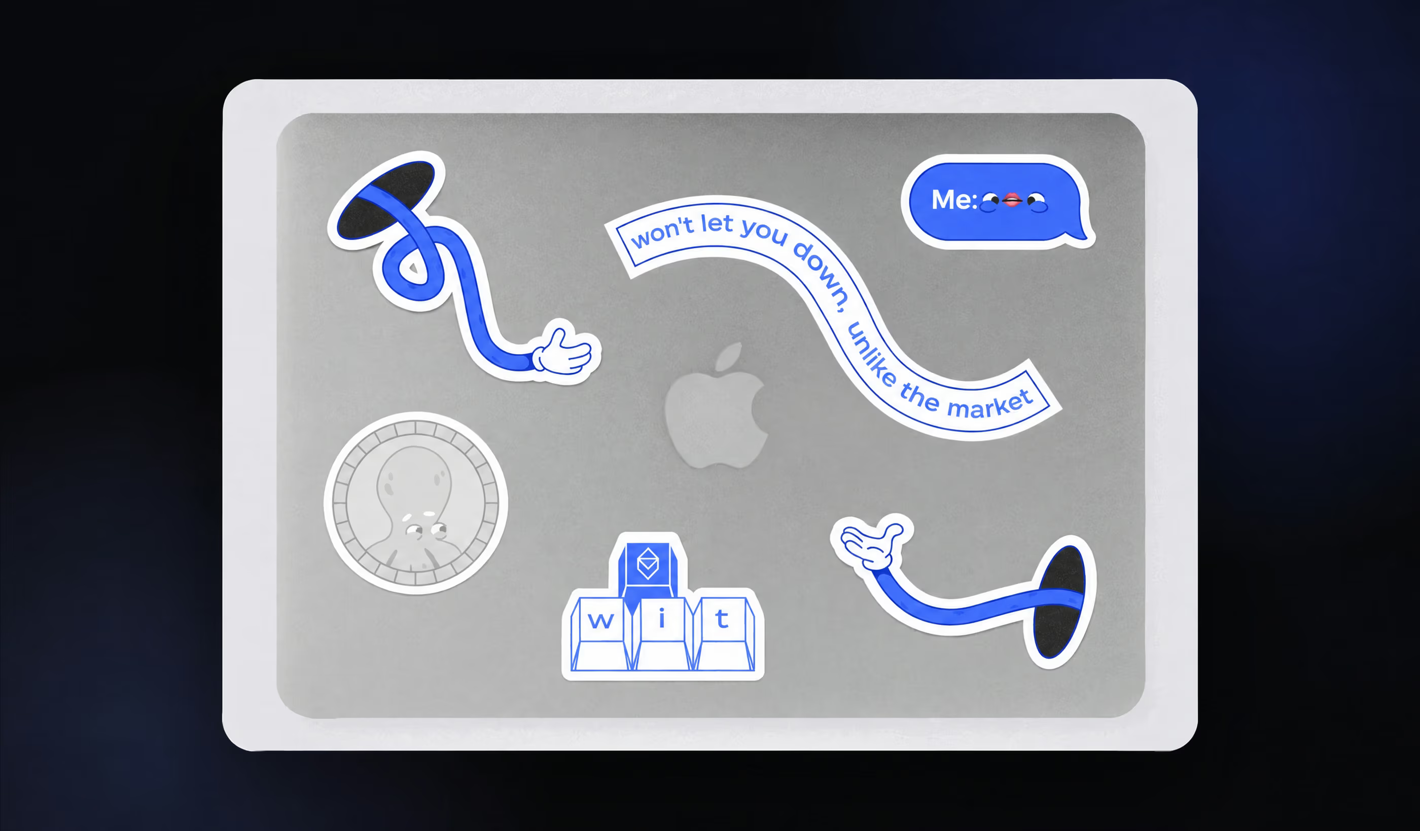
Stickers came in as many variations as possible. They feature the mascot, graphic elements that reference WIT's interface, and text slogans.
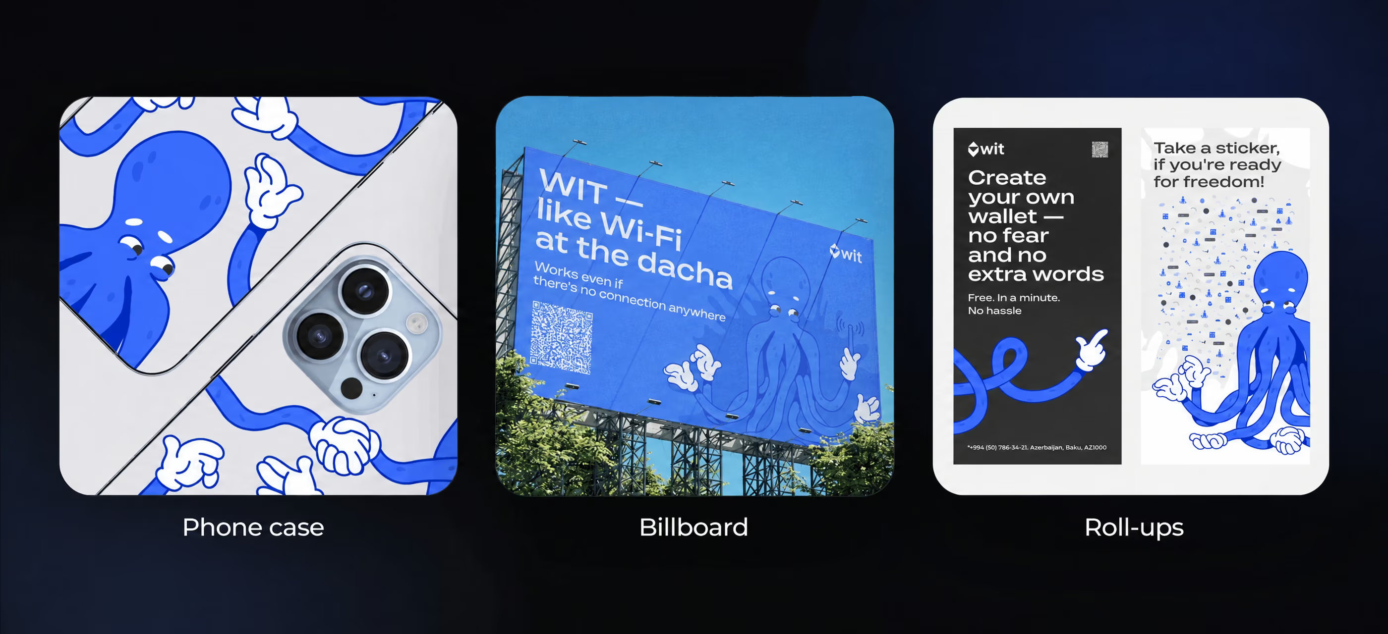
Here are a few more concepts.
In 3 months, we:
We enjoyed working on such a bold, exciting project and believe WIT has a big future ahead.
➡️ Planning a fintech app or a redesign? Let's discuss your product goals, user flows, and brand identity. Fill out the form for a free project estimate within 48 hours.
Full-cycle mobile development. We handle the whole process, from design and development to testing and supporting the app's release in the stores.
10 years of experience. We've been building digital products for businesses and startups for more than a decade. We've completed 550+ projects across a range of fields, including IoT, EdTech, marketplaces, dating apps, and more.
Turning ideas into real products. You don't need a detailed technical specification to come to us. We'll take your ideas, flesh them out, propose creative approaches, and turn them into a working product.