Explore

Need help with your project?

Oops! Something went wrong while submitting the form.
Designing convenient, good-looking interfaces is business as usual for the Purrweb team. But what if the entire interface is a small screen with button controls? Now that’s an interesting challenge for UI/UX designers.
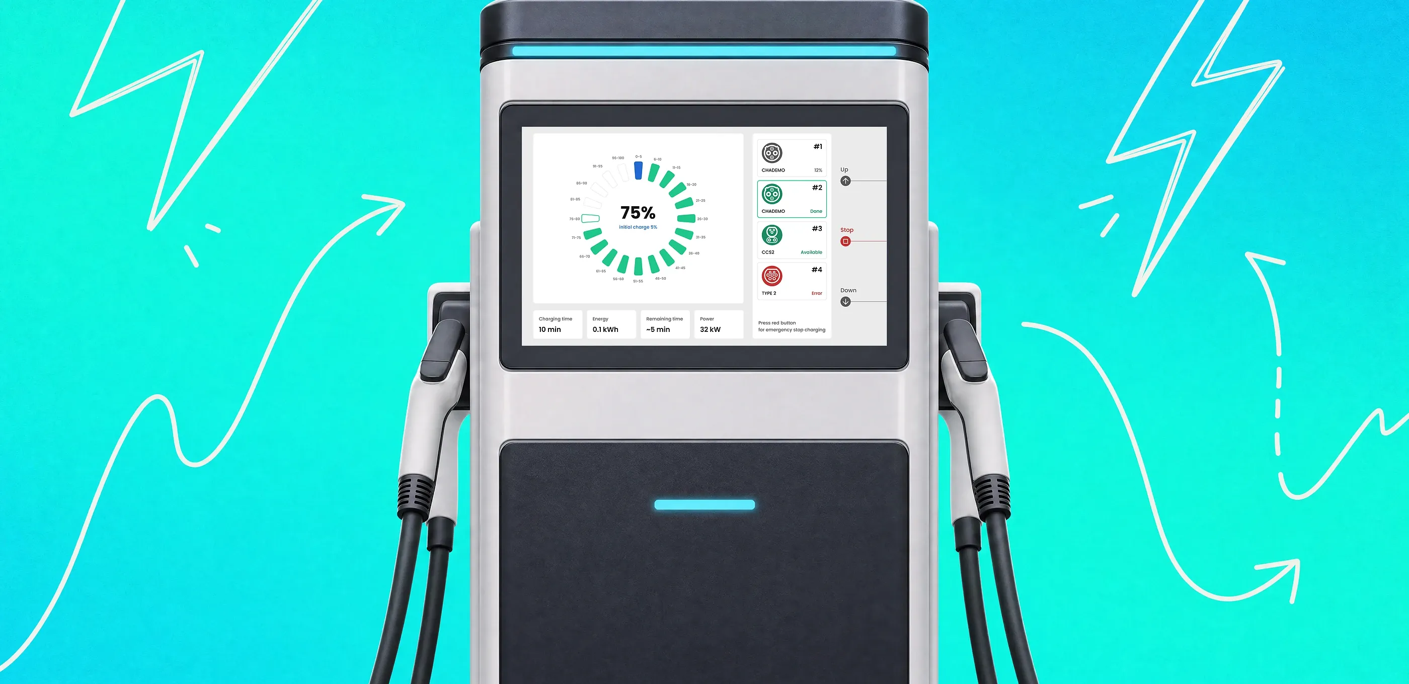
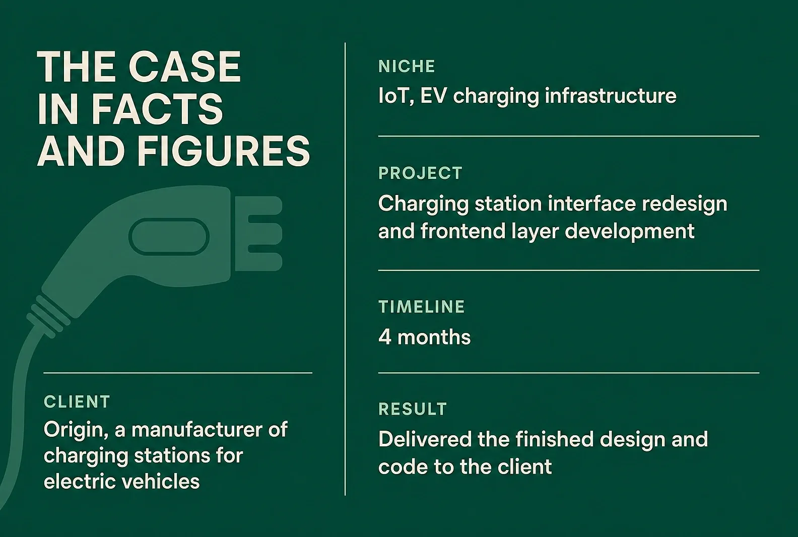
Origin, a charging station manufacturer, came to us with a task. They wanted us to update the interface of their station screens and make them even easier to use, then build a frontend layer on top. In this case study, we’ll walk you through the decisions we made and the details we had to account for along the way.
In the summer of 2023, Origin reached out to us — a manufacturer and developer of charging stations for electric vehicles. The company has been around since 2016 and grew from a startup into a company, delivering large, technically complex infrastructure projects.
Origin also works on innovation: together with a university research team, they built a prototype of a wireless charging system for electric cars.
The company keeps developing its products, and it had an interface update for the station screens on the roadmap — to make them more usable and improve the customer experience. The project also called for a frontend layer for the new screens.
To pull this off, Origin wanted a team of experts in designing modern, user-friendly interfaces. They also needed people who could get into the specifics of the product and close out the frontend work.
That team turned out to be us, Purrweb. We’d already worked on IoT projects: for example, we built EnerGO, a power bank rental app. And we had experience in the EV space, too — we did a redesign for ThunderSoft, a company that makes software for charging stations.
Here’s what was on our plate:
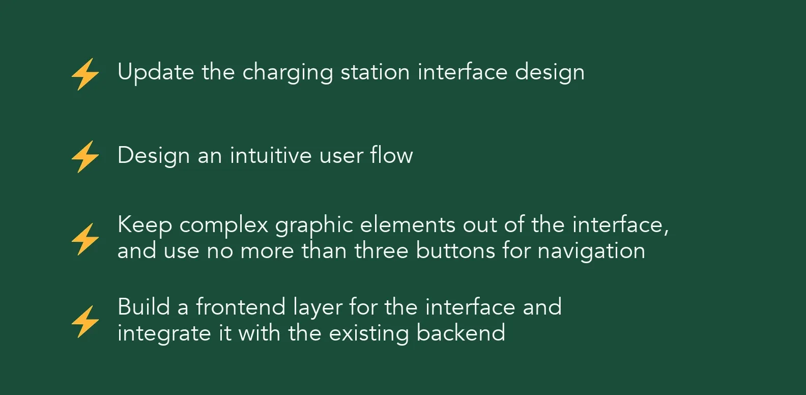
In design terms the project was small: the station interface has only a handful of states and user flows. That didn’t make it easy, though — technically, it was a tough one.
We had to account for how charging stations actually get used. The equipment runs outdoors, in different climates, year-round, in any weather.
So that drivers don’t run into trouble charging in the winter months, the station interface is controlled with mechanical buttons. At low temperatures, touchscreens on stations can misread taps. And if the user is wearing gloves, a touchscreen gets even harder to work with.
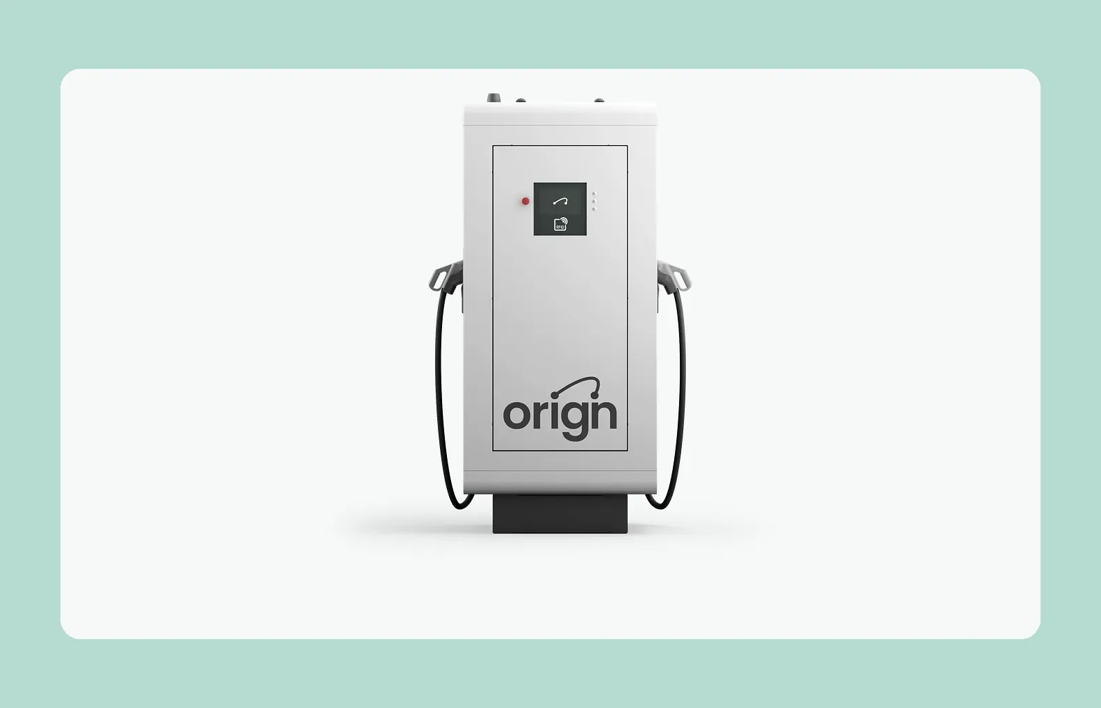
Since buttons are the only way to interact with the interface and move through the menu, the design couldn’t use clickable elements, tab bars, or dropdowns.
The task Origin set for us was to work out the interface control system and design a comfortable UX scenario within those limited interaction options. The menu had to be simple and intuitive, so users could pick a language, log in, choose a connector type, and track charging progress without a second thought.
Another constraint was the size of the screen itself. Every interface element had to fit compactly, while still staying large enough to read.
Working alongside the Origin developers, we built an intuitive interface that lets people interact with the company’s charging stations quickly and comfortably.
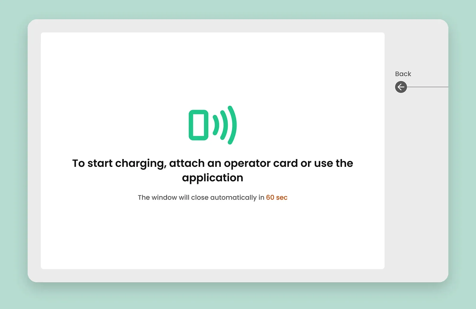
The focus was on clear navigation, easy parameter selection, and a readable visualization of the charging process.
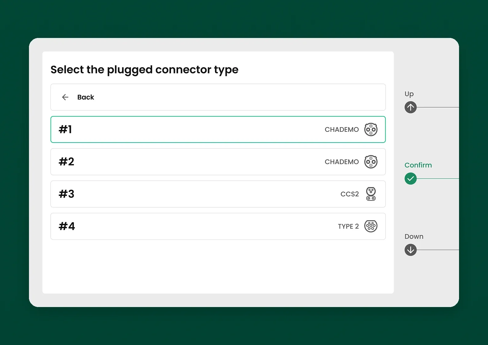
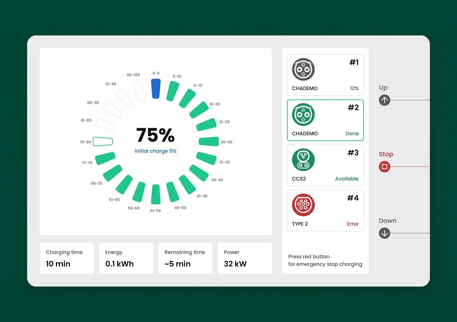
To avoid confusion when several connectors are in use at once, we show the availability status of each one.
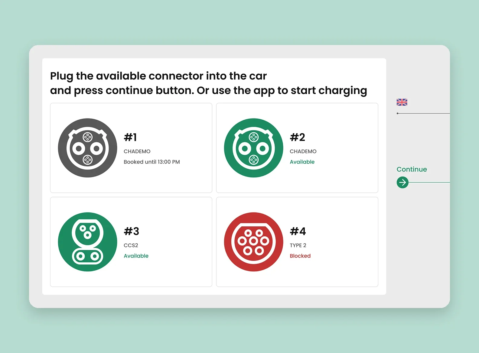
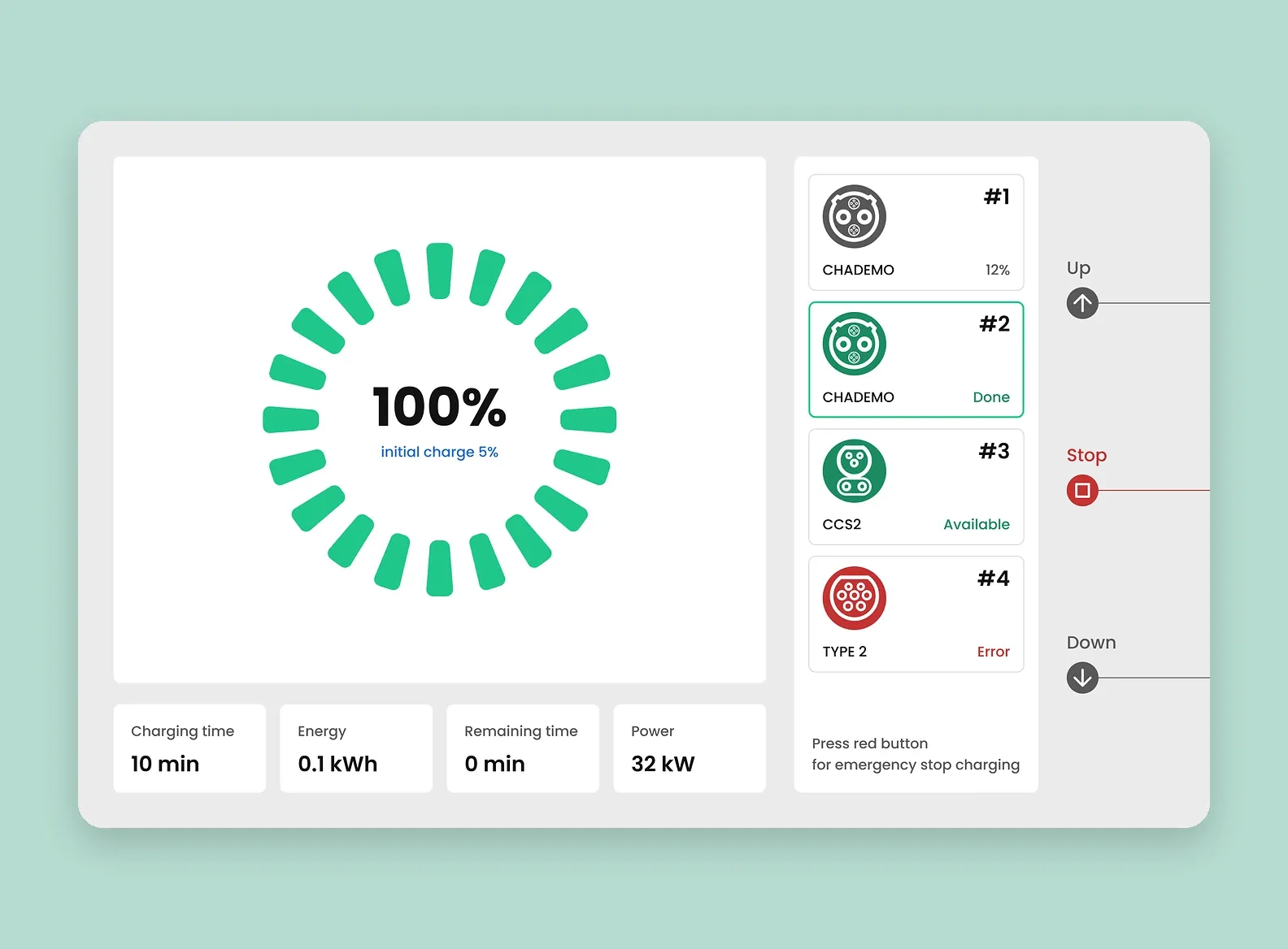
We also added indicators for different error states, so users know what to do next.
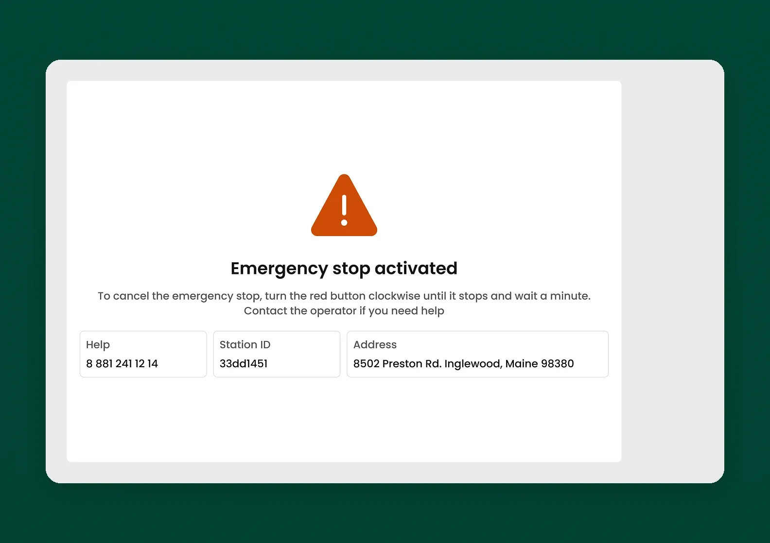
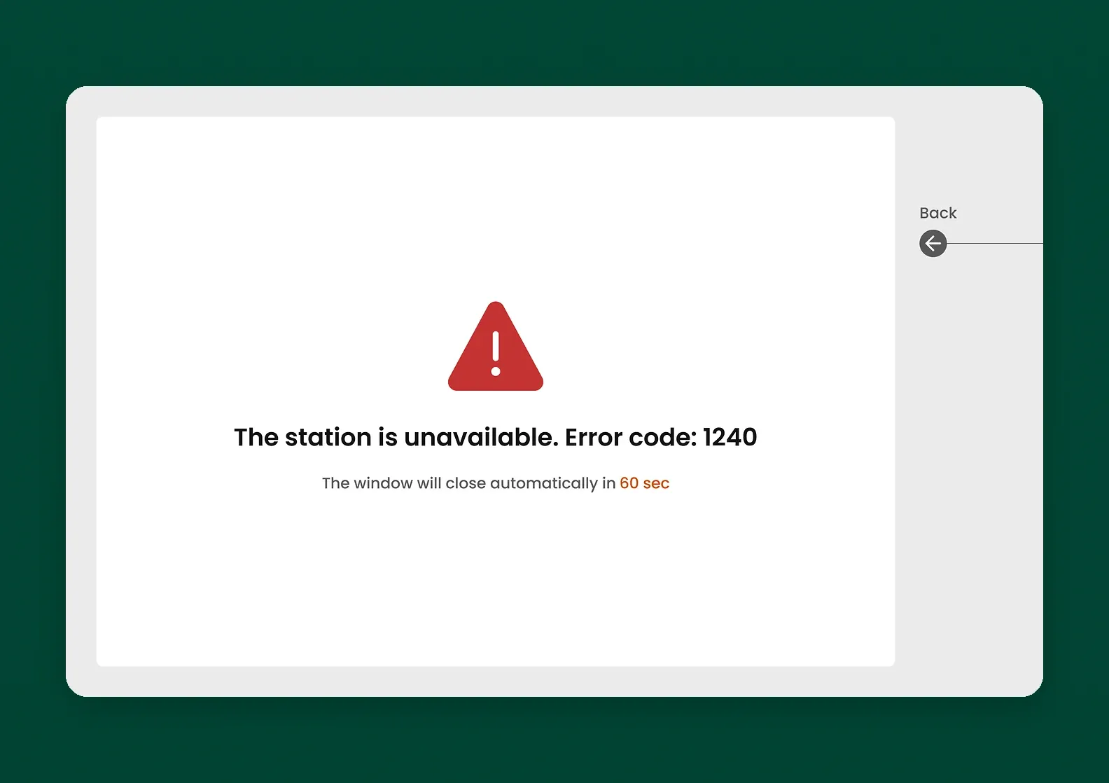
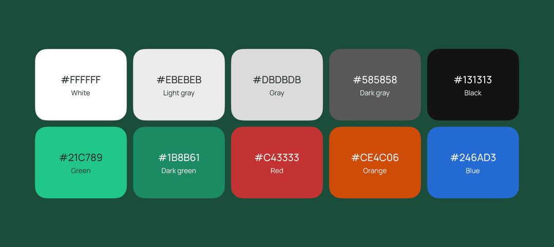
The high-contrast color palette accounts for ambient light and the protective glass over the screen. The interface uses monochrome colors with no effects or gradients: gray, white, and black as the base, which gives good contrast. For accents we picked brighter shades of green, red, orange, and blue.
The finished design went through testing with real users, and we refined it based on the feedback.
While building the frontend layer, we worked closely with the client’s team. That’s what let us integrate the updates into the existing system smoothly and account for the quirks of the hardware platform.
When we’re responsible for only one part of a project, we know the outcome depends on how well we set up communication with the client’s in-house team. We’ve worked in that format many times.
On the client’s side we worked with the backend developers, and we set up a process that let us resolve tasks quickly. By the way, we shared our tips on organizing in-house and outsourced work so that everyone wins.
The project took 4 months. The client was happy with the outcome: the Origin charging station interface meets the requirements of the company, the industry, and the users. Navigation is clear, and the design is clean and easy on the eyes. People are comfortable using this interface — which means they’ll come back.
The solution passed testing and went into production. Our team came away with experience designing UI/UX for physical devices that operate in demanding conditions.
➡️ Looking for an experienced team for your IoT project? At Purrweb, we know how to work with hardware and build software and design for it. If we need to learn something new, we will. We’ll dig into the details and figure out the specifics ourselves, and only ask you what’s absolutely necessary.
Get in touch — we’ll talk through your task, propose a solution, and estimate the timeline and budget.
Design expertise. We’ve been building digital products with great design for over 10 years. Our portfolio has 550+ projects across all kinds of fields: IoT, EdTech, marketplaces, dating apps, and plenty more.
We can work without detailed technical requirements. You don’t need to show up with a fully specced brief. A general request and some context are enough for us to figure out the task and propose a solution that fits your project exactly.
Modern technology. We work with a current tech stack so we can build even the most complex, advanced features. Our solutions are easy to scale, update, and maintain.


.svg)

%20(1).png)