Explore

Need help with your project?

Oops! Something went wrong while submitting the form.
One of the largest eyewear retail chains came to us. The company decided to move into a niche that was new for them and launch a marketplace selling glasses, frames, and other accessories.
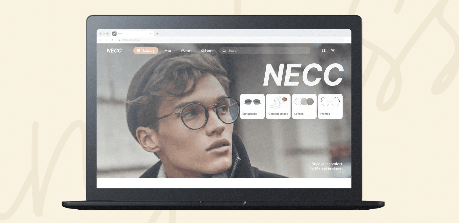
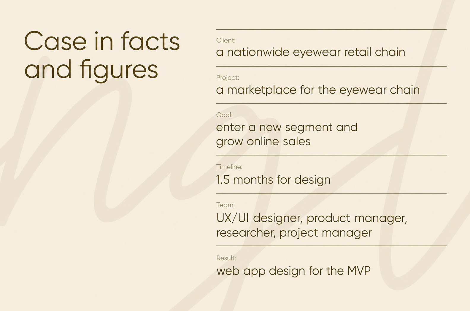
One of the largest eyewear retail chains came to us. The company decided to move into a niche that was new for them and launch a marketplace selling glasses, frames, and other accessories.
We helped the client go all the way from a product hypothesis to the final web app design. In this case study, we'll share how we researched the market, gathered user feedback, and built an interface that brings together business logic and a smooth experience for the shopper.
The nationwide eyewear chain wanted to launch a digital product to attract a new audience. The original concept was built around a mobile app — a marketplace for craft sunglasses. The client had studied the market on their own, but they also asked us to run research to validate the hypothesis and get a deeper understanding of their audience's pain points.
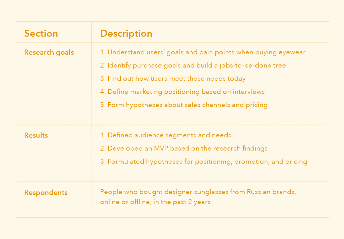
We covered how we ran the discovery phase and validated the project's hypotheses in a separate case study, so we won’t go into detail here. We’ll just note the key things the research revealed:
These insights shaped the product and became the starting point for the design. As we discussed the findings, the client refined their vision and decided to make the marketplace broader in scope — a place to buy not only ultra-fashionable sunglasses but also frames, prescription and contact lenses, and other useful products and accessories.
To avoid designing the interface blindly, we conducted a series of in-depth interviews with users from major cities and outlying regions. We showed respondents a clickable prototype and gathered their feedback.
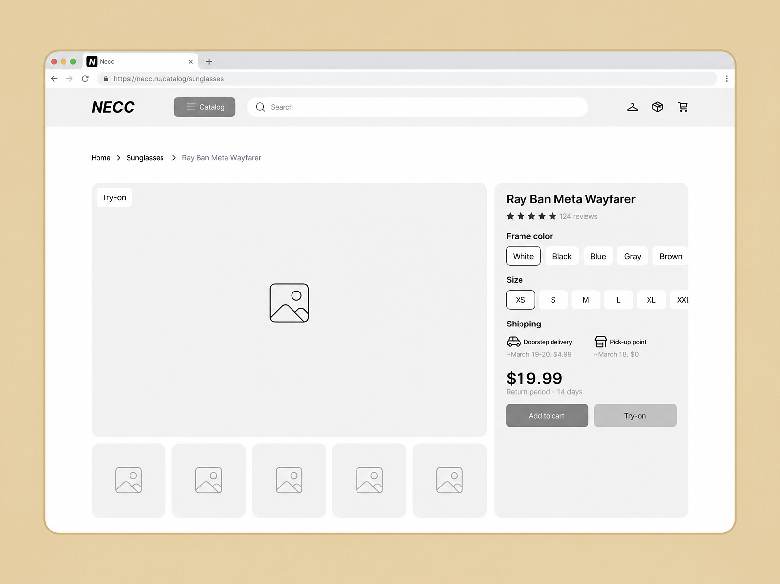
This let us collect valuable feedback at the earliest stage and pinpoint where the user flows fell short and how to improve them. For example, respondents:
Based on this user feedback, we created color mockups. This stage helped us craft a design that made buying as simple and clear as possible.
We put together the core screens — the homepage, catalog, product page, cart, and checkout. Once these were approved, we moved on to the design concept, adding color, typography, and graphics that set the mood for the future service.
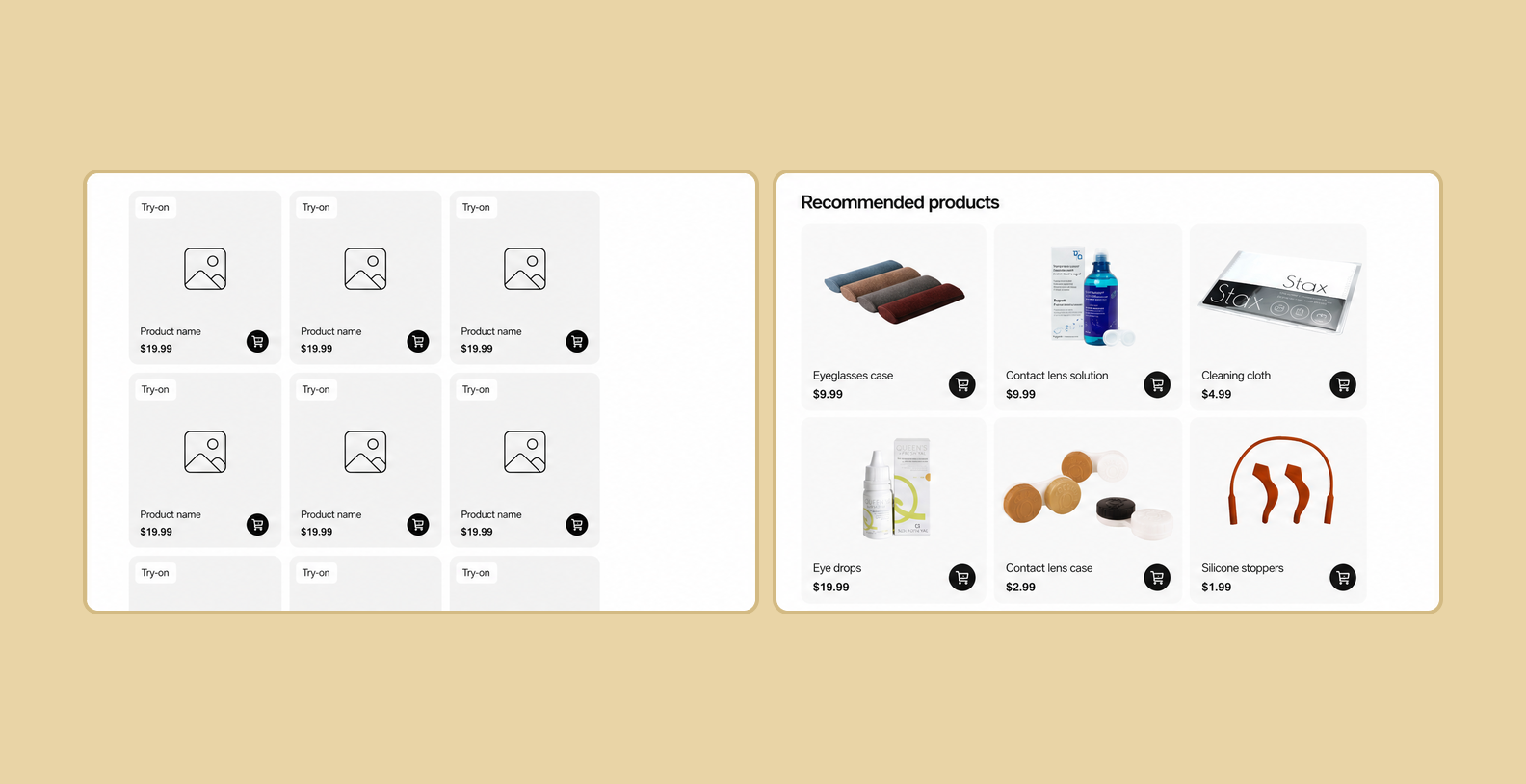
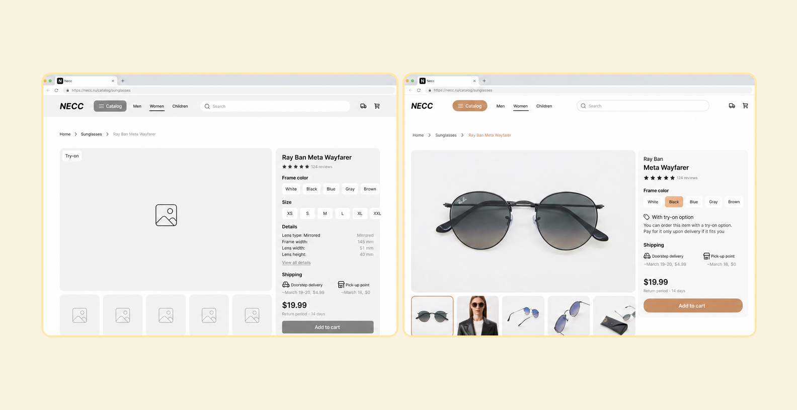
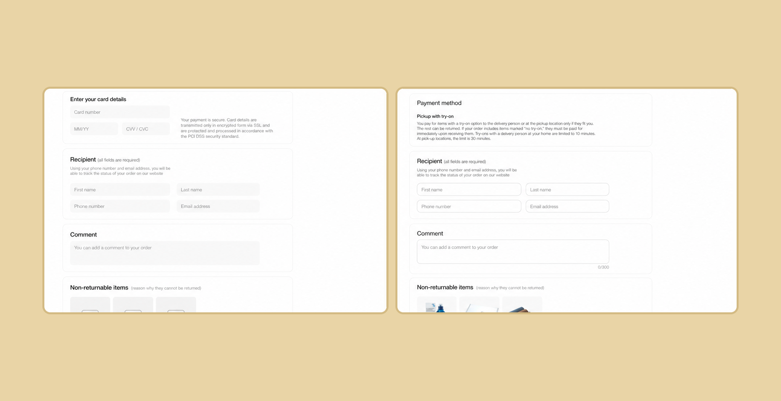
We deliberately left out visual details at this stage — just logic and flows, with nothing to distract.
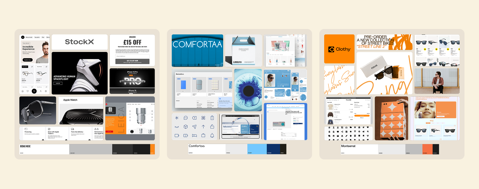
To find the visual style for the future service, we put together 5 different moodboards. Each captured its own mood — from a clinical aesthetic to a techno-futuristic look.
In the end, the team settled on a calm, minimalist palette in beige tones. It looked modern and stylish. On top of that, we borrowed graphics and a pattern from an alternative moodboard, which gave the visuals more energy.
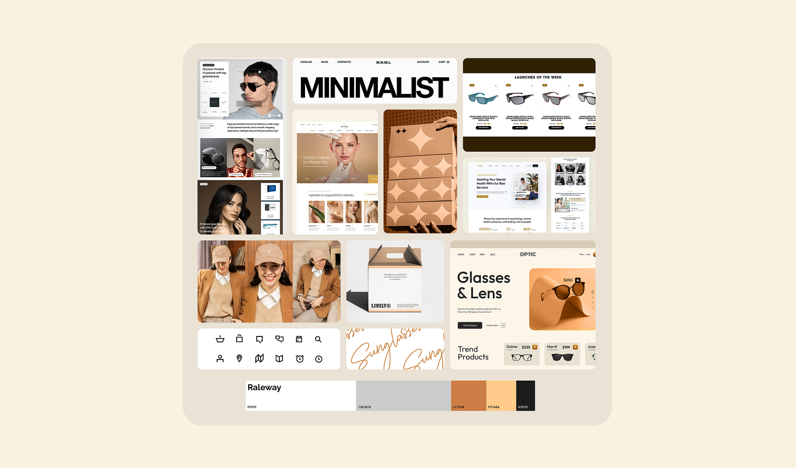
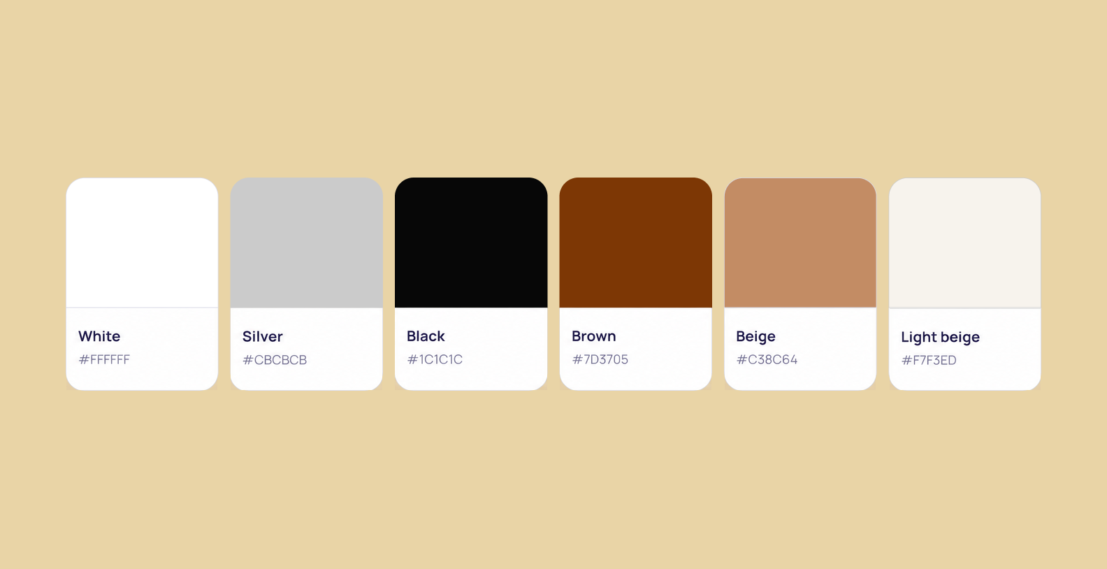
Working from the moodboard, we developed the palette, typography, and decorative elements.
A harmonious palette of beiges and browns conveys a sense of comfort and style. Deeper shades of brown highlight action buttons, while lighter, neutral tones serve as backgrounds, creating a feeling of cleanliness and care.
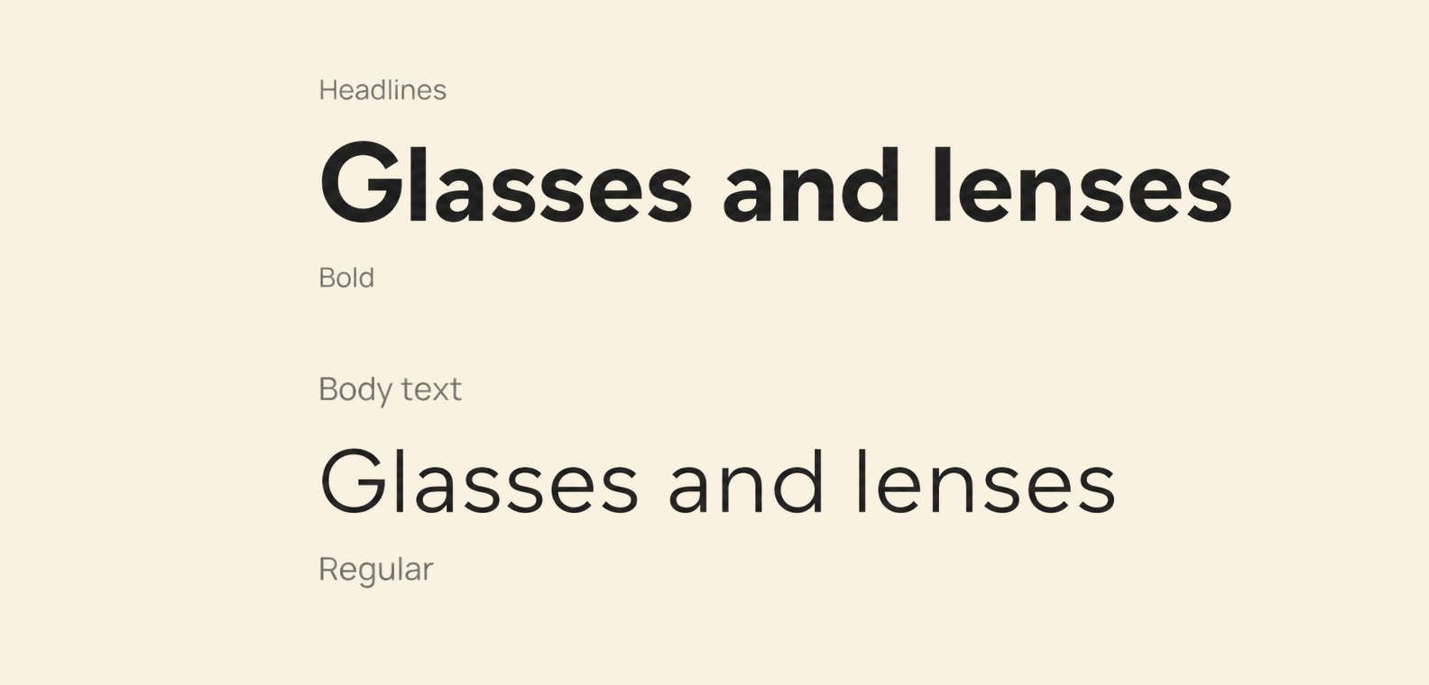
For typography, we paired Coolvetica with Raleway. Coolvetica is a clean, easy-to-read sans serif that also offers distinctive letterforms, so it works beautifully in standout headlines. Raleway is an elegant, well-balanced sans serif — versatile and a great fit for body text.
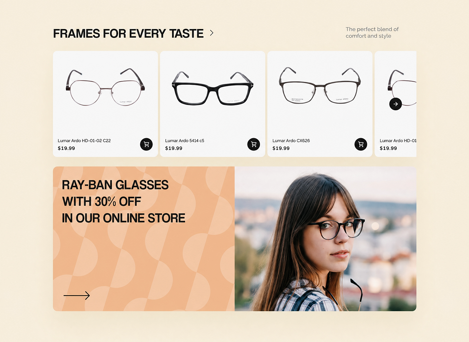
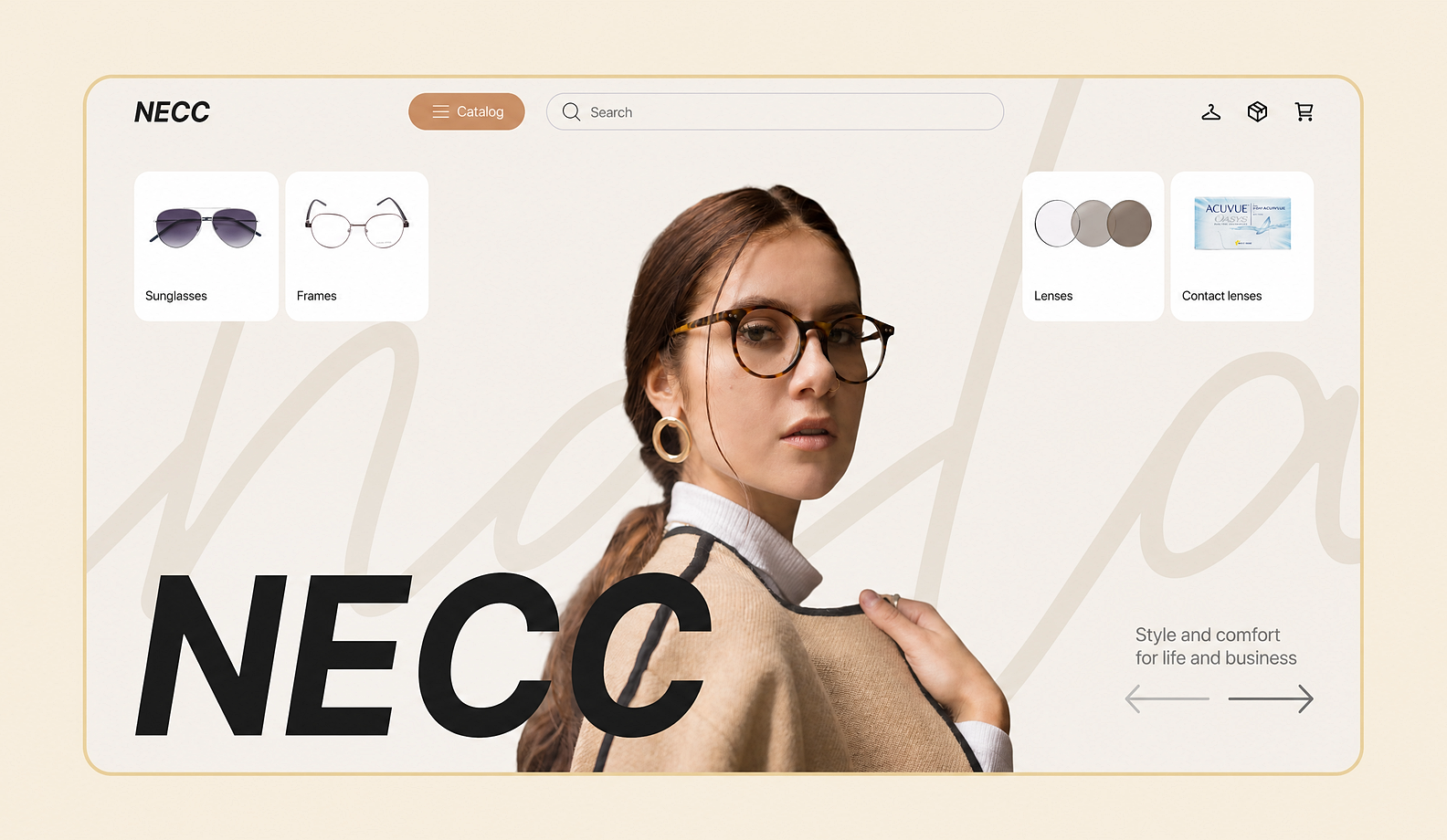
And here's how the web app's hero page looked in our design concept. The homepage immediately evokes comfort and cleanliness thanks to the light, airy design, a visual twist in the form of a signature pattern, and an unconventional composition.
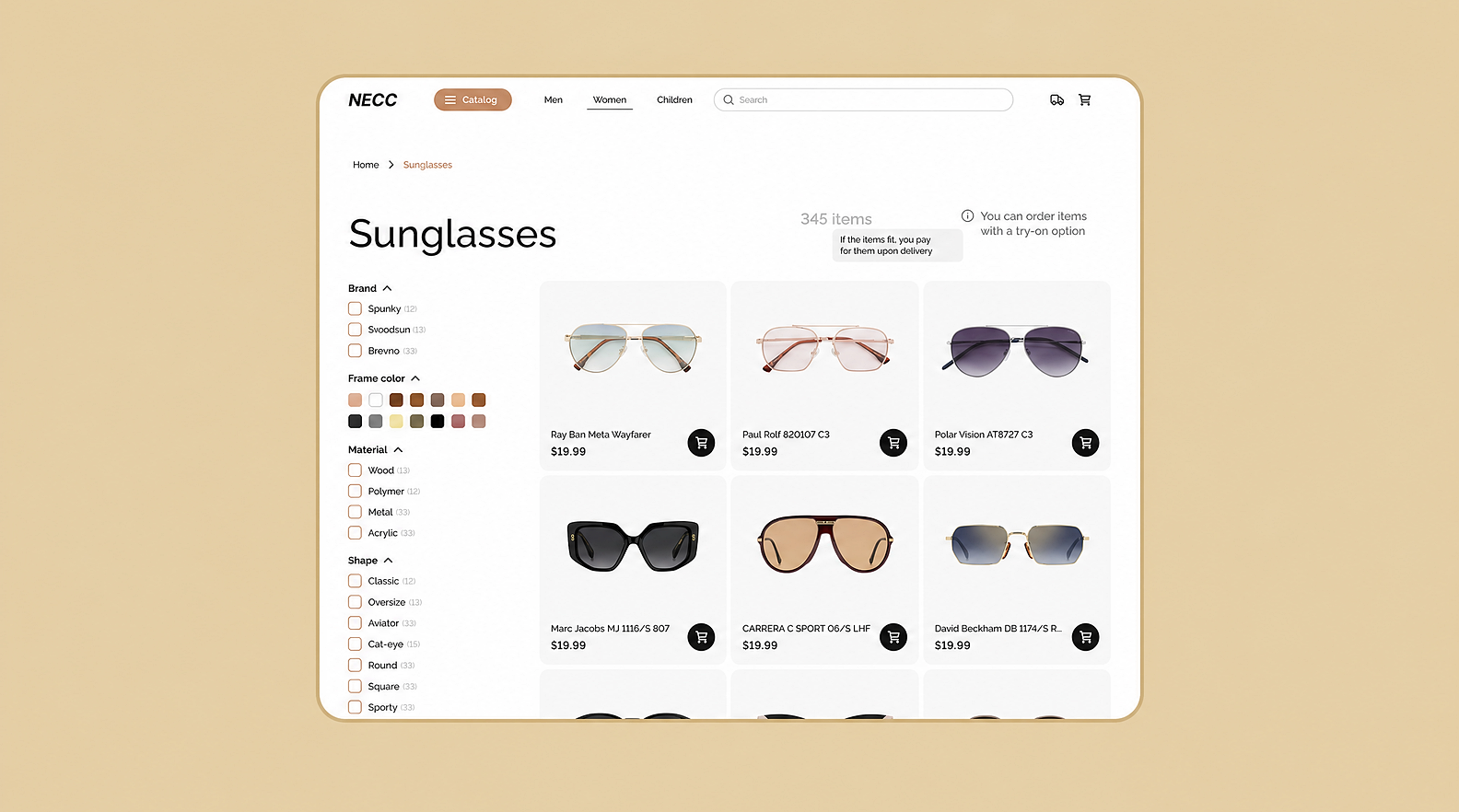
And here's the catalog page. Product cards with large images keep the focus on the products, while the Coolvetica display typeface, an unconventional category grid, and promotional banners reinforce the site's style and distinct character.
The result is a minimalist, modern interface where the user's full attention is on choosing products with ease.
Together with the client, we went all the way from research to a finished design. At every step, we tested ideas with users and refined the interfaces so they'd be easy to use and pleasant to return to.
As a result, the nationwide eyewear chain now has a web service with clear, intuitive logic:
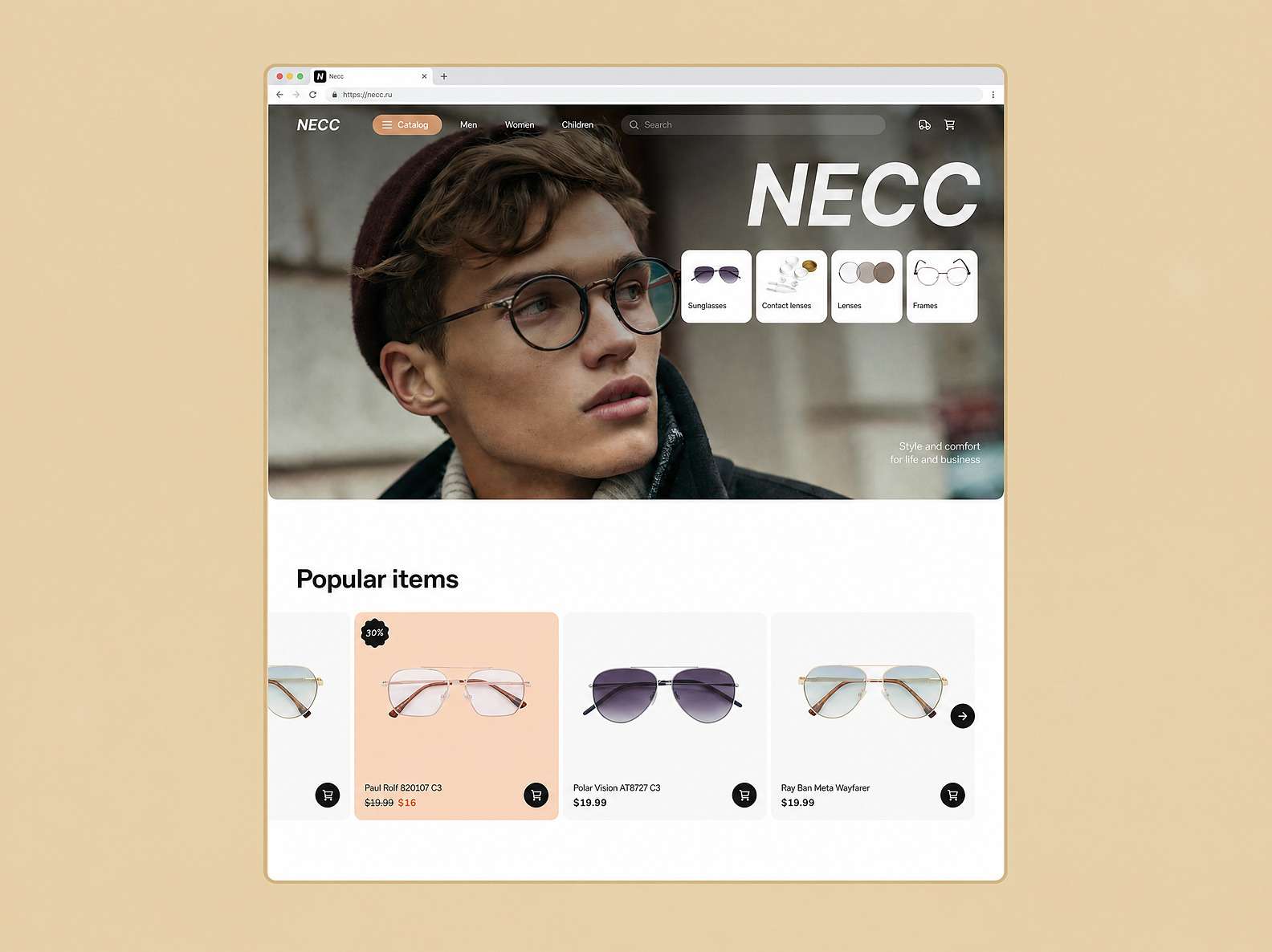
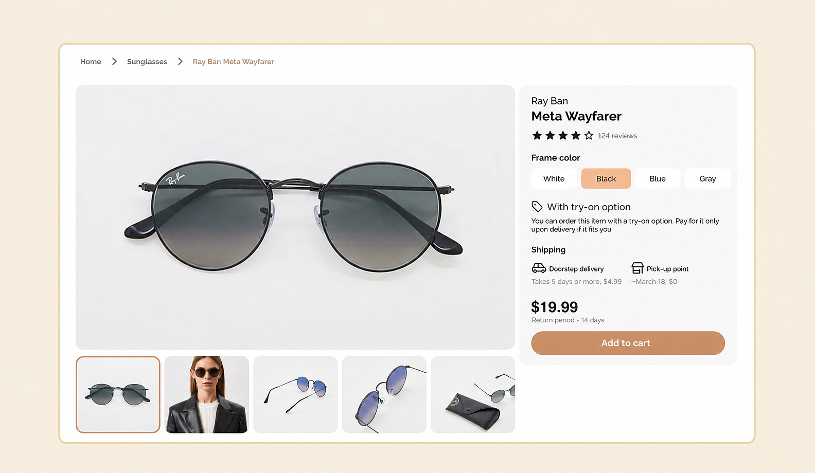
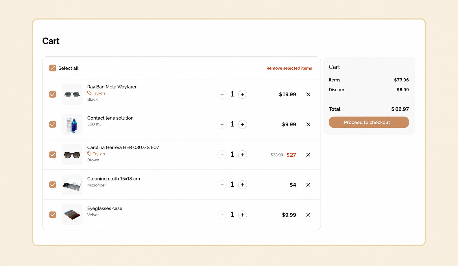
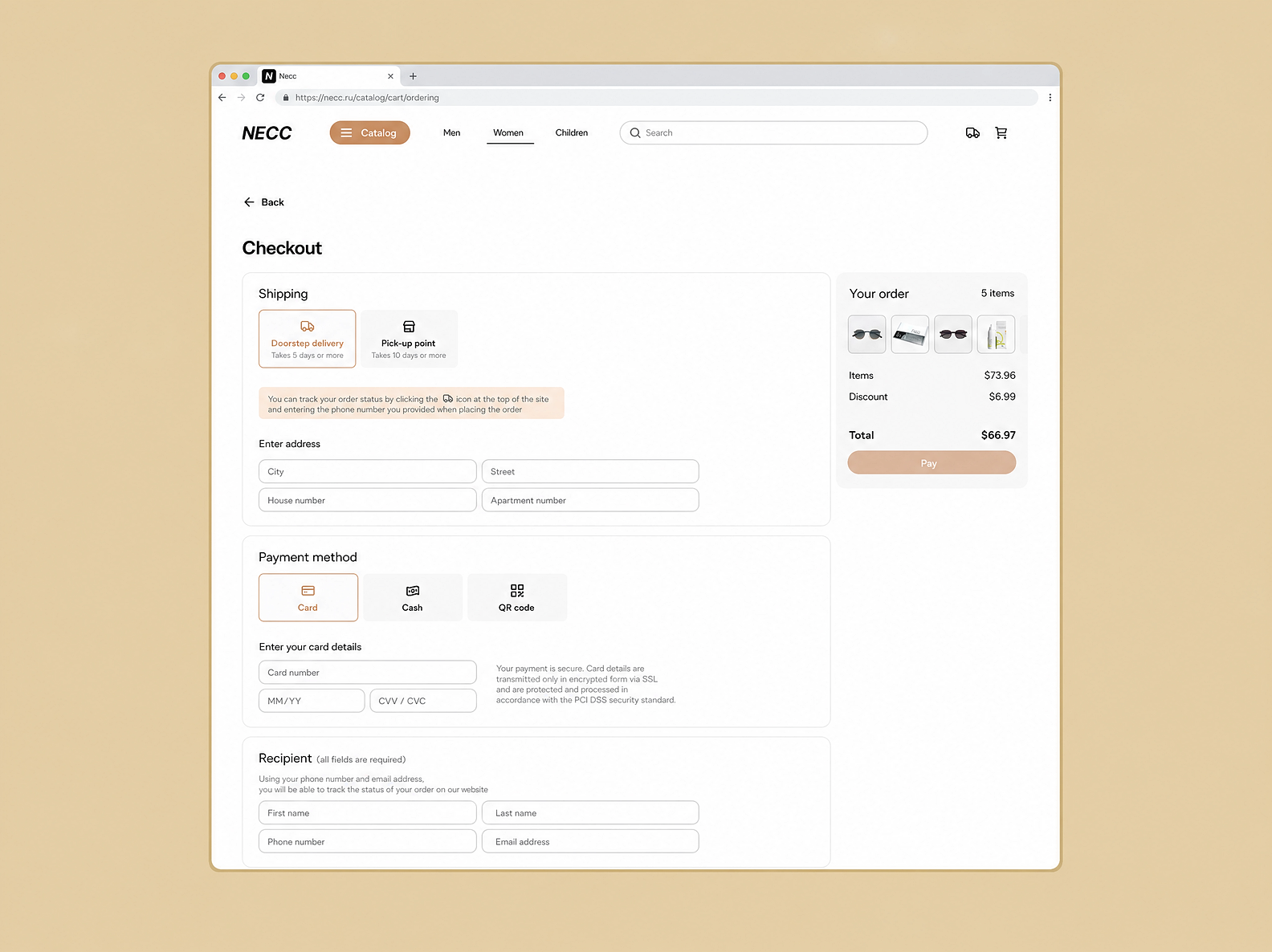
We made the design modern and flexible: it can scale, accommodate new flows, and serve as a foundation for growing the product.
Design expertise
Our portfolio includes more than 550 projects — from marketplaces and IoT to e-commerce and education platforms. We know how to tailor design to the task and the audience.
We work as one team
We integrate into the client's processes, collaborating with developers and marketers — no bureaucracy, and with full respect for your pace.
We turn ideas into products
You don't need a 10-page brief. An idea is enough — we'll help shape it, work out the details, and bring creative solutions to the table.
Tell us about your project, and we'll map out the timeline, budget, and plan of work.


.svg)

%2520(1)%2520(1)-1.avif&w=1200&q=75)