Explore

Need help with your project?

Oops! Something went wrong while submitting the form.
For years, a bank’s website was the brochure version of the branch — opening hours, product names, and a phone number on every page. Today it does the work that physical branches used to do. Account openings happen there, customer service starts there, and regulators audit it on the same homepage that visual designers obsess over.
That makes the redesign question a different one. It’s no longer about whether the new site looks fresh in the launch announcement. It’s about whether the homepage actually moves account opening rates, survives an accessibility audit, and loads under three seconds on a four-year-old Android.
%20(1)%20(1)%20(1)%20(1)%20(1)%20(1)%20(1)%20(1)%20(1)%20(1).png)
A great bank website is one that knows which kind of bank it is and designs accordingly.
Traditional banks lead with trust hierarchy. Their homepages put returning customers first — Chase has a sign-in form above the hero image because most visitors arrived to log in.
Neobanks, on the other hand, lead with conversion hierarchy. N26 puts a single “Open an N26 Standard account” CTA above everything else because most of their visitors arrive to evaluate the service, and the design treats every other action as noise.
Both calls are correct for their audience. Most of the time, what goes wrong is when banks start to mix these things — trust signals above the fold but also a hero image promoting a new app feature, three competing CTAs, and a microcopy block targeting investors. This becomes entirely too much and the site ends up feeling cluttered and speaking to no one.
Bank-website work is its own discipline, distinct from designing a banking mobile app, which strives for repeat use and transaction speed. The web side is built for first-touch conversion, comparison shopping, and regulatory disclosure. Purpose-built financial services UI/UX design treats it as a different problem from a generic product site.
The features below are the must-have surfaces a bank website is scan-graded against in the first 30 seconds. Skip one and the page reads as missing something before the visitor reaches the product copy.
The most-used action on a bank’s homepage is sign-in. Place the form or its CTA above the fold and within thumb-reach on mobile. Personalized dashboards behind the login — recent activity, balance alerts, suggested next actions — keep returning customers inside the site rather than bouncing straight to the app.
The second-most-used action is opening an account. It needs a single dedicated CTA that does not compete with the sign-in form. N26’s “Open an N26 Standard account” button works because nothing else above the fold tries for the same click. The same logic shows up in any financial product redesign where one ambiguous “Replenish” button has to split into discrete Buy, Withdraw, and Exchange flows.
⭐ Our experience.
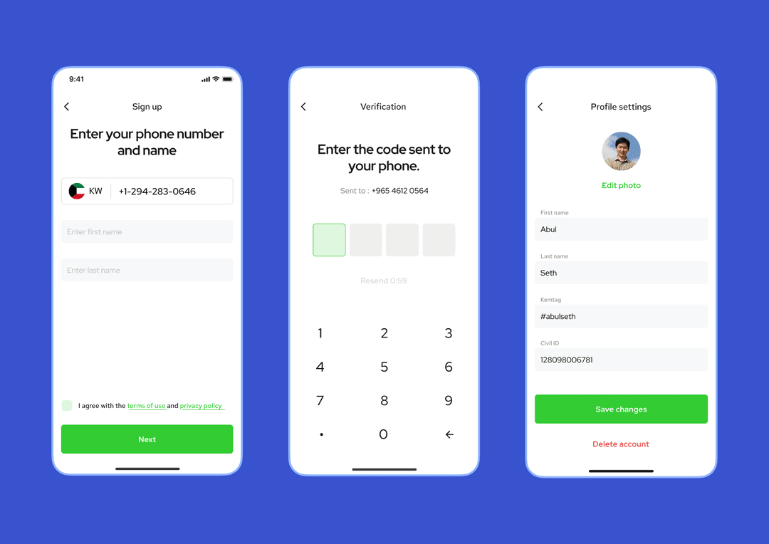
For KEM, a peer-to-peer payment app built for the Kuwaiti market, the account-opening flow was the only path into the product. We designed onboarding around a single PIN-based login, a credit-card linking step that took fewer than three taps, and a QR-based friend-add that turned the first session into an actual transfer.
The product reached 100,000+ users and secured $1M in seed funding from Kuwait Investment Fund and international investors. The same UX patterns now map into how we structure sign-up flows on banking websites.
Mortgage, savings, and loan calculators do double duty as lead-capture and product education. Wealthfront makes its projected-growth calculator the hero element of the homepage — visitors enter an amount and see projected returns before reading anything else. Chase uses progressive disclosure to link calculators from product pages rather than front-loading the full tool set.
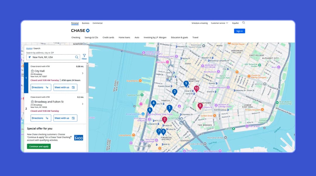
Branch and ATM locators belong in the global navigation or footer, not buried two clicks deep. An embedded map widget on the locator page, with click-to-call and click-to-directions on mobile, removes the most common reason customers call support before they ever visit a branch.
Live chat works as a capacity multiplier. A single agent handles four to six simultaneous chats while phone keeps that same agent on one call. Chat also stays open for after-hours triage when a chatbot routes routine questions and queues human handoffs for the morning. Both reduce the support spike that follows any homepage change.
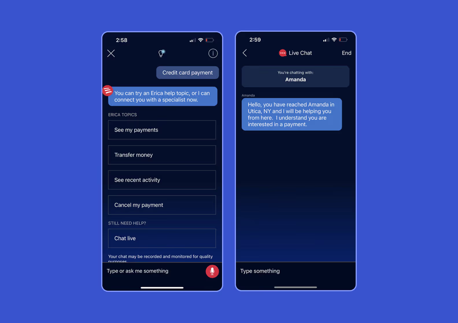
The features above are the visible furniture of a bank website. The design elements below are the invisible foundation that decides whether visitors actually convert and whether the site survives an accessibility audit. Get the foundation wrong and the visible interactive features stop performing. Here are the four foundations that matter most.
Trust signals belong right next to the action they support, not in the footer. Beside every login or account-opening button there should be a padlock icon (signalling that HTTPS encryption is on), a 2FA prompt (the second-step code most banks require to confirm it’s really the customer), and a regulatory anchor.
For US banks, the regulatory anchor is the “Member FDIC” badge — confirmation that deposits are federally insured up to $250,000. Chase repeats it across product sections, not just in the footer. European equivalents work the same way: N26 displays “German BaFin digital banking license” and “€100,000 deposit protection” inline, so visitors see the regulator and the protection amount in one glance.
Banks have to make their websites usable for people with disabilities — Title III of the ADA covers bank websites the same way it covers physical branches. In practice that means screen readers can read every page out loud, keyboard navigation works without a mouse, and color contrast is high enough that low-vision visitors can still see CTAs.
Most US accessibility lawsuits cite WCAG 2.1 Level AA as the bar. A newer version, WCAG 2.2, added six more criteria in October 2023 and is what forward-looking banks aim for now. The audience is real — around 16% of the world has a significant disability, or 1.3 billion people.
Most fixes are cheap once they’re in the design system: a “skip to main content” link for keyboard users, sufficient contrast on every CTA button, form labels that screen readers can announce, and visible focus rings that show where the keyboard tab landed.
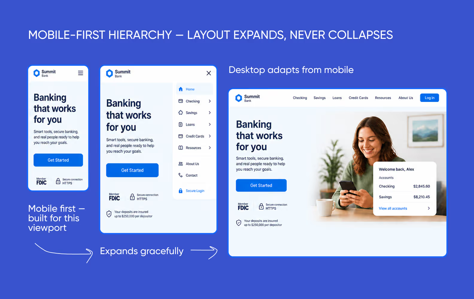
Mobile drives over 63% of global web requests, and nearly half of US banking households now do most of their banking on a phone. That makes the design order matter: build the mobile layout first, then expand it for tablet and desktop — not the other way around.
When you start from mobile, the navigation, the hero CTA, and the trust signals get the smallest screen first and only get more breathing room on bigger ones. When you start from desktop, those same elements often collapse awkwardly the moment they’re squeezed down to a phone.
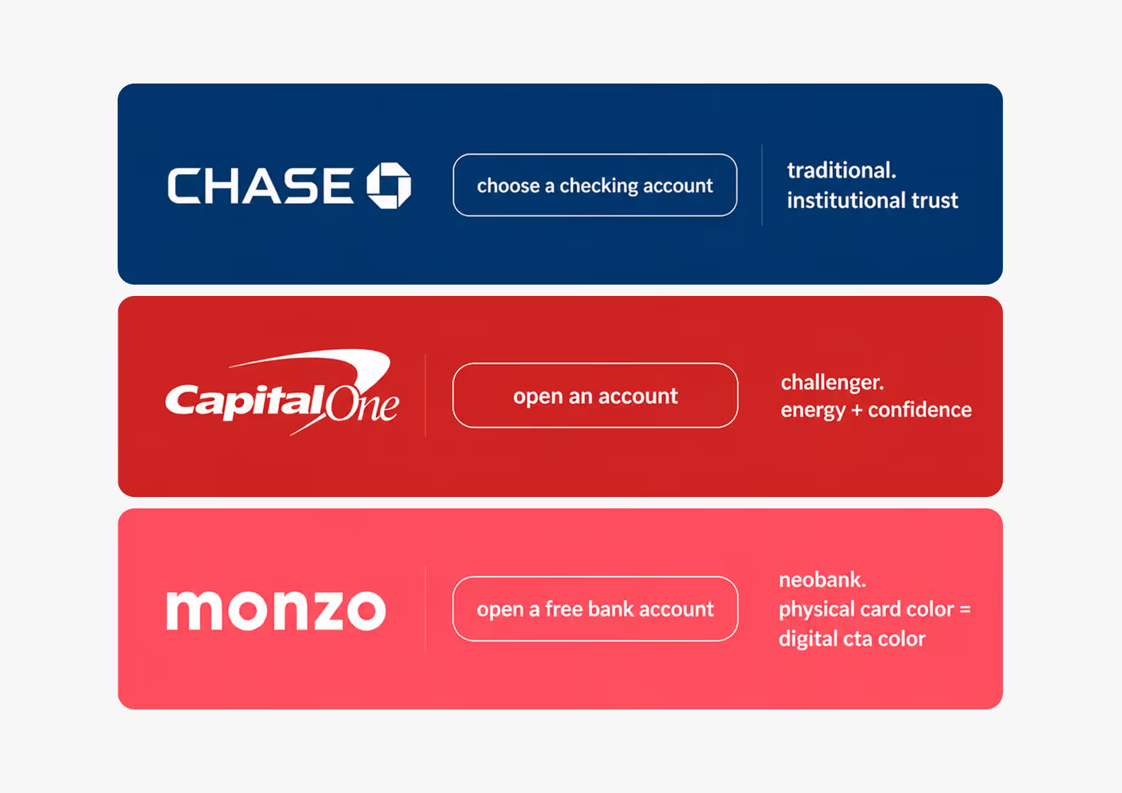
Brand-identity decisions cluster into three families.
Small movement matters at this layer too. A button that scales slightly on hover, or a number that animates in when a calculator finishes, tells the visitor the site is responsive — not a static brochure.
⭐ Our experience
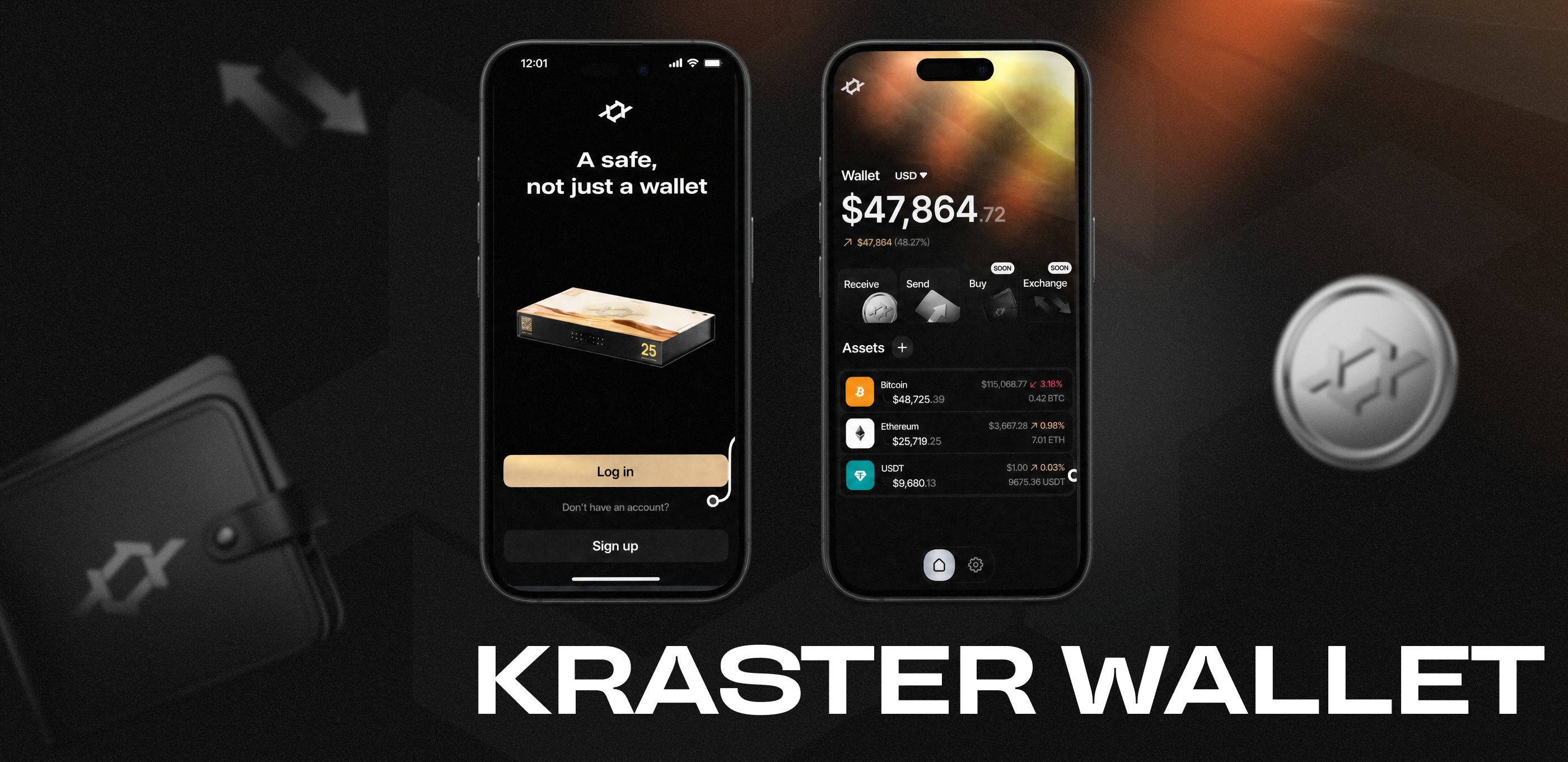
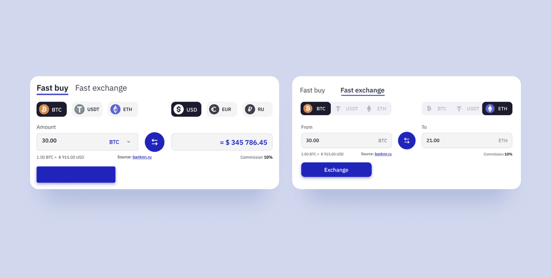
For Pay-pay, a crypto e-wallet we redesigned across desktop, tablet, and mobile, the brand-identity and CTA-architecture decisions were tightly linked. We split three competing CTAs into a clean Buy / Withdraw / Exchange triad with a real-time conversion widget.
The redesign pulled the landing page out of crypto-noise territory and into something that read as a working financial product. The same “one accent color, one primary action per surface” logic transfers directly into bank-website hero design.
If the previous block is the foundation, this one is the operating manual. The four practices below are how to design a bank website so visitors find what they came for, the brand stays consistent, and Google ranks the right pages for the right queries. Here is the short version.
The top navigation is the first decision a visitor makes before they read a single word. Two choices carry most of the work:
Breadcrumbs on deep product pages let visitors backtrack without losing context — useful when account-opening flows span multiple screens.
Customer experience on a bank website starts with naming pages and CTAs by the decision the visitor is making — “Open an account”, “Refinance my mortgage”, “Send a wire transfer” — not by the internal department that owns the product. The visitor does not think in org-chart terms. They think in actions.
The same logic applies to error messages, confirmation screens, and help articles: name what the customer is trying to do, not the system they happen to be using.
Each product, service, and promotion gets its own dedicated page rather than a stack on the homepage. Bank of America’s “Better Money Habits” is the canonical example — instead of cramming financial-education content into the homepage, it gets its own hub with topic pages, then individual articles inside each topic.
Separate pages help two things at once. Visitors find what they want faster. And Google can rank each page for its own keyword cluster instead of forcing the homepage to compete for everything.
⭐ Our experience
For Fintarget, an investment platform we designed for BCS Broker, the entire architecture rested on giving every investment strategy its own page. Each page used the same template:
This way, visitors could compare strategies without changing mental gears between them. A separate strategy-author dashboard lets financial experts publish updates without touching engineering.
The pattern transfers to financial institutions websites cleanly: one page per checking account, one page per mortgage product, one page per credit card, with the same template structure across all of them.
.png&w=640&q=75)
Once the page is built, four things decide how it performs:
Here is the one-page recap of what every bank website needs before launch, and what each item actually buys you:
|
Element |
Why it matters |
|---|---|
|
Clear navigation menu (≤7 top-level items) |
Aligns with cognitive-load research — fewer options mean faster evaluation |
|
Hero section with primary CTA above the fold |
Drives account-opening conversions (N26 single-CTA pattern) |
|
HTTPS plus visible SSL indicator |
Trust signal for first-time visitors evaluating safety |
|
WCAG 2.1 AA compliance (WCAG 2.2 forward-looking) |
ADA Title III baseline. 16% of the world’s population (1.3 billion people) has a significant disability per WHO 2023 |
|
Mobile-responsive design |
Mobile devices drive over 63% of global web requests (DataReportal 2024). Nearly half of US banking households use mobile as primary channel (FDIC 2023) |
|
Page load LCP ≤2.5 seconds |
Core Web Vitals “Good” threshold. E-commerce conversion drops from 3.05% at one-second load to 1.12% at three-second load (Portent 2022) |
|
Two-factor authentication on login |
FFIEC regulatory requirement for US online banking that doubles as a visible trust signal |
|
Live chat or chatbot |
Agents handle four to six simultaneous chat sessions versus one phone call — capacity multiplier |
|
Branch and ATM locator map |
Reduces support inquiries for physical-access questions |
|
Financial calculators (loan, mortgage, projected returns) |
Lead capture into the account-opening flow (Wealthfront hero-as-calculator) |
|
Separate product pages (one page per product) |
Better search engine optimization and per-product conversion focus |
|
Visible privacy policy and FDIC disclosure |
FDIC sign-rule requirement and trust anchor above the fold |
Most bank website projects fail or stretch in predictable places. The four stages below are how a working studio sequences the work — research, content, UI, then development — and what each one actually produces. Here is what to expect at every gate and where the typical timeline ends up.
This is where stakeholder interviews happen, competitive audits land on the wall, and the compliance picture gets surfaced before any wireframe gets drawn. That picture covers FDIC deposit-insurance scope, GLBA privacy rules (the federal law that limits how customer financial data appears in product copy), and ADA accessibility requirements.
A typical bank research stage runs two to three weeks. The output is a one-page audit summary and a prioritized list of constraints — regulatory, technical, brand — the banking web design team has to respect through the rest of the project.
Content planning turns the audit into a site map (one page per product, one page per service, one page per audience cohort) and an information-architecture document — the diagram that decides how pages link to each other and what stays one click away from the homepage.
The site map is the most valuable deliverable of the whole project. If it is wrong, every later stage paves over the mistake instead of fixing it. Typical timeline: one to two weeks.
UI design moves from wireframes (low-fidelity greyscale layouts that test page structure without distraction) to hi-fi mockups (the final visual designs with brand color, type, and imagery applied) and ends with a responsive web design system — a reusable library of buttons, forms, headers, and spacing rules every page is built from.
Wireframes catch structural mistakes before they cost hi-fi rework. The design system saves time on every page that comes after the redesign launch. Typical timeline: four to eight weeks for a mid-size bank.
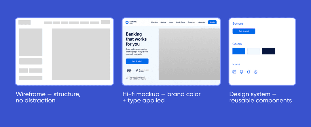
Development translates the design into a working website. The build covers the front end (the part visitors see), CMS integration so non-engineers can update content without filing a ticket, accessibility QA against WCAG 2.1 AA, load testing for the homepage and product pages, and a security review running in parallel with the front-end work. Financial software development covers the backend security and compliance work that runs alongside.
Typical timeline: six to twelve weeks before launch.
A well designed bank website does three things on the same homepage. It anchors trust for visitors who arrived to log in. It moves new visitors toward an account-opening CTA. And it stays accessible, compliant, and fast enough that an audit or a four-year-old Android does not break it.
Most redesign projects that fail miss one of the three. Most that work land all three on the same page because the research stage caught what would otherwise have been a missed corner.
➡️ If you are scoping a redesign and want a second pair of eyes on the homepage and product pages, we can give you a free 48-hour project estimate from our online banking services design team.
The four-stage process: research and audit, content planning, UI design, and then website development and launch. A mid-size bank redesign typically runs twelve to twenty weeks end-to-end, with research taking two to three weeks at the start.
Six must-haves: easy access to online banking, online account opening with a clear CTA, financial calculators, ATM and branch maps, live chat, and light social integration in the footer. Each one is scan-graded by visitors in their first 30 seconds.
Three jobs landed at once: trust anchor for returning customers, conversion engine for new account openings, and compliance surface for regulators. Brand, photography, and microcopy are subordinate to those three. Failing one of them breaks the site.
A small bank or credit union redesign typically runs $6,000 to $15,000. Mid-tier and custom projects land between $50,000 and $500,000+ depending on page count, compliance scope, and CMS work. For a precise number, our financial services design team can give you a free estimate in 48 hours.
Traditional banks lead with trust hierarchy — sign-in form above the hero, returning customers prioritized (Chase pattern). Neobanks lead with conversion hierarchy — a single account-opening CTA above everything else with zero competing actions (N26 pattern). Both work for their audience.
Trust signals belong next to the actions they support, not in the footer. The HTTPS padlock, “Member FDIC” badge, 2FA prompts, and regulatory licenses (BaFin, FCA) sit beside the login or account-opening button so visitors see the regulator and protection amount in one glance.
Traditional banks dominate blue for institutional trust (Chase navy, Citi blue) and red for energy (Capital One, Wells Fargo). Neobanks use challenger colors: Monzo Hot Coral, Revolut purple-cyan gradient, and N26 black plus tier-specific accents (silver, pink, and teal).
Every three to five years for a full redesign, with iterative updates every six to twelve months. Triggers for an early redesign: a new WCAG version, mobile web traffic crossing a critical threshold, or measurable conversion decline on the homepage.


.svg)