Explore

Need help with your project?

Oops! Something went wrong while submitting the form.
A banking app is no longer just a nice-to-have, it’s a must-have. For many, it replaces in-person visits, ATMs, and even desktop banking. In this article, we’re going to break down the core principles of banking app design, check out some of the best practices, and even try to look into the future of fintech UX.

A banking app handles decisions people cannot afford to misunderstand. A clean screen is not enough when the interface also has to explain identity checks, payment status, and recovery after an error.
In this guide, we’ll look at the UX patterns that make regulated financial tasks feel predictable without hiding security requirements. The focus is on how product teams evaluate trust, usability, and recovery across core banking flows.
Banking apps operate in a domain where UX mistakes have real consequences. A confusing transaction flow doesn't just frustrate users — it can lead to financial errors. A poorly designed consent screen can create compliance risk. These constraints don't restrict creativity — they shape it.
Here are the four domains that distinguish financial UX from general consumer app design:
Security in banking apps isn't a checklist item — it's a user expectation. When users open a banking app, they bring with them anxiety about fraud, unauthorized access, and data leakage. Good security UX reassures them without creating friction.
The most impactful security design patterns are:
Biometric authentication : Face ID and fingerprint login reduce routine login friction. The UX challenge is making fallback states, such as a failed scan or unavailable sensor, feel safe rather than alarming.
Banking products often need identity verification, consent flows, data disclosures, and accessible controls. These requirements shape the minimum information architecture before visual design starts.
The UX challenge is to design these screens in a way that feels intentional rather than bureaucratic. Clear headings, plain-language copy, and logical sequencing can turn a compliance requirement into a trust-building moment.
In consumer apps, an error state is an inconvenience. In a banking app, it's a potential anxiety trigger. A failed payment, declined transaction, or verification error creates real stress — and the design needs to absorb that.
Good error UX in banking apps follows three principles:
Banking apps serve users across a wide age range, including people with lower digital literacy or accessibility needs. WCAG 2.1 Level AA provides a practical baseline for inclusive interfaces and a shared test standard for design and development teams.
Key accessibility requirements for banking app design:
Banking interfaces rely on familiar components because users need predictable behavior when they check balances, verify identity, or move money. The design work lies in showing status and recovery without crowding the primary task. Each component therefore needs a clear default state and an equally clear response when the normal flow breaks.
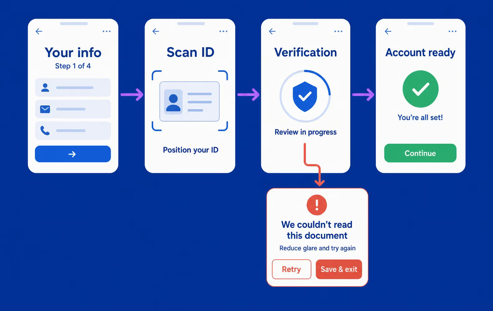
Identity verification comes before most core actions, so onboarding needs to explain why each request is necessary and what happens after submission.
Four decisions keep the process understandable:
The dashboard prioritizes current balance, recent activity, pending items, and the primary money actions. Secondary tools stay deeper in the interface. Simple products can emphasize one account. Multi-account products need a consolidated view with timestamps and status labels that show whether each value is current.
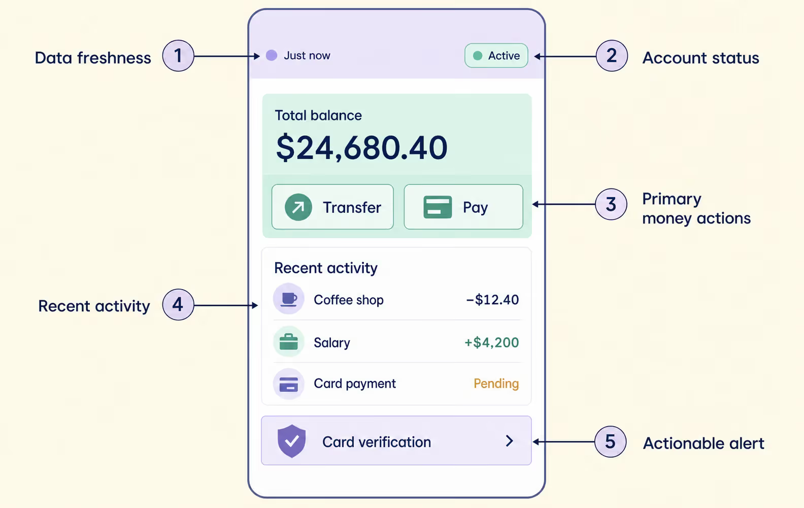
Transaction history works as a financial record, not a decorative feed. Users need readable merchant labels, search and filters, and a visible difference between pending, completed, reversed, and disputed operations. Detail views can expose the payment method, reference number, and dispute path without crowding the main list.
Payment flows preserve speed while keeping irreversible details visible. The review state confirms the recipient, amount, fee, and resulting balance before submission. If a limit, balance, or verification problem interrupts the flow, the interface keeps entered data and points to the specific correction.
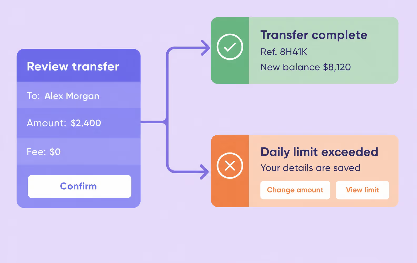
Banking alerts carry different levels of urgency. Security events, transaction updates, and informational messages need distinct visual treatment. Preference controls can reduce noncritical noise without hiding account warnings, while every alert links to the relevant transaction or recovery action.
Each component earns trust when the interface accounts for the state that interrupts the normal flow. This matrix connects the primary UX goal with the failure state users need to understand and the recovery action that keeps the task moving.
| Component | UX goal | Critical state to show | Recovery pattern |
| Onboarding and KYC | Explain why each data point is needed and show progress | Document rejected, verification pending, session expired | Plain-language reason + retry or save-and-return action |
| Dashboard | Make account balance and primary actions scannable | Delayed balance, unavailable account, hidden funds | Timestamp or status label + refresh or support path |
| Transaction history | Help users identify and verify money movement | Pending, reversed, duplicated, disputed transaction | Status explanation + dispute or contact action |
| Money transfer | Keep recipient, amount, fee, and confirmation unambiguous | Insufficient funds, wrong recipient, limit exceeded | Preserve entered data + specific corrective CTA |
| Alerts | Communicate risk and account activity without noise | Suspicious login, failed transfer, card freeze | Severity hierarchy + direct next step |
Wondering how much it costs to develop your mobile banking app?
After 550+ completed projects, we can design an app in any niche. Contact us and get a free project estimation in 48 hours.
Get estimate
Banking interfaces work better when they reflect a specific user type rather than a generic “banking user.”
Retail, business, and investment users make different decisions and need different levels of control.
Retail users want speed and clarity. They check balances frequently, make payments from known recipients, and expect the app to handle common tasks without requiring thought. Design priorities: fast dashboard load, minimal-step payment flow, proactive alerts for unusual activity.
Business users deal with higher transaction volumes, multi-user access controls, and more complex approval workflows. Design priorities: multi-account views, bulk payment batch management, role-based access UI, and integration with invoicing or accounting tools.
Investment users expect more data on the screen, including portfolio performance, asset breakdowns, and transaction tax lots. The interface still needs a clear hierarchy. Drill-down views keep detailed information available without turning the dashboard into a wall of numbers.
The three user types share the same need for clear status feedback, but their dashboards support different decisions. The matrix keeps those priorities visible without forcing every product into one generic banking experience.
| User type | Dashboard priority | Controls that matter most |
| Retail | Balance, recent activity, transfer, and payment | Transaction status, card controls, and security alerts |
| Business | Multi-account position, approvals, and batch payments | Roles, limits, approval queue, and audit trail |
| Investment | Portfolio performance, asset breakdown, and market movement | Data timestamp, order status, risk details, and drill-down |
The hardest banking app UX problems appear when security, product complexity, and operational exceptions reach the interface without explanation. Effective designs do not remove these constraints. They show why a step exists, protect the user’s context, and state what happened when a transfer, login, or verification flow cannot continue.
These UX challenges rarely belong to one screen. Dashboard overload affects navigation, unclear terminology slows decisions, and weak error states leave users unsure whether their money moved. A user-centric response begins with the moment of uncertainty and gives it a visible next step.
| UX challenge | Why it happens | Interface response |
| Security adds friction | Extra verification appears without context | Explain the trigger, show progress, and provide a fallback path |
| Dashboard overload | Product teams expose every feature on the home screen | Keep balance, recent activity, and primary actions visible, then move secondary tools deeper |
| Financial language is unclear | Internal banking terminology reaches users | Replace jargon with task-based labels and explain unavoidable legal terms inline |
| Error states break trust | Generic codes do not tell the user whether money moved | State what happened, confirm whether funds are safe, and offer a specific recovery action |
| Notifications become noise | Every event receives the same urgency | Separate security, transactional, and informational alerts, then let users control noncritical categories |
| Localization stops at translation | Currency, dates, reading direction, and disclosure patterns differ | Design locale-specific layouts and prototype complete workflows before handoff |
Trust-building banking experiences depend on product behavior as well as interface design. A screen cannot explain a transaction state the system does not expose. This is where banking software development and UX meet. Backend events define the available states. Interface copy and controls make those states understandable.
New banking patterns matter only when they help users understand or control a financial task. Current digital banking trends center on connected accounts, relevant guidance, and context-aware service. More experimental interfaces still need evidence that they improve a core flow.
Open banking lets users connect accounts through application programming interfaces (APIs). The UX work sits in consent and control. The interface names the shared data and provider, shows the access period, and gives users a clear way to revoke permission.
AI in banking can turn account activity into spending insights, unusual-activity prompts, or relevant next actions. These elements work best as contextual cards rather than permanent dashboard modules. The interface also needs to separate a calculated suggestion from a confirmed account fact.
Location can make branch, ATM, travel, and merchant-related support more relevant. The app still needs explicit permission and a useful fallback when access is denied. A nearby result is helpful only when opening hours, availability, and distance are current.
Chat and voice interfaces can shorten simple support and search tasks. Payments, account changes, and other sensitive actions still need a review screen, explicit confirmation, and a record that users can inspect later.
Augmented reality and spatial interfaces remain experiments in banking rather than standard product patterns. ATM navigation is a plausible narrow use case, but it should not displace a reliable map. Programmable payments are more practical today. Clear rule builders help users schedule transfers or savings without exposing the underlying blockchain or automation logic.
A useful review follows complete tasks rather than judging isolated screens. These eight checks show whether the interface explains regulated steps and the status of money movement. They also test whether users get a recovery path when the expected flow breaks.
The checklist works as a prototype review before usability testing or handoff. It also gives product and design teams a shared definition of a complete state, not only a finished screen.
Let’s start the banking app development process today!
We look forward to hearing from you. Contact us for a free project estimate within 48 hours.
Start project
Across our fintech projects, the recurring design problem is carrying critical decisions from research into interface states and developer handoff. These cases show what to inspect when evaluating a fintech design agency. They also show how our UI/UX design services respond when a financial product has a specific constraint.
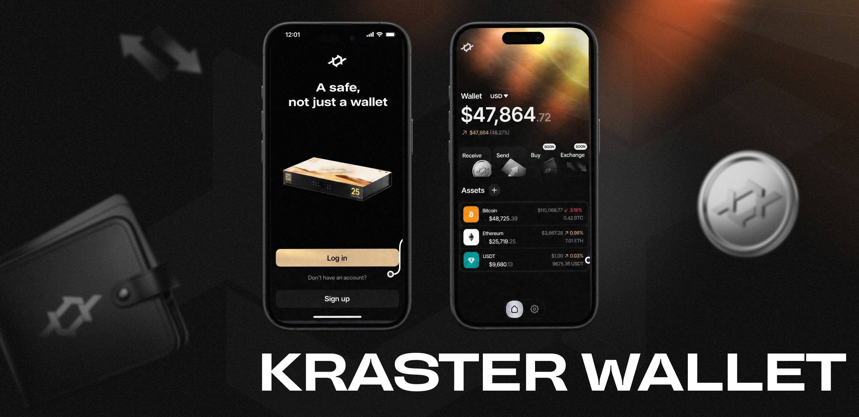
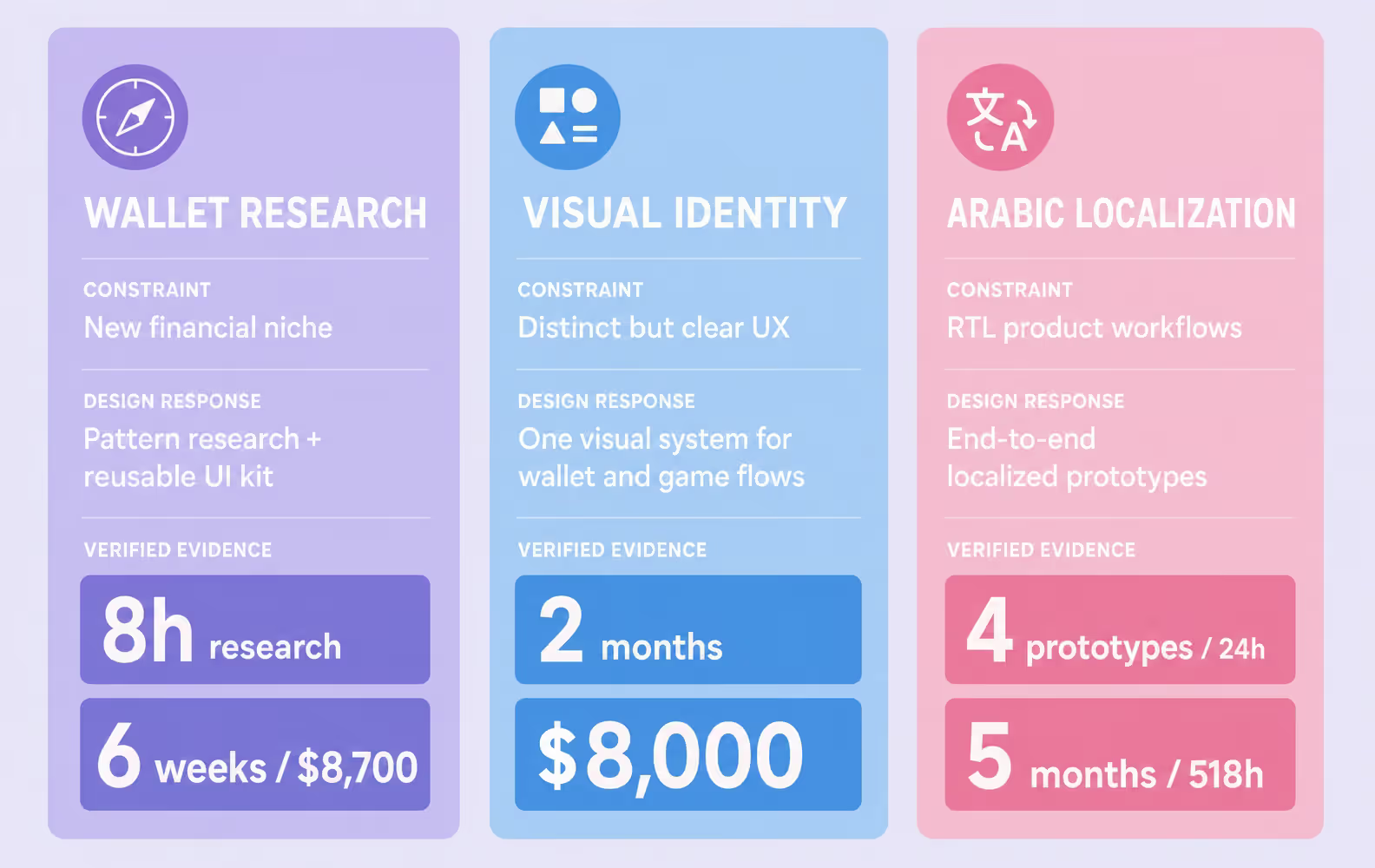
Our fintech UX case study for a crypto wallet began with eight hours of research into the market and existing solutions. That work gave the team a shared reference for evaluating financial patterns before visual decisions started.
The app and landing page design took six weeks. We handed the client a UI kit for their development team rather than a collection of unrelated screens. The published design cost was $8,700. For banking UX, the lesson is that consistent components carry decisions into implementation.
A Singapore startup needed a wallet that looked distinct without making its main actions harder to understand. We completed the visual style and wallet design in two months. The published project cost was $8,000.
After launch, the client attracted investment and the product’s first users. The result does not prove that visual identity replaces usability. It shows that a recognizable style works when the wallet, game elements, and navigation still support a clear core flow.
An Arabic crypto exchange needed more than translated interface copy. Reading direction, registration, formats, and navigation all affected the structure of the product. The team prepared four end-to-end prototypes in 24 hours so the client could review complete workflows instead of isolated screens.
The full project took five months and 518 hours. The practical lesson is that localization belongs in information architecture and prototyping. Treating it as a final translation pass leaves layout and workflow decisions unresolved.
Banking app design builds trust when every critical action has a clear state, a visible result, and a route back after failure. The same principle connects onboarding, dashboards, transfers, accessibility, and localization.
Visual polish supports the experience, but it cannot replace precise transaction feedback or recovery logic. Teams get a stronger product when these decisions remain consistent from research and prototyping through developer handoff.
➡️ Planning a banking product or reviewing an existing flow? Tell us what you are building, and we’ll map the design scope around its users and core transactions.
Banking app UX/UI design usually costs $15,000–$50,000 for an MVP scope with a specialized agency. Discovery and prototyping may account for $5,000–$12,000. The final budget depends on user roles, compliance screens, the number of core flows, and advanced features such as personalization or gamification.
A full banking app UX/UI engagement usually takes 10–16 weeks. Discovery and user research require about 2–3 weeks, wireframing and prototyping 3–5 weeks, and visual design plus iterative testing 4–8 weeks. Regulatory review of KYC, consent, or payment authorization may extend the schedule.
Banking app design must account for PSD2 and Open Banking consent flows, WCAG 2.1 AA accessibility, GDPR or CCPA disclosures, and KYC/AML onboarding requirements. These rules shape information architecture through explicit consent, readable disclosures, accessible controls, and step-by-step identity verification.
Trust comes from visual clarity, predictable navigation, transparent data handling, visible authentication feedback, real-time transaction status, and recovery paths that explain what happened. Clear fee disclosures and specific error messages matter more than decorative security imagery or generic assurances.
Biometric authentication can reduce login friction, but it must never become a dead end. Pair Face ID or fingerprint login with a visible PIN or OTP fallback, explain why a scan failed, and make it clear whether the account remains secure after repeated attempts.
UX covers the full user journey: onboarding, transaction logic, error recovery, and information architecture. UI is the visual execution through typography, color, iconography, and interactive states. In regulated fintech, UX constraints come first because compliance and security define which screens and states must exist.
Banking apps should meet WCAG 2.1 AA as a baseline, including sufficient color contrast, tap targets of at least 44×44 pt, screen-reader labels, dynamic text support, and alternatives to gesture-only actions. Test accessibility on complete financial flows, not isolated components.
Yes. A scoped MVP engagement can focus on onboarding, dashboard, transactions, and notifications before advanced personalization or emerging features. Published Purrweb cases include wallet design projects completed for $8,000–$8,700, although every banking product requires an individual estimate based on scope and compliance needs.
A banking app dashboard should show account balance, recent activity, primary actions such as transfer or payment, and any urgent account status. Secondary tools should not compete with these tasks. Every value must show whether it is current, delayed, pending, or temporarily unavailable.
The biggest banking app UX challenges are balancing security with speed, reducing dashboard overload, explaining financial terminology, designing trustworthy error recovery, controlling notification noise, and adapting flows for accessibility and localization. Each challenge needs a visible interface response, not only a policy or backend solution.


.svg)