Explore

Need help with your project?

Oops! Something went wrong while submitting the form.
HealthTech interfaces have to do more than look clear: they need to reduce anxiety and build trust. We break down five projects across men’s health, ADHD support, telemedicine, and fitness.
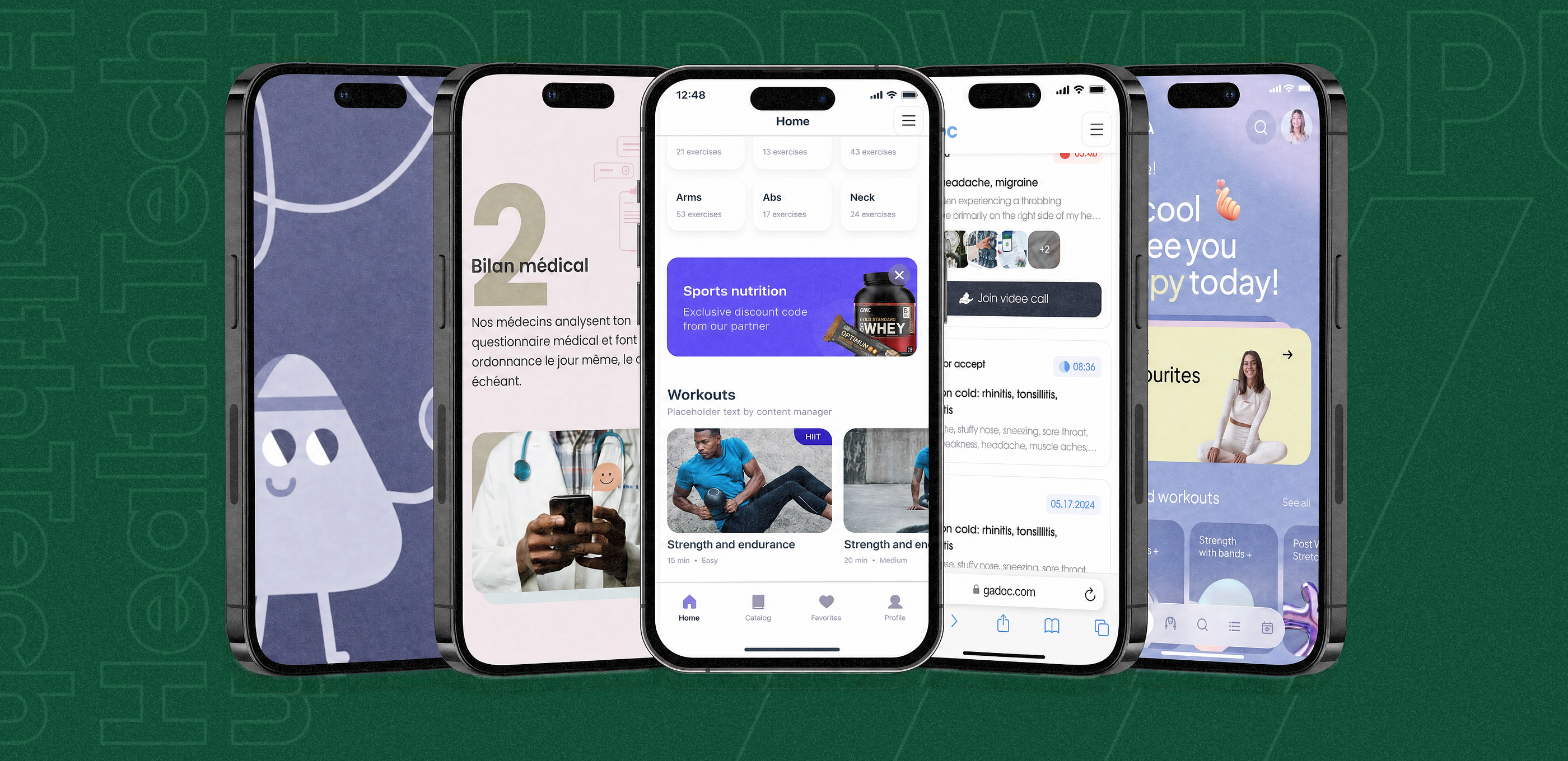
HealthTech is a field where design must be especially thoughtful. Users often come with anxiety, doubts, or embarrassment. They don’t want to figure out confusing navigation, scroll through excessive screens, or question the product. In other digital services, an interface flaw might cost conversion — but in HealthTech, it costs trust.
Over the last few years, we’ve worked with various HealthTech products — sometimes only on design, other times on the logic, and in some cases building the product entirely. These projects vary in scale and market, but they share one thing: accessible, concise, and clear design that doesn’t distract from what matters.
In this piece, we’ve gathered several of those case studies and briefly described the challenges we solved and the key design decisions that made the difference.
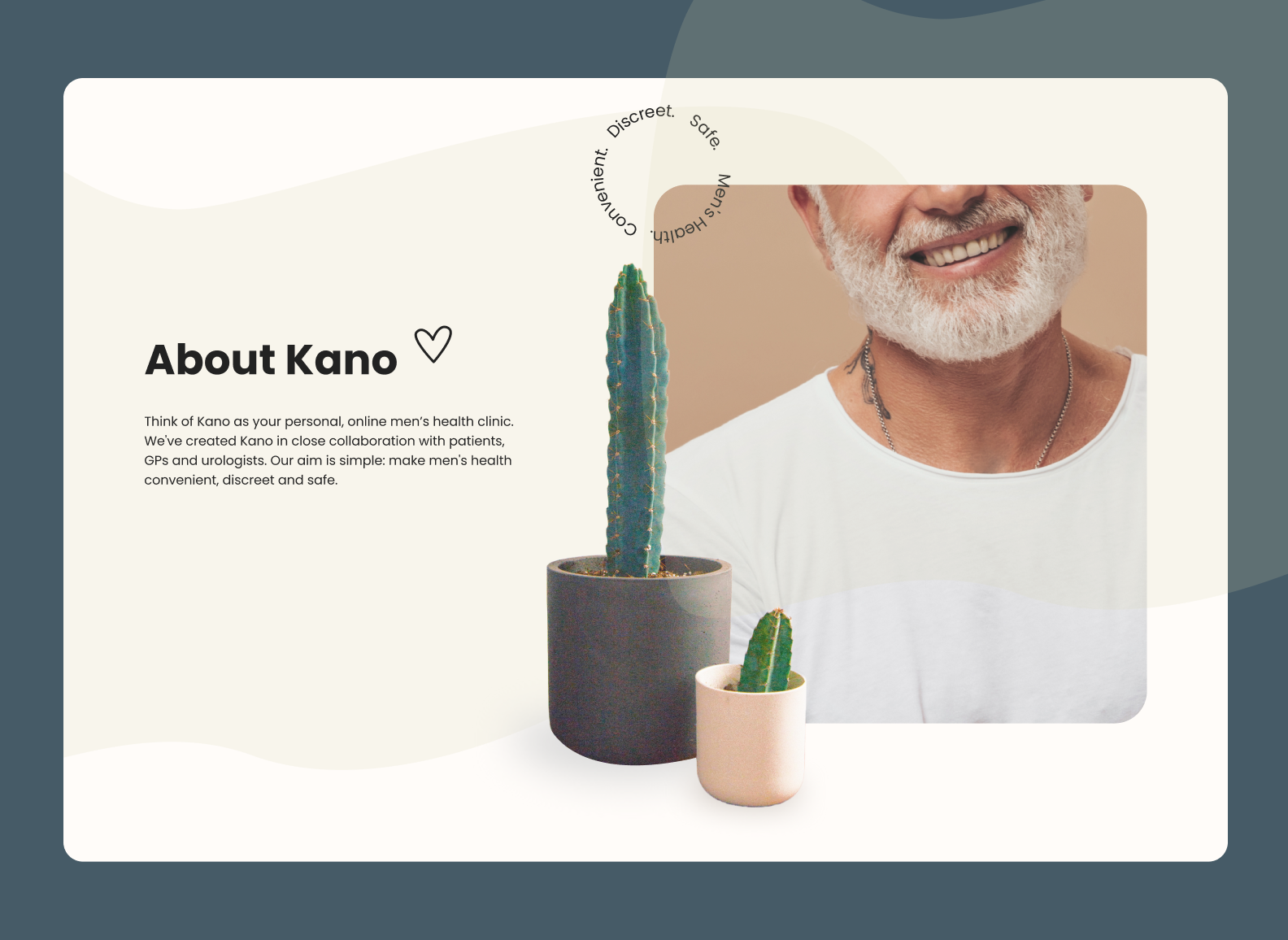
Kano is an online medication ordering service for men with erectile dysfunction. It is aimed at the French-speaking European market. The topic is sensitive: many patients avoid treatment precisely because they feel embarrassed. The online format solved that problem — but only on one condition: the interface had to inspire maximum trust.
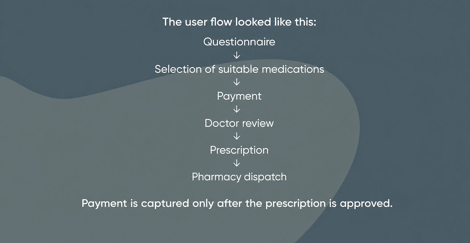
The user journey looked like this: questionnaire → selection of suitable medications → payment → doctor review → prescription → pharmacy shipment. Money is only charged after the prescription is confirmed.
Our task was to design the landing page and product interface so that this sensitive user journey felt consistent and clear.
The initial plan included 26 screens, but during optimization the structure was reduced to 13 without losing logic or journey completeness. The project took about 2.5 months.
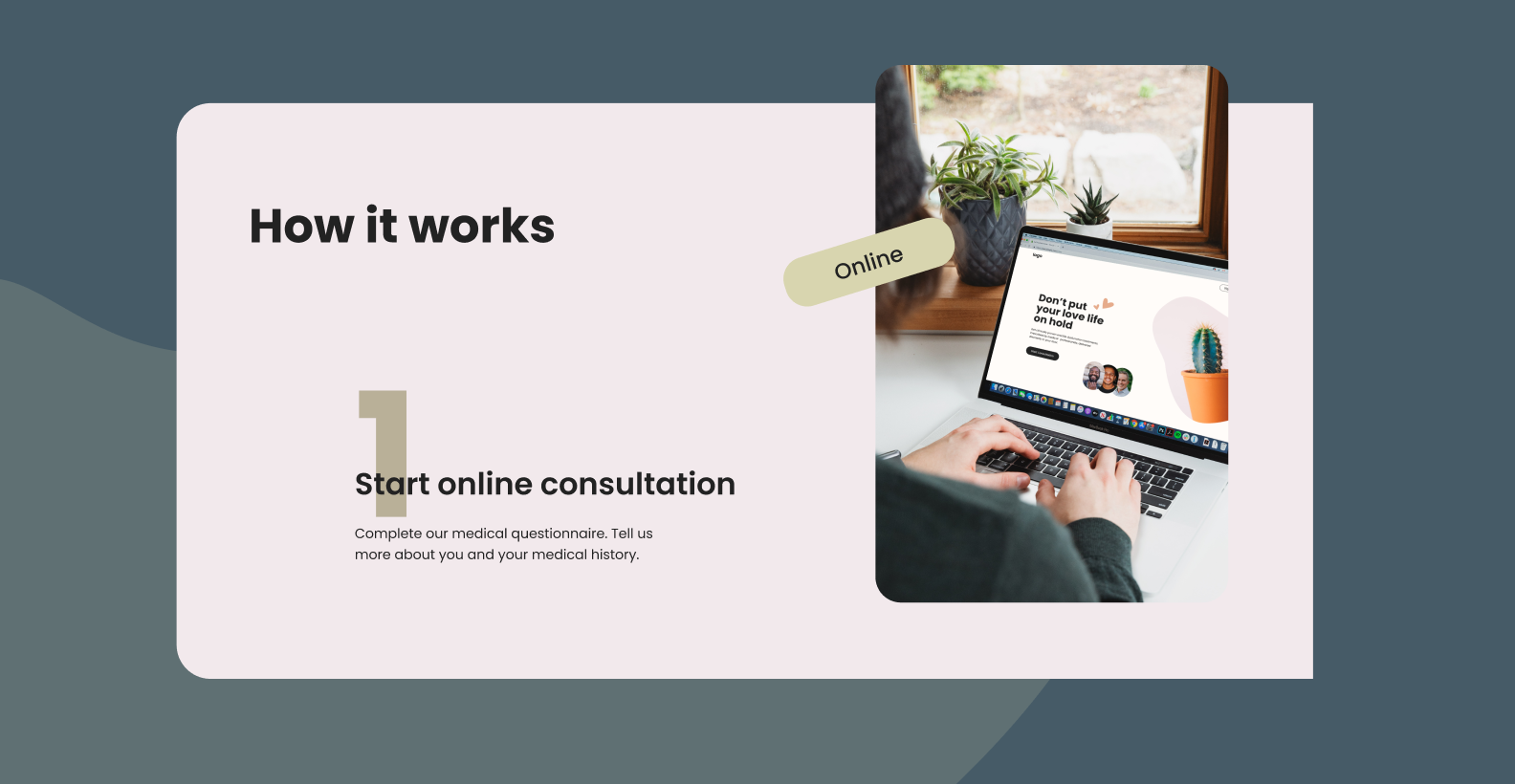
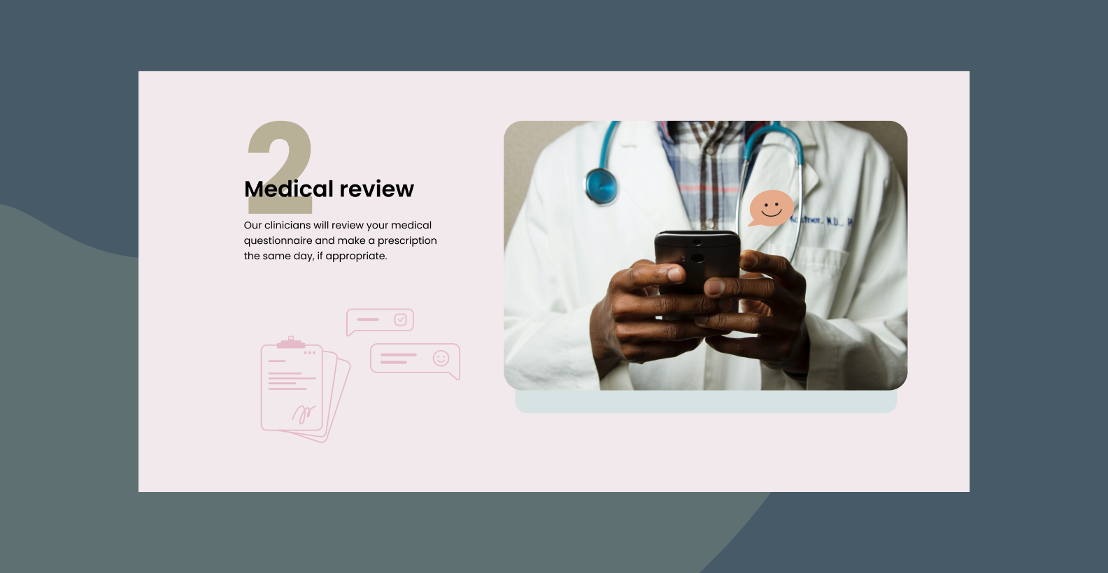
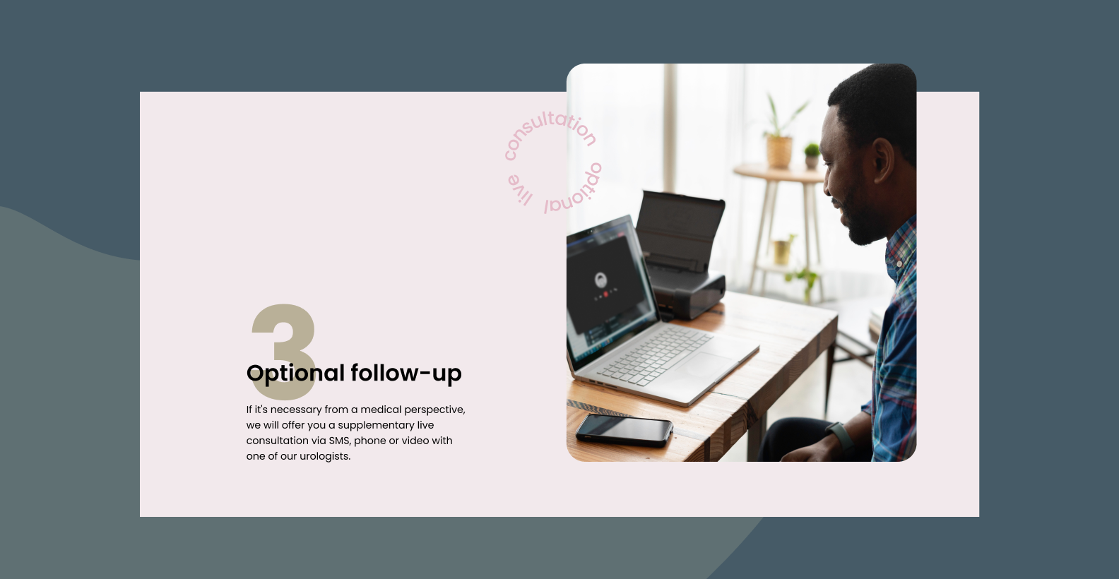
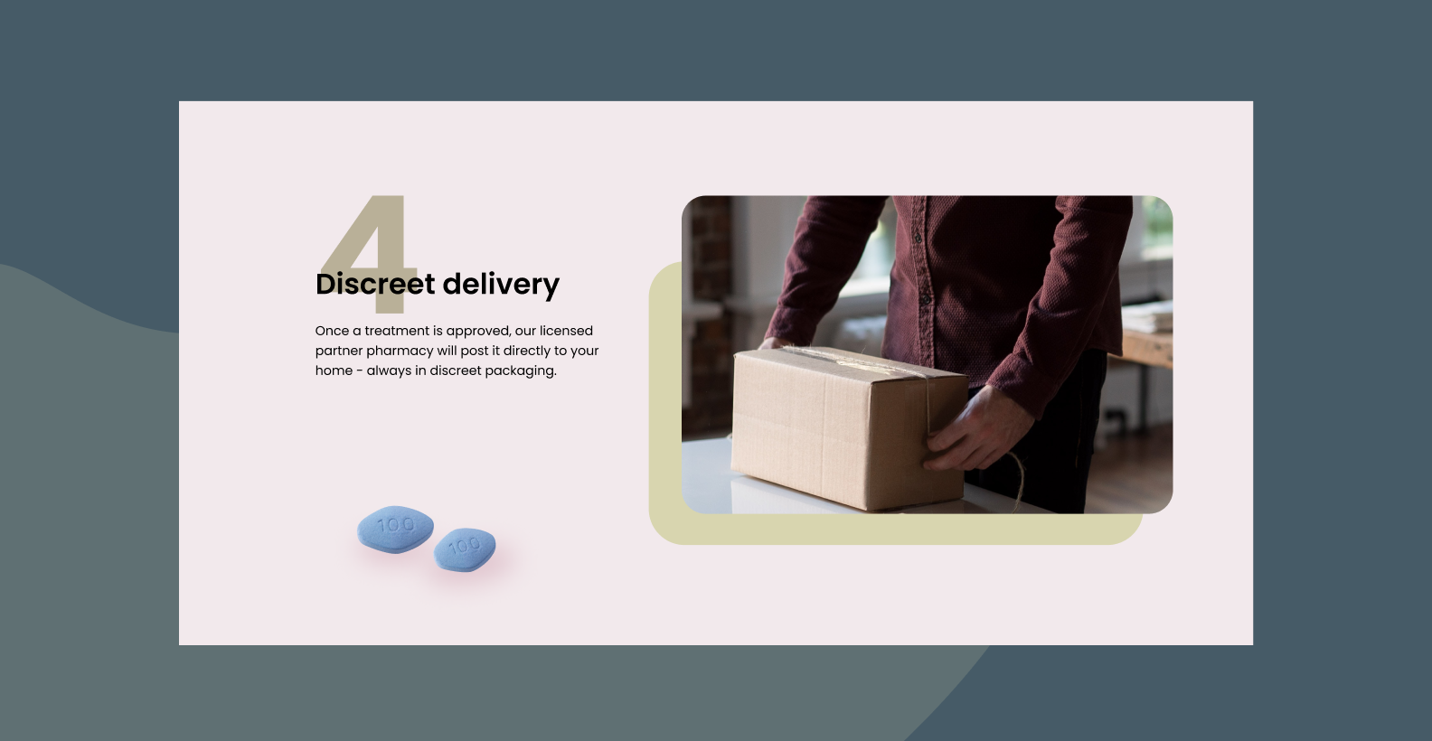
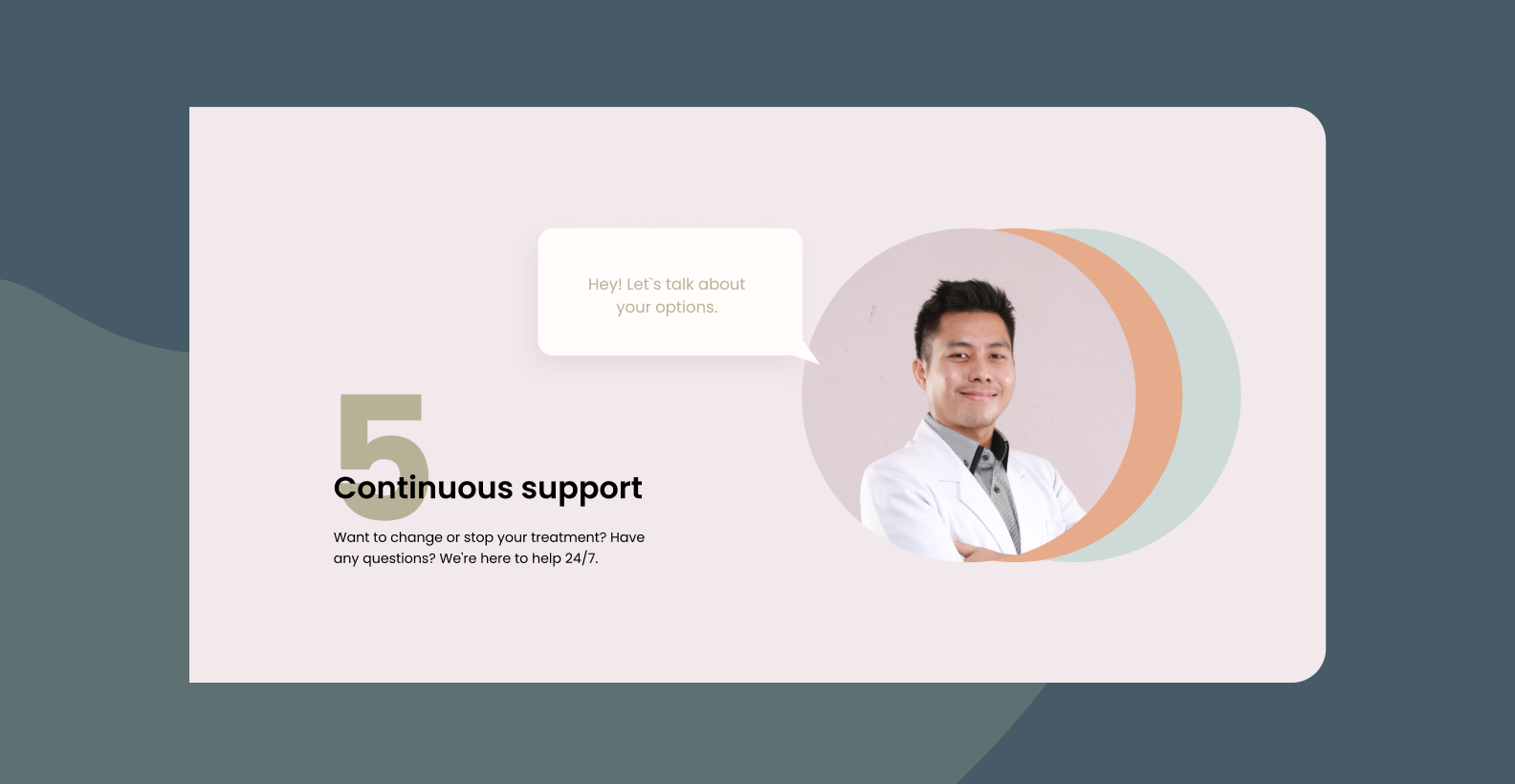
We created a clean, easy-to-understand interface that does not amplify awkwardness but, on the contrary, reduces it. In HealthTech, that is especially important — users need to feel they are in a safe environment.
1. Sensitive topic. We had to remove the feeling of “medical anxiety” without drifting into something childish. Visually, we leaned on soft minimalism: a calm palette, clean typography, and illustrations.
2. The product was evolving in parallel with the design. During the project, additional flows and logic changes kept appearing. That required constant task reassessment and close synchronization with the client. For example, we insisted on adding a section that explains the logic behind medication selection — users need to understand how a recommendation is formed.
3. French localization. French constructions are longer than English ones, and buttons and headings grew 1.5–2 times in length. We had to adapt the interface to larger text volumes and account for language-specific details — down to spaces before question marks and exclamation marks.
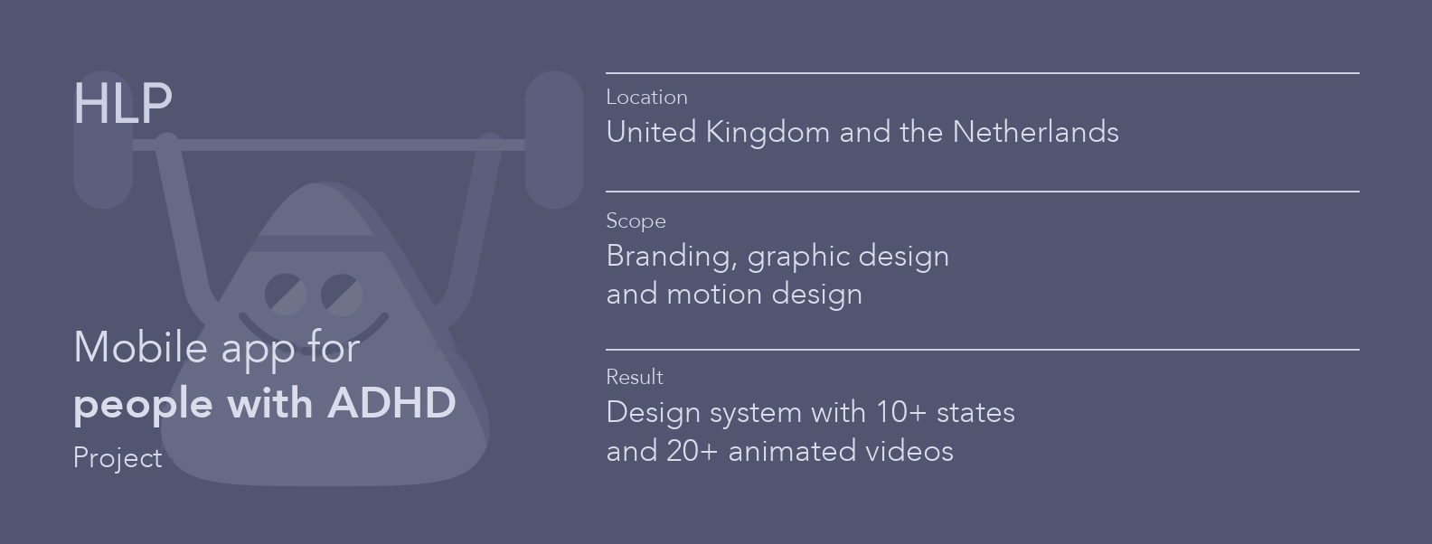
HLP is an app for people with Attention Deficit Hyperactivity Disorder (ADHD) that helps them track their mood and condition. When the team came to us, the product already existed, but visually it lacked cohesion: for example, there was a mascot, but in only one state, and the brand identity did not reflect the product’s emotional side.
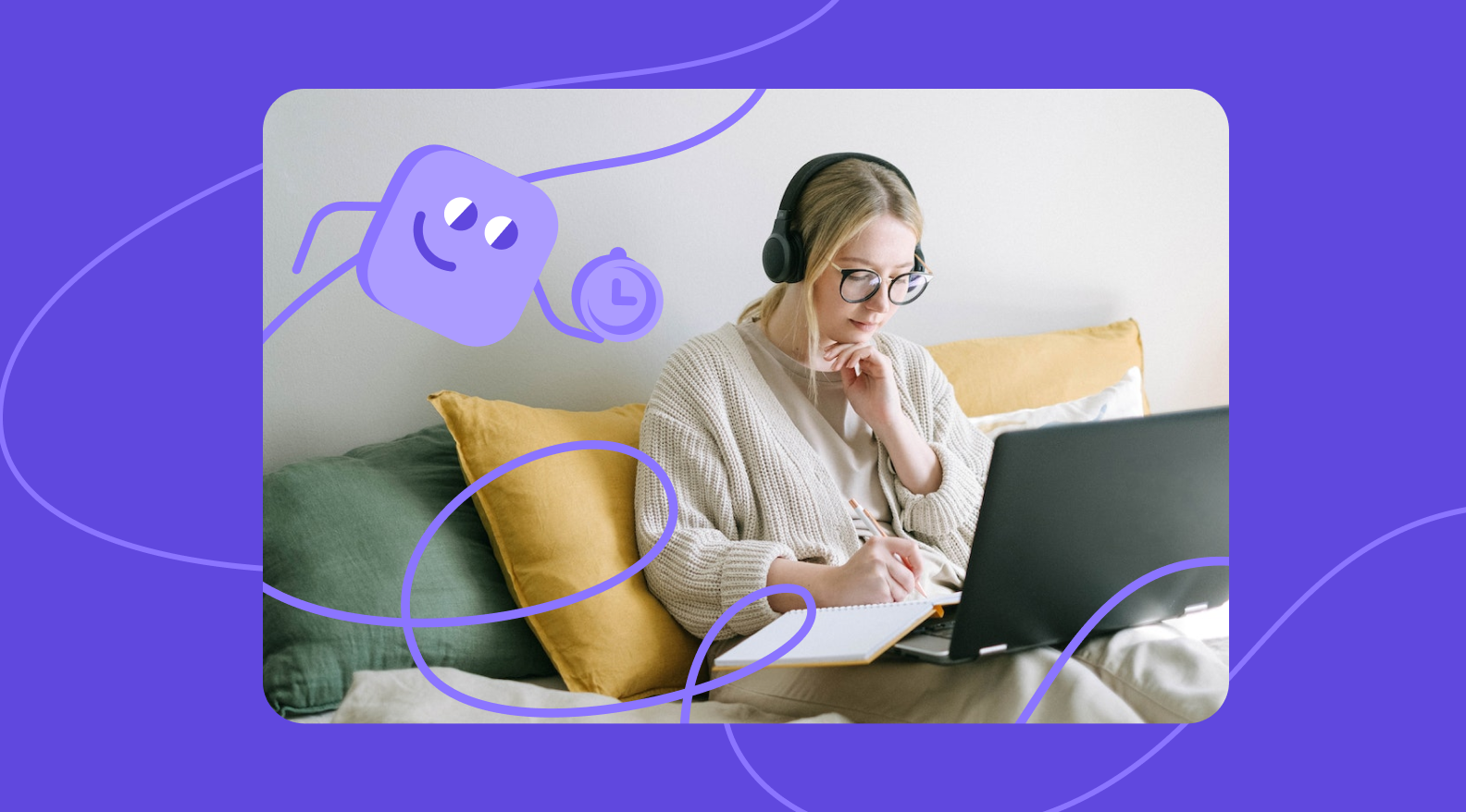
The focus was on creating a visual language that could scale. As a result, HLP received a recognizable style that can be easily adapted to different user touchpoints.
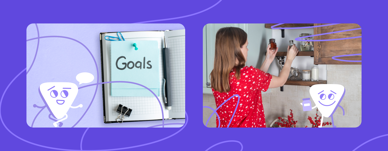
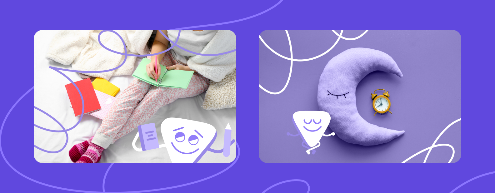
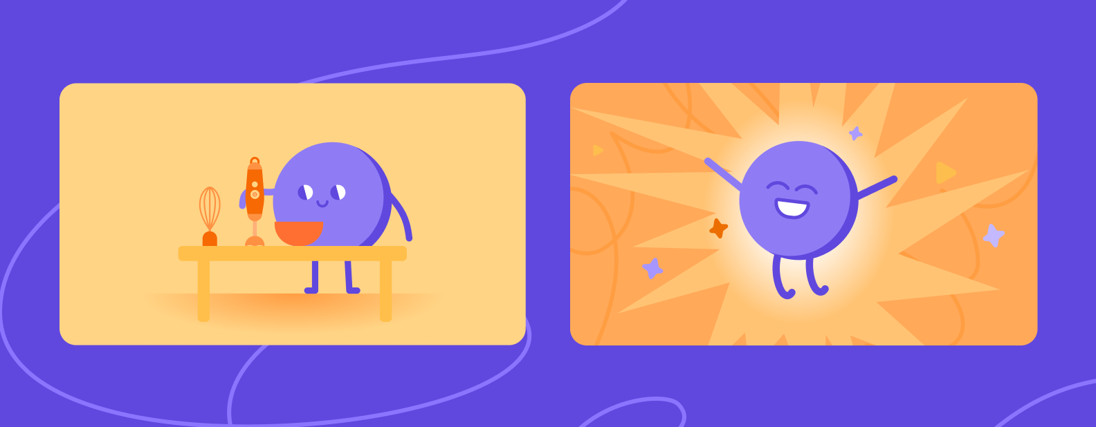
1. Working with emotional range. ADHD comes with different human states: focus, distraction, fatigue, hyperfocus. The mascot had to reflect that dynamic without becoming cartoonish. We developed several state variations and appearance scenarios so the character would help rather than distract.
2. Balancing friendliness and frivolity. The app could not look like a children’s product, but excessive strictness isn’t right either. The visual system turned out bright yet structured — with a clear hierarchy and unobtrusive typography.
3. Identity as part of UX. We thought through the moments when users interact with the character and illustrations. They help in difficult states, provide support during the journey, and stay out of the way where concentration matters.
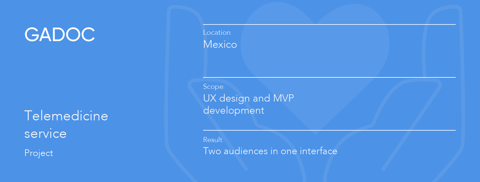
Gadoc is a telemedicine app for the Mexican market. The idea is simple: patients can get a quick online consultation with a doctor — show a bruise, describe symptoms, and clarify whether they need an in-person appointment. For doctors, the in-app shift format is an additional source of income.
The project was launched as a hypothesis, and the goal wasn’t to build a perfect product right away, but to quickly test market demand.
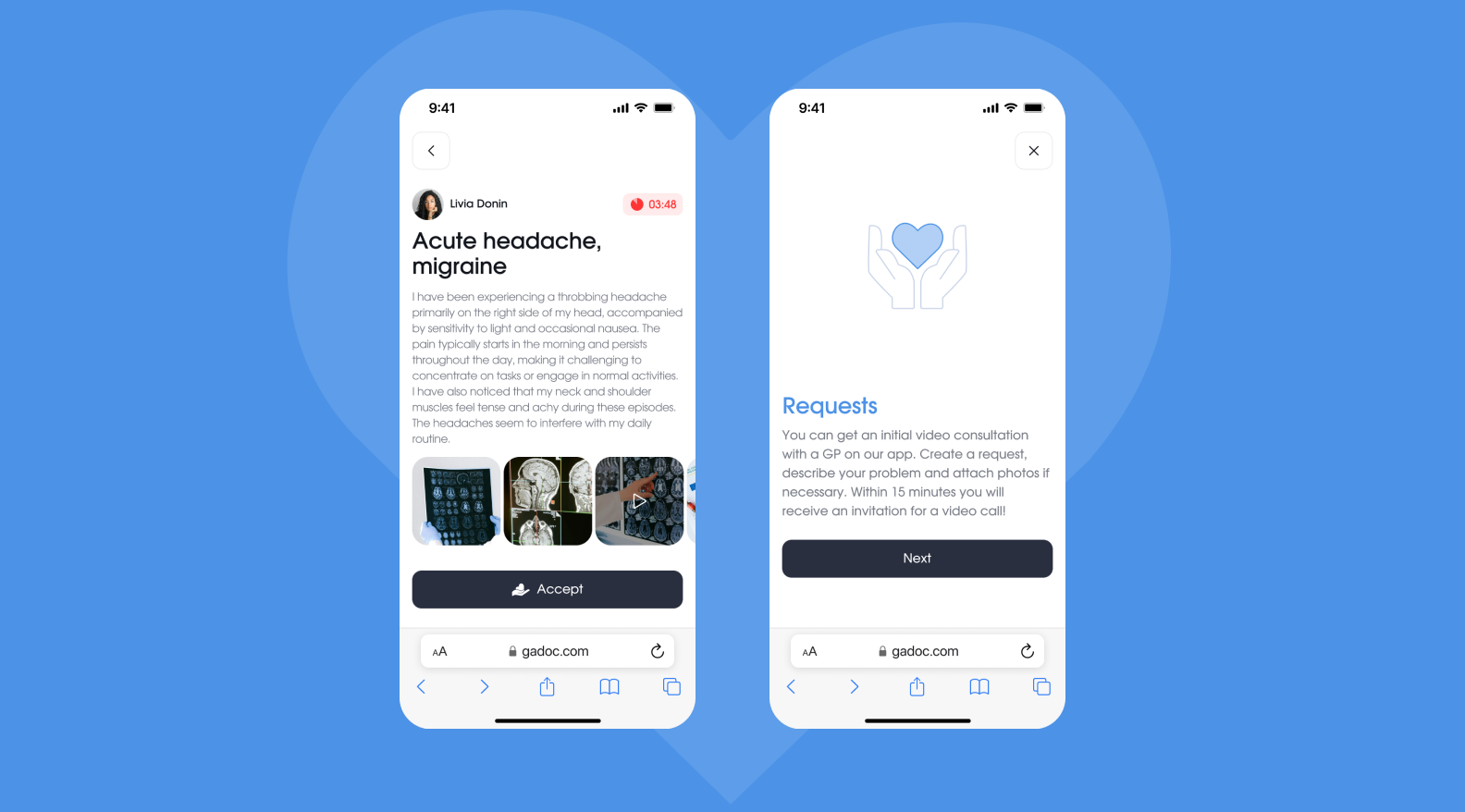
The video call feature was postponed to a later stage to launch the MVP faster and test the core consultation scenario.
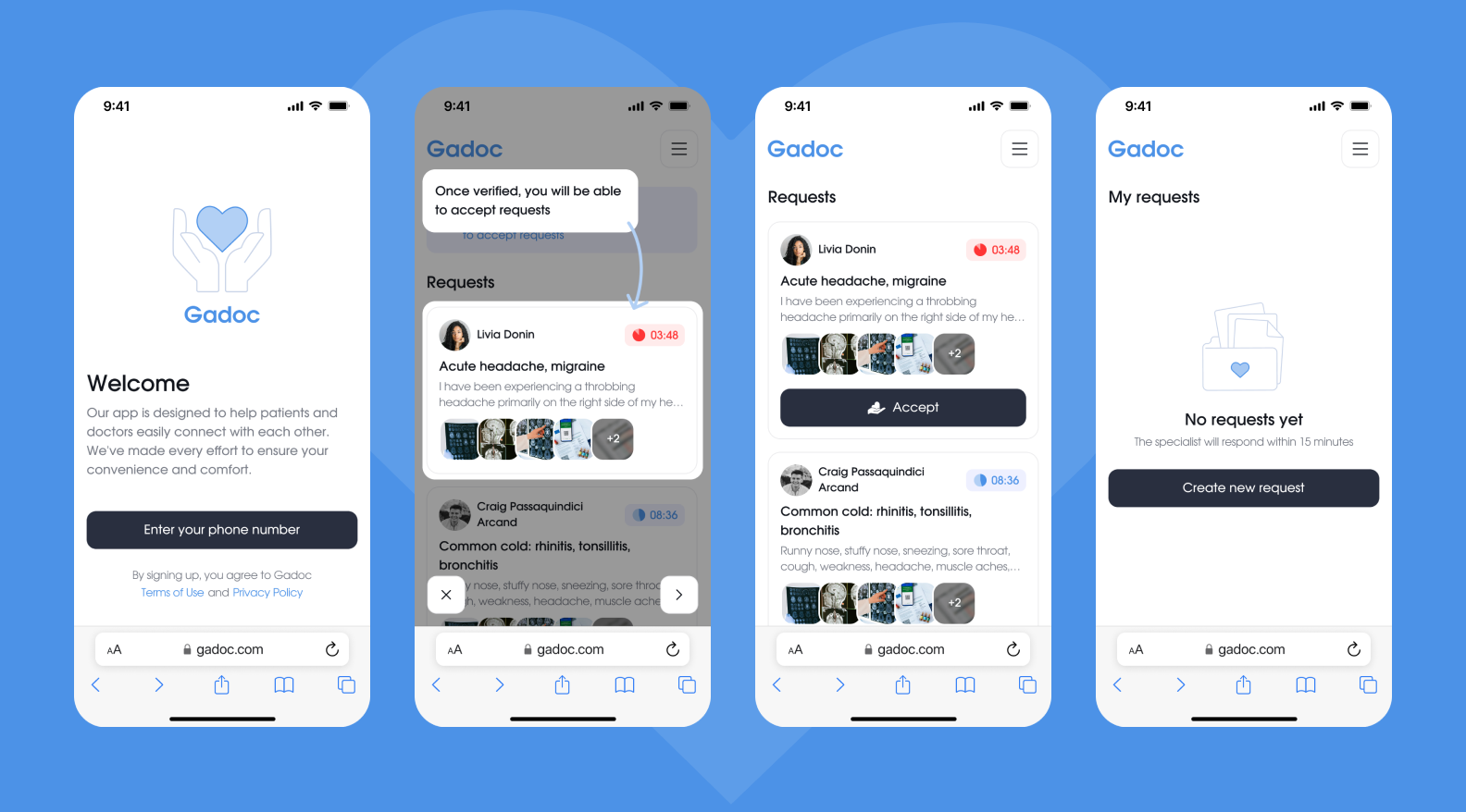
We assembled an MVP that can be scaled further by adding video communication, expanded doctor profiles, and additional scenarios.
In this project, design is a tool: it helps test the hypothesis and move forward.
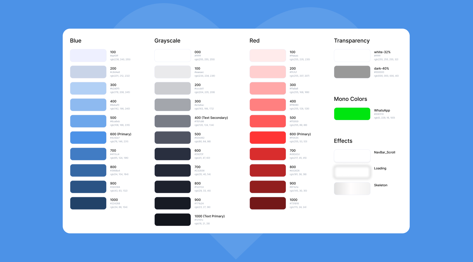
1. Two audiences — one system. Doctors and patients have different tasks: one side needs to quickly find a specialist and book a consultation, while the other needs to manage requests and see patients. The interface had to be equally clear for both sides while accounting for their different goals.
2. MVP and nothing extra. In HealthTech, it is easy to end up wanting to “add everything useful at once” — medical history, analytics, reminders, complex filters. We focused on the core scenario — request → communication → consultation.
3. A simple interface builds trust. In telemedicine, the feeling of reliability comes first. That is why we chose a concise design with a clear hierarchy and clean screens free of decorative excess.
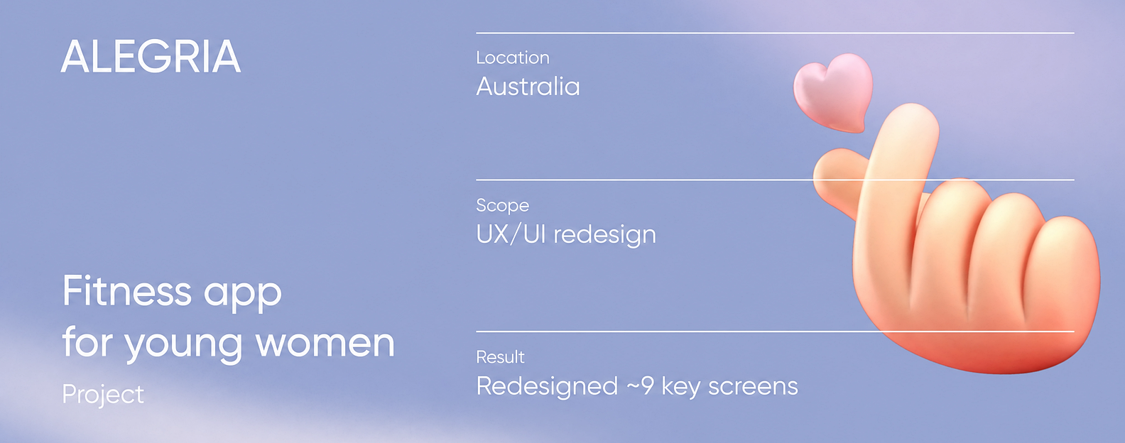
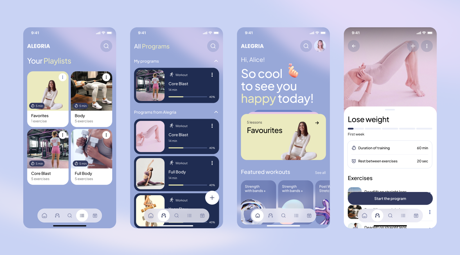
Alegria is a fitness app for young women that combines workouts and results tracking. The MVP was already live: it had a feature set, workouts, and even a technology for measuring muscle activity during exercises as its core USP (Unique Selling Proposition).
But once the product was shown to a focus group, it became clear that visually it did not match the audience’s expectations. The design supported neither the product’s value nor its premium wellness direction.
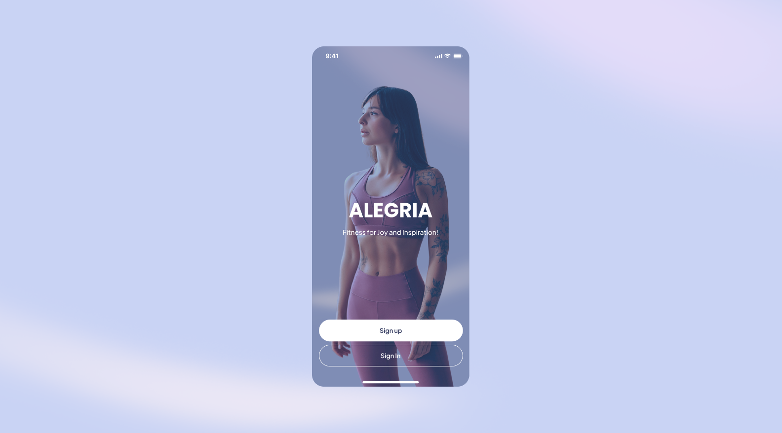
We worked within the existing product rather than rebuilding the architecture from scratch, with a focus on delivering a stronger sense of cohesion.
As a result, Alegria received a visual update that:
1. A working product with a visual that was not working. We needed to carefully improve an existing system — and that is always harder than building from scratch.
2. An audience with high visual expectations. A young female audience is highly sensitive to aesthetics. The request was for a soft, modern, Pinterest-like visual — with a pastel palette, lightness, and airy branding.
3. Limited budget and a tight timeline. The redesign had to be targeted, but noticeable. We focused on the main screens — the ones that shape first impressions and retain users.
VIMS is an app for home workouts and face fitness. The idea behind the product is to save users time and money: instead of going to the gym, paying for personal training sessions, or spending extra on cosmetic procedures, they can work out on their own using ready-made programs.
We joined the project from scratch: we created the logo, designed the interface, built the mobile app, and delivered the admin panel. The project started in February 2021 and lasted almost until the end of the year.
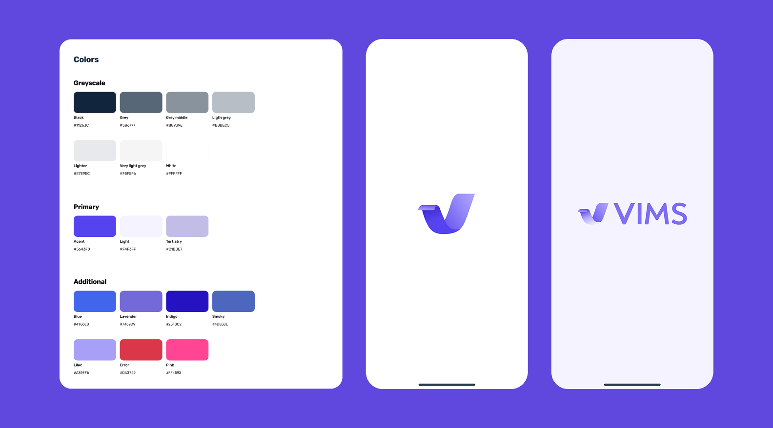
The logo needed to convey a sense of energy, activity, and inner drive, but without aggressive colors or direct sports clichés. The brand palette was built around purple and its variations to preserve emotional softness and avoid an aggressive sports aesthetic centered on “strength” and “results at any cost.”
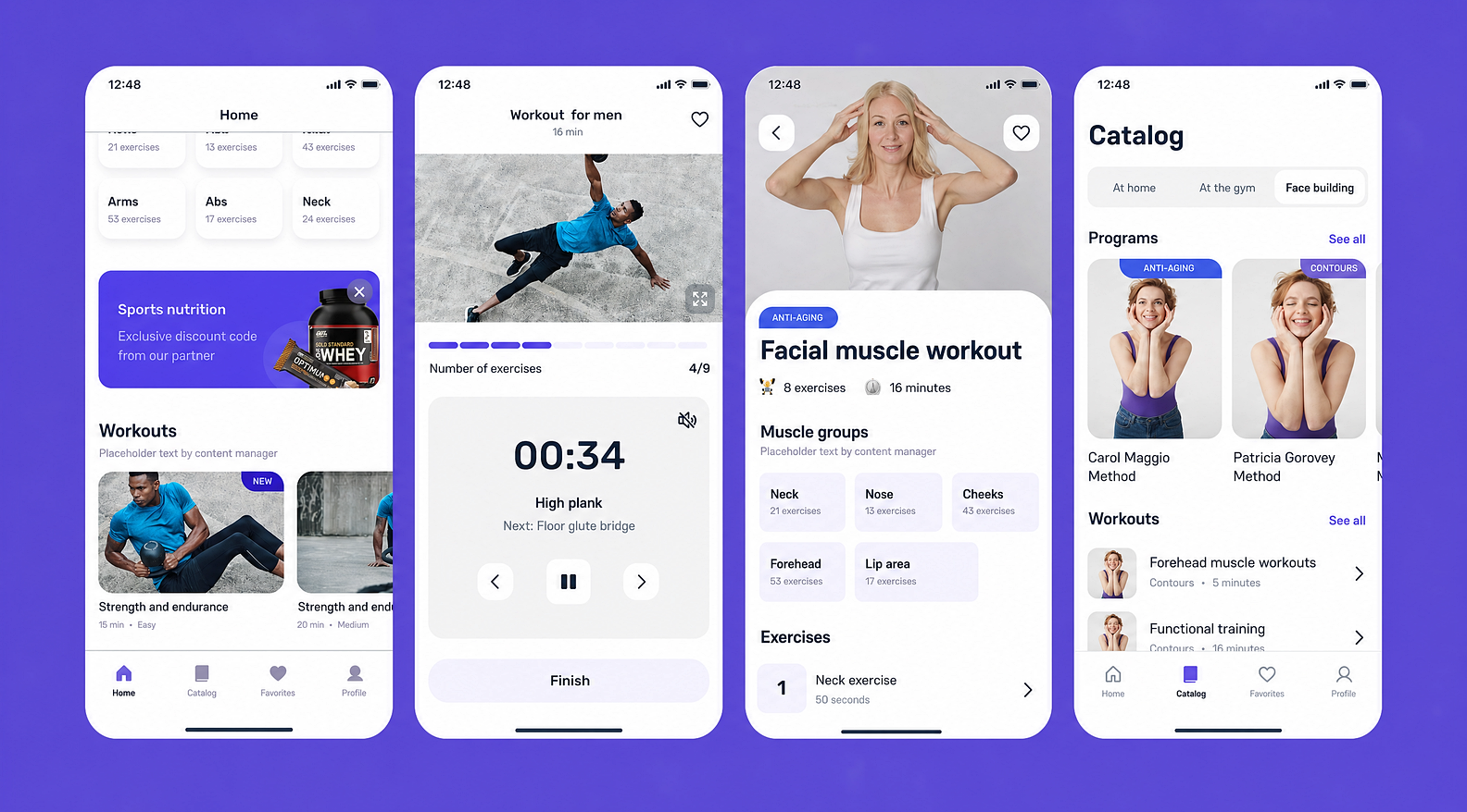
In VIMS, we created minimalist mobile screens with a soft sporty character — from the home page to the catalog and workout card.
1. Working with Apple and Google subscriptions. In-app subscriptions for Apple and Google require careful work on logic, statuses, and store limitations. We additionally synchronized business logic and implementation to avoid mistakes at the publication stage.
2. Limited budget and resources. The project was delivered under budget constraints and with partial team capacity. That required precise prioritization and thoughtful task distribution to preserve product integrity.
3. Full-cycle development. Unlike some of the other cases, here we were responsible not only for the visual side, but also for implementation. That is a completely different level of responsibility.
Each of these projects solved its own task and worked with a different audience. But if you look wider, they share a common principle.
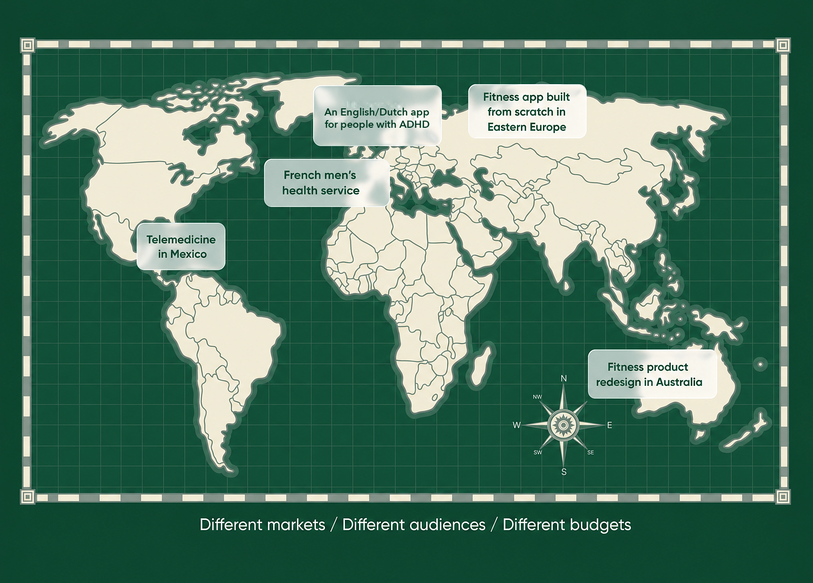
In every case, design was a tool for:
In HealthTech, the interface directly affects whether a user stays in the product.
➡️ Looking for a team that will carefully and thoughtfully build your HealthTech product? We’re here.
For more than 10 years, the Purrweb team has been launching clear and beautiful digital services — from MVPs to full-fledged subscription-based products. We know how to work with sensitive topics, complex logic, and different markets: we design interfaces that inspire trust and visual systems that strengthen the product.
Tell us about your idea — we will estimate the timeline and budget and suggest a clear work plan.
Our portfolio includes more than 550 projects: from startups and telemedicine to marketplaces, IoT, and fintech. We know how to adapt design to the audience, the market, and the product stage — whether it is an MVP or a scaling product.
We integrate into your processes and collaborate with developers, product teams, and marketing. No unnecessary bureaucracy, and communication stays transparent.
You do not have to come with a finished specification. An idea is enough — we’ll help structure it, design the UX, create the visual design, and, if needed, build the product.
Write to us — let’s discuss your project and the next step 🚀


.svg)